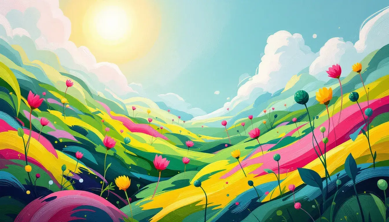
Spring Awakening: Trending Colors for Energetic Mood Boards
25 Sep 2025 · 5 min readSpring, the season of reawakening, whispers promises of growth and vitality. It’s a time when the world shakes off its slumber, bursting forth in a riot of color and energy. But how do we translate this vibrant resurgence into a visual language? How do we capture the essence of a 'Spring Awakening' for mood boards intended to crackle with pure energy? The answer lies in selecting palettes that mirror nature's own vivacious palette – colors that not only reflect springtime but also ignite the imagination, stirring the soul with a sense of limitless potential. Think beyond pastel clichés to explore daring and unexpected combinations, hues that mirror the audacious spirit of a season unafraid to show its true colors. The palettes selected here seek to capture exactly that: the feeling of sun-drenched meadows, the exhilaration of a first bloom, the sheer, untamed joy of renewal.
The "Modern Science" palette presents an unexpected laboratory of springtime joy. Bright Lime electrifies the senses, a jolt of fresh growth mirroring the first verdant shoots pushing through the earth. Juxtaposed against this is Hot Pink, an unapologetically bold statement, reminiscent of flamboyant tulips bursting into bloom. Teal Green tempers the exuberance, a grounding force evoking the cool shade of a forest canopy, while Dark Burgundy adds an intriguing depth, like rich soil teeming with unseen potential. The final note, Navy Blue, grounds the palette, echoing the vast expanse of a springtime sky streaked with energetic clouds. This isn’t a gentle, whispering spring; it is a spring amplified, a season demanding attention. Imagine this palette within a space designed to foster innovation, such as a collaborative workspace or a forward-thinking classroom. It is a color story that rejects predictability, instead urging us to embrace the unconventional and discover the exciting possibilities that lie just beyond the horizon. It is a call to explore, to create, and to push boundaries with the same fearless abandon as nature itself erupting into life. "Modern Science" doesn’t simply represent spring; it embodies its inherent ambition, its thirst for discovery, the constant reaching towards something new.
"Vibrant Finance" projects a spring equally dynamic, but channeled in a different direction. Chartreuse Yellow captures the sun's potent energy, reflecting off new leaves after a spring shower. It's optimism distilled into a vibrant hue. Spring Green, its close companion, evokes the lush vitality of a burgeoning garden, the promise of growth and abundance. The intrusion of Steel Blue cools the effervescence, like a crisp breeze cutting through the warmth, grounding the palette in something stable and reliable. Neutral Gray offers a moment for contemplation, a pause before the next explosion of activity, reflecting the quiet moments interspersed amidst springtime commotion. Deep Black, a surprising counterpoint, suggests the rich depth of the earth, teeming with hidden potential, the reservoir from which all this energy springs. Imagine this palette translated into environments designed to generate innovative ideas: think creative financial hubs or tech startup spaces. It presents an atmosphere of confidence and grounded ambition, as if every project is destined for success. This is not a naive optimism, but one tempered with pragmatism and strategic thinking. "Vibrant Finance" is tailored for a context of progress, a belief that, like nature itself, careful planning can yield fruitful outcomes. The palette captures the sense of possibility that underlies genuine progress, the excitement in seeing an idea grow from seed to fruition.
The "Vibrant Contrast" palette offers a complex take on Spring's energy. Light Gray mirrors the diffuse light of a spring morning, a gentle start to a day brimming with potential. It allows the bolder shades to truly shine. Bright Gold captures the first bold rays of sunlight, glinting off newly unfurled leaves, an unapologetic declaration of warmth. Misty Blue-Gray acts as a counterpoint, like the distant haze of mountains beginning to emerge after winter; it adds space and breath. Dusty Red is like the earthy tones of the awakening soil, hinting at dormant potential, a quiet strength that underlies the bursts of new growth. Dark Forest Green, the deepest note, speaks of nature’s constant renewal, reminiscent of ancient trees that have witnessed countless springs, standing firm in their silent wisdom. Transferred into the realm of interior design, imagine this palette gracing spaces where creativity flows freely. The balance it strikes between boldness and calm positions it well for creative offices and living rooms that thrive on the exchange of energies. It encourages a sense of stability, as if every idea is met with enthusiasm and consideration. "Vibrant Contrast" isn’t about superficial liveliness; it’s about a deep, considered energy, the kind that fuels lasting innovation. Each color contributes to a sense of inspired growth, not just in terms of appearance, but also in the feeling that something real and substantial is coming into being.
These palettes present a dynamic vision of springtime energy – one reaching beyond the expected pastel hues and sentimental themes. From bold experimentation in "Modern Science" to the strategic optimism shown in "Vibrant Finance" and the nuanced growth in "Vibrant Contrast", there are many ways to translate the season's spirit into compelling visual narratives. It is a reminder that spring’s energy is not just about pretty blossoms; it is powerful, inventive, and deeply transformative. The careful pairing of hues opens up a space for growth, for ingenuity, for seeing the world with renewed vigor. These palettes offer the tools for bringing that awakening to life, sparking inspiration with the promise of endless possibilities.