'%3e%3cpath%20fill-rule='evenodd'%20clip-rule='evenodd'%20d='M51.1303%2019.2492C50.7278%2019.913%2050.1346%2020.4426%2049.3508%2020.838C48.5669%2021.2335%2047.6172%2021.4312%2046.5014%2021.4312C44.8208%2021.4312%2043.4367%2021.0216%2042.3492%2020.2025C41.2617%2019.3833%2040.6686%2018.2394%2040.5697%2016.7706H44.4253C44.4818%2017.3355%2044.6831%2017.7804%2045.0291%2018.1052C45.3751%2018.43%2045.8164%2018.5924%2046.3531%2018.5924C46.8192%2018.5924%2047.1864%2018.4653%2047.4547%2018.2111C47.7231%2017.9569%2047.8572%2017.618%2047.8572%2017.1943C47.8572%2016.8129%2047.7337%2016.4952%2047.4865%2016.241C47.2393%2015.9867%2046.9322%2015.7784%2046.565%2015.616C46.1978%2015.4536%2045.6893%2015.2594%2045.0397%2015.0334C44.0934%2014.7086%2043.3202%2014.3944%2042.72%2014.0907C42.1197%2013.7871%2041.6042%2013.3351%2041.1735%2012.7349C40.7427%2012.1347%2040.5273%2011.3544%2040.5273%2010.394C40.5273%209.50418%2040.7533%208.73448%2041.2053%208.08481C41.6572%207.43515%2042.2821%206.93731%2043.0801%206.5913C43.8781%206.24528%2044.7925%206.07227%2045.8235%206.07227C47.49%206.07227%2048.8141%206.46771%2049.7956%207.25861C50.7772%208.04951%2051.3315%209.13698%2051.4586%2010.5211H47.5395C47.4689%2010.0268%2047.2888%209.63483%2046.9993%209.3453C46.7097%209.05578%2046.3178%208.91102%2045.8235%208.91102C45.3998%208.91102%2045.0573%209.024%2044.7961%209.24997C44.5348%209.47594%2044.4041%209.80783%2044.4041%2010.2457C44.4041%2010.5988%2044.5207%2010.8989%2044.7537%2011.146C44.9867%2011.3932%2045.2798%2011.5944%2045.6328%2011.7498C45.9859%2011.9052%2046.4944%2012.1029%2047.1581%2012.343C48.1185%2012.6678%2048.9023%2012.9891%2049.5096%2013.3069C50.1169%2013.6246%2050.6395%2014.0872%2051.0773%2014.6945C51.5151%2015.3018%2051.734%2016.0927%2051.734%2017.0672C51.734%2017.8581%2051.5328%2018.5854%2051.1303%2019.2492ZM59.0242%206.3053V21.2829H55.4016V6.3053H59.0242ZM73.9409%206.3053V9.18642H69.8734V21.2829H66.2296V9.18642H62.2046V6.3053H73.9409ZM80.7438%209.18642V12.3218H85.8069V15.0546H80.7438V18.3806H86.4425V21.2829H77.1212V6.3053H86.4425V9.18642H80.7438ZM99.667%2016.0291V21.2829H96.0444V6.3053H101.913C103.692%206.3053%20105.048%206.74665%20105.98%207.62934C106.912%208.51204%20107.378%209.7019%20107.378%2011.199C107.378%2012.1311%20107.17%2012.9609%20106.753%2013.6882C106.337%2014.4155%20105.719%2014.9875%20104.9%2015.4042C104.08%2015.8208%20103.085%2016.0291%20101.913%2016.0291H99.667ZM103.692%2011.199C103.692%209.8855%20102.965%209.22879%20101.51%209.22879H99.667V13.1268H101.51C102.965%2013.1268%20103.692%2012.4842%20103.692%2011.199ZM120.092%2018.5501H114.478L113.546%2021.2829H109.732L115.219%206.41123H119.393L124.879%2021.2829H121.024L120.092%2018.5501ZM119.16%2015.7961L117.295%2010.2881L115.41%2015.7961H119.16ZM131.555%2018.5077H136.385V21.2829H127.933V6.3053H131.555V18.5077ZM143.337%209.18642V12.3218H148.4V15.0546H143.337V18.3806H149.035V21.2829H139.714V6.3053H149.035V9.18642H143.337ZM163.507%206.3053V9.18642H159.44V21.2829H155.796V9.18642H151.771V6.3053H163.507ZM177.449%206.3053V9.18642H173.382V21.2829H169.738V9.18642H165.713V6.3053H177.449ZM184.252%209.18642V12.3218H189.315V15.0546H184.252V18.3806H189.951V21.2829H180.629V6.3053H189.951V9.18642H184.252Z'%20fill='%23EEF0ED'/%3e%3cmask%20id='mask0_3101_7327'%20style='mask-type:alpha'%20maskUnits='userSpaceOnUse'%20x='0'%20y='0'%20width='27'%20height='28'%3e%3cpath%20d='M23.8328%200.759766H2.64808C1.18559%200.759766%200%201.94535%200%203.40785V24.5925C0%2026.055%201.18559%2027.2406%202.64808%2027.2406H23.8328C25.2952%2027.2406%2026.4808%2026.055%2026.4808%2024.5925V3.40785C26.4808%201.94535%2025.2952%200.759766%2023.8328%200.759766Z'%20fill='white'/%3e%3c/mask%3e%3cg%20mask='url(%23mask0_3101_7327)'%3e%3cpath%20d='M23.8328%200.759766H2.64808C1.18559%200.759766%200%201.94535%200%203.40785V24.5925C0%2026.055%201.18559%2027.2406%202.64808%2027.2406H23.8328C25.2952%2027.2406%2026.4808%2026.055%2026.4808%2024.5925V3.40785C26.4808%201.94535%2025.2952%200.759766%2023.8328%200.759766Z'%20fill='%23D8D8D8'/%3e%3cpath%20d='M13.2404%200.759766H0V14.0001H13.2404V0.759766Z'%20fill='%238C61FF'/%3e%3cpath%20d='M13.2404%2014H0V27.2404H13.2404V14Z'%20fill='%2336C3FE'/%3e%3cpath%20d='M26.4806%2014H13.2402V27.2404H26.4806V14Z'%20fill='%236592FE'/%3e%3cpath%20d='M26.4806%200.759766H13.2402V14.0002H26.4806V0.759766Z'%20fill='%236059F7'/%3e%3c/g%3e%3c/g%3e%3cdefs%3e%3cclipPath%20id='clip0_3101_7327'%3e%3crect%20width='190'%20height='28'%20fill='white'/%3e%3c/clipPath%3e%3c/defs%3e%3c/svg%3e)
'%3e%3cpath%20d='M23.8328%200.759521H2.64808C1.18559%200.759521%200%201.94511%200%203.40761V24.5923C0%2026.0548%201.18559%2027.2404%202.64808%2027.2404H23.8328C25.2952%2027.2404%2026.4808%2026.0548%2026.4808%2024.5923V3.40761C26.4808%201.94511%2025.2952%200.759521%2023.8328%200.759521Z'%20fill='%23D8D8D8'/%3e%3cpath%20d='M13.2404%200.759521H0V13.9999H13.2404V0.759521Z'%20fill='%238C61FF'/%3e%3cpath%20d='M13.2404%2013.9998H0V27.2402H13.2404V13.9998Z'%20fill='%2336C3FE'/%3e%3cpath%20d='M26.4809%2013.9998H13.2405V27.2402H26.4809V13.9998Z'%20fill='%236592FE'/%3e%3cpath%20d='M26.4809%200.759277H13.2405V13.9997H26.4809V0.759277Z'%20fill='%236059F7'/%3e%3c/g%3e%3c/svg%3e)
Golden Yellow's Momentum
25 Sep 2025 · 4 min readEven the most steadfast sunrise needs its moment in the spotlight. Colors, like notes in a melody, can rise and fall in popularity, influence, and emotional impact. Today, we turn our gaze towards a hue that evokes warmth and optimism, a color that hints at both luxury and approachability: Golden Yellow. It carries the promise of late summer afternoons, the glint of precious metals, and the cheerful energy of a child’s laughter. It's a color that doesn't demand attention, but rather gently attracts it, like bees to honey. To witness Golden Yellow’s upswing means watching how light itself transforms, how even familiar surroundings take on a new dimension when kissed by its vibrant glow. What stories do palettes containing the color hold? How can they guide our perceptions, shape our desires? Let's trace its journey through different chromatic landscapes.
The SNCF Palette presents a world of focused energy, a symphony of shades that speak of thoughtful action. Bright White offers boundless potential, while Light Sky Blue whispers of clarity. But it's the Golden Yellow that truly anchors the ensemble. Paired with Vivid Coral, there's a sense of delightful exuberance. Emerald Green and Olive Drab add natural grounding, while Dusty Blue Grey and Burnt Sienna deepen the story to create tension. Dark Teal Blue hints at hidden depths and Deep Charcoal brings a decisive, elegant finality. The entire sequence feels grounded not in fleeting fads, but steady purpose. Visualize a train station bathed in the morning light, reflecting off polished brass fixtures. The palette is timeless, suggesting a world where dependability meets ambition. It is a celebration of simple, direct communication. It speaks of clear signage, well-designed spaces, and a commitment to quality extending beyond mere aesthetic appeal. The Deep Charcoal grounds everything, enabling the lighter, brighter colors to shine without becoming saccharine. The palette suggests a smooth journey, both literally and figuratively. It represents a connection from one point to another, a bridge built with thoughtful consideration and skilled execution, all warmed by the presence of Golden Yellow.
The core of the Earthy Brightness 🎨 palette is a burst of youthful energy. The Light Gray acts as a canvas on which the other colors are ready to come to life. Golden Yellow takes on a slightly more subdued role here, almost as if acknowledging the presence of Bright Yellow stepping into the spotlight. Light Blue inspires serenity. Taupe and Slate Gray root the palette, creating a sense of stability as Magenta Pink and Royal Blue evoke an artistic playfulness. Mustard Yellow pulls it all together with its rustic charm. The Black at the end is inky and evocative of strong, bold statements. Imagine a studio filled with canvases and tubes of paint, sunlight streaming across the room. The palette suggests a world where experimentation is encouraged, where mistakes are simply opportunities for fresh perspectives. It's a celebration of imperfections, seeing beauty in unexpected combinations. This is not about sterile perfection but living with spirited awareness. The Golden Yellow in this context represents a welcoming flicker.
The Fresh Contrast ☘️ palette presents a restrained and contemplative view. Pale White begins this progression. Then comes Chartreuse Green, a color that hints at new beginnings, a pop of color amidst the more muted tones. Neutral Gray creates a subtle yet present ambiance. Brick Red suggests antiquity, a rich earthiness. Dark Gray is a final grounding, an absolute sense of closure. This color family might paint the picture of a sophisticated workshop, or even a quiet corner in a bustling city - an island of calm amidst the storm. The palette feels grounded and reliable, an ode to things well-made. The absence of more vivid elements hints at the beauty found in simplicity and purpose. Notice how each color complements the others, creating a layered experience. The Pale White doesn’t scream - it simply serves as a foundation for every other shade to stand on. This is a scene of quiet strength, where thoughtfulness is valued over fleeting trends.
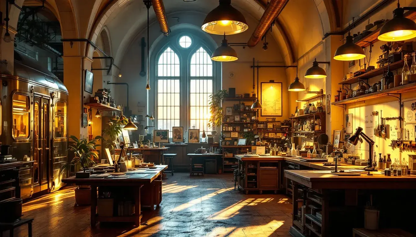
The Modern Science 🧪 palette whispers of hushed labs and focused observation. Dusty Rose lends a touch of whimsy, calling to mind the human touch even in the midst of scientific rigor. Mint Green and Olive Drab create a natural connection, suggesting a world where nature and technology intertwine harmoniously. Steel Blue brings a sense of precision and clarity of thought. Dark Coal represents a finality to each scientific examination. Imagine a laboratory where experiments are carefully conducted, where hypothesis meets evidence. A palette celebrating thoughtful investigation, where curiosity and precision dance together. It’s restrained but hopeful, suggesting a world where innovation is driven by both intellect and intuition, where the beauty lies in understanding rather than mere discovery. The presence of these subdued colors reminds us that even the most advanced research is rooted in something real and approachable. This is a palette about the pursuit of truth.
Across these diverse palettes, we see Golden Yellow not as a singular statement, but as a versatile accent. In the SNCF Palette, it signifies clear direction and optimism. In Earthy Brightness, it is part of an artistic flow. But in all instances, it acts as a gentle encouragement, a reminder of warmth and light even amidst the cooler, more subdued tones. Its momentum grows not through insistent dominance, but through its ability to lift and enrich. It is a quiet revolution, a subtle shift in perspective, proving that true brilliance lies not in being the loudest voice, but in the most poignant resonance.