'%3e%3cpath%20fill-rule='evenodd'%20clip-rule='evenodd'%20d='M51.1303%2019.2492C50.7278%2019.913%2050.1346%2020.4426%2049.3508%2020.838C48.5669%2021.2335%2047.6172%2021.4312%2046.5014%2021.4312C44.8208%2021.4312%2043.4367%2021.0216%2042.3492%2020.2025C41.2617%2019.3833%2040.6686%2018.2394%2040.5697%2016.7706H44.4253C44.4818%2017.3355%2044.6831%2017.7804%2045.0291%2018.1052C45.3751%2018.43%2045.8164%2018.5924%2046.3531%2018.5924C46.8192%2018.5924%2047.1864%2018.4653%2047.4547%2018.2111C47.7231%2017.9569%2047.8572%2017.618%2047.8572%2017.1943C47.8572%2016.8129%2047.7337%2016.4952%2047.4865%2016.241C47.2393%2015.9867%2046.9322%2015.7784%2046.565%2015.616C46.1978%2015.4536%2045.6893%2015.2594%2045.0397%2015.0334C44.0934%2014.7086%2043.3202%2014.3944%2042.72%2014.0907C42.1197%2013.7871%2041.6042%2013.3351%2041.1735%2012.7349C40.7427%2012.1347%2040.5273%2011.3544%2040.5273%2010.394C40.5273%209.50418%2040.7533%208.73448%2041.2053%208.08481C41.6572%207.43515%2042.2821%206.93731%2043.0801%206.5913C43.8781%206.24528%2044.7925%206.07227%2045.8235%206.07227C47.49%206.07227%2048.8141%206.46771%2049.7956%207.25861C50.7772%208.04951%2051.3315%209.13698%2051.4586%2010.5211H47.5395C47.4689%2010.0268%2047.2888%209.63483%2046.9993%209.3453C46.7097%209.05578%2046.3178%208.91102%2045.8235%208.91102C45.3998%208.91102%2045.0573%209.024%2044.7961%209.24997C44.5348%209.47594%2044.4041%209.80783%2044.4041%2010.2457C44.4041%2010.5988%2044.5207%2010.8989%2044.7537%2011.146C44.9867%2011.3932%2045.2798%2011.5944%2045.6328%2011.7498C45.9859%2011.9052%2046.4944%2012.1029%2047.1581%2012.343C48.1185%2012.6678%2048.9023%2012.9891%2049.5096%2013.3069C50.1169%2013.6246%2050.6395%2014.0872%2051.0773%2014.6945C51.5151%2015.3018%2051.734%2016.0927%2051.734%2017.0672C51.734%2017.8581%2051.5328%2018.5854%2051.1303%2019.2492ZM59.0242%206.3053V21.2829H55.4016V6.3053H59.0242ZM73.9409%206.3053V9.18642H69.8734V21.2829H66.2296V9.18642H62.2046V6.3053H73.9409ZM80.7438%209.18642V12.3218H85.8069V15.0546H80.7438V18.3806H86.4425V21.2829H77.1212V6.3053H86.4425V9.18642H80.7438ZM99.667%2016.0291V21.2829H96.0444V6.3053H101.913C103.692%206.3053%20105.048%206.74665%20105.98%207.62934C106.912%208.51204%20107.378%209.7019%20107.378%2011.199C107.378%2012.1311%20107.17%2012.9609%20106.753%2013.6882C106.337%2014.4155%20105.719%2014.9875%20104.9%2015.4042C104.08%2015.8208%20103.085%2016.0291%20101.913%2016.0291H99.667ZM103.692%2011.199C103.692%209.8855%20102.965%209.22879%20101.51%209.22879H99.667V13.1268H101.51C102.965%2013.1268%20103.692%2012.4842%20103.692%2011.199ZM120.092%2018.5501H114.478L113.546%2021.2829H109.732L115.219%206.41123H119.393L124.879%2021.2829H121.024L120.092%2018.5501ZM119.16%2015.7961L117.295%2010.2881L115.41%2015.7961H119.16ZM131.555%2018.5077H136.385V21.2829H127.933V6.3053H131.555V18.5077ZM143.337%209.18642V12.3218H148.4V15.0546H143.337V18.3806H149.035V21.2829H139.714V6.3053H149.035V9.18642H143.337ZM163.507%206.3053V9.18642H159.44V21.2829H155.796V9.18642H151.771V6.3053H163.507ZM177.449%206.3053V9.18642H173.382V21.2829H169.738V9.18642H165.713V6.3053H177.449ZM184.252%209.18642V12.3218H189.315V15.0546H184.252V18.3806H189.951V21.2829H180.629V6.3053H189.951V9.18642H184.252Z'%20fill='%23EEF0ED'/%3e%3cmask%20id='mask0_3101_7327'%20style='mask-type:alpha'%20maskUnits='userSpaceOnUse'%20x='0'%20y='0'%20width='27'%20height='28'%3e%3cpath%20d='M23.8328%200.759766H2.64808C1.18559%200.759766%200%201.94535%200%203.40785V24.5925C0%2026.055%201.18559%2027.2406%202.64808%2027.2406H23.8328C25.2952%2027.2406%2026.4808%2026.055%2026.4808%2024.5925V3.40785C26.4808%201.94535%2025.2952%200.759766%2023.8328%200.759766Z'%20fill='white'/%3e%3c/mask%3e%3cg%20mask='url(%23mask0_3101_7327)'%3e%3cpath%20d='M23.8328%200.759766H2.64808C1.18559%200.759766%200%201.94535%200%203.40785V24.5925C0%2026.055%201.18559%2027.2406%202.64808%2027.2406H23.8328C25.2952%2027.2406%2026.4808%2026.055%2026.4808%2024.5925V3.40785C26.4808%201.94535%2025.2952%200.759766%2023.8328%200.759766Z'%20fill='%23D8D8D8'/%3e%3cpath%20d='M13.2404%200.759766H0V14.0001H13.2404V0.759766Z'%20fill='%238C61FF'/%3e%3cpath%20d='M13.2404%2014H0V27.2404H13.2404V14Z'%20fill='%2336C3FE'/%3e%3cpath%20d='M26.4806%2014H13.2402V27.2404H26.4806V14Z'%20fill='%236592FE'/%3e%3cpath%20d='M26.4806%200.759766H13.2402V14.0002H26.4806V0.759766Z'%20fill='%236059F7'/%3e%3c/g%3e%3c/g%3e%3cdefs%3e%3cclipPath%20id='clip0_3101_7327'%3e%3crect%20width='190'%20height='28'%20fill='white'/%3e%3c/clipPath%3e%3c/defs%3e%3c/svg%3e)
'%3e%3cpath%20d='M23.8328%200.759521H2.64808C1.18559%200.759521%200%201.94511%200%203.40761V24.5923C0%2026.0548%201.18559%2027.2404%202.64808%2027.2404H23.8328C25.2952%2027.2404%2026.4808%2026.0548%2026.4808%2024.5923V3.40761C26.4808%201.94511%2025.2952%200.759521%2023.8328%200.759521Z'%20fill='%23D8D8D8'/%3e%3cpath%20d='M13.2404%200.759521H0V13.9999H13.2404V0.759521Z'%20fill='%238C61FF'/%3e%3cpath%20d='M13.2404%2013.9998H0V27.2402H13.2404V13.9998Z'%20fill='%2336C3FE'/%3e%3cpath%20d='M26.4809%2013.9998H13.2405V27.2402H26.4809V13.9998Z'%20fill='%236592FE'/%3e%3cpath%20d='M26.4809%200.759277H13.2405V13.9997H26.4809V0.759277Z'%20fill='%236059F7'/%3e%3c/g%3e%3c/svg%3e)
Dominant Style Evolution: From Natural to Modern in a Year
25 Sep 2025 · 5 min readFrom the quiet rustle of earth tones to the bold declaration of electric hues, color wields a power to define our environments, our experiences, and even our aspirations. As visual language, it speaks without words, shaping our perception of style. This year, the shift from grounding natural aesthetics towards forward-leaning modern sensibilities has been particularly striking. Not just a trend, but a reflection of a changing world, these color stories echo our collective desire for progress, energy, and a reimagined future, moving from organic comfort to streamlined innovation. Each palette acts as a time capsule, capturing not only a specific feeling, but a potential pathway forward. What was once familiar fades, opening space for the exciting, unconventional, and yet-to-be-defined. The allure of crisp edges and unexpected pairings signals a departure with exciting possibilities.
The "Fresh Contrast" 🌿 palette feels like a jolt of morning air. In its essence, imagine a minimalist gallery bathed in the pearly light of a late spring day. Where bare concrete floors meet art installations pulsing with understated life. There's a sense of clean ambition, a quiet buzz in the air. The Chartreuse Green acts a playful rebel, daring among more restrained companions, bringing the energy of a budding garden into a structured space. Brick Red is a subtle anchor, that hints at warmth and individuality, pushing back against cold austerity. Pale White provides the canvas. The palette speaks of a contemporary living space where functionality and personality coalesce. Think of tech startups in converted warehouses and open-plan co-working spaces buzzing with creativity and muted chaos. It whispers of clean web layouts splashed with quirky illustrations, while it creates a space for the free mind to roam. This feels like possibility and growth, the kind of excitement that arrives with spring. It's a visual representation of shedding winter's cloak and stepping into a brighter, bolder future, reflecting the evolution from a reliance on the comfortable and familiar to embracing a refreshing and invigorated outlook.
"Corporate Harmony" 🏢 introduces a sophisticated blend of ambition and composure. Imagine a polished, wood-paneled boardroom where deals are sealed and ideas take flight. Here, Deep Indigo commands respect, balanced by the unassuming confidence of Pure White. Golden Yellow brings a touch of warmth, a hint of optimism to serious discussions. It feels like the dawn of a new project, where potential seems limitless, and every element is precisely calibrated. Soft Gray-Green provides a grounding effect, mirroring the calmness needed to bring ideas to life. Bright Green is a spark, symbolic of growth and innovation. Magenta-Rose is a reminder that even in the world of boardrooms, the human touch cannot be forgotten. Picture it in the visual identity of a cutting-edge finance firm, or woven into the sleek interfaces of a technology company. This palette evokes a sense of trustworthiness and forward momentum. Moving away from warmer, earthier corporate identities, embraces a future where clarity, collaboration, and creativity converge, demonstrating a contemporary shift in how businesses want to be perceived.
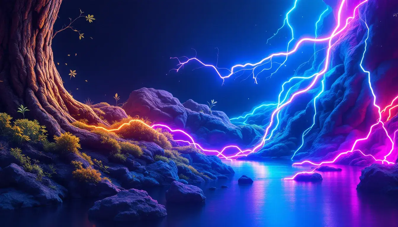
With "Stellar Database" ✨, we encounter a vibrant intersection of technology, imagination, and play. Envision neon lights reflecting on the polished surface of a gaming console, creating a visual landscape that's both inviting and exciting. Crimson Red injects urgency, while Bright Cyan embodies the slick, instantaneous nature of the digital realm. Imagine the color splashed across a website for a forward-thinking app, or embedded within the user interface of an immersive video game. Orchid Purple introduces a dreamlike quality, and balances the energy with creativity. Muted Gray serves as a grounding force, and Dark Brown delivers a touch of naturalness, hinting at the human element. While this palette might be loud, it’s a controlled vibrancy that inspires action, pulling users into its world with a captivating blend of color and form. Imagine a community fueled by technological advances and future potential, and you see Steller Database. Here, the natural is replaced by the possibilities of a man-made world, reflecting a decisive shift into digital environments.
"Ethereal Purple" 🔮 creates a sense of peace. It whispers of lavender fields in the twilight, with a cool breeze sweeping through them. Royal Purple becomes the central theme, inviting us to find moments of reflection within a busy world. Light Lavender and Soft Lilac are additions that invite the user to unwind and recharge. This is an invitation to step away from sensory overload. Imagine this palette in the design of a meditation app or a wellness website, offering a visual experience as harmonious as a calming breath. Dark Plum is a grounding note, a suggestion that even in moments of tranquility, there’s depth and resilience. Deep Night is a reminder of the rest that comes when we embrace quiet. This color story speaks of sanctuary and peace, a necessary respite from the relentless pace of modern life. Yet, within its serene nature lies a modern sensibility, a desire to find balance through technology, reflecting a growing awareness of the need to merge technology with well-being.
From the energizing contrast to the corporate poise, each palette reflects a facet of our evolving preferences and the visual stories we choose to tell. These colors demonstrate our collective movement toward styles that are sleek, intuitive, and ready for the future. "Fresh Contrast" awakens the senses. "Corporate Harmony" builds trust and confidence. "Stellar Database" drives participation. "Ethereal Purple" encourages mindfulness. Together, these shifting palettes display our cultural landscape and a yearning to blend innovation with aspiration for a forward-thinking culture. They signal a world that embraces the clean vibrancy of the new, never fully abandoning the textures of the old, but reshaping them into something undeniably modern.