'%3e%3cpath%20fill-rule='evenodd'%20clip-rule='evenodd'%20d='M51.1303%2019.2492C50.7278%2019.913%2050.1346%2020.4426%2049.3508%2020.838C48.5669%2021.2335%2047.6172%2021.4312%2046.5014%2021.4312C44.8208%2021.4312%2043.4367%2021.0216%2042.3492%2020.2025C41.2617%2019.3833%2040.6686%2018.2394%2040.5697%2016.7706H44.4253C44.4818%2017.3355%2044.6831%2017.7804%2045.0291%2018.1052C45.3751%2018.43%2045.8164%2018.5924%2046.3531%2018.5924C46.8192%2018.5924%2047.1864%2018.4653%2047.4547%2018.2111C47.7231%2017.9569%2047.8572%2017.618%2047.8572%2017.1943C47.8572%2016.8129%2047.7337%2016.4952%2047.4865%2016.241C47.2393%2015.9867%2046.9322%2015.7784%2046.565%2015.616C46.1978%2015.4536%2045.6893%2015.2594%2045.0397%2015.0334C44.0934%2014.7086%2043.3202%2014.3944%2042.72%2014.0907C42.1197%2013.7871%2041.6042%2013.3351%2041.1735%2012.7349C40.7427%2012.1347%2040.5273%2011.3544%2040.5273%2010.394C40.5273%209.50418%2040.7533%208.73448%2041.2053%208.08481C41.6572%207.43515%2042.2821%206.93731%2043.0801%206.5913C43.8781%206.24528%2044.7925%206.07227%2045.8235%206.07227C47.49%206.07227%2048.8141%206.46771%2049.7956%207.25861C50.7772%208.04951%2051.3315%209.13698%2051.4586%2010.5211H47.5395C47.4689%2010.0268%2047.2888%209.63483%2046.9993%209.3453C46.7097%209.05578%2046.3178%208.91102%2045.8235%208.91102C45.3998%208.91102%2045.0573%209.024%2044.7961%209.24997C44.5348%209.47594%2044.4041%209.80783%2044.4041%2010.2457C44.4041%2010.5988%2044.5207%2010.8989%2044.7537%2011.146C44.9867%2011.3932%2045.2798%2011.5944%2045.6328%2011.7498C45.9859%2011.9052%2046.4944%2012.1029%2047.1581%2012.343C48.1185%2012.6678%2048.9023%2012.9891%2049.5096%2013.3069C50.1169%2013.6246%2050.6395%2014.0872%2051.0773%2014.6945C51.5151%2015.3018%2051.734%2016.0927%2051.734%2017.0672C51.734%2017.8581%2051.5328%2018.5854%2051.1303%2019.2492ZM59.0242%206.3053V21.2829H55.4016V6.3053H59.0242ZM73.9409%206.3053V9.18642H69.8734V21.2829H66.2296V9.18642H62.2046V6.3053H73.9409ZM80.7438%209.18642V12.3218H85.8069V15.0546H80.7438V18.3806H86.4425V21.2829H77.1212V6.3053H86.4425V9.18642H80.7438ZM99.667%2016.0291V21.2829H96.0444V6.3053H101.913C103.692%206.3053%20105.048%206.74665%20105.98%207.62934C106.912%208.51204%20107.378%209.7019%20107.378%2011.199C107.378%2012.1311%20107.17%2012.9609%20106.753%2013.6882C106.337%2014.4155%20105.719%2014.9875%20104.9%2015.4042C104.08%2015.8208%20103.085%2016.0291%20101.913%2016.0291H99.667ZM103.692%2011.199C103.692%209.8855%20102.965%209.22879%20101.51%209.22879H99.667V13.1268H101.51C102.965%2013.1268%20103.692%2012.4842%20103.692%2011.199ZM120.092%2018.5501H114.478L113.546%2021.2829H109.732L115.219%206.41123H119.393L124.879%2021.2829H121.024L120.092%2018.5501ZM119.16%2015.7961L117.295%2010.2881L115.41%2015.7961H119.16ZM131.555%2018.5077H136.385V21.2829H127.933V6.3053H131.555V18.5077ZM143.337%209.18642V12.3218H148.4V15.0546H143.337V18.3806H149.035V21.2829H139.714V6.3053H149.035V9.18642H143.337ZM163.507%206.3053V9.18642H159.44V21.2829H155.796V9.18642H151.771V6.3053H163.507ZM177.449%206.3053V9.18642H173.382V21.2829H169.738V9.18642H165.713V6.3053H177.449ZM184.252%209.18642V12.3218H189.315V15.0546H184.252V18.3806H189.951V21.2829H180.629V6.3053H189.951V9.18642H184.252Z'%20fill='%23EEF0ED'/%3e%3cmask%20id='mask0_3101_7327'%20style='mask-type:alpha'%20maskUnits='userSpaceOnUse'%20x='0'%20y='0'%20width='27'%20height='28'%3e%3cpath%20d='M23.8328%200.759766H2.64808C1.18559%200.759766%200%201.94535%200%203.40785V24.5925C0%2026.055%201.18559%2027.2406%202.64808%2027.2406H23.8328C25.2952%2027.2406%2026.4808%2026.055%2026.4808%2024.5925V3.40785C26.4808%201.94535%2025.2952%200.759766%2023.8328%200.759766Z'%20fill='white'/%3e%3c/mask%3e%3cg%20mask='url(%23mask0_3101_7327)'%3e%3cpath%20d='M23.8328%200.759766H2.64808C1.18559%200.759766%200%201.94535%200%203.40785V24.5925C0%2026.055%201.18559%2027.2406%202.64808%2027.2406H23.8328C25.2952%2027.2406%2026.4808%2026.055%2026.4808%2024.5925V3.40785C26.4808%201.94535%2025.2952%200.759766%2023.8328%200.759766Z'%20fill='%23D8D8D8'/%3e%3cpath%20d='M13.2404%200.759766H0V14.0001H13.2404V0.759766Z'%20fill='%238C61FF'/%3e%3cpath%20d='M13.2404%2014H0V27.2404H13.2404V14Z'%20fill='%2336C3FE'/%3e%3cpath%20d='M26.4806%2014H13.2402V27.2404H26.4806V14Z'%20fill='%236592FE'/%3e%3cpath%20d='M26.4806%200.759766H13.2402V14.0002H26.4806V0.759766Z'%20fill='%236059F7'/%3e%3c/g%3e%3c/g%3e%3cdefs%3e%3cclipPath%20id='clip0_3101_7327'%3e%3crect%20width='190'%20height='28'%20fill='white'/%3e%3c/clipPath%3e%3c/defs%3e%3c/svg%3e)
'%3e%3cpath%20d='M23.8328%200.759521H2.64808C1.18559%200.759521%200%201.94511%200%203.40761V24.5923C0%2026.0548%201.18559%2027.2404%202.64808%2027.2404H23.8328C25.2952%2027.2404%2026.4808%2026.0548%2026.4808%2024.5923V3.40761C26.4808%201.94511%2025.2952%200.759521%2023.8328%200.759521Z'%20fill='%23D8D8D8'/%3e%3cpath%20d='M13.2404%200.759521H0V13.9999H13.2404V0.759521Z'%20fill='%238C61FF'/%3e%3cpath%20d='M13.2404%2013.9998H0V27.2402H13.2404V13.9998Z'%20fill='%2336C3FE'/%3e%3cpath%20d='M26.4809%2013.9998H13.2405V27.2402H26.4809V13.9998Z'%20fill='%236592FE'/%3e%3cpath%20d='M26.4809%200.759277H13.2405V13.9997H26.4809V0.759277Z'%20fill='%236059F7'/%3e%3c/g%3e%3c/svg%3e)
Websites and Winter: The Palette Connection
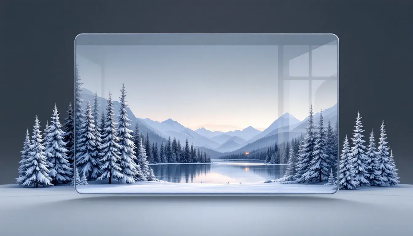
24 Sep 2025 · 3 min readAs winter's crisp air sweeps in, and the light takes on a sharper, more ethereal quality, the world shifts. Where summer roars with vibrancy, winter whispers of quiet strength, of depth discovered in muted tones. Web design, often a mirror reflecting the wider world, must acknowledge this shift. Websites shouldn't ignore the season, but instead, embrace palettes that conjure the stillness of frosted landscapes, the warmth of a crackling fire, or the cool elegance of ice crystals. These color selections aren't fleeting trends. They are considered decisions that enhance user experience, create a compelling mood, and build lasting connections. Choosing a fitting palette transforms a simple webpage into an immersive experience that resonates with the season's unique character.
Modern Contrast captures the spirit of a season where nature favors muted scenes, yet bold statements still punctuate the quiet. Think of a cityscape in the depths of January: the soft, gray sky looms over dark buildings that stand as if etched against their pale backdrop. Light Lavender provides a gentle foundation that hints at snow-dusted fields. Periwinkle Grey offers depth, like shadows lengthening across glacial plains. Taupe Brown stands as a reminder of the earth beneath the ice, a grounded sensibility that connects us to something elemental. Dusty Burgundy adds a touch of refined drama, as deep and warm as mulled wine. Finally, Dark Slate brings a sense of steadfastness to the composition, something unyielding against the winter months. Consider this palette for brands that want to project an aura of both strength and sophistication. Visualize a financial tech company whose website subtly embraces the season, instilling trust with its muted elegance. The overall effect is one of poised confidence, a reminder that stillness need not equate to inactivity and that beauty exists even in bare branches. A user encountering this style of site in the middle of winter is likely to feel comforted, a sense of understated reliability that separates it from the louder colors of summer.
Modern Splash presents winter through the lens of an icy expanse, a symphony of blues and grays that echoes the season's distinctive crispness. The experience evokes standing at the edge of a frozen lake, where the air is so clear it seems to cut like glass. Light Gray serves as the pristine background, reminiscent of freshly fallen snow that blankets the ground in serene quiet. Pale Blue replicates the diffused light that filters through overcast skies, casting a tranquil spell. Steel Blue hints at the deeper tones of arctic waters, unseen depths that hold secrets beneath their frozen surface. Deep Turquoise adds just a hint of something vibrant, like the shimmer of an iceberg reflecting sunlight in unexpected colors. Finally, Dark Charcoal lends solid weight, a grounding element that anchors the entire composition. Envision a design agency’s website taking gentle cues from this palette, aiming toward a user experience that is both sophisticated and reassuring. This combination of tones conjures a feeling of quiet power, lending an air of trustworthiness and calm that resonates deeply with the season's inherent essence. Users are invited to embark on a calming digital excursion, in harmony with the winter's inherent stillness.
Modern Tech interprets winter with a nod towards innovation and a hint of understated warmth. It envisions a cozy, futuristic cabin nestled within a snowy landscape. Light Gold evokes the soft glow of a fireplace against a snowy evening, a symbol of welcoming comfort. Vivid Blue captures the crystalline clarity of a cloudless winter sky, crisp and invigorating. Olive Drab speaks to nature's resilience, capturing the muted tones of evergreen trees steadfastly enduring the cold. Brownish Grey adds an earthy element, anchoring the composition to a tangible sense of comfort. Dark Navy creates depth, reminiscent of the long winter nights that encourage introspection and innovation. Imagine a technology startup utilizing this palette; their website would convey both trustworthiness and forward-thinking progress, projecting a refined but not sterile image. The user's encounter becomes a welcoming breath of fresh air, an invitation to discover something cutting edge but fundamentally grounded. All together, this creates user encounters that feel both dependable and surprisingly sophisticated, mirroring how innovations are often born from the simplicity of winter’s quietude.
Gotham FC offers a vision of winter that is bold, energetic, and unapologetically urban. It's the feeling of watching snow fall over a cityscape, turning the mundane into a scene of striking beauty. Light Steel Blue acts as a backdrop reminiscent of winter's sky before snowfall, soft and expansive. Slate Gray builds a sense of steadfastness, embodying the architectural permanence of city structures against fleeting weather changes. Maroon Red brings a touch of unexpected warmth, like the glow of shop windows inviting you in from the cold. Deep Indigo adds depth; it is night falling over a snowy park as lights glimmer. Finally, Dark Charcoal is the firm grounding – the asphalt beneath the snow, a solid foundation. Envision a sports team utilizing this palette; it evokes boldness, grit, but also the delicate contrast of a city transformed by winter’s touch. This offers a user engagement that captures the powerful sense of belonging, reminding users that the team, like the city, is resilient, dynamic, but also warmed by unexpected beauty. The impact is one of confident vitality, encouraging connection through a balanced blend of power and elegance.
The palettes considered are more than just sets of colors. They are reflections of the complex feelings and experiences of winter, translated into visual language. Modern Contrast encapsulates a sophisticated, grounded elegance; Modern Splash, a quiet, crystalline calmness; Modern Tech, a blend of sophistication and a warming sense of future progress; and Gotham FC, offers powerful contrast, melding urban vitality with the soft touch of winter. When carefully incorporated into website design, these palettes go beyond mere aesthetics. They craft user encounters that ring true with a quiet, crisp cadence, conveying reliability, innovation, and belonging that speak to the depths of user sentiment.