'%3e%3cpath%20fill-rule='evenodd'%20clip-rule='evenodd'%20d='M51.1303%2019.2492C50.7278%2019.913%2050.1346%2020.4426%2049.3508%2020.838C48.5669%2021.2335%2047.6172%2021.4312%2046.5014%2021.4312C44.8208%2021.4312%2043.4367%2021.0216%2042.3492%2020.2025C41.2617%2019.3833%2040.6686%2018.2394%2040.5697%2016.7706H44.4253C44.4818%2017.3355%2044.6831%2017.7804%2045.0291%2018.1052C45.3751%2018.43%2045.8164%2018.5924%2046.3531%2018.5924C46.8192%2018.5924%2047.1864%2018.4653%2047.4547%2018.2111C47.7231%2017.9569%2047.8572%2017.618%2047.8572%2017.1943C47.8572%2016.8129%2047.7337%2016.4952%2047.4865%2016.241C47.2393%2015.9867%2046.9322%2015.7784%2046.565%2015.616C46.1978%2015.4536%2045.6893%2015.2594%2045.0397%2015.0334C44.0934%2014.7086%2043.3202%2014.3944%2042.72%2014.0907C42.1197%2013.7871%2041.6042%2013.3351%2041.1735%2012.7349C40.7427%2012.1347%2040.5273%2011.3544%2040.5273%2010.394C40.5273%209.50418%2040.7533%208.73448%2041.2053%208.08481C41.6572%207.43515%2042.2821%206.93731%2043.0801%206.5913C43.8781%206.24528%2044.7925%206.07227%2045.8235%206.07227C47.49%206.07227%2048.8141%206.46771%2049.7956%207.25861C50.7772%208.04951%2051.3315%209.13698%2051.4586%2010.5211H47.5395C47.4689%2010.0268%2047.2888%209.63483%2046.9993%209.3453C46.7097%209.05578%2046.3178%208.91102%2045.8235%208.91102C45.3998%208.91102%2045.0573%209.024%2044.7961%209.24997C44.5348%209.47594%2044.4041%209.80783%2044.4041%2010.2457C44.4041%2010.5988%2044.5207%2010.8989%2044.7537%2011.146C44.9867%2011.3932%2045.2798%2011.5944%2045.6328%2011.7498C45.9859%2011.9052%2046.4944%2012.1029%2047.1581%2012.343C48.1185%2012.6678%2048.9023%2012.9891%2049.5096%2013.3069C50.1169%2013.6246%2050.6395%2014.0872%2051.0773%2014.6945C51.5151%2015.3018%2051.734%2016.0927%2051.734%2017.0672C51.734%2017.8581%2051.5328%2018.5854%2051.1303%2019.2492ZM59.0242%206.3053V21.2829H55.4016V6.3053H59.0242ZM73.9409%206.3053V9.18642H69.8734V21.2829H66.2296V9.18642H62.2046V6.3053H73.9409ZM80.7438%209.18642V12.3218H85.8069V15.0546H80.7438V18.3806H86.4425V21.2829H77.1212V6.3053H86.4425V9.18642H80.7438ZM99.667%2016.0291V21.2829H96.0444V6.3053H101.913C103.692%206.3053%20105.048%206.74665%20105.98%207.62934C106.912%208.51204%20107.378%209.7019%20107.378%2011.199C107.378%2012.1311%20107.17%2012.9609%20106.753%2013.6882C106.337%2014.4155%20105.719%2014.9875%20104.9%2015.4042C104.08%2015.8208%20103.085%2016.0291%20101.913%2016.0291H99.667ZM103.692%2011.199C103.692%209.8855%20102.965%209.22879%20101.51%209.22879H99.667V13.1268H101.51C102.965%2013.1268%20103.692%2012.4842%20103.692%2011.199ZM120.092%2018.5501H114.478L113.546%2021.2829H109.732L115.219%206.41123H119.393L124.879%2021.2829H121.024L120.092%2018.5501ZM119.16%2015.7961L117.295%2010.2881L115.41%2015.7961H119.16ZM131.555%2018.5077H136.385V21.2829H127.933V6.3053H131.555V18.5077ZM143.337%209.18642V12.3218H148.4V15.0546H143.337V18.3806H149.035V21.2829H139.714V6.3053H149.035V9.18642H143.337ZM163.507%206.3053V9.18642H159.44V21.2829H155.796V9.18642H151.771V6.3053H163.507ZM177.449%206.3053V9.18642H173.382V21.2829H169.738V9.18642H165.713V6.3053H177.449ZM184.252%209.18642V12.3218H189.315V15.0546H184.252V18.3806H189.951V21.2829H180.629V6.3053H189.951V9.18642H184.252Z'%20fill='%23EEF0ED'/%3e%3cmask%20id='mask0_3101_7327'%20style='mask-type:alpha'%20maskUnits='userSpaceOnUse'%20x='0'%20y='0'%20width='27'%20height='28'%3e%3cpath%20d='M23.8328%200.759766H2.64808C1.18559%200.759766%200%201.94535%200%203.40785V24.5925C0%2026.055%201.18559%2027.2406%202.64808%2027.2406H23.8328C25.2952%2027.2406%2026.4808%2026.055%2026.4808%2024.5925V3.40785C26.4808%201.94535%2025.2952%200.759766%2023.8328%200.759766Z'%20fill='white'/%3e%3c/mask%3e%3cg%20mask='url(%23mask0_3101_7327)'%3e%3cpath%20d='M23.8328%200.759766H2.64808C1.18559%200.759766%200%201.94535%200%203.40785V24.5925C0%2026.055%201.18559%2027.2406%202.64808%2027.2406H23.8328C25.2952%2027.2406%2026.4808%2026.055%2026.4808%2024.5925V3.40785C26.4808%201.94535%2025.2952%200.759766%2023.8328%200.759766Z'%20fill='%23D8D8D8'/%3e%3cpath%20d='M13.2404%200.759766H0V14.0001H13.2404V0.759766Z'%20fill='%238C61FF'/%3e%3cpath%20d='M13.2404%2014H0V27.2404H13.2404V14Z'%20fill='%2336C3FE'/%3e%3cpath%20d='M26.4806%2014H13.2402V27.2404H26.4806V14Z'%20fill='%236592FE'/%3e%3cpath%20d='M26.4806%200.759766H13.2402V14.0002H26.4806V0.759766Z'%20fill='%236059F7'/%3e%3c/g%3e%3c/g%3e%3cdefs%3e%3cclipPath%20id='clip0_3101_7327'%3e%3crect%20width='190'%20height='28'%20fill='white'/%3e%3c/clipPath%3e%3c/defs%3e%3c/svg%3e)
'%3e%3cpath%20d='M23.8328%200.759521H2.64808C1.18559%200.759521%200%201.94511%200%203.40761V24.5923C0%2026.0548%201.18559%2027.2404%202.64808%2027.2404H23.8328C25.2952%2027.2404%2026.4808%2026.0548%2026.4808%2024.5923V3.40761C26.4808%201.94511%2025.2952%200.759521%2023.8328%200.759521Z'%20fill='%23D8D8D8'/%3e%3cpath%20d='M13.2404%200.759521H0V13.9999H13.2404V0.759521Z'%20fill='%238C61FF'/%3e%3cpath%20d='M13.2404%2013.9998H0V27.2402H13.2404V13.9998Z'%20fill='%2336C3FE'/%3e%3cpath%20d='M26.4809%2013.9998H13.2405V27.2402H26.4809V13.9998Z'%20fill='%236592FE'/%3e%3cpath%20d='M26.4809%200.759277H13.2405V13.9997H26.4809V0.759277Z'%20fill='%236059F7'/%3e%3c/g%3e%3c/svg%3e)
The Reign of Classics: Dominant Color Scheme for September Branding Campaigns
24 Sep 2025 · 5 min readColor holds court, particularly as summer relinquishes its grasp and autumn's dominion begins. September, a month of transitions, whispers a tale of returning comfort and renewed focus. In the branding world, this translates into a craving for palettes that soothe yet stimulate, beckoning consumers towards familiar ground. The classic endures, not as a stagnant relic, but as a foundation upon which sophistication and contemporary flair find secure footing. Think of tweed jackets warmed by the afternoon sun, the scent of old books mingling with brewed coffee, and the quiet confidence of a perfectly chosen font. These are not mere colors; they are echoes of shared experiences, promises of reliability, and visual cues that steer us toward what feels trustworthy and true. The skillful application of classic palettes becomes a powerful tool, forging connections with audiences seeking solace and stability in a world of ceaseless change. It's about creating spaces, both physical and digital, that feel like a cherished homecoming.
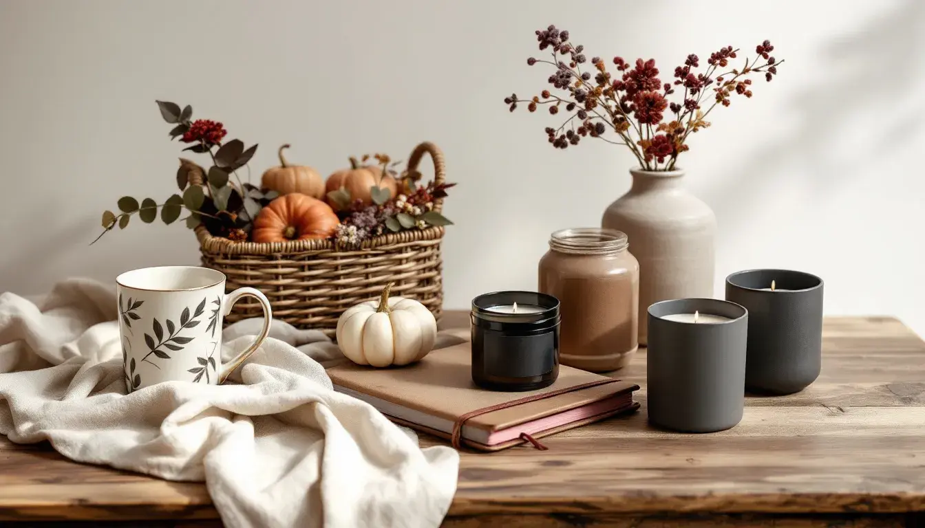
🍂 The "Earthy Contrast" palette weaves a narrative of organic elegance. Pure White anchors the composition, offering a canvas of clarity for the richer tones to expand. Pale Peach emits a warm, familiar glow, reminiscent of late afternoon light filtering through sheer curtains. Dusty Lavender introduces a touch of grounded introspection, like cool stone walls within a sun-drenched courtyard. Olive Drab grounds the palette with a sense of quiet strength, evoking fertile earth and autumnal harvests. Crimson Red adds a subtle vibrancy, similar to the flushed cheeks of someone returning from a brisk walk. Charcoal Gray and Deep Black instill a sense of groundedness and permanence. This palette suggests a return to craftsmanship, a slowing of pace, and an emphasis on lasting quality. It’s the scent of beeswax polish on antique wood, the feeling of thick wool against skin, and the satisfying weight of a well-bound book. Imagine a wellness brand utilizing this scheme, not to shout about vitality, but to whisper about enduring well-being. It’s understated luxury, a visual language aimed at an audience who seeks genuine connection and quiet confidence. This palette aligns seamlessly with September branding campaigns targeting those seeking a sense of groundedness. It embodies a quiet sophistication, moving beyond fleeting trends toward timeless appeal. It suggests a sanctuary, a place to rest and rejuvenate, which is a powerful message as the days grow shorter. This muted symphony of hues is not about grabbing attention; it's about cultivating a lasting impression, forging a bond based on shared values and a mutual appreciation for quiet beauty.
🏈 The "Gridiron Palette" presents a story of tradition infused with understated power. Golden Khaki imparts a sense of heritage, reminiscent of leather-bound volumes and time-honored rituals. Grayish Beige offers a grounded neutrality, like the hushed reverence of stadium hallways before a pivotal game. Brick Red introduces a note of assertive warmth, akin to the burnished glow of polished trophies. Dark Teal offers a grounding counterpoint, suggesting steadfast determination and unwavering focus, like the calm eye of a seasoned athlete. Blackish Brown grounds the composition with undeniable authority, evoking the solid foundation upon which success is built. This balanced combination creates a feeling of assured excellence, suggesting both timelessness and ambition. Picture a heritage brand adopting this scheme, not to flaunt prestige, but to communicate enduring reliability. Imagine the gleam of brass fixtures against dark wood paneling, the whisper of fine paper beneath a fountain pen, and the reassuring weight of a tailored suit. This approach suggests a careful appreciation for detail, a commitment to lasting value, and a genuine understanding of customer expectations. As we transition into autumn, the "Gridiron Palette" resonates perfectly with September branding campaigns, where the focus shifts to trusted products and services. It's not about chasing fleeting trends; it's about projecting an aura of established credibility. This palette embodies quiet confidence, fostering a sense of trust, and suggesting a solid performance.
🌊 The "Ocean Breeze" palette proposes a narrative of refreshing tranquility. Off White provides a serene backdrop, akin to the soft glow of morning mist lingering over calm waters. Vibrant Teal evokes a sense of invigorating energy, recalling crystal-clear depths teeming with life. Bright Cyan brings a refreshing burst of energy, similar to sunlight dancing on the surface of waves. Dark Taupe introduces a grounding element, reminiscent of weathered driftwood and smooth pebbles. Charcoal Blue adds gravity to the composition, suggesting the deep mysteries of the sea. This combination creates a sensation of calm strength, promoting both revitalization and peace. Think of a wellness retreat embracing this scheme, not to preach about relaxation, but to suggest an atmosphere of quiet reconnection. Imagine the soft sound of waves lapping against the shore, the cool touch of sea breeze against skin, and the comforting scent of salt-tinged air. This approach underscores a deep respect for natural beauty, a commitment to fostering well-being, and a genuine understanding of consumer needs. As September unfolds, the "Ocean Breeze" palette adapts harmoniously, providing a refreshing contrast. It's all about embracing the shift towards simpler comfort. Moving beyond the exuberance of summer, this scheme offers an opportunity to connect with an audience seeking restorative experiences. This palette embodies natural grace, promoting a sense of mindful presence.
🏛️ The "Elegant Academia" palette evokes a history of knowledge framed with finesse. Pure White provides an airy clarity, evocative of light streaming through a grand library window. Bright Gold adds a touch of timeless prestige, calling to mind antique book bindings and the warm glow of candlelight. Grayish Beige imparts a sense of refined neutrality, similar to the aged parchment of ancient texts. Olive Yellow adds a touch of subtle sophistication, resembling well-worn leather chairs and whispering secrets. Steel Blue injects a spark of disciplined intellect offering an elegant calm. Dusty Rose presents a gentle strength, the subtle mark of dedication, like well-earned honors. Deep Indigo creates a grounding depth, like the hushed quiet of scholarly pursuit. Dark Crimson adds a final whisper of richness, akin to antique tapestries. This striking combination creates a sense of enduring quality, underlining both tradition and innovation. Picture a financial institution adopting this scheme, not to boast about its wealth, but to communicate steadfast reliability. The combination generates a quiet hum of academic achievement, reflecting years of experience. During September branding campaigns, the "Elegant Academia" palette conveys a story of enduring wisdom and timeless elegance. It embodies trusted expertise, fostering a sense of confidence, and suggesting a path towards informed decisions.
As summer turns to autumn, color palettes become a powerful tool for cultivating emotional resonance. "Earthy Contrast" champions understated luxury, "Gridiron Palette" demonstrates confident reliability, "Ocean Breeze" embraces refreshing tranquility, and "Elegant Academia" exudes trusted expertise. Each palette offers a distinct route to connect with audiences seeking comfort and stability, steering us toward thoughtful branding. In a world of fleeting trends, these classic palettes provide a grounding, ensuring a lasting impact that transcends momentary whims. These colors tell silent stories, shaping perceptions with their carefully measured application. They are more than mere aesthetics; they are the quiet architects of trust, memory, and enduring connection.