'%3e%3cpath%20fill-rule='evenodd'%20clip-rule='evenodd'%20d='M51.1303%2019.2492C50.7278%2019.913%2050.1346%2020.4426%2049.3508%2020.838C48.5669%2021.2335%2047.6172%2021.4312%2046.5014%2021.4312C44.8208%2021.4312%2043.4367%2021.0216%2042.3492%2020.2025C41.2617%2019.3833%2040.6686%2018.2394%2040.5697%2016.7706H44.4253C44.4818%2017.3355%2044.6831%2017.7804%2045.0291%2018.1052C45.3751%2018.43%2045.8164%2018.5924%2046.3531%2018.5924C46.8192%2018.5924%2047.1864%2018.4653%2047.4547%2018.2111C47.7231%2017.9569%2047.8572%2017.618%2047.8572%2017.1943C47.8572%2016.8129%2047.7337%2016.4952%2047.4865%2016.241C47.2393%2015.9867%2046.9322%2015.7784%2046.565%2015.616C46.1978%2015.4536%2045.6893%2015.2594%2045.0397%2015.0334C44.0934%2014.7086%2043.3202%2014.3944%2042.72%2014.0907C42.1197%2013.7871%2041.6042%2013.3351%2041.1735%2012.7349C40.7427%2012.1347%2040.5273%2011.3544%2040.5273%2010.394C40.5273%209.50418%2040.7533%208.73448%2041.2053%208.08481C41.6572%207.43515%2042.2821%206.93731%2043.0801%206.5913C43.8781%206.24528%2044.7925%206.07227%2045.8235%206.07227C47.49%206.07227%2048.8141%206.46771%2049.7956%207.25861C50.7772%208.04951%2051.3315%209.13698%2051.4586%2010.5211H47.5395C47.4689%2010.0268%2047.2888%209.63483%2046.9993%209.3453C46.7097%209.05578%2046.3178%208.91102%2045.8235%208.91102C45.3998%208.91102%2045.0573%209.024%2044.7961%209.24997C44.5348%209.47594%2044.4041%209.80783%2044.4041%2010.2457C44.4041%2010.5988%2044.5207%2010.8989%2044.7537%2011.146C44.9867%2011.3932%2045.2798%2011.5944%2045.6328%2011.7498C45.9859%2011.9052%2046.4944%2012.1029%2047.1581%2012.343C48.1185%2012.6678%2048.9023%2012.9891%2049.5096%2013.3069C50.1169%2013.6246%2050.6395%2014.0872%2051.0773%2014.6945C51.5151%2015.3018%2051.734%2016.0927%2051.734%2017.0672C51.734%2017.8581%2051.5328%2018.5854%2051.1303%2019.2492ZM59.0242%206.3053V21.2829H55.4016V6.3053H59.0242ZM73.9409%206.3053V9.18642H69.8734V21.2829H66.2296V9.18642H62.2046V6.3053H73.9409ZM80.7438%209.18642V12.3218H85.8069V15.0546H80.7438V18.3806H86.4425V21.2829H77.1212V6.3053H86.4425V9.18642H80.7438ZM99.667%2016.0291V21.2829H96.0444V6.3053H101.913C103.692%206.3053%20105.048%206.74665%20105.98%207.62934C106.912%208.51204%20107.378%209.7019%20107.378%2011.199C107.378%2012.1311%20107.17%2012.9609%20106.753%2013.6882C106.337%2014.4155%20105.719%2014.9875%20104.9%2015.4042C104.08%2015.8208%20103.085%2016.0291%20101.913%2016.0291H99.667ZM103.692%2011.199C103.692%209.8855%20102.965%209.22879%20101.51%209.22879H99.667V13.1268H101.51C102.965%2013.1268%20103.692%2012.4842%20103.692%2011.199ZM120.092%2018.5501H114.478L113.546%2021.2829H109.732L115.219%206.41123H119.393L124.879%2021.2829H121.024L120.092%2018.5501ZM119.16%2015.7961L117.295%2010.2881L115.41%2015.7961H119.16ZM131.555%2018.5077H136.385V21.2829H127.933V6.3053H131.555V18.5077ZM143.337%209.18642V12.3218H148.4V15.0546H143.337V18.3806H149.035V21.2829H139.714V6.3053H149.035V9.18642H143.337ZM163.507%206.3053V9.18642H159.44V21.2829H155.796V9.18642H151.771V6.3053H163.507ZM177.449%206.3053V9.18642H173.382V21.2829H169.738V9.18642H165.713V6.3053H177.449ZM184.252%209.18642V12.3218H189.315V15.0546H184.252V18.3806H189.951V21.2829H180.629V6.3053H189.951V9.18642H184.252Z'%20fill='%23EEF0ED'/%3e%3cmask%20id='mask0_3101_7327'%20style='mask-type:alpha'%20maskUnits='userSpaceOnUse'%20x='0'%20y='0'%20width='27'%20height='28'%3e%3cpath%20d='M23.8328%200.759766H2.64808C1.18559%200.759766%200%201.94535%200%203.40785V24.5925C0%2026.055%201.18559%2027.2406%202.64808%2027.2406H23.8328C25.2952%2027.2406%2026.4808%2026.055%2026.4808%2024.5925V3.40785C26.4808%201.94535%2025.2952%200.759766%2023.8328%200.759766Z'%20fill='white'/%3e%3c/mask%3e%3cg%20mask='url(%23mask0_3101_7327)'%3e%3cpath%20d='M23.8328%200.759766H2.64808C1.18559%200.759766%200%201.94535%200%203.40785V24.5925C0%2026.055%201.18559%2027.2406%202.64808%2027.2406H23.8328C25.2952%2027.2406%2026.4808%2026.055%2026.4808%2024.5925V3.40785C26.4808%201.94535%2025.2952%200.759766%2023.8328%200.759766Z'%20fill='%23D8D8D8'/%3e%3cpath%20d='M13.2404%200.759766H0V14.0001H13.2404V0.759766Z'%20fill='%238C61FF'/%3e%3cpath%20d='M13.2404%2014H0V27.2404H13.2404V14Z'%20fill='%2336C3FE'/%3e%3cpath%20d='M26.4806%2014H13.2402V27.2404H26.4806V14Z'%20fill='%236592FE'/%3e%3cpath%20d='M26.4806%200.759766H13.2402V14.0002H26.4806V0.759766Z'%20fill='%236059F7'/%3e%3c/g%3e%3c/g%3e%3cdefs%3e%3cclipPath%20id='clip0_3101_7327'%3e%3crect%20width='190'%20height='28'%20fill='white'/%3e%3c/clipPath%3e%3c/defs%3e%3c/svg%3e)
'%3e%3cpath%20d='M23.8328%200.759521H2.64808C1.18559%200.759521%200%201.94511%200%203.40761V24.5923C0%2026.0548%201.18559%2027.2404%202.64808%2027.2404H23.8328C25.2952%2027.2404%2026.4808%2026.0548%2026.4808%2024.5923V3.40761C26.4808%201.94511%2025.2952%200.759521%2023.8328%200.759521Z'%20fill='%23D8D8D8'/%3e%3cpath%20d='M13.2404%200.759521H0V13.9999H13.2404V0.759521Z'%20fill='%238C61FF'/%3e%3cpath%20d='M13.2404%2013.9998H0V27.2402H13.2404V13.9998Z'%20fill='%2336C3FE'/%3e%3cpath%20d='M26.4809%2013.9998H13.2405V27.2402H26.4809V13.9998Z'%20fill='%236592FE'/%3e%3cpath%20d='M26.4809%200.759277H13.2405V13.9997H26.4809V0.759277Z'%20fill='%236059F7'/%3e%3c/g%3e%3c/svg%3e)
Sophistication in Minimalist Design: The Winter Look
24 Sep 2025 · 3 min readWinter’s minimalist spirit whispers of quiet luxury. Not the clamorous kind, but a sophisticated restraint that speaks volumes through considered simplicity. Colors become crucial instruments in this orchestration. They define space, sculpt atmosphere, and ultimately, dictate how we experience the season's embrace. Winter, with its bare trees and hushed landscapes, invites introspection. The palettes that mirror this sensibility offer not just visual information, but emotional cues, shaping feelings of calm, focus, and even a touch of understated drama. Choosing the right shades can transform a stark space into a sanctuary, a blank canvas into a curated narrative. It's about finding the balance between crispness and comfort, between the stark beauty of a snow-covered field and the inviting glow of a hearth. These palettes demonstrate that elegance isn't about excess, but about thoughtful curation—a whispered expression of style in a world often shouting for attention.
"Modern Serenity" presents a carefully balanced contrast, mirroring the tranquil yet decisive nature of sophisticated minimalism. Imagine a pristine art gallery on a winter afternoon – the walls painted in Off-White, reflecting the pale light filtering through frosted windows. Sculptures cast shadows in Medium Gray and Deep Black, their stark forms softened by the diffused daylight. A single Bright Coral accent, perhaps a delicate flower arrangement, introduces a subtle warmth, preventing the space from feeling sterile. The Periwinkle Blue adds a touch of ethereal coolness, like the distant horizon seen through a winter haze. This palette doesn't overwhelm; it invites contemplation. It’s ideal for spaces designed to foster focus and creativity, where quiet elegance inspires innovative thought. The interplay between the cool tones and the touch of Bright Coral embodies a balance between serenity and subtle energy. This palette is well-suited for a tech company's collaborative workspace, or a minimalist home office designed to promote productivity and well-being. The varying shades of grays provide a sturdy base, while the brighter splashes of color serve as gentle reminders of warmth and creative freedom. Its cool-balanced approach is perfect for interiors focusing on texture and material. Think of smooth concrete walls paired with luxuriously soft wool throws, or sleek metal furniture accented by natural wood elements. The essence here is in the thoughtful juxtaposition of materials and colors, which results in a calming yet powerful atmosphere. “Modern Serenity” feels not only modern, but timeless.
The "Deep Innovation" palette offers a more dramatic take on winter's minimalist sophistication, suggesting an atmosphere of intellectual curiosity and understated power. Imagine a dimly lit, modern library, the walls a Deep Charcoal. Bookshelves, crafted from dark wood, house rows of leather-bound volumes. Small lamps cast a soft glow, accentuating the spines in Pure White and Soft Gray. A striking piece of modern art, incorporating Vivid Lavender and Dark Indigo, serves as a focal point, its abstract forms hinting at complex ideas. The unexpected dash of Lime Green, perhaps in a sculptural element or a strategically placed plant, injects a hint of unexpected energy, like a sudden flash of insight. This isn't a space for passive relaxation; it’s a space designed for intense focus and creative problem-solving. It inspires a certain confidence, a sense of being surrounded by timeless wisdom and cutting-edge innovation. The inclusion of Olive Drab and Neutral Gray provides a subtle grounding, preventing the palette from becoming overly theatrical. This palette would shine in a law firm’s executive suite, or in the design studio of a forward-thinking tech company. The combination of traditional elegance and bold, unexpected colors creates a distinctive atmosphere of intellectual rigor and sophisticated creativity. It's almost as if the colors were chosen to carefully balance each other out, achieving a sense of restrained intensity. Visualise the Deep Charcoal used as a background for a digital interface, punctuated by the Vivid Lavender and Lime Green, creating a user interface that is both intuitive and eye-catching. "Deep Innovation" is not just a style choice, but an invitation to explore and invent.
"Neutral Serenity" feels like a hushed winter morning in a Scandinavian retreat. It whispers of minimalism through its airy lightness and grounding shadows. Envision a bedroom with walls painted Pale Ice, almost indistinguishable from the soft morning light that filters through linen curtains. A woven rug in Smokey Gray lies beneath a simple wooden bed frame draped with a textured throw. Accents of Teal Green, perhaps in a vase holding delicate winter branches, provide a subtle touch of nature. Dark Teal and Ebony Black punctuate the space, grounding the ethereal lightness and adding a quiet structural depth – imagine it in the thin, dark metal legs of a side table. This is a place of quiet reflection, designed to evoke a sense of tranquility. It's not just a space; it’s a sanctuary from the sensory overload of modern life. The restraint of the palette encourages clarity and focus, promoting a sense of inner peace. It’s a color scheme for those who find beauty in simplicity, who appreciate the subtle nuances of light and shadow. Imagine "Neutral Serenity" in a yoga studio, where the calming color scheme enhances the meditative experience. Or in a photographer's editing suite, where the neutral tones allow for a concentrated focus on the details of their work. Each element contributes to a feeling of balanced well-being and elegant restraint. It represents a deliberate choice to surround oneself with calm, inviting reflection and inner peace. The palette seems inspired by landscapes blanketed in fog, the colors muted and soft, creating a sense of ethereal quietude. This is minimalism not as a trend, but as a lifestyle.
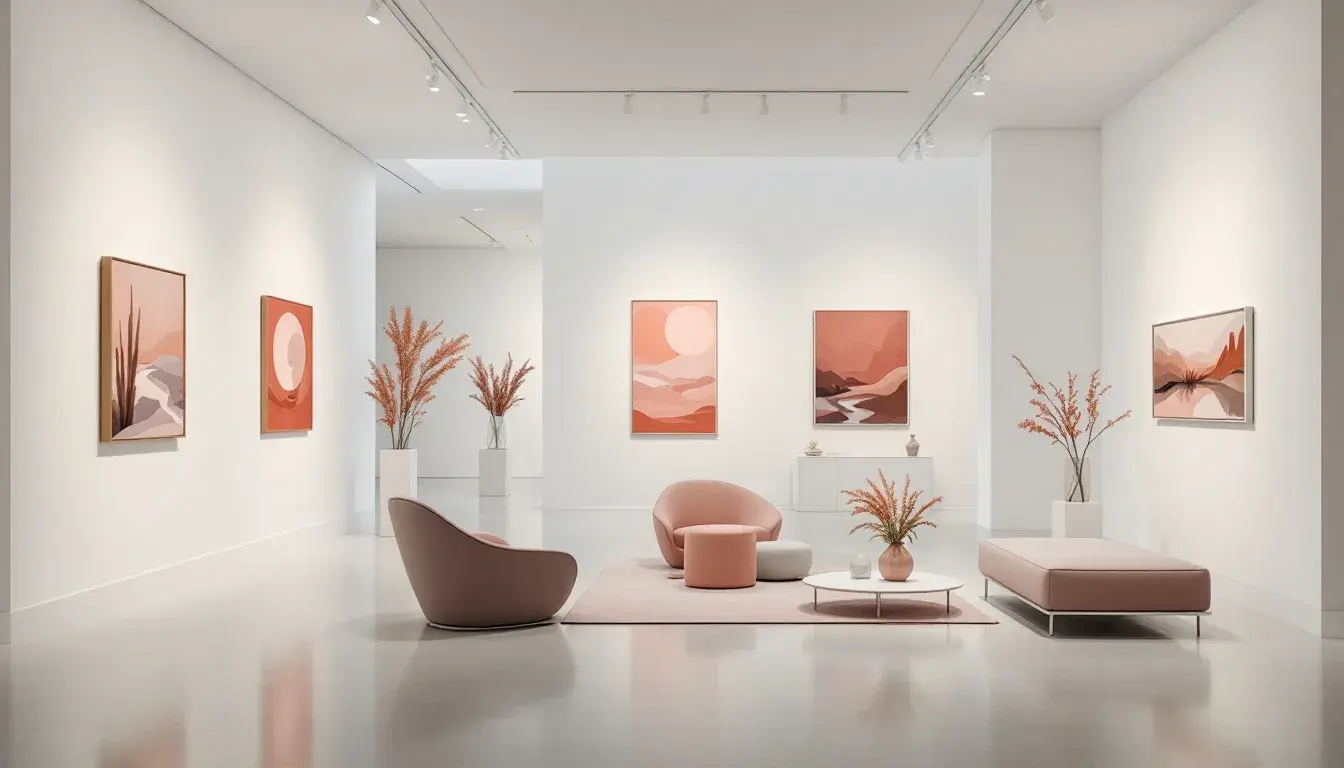
"Modern Calm" offers a studied neutrality. Imagine a well-curated gallery – the walls washed in Pale Gray, providing a backdrop that’s equally subdued and refined. Sculptures, perhaps cast in bronze, appear in Neutral Gray while natural light spills from tall windows. A solitary piece of furniture, maybe a chaise upholstered in Slate Blue, introduces a cool, grounding element. The Mauve Purple hints at a touch of artifice, like an elegant handbag. This palette isn't about bold statements; it’s about creating an environment of quiet distinction. It’s the kind of space where one can think clearly, work productively, and feel serenely at ease. The blend of grays provides visual harmony without being monotonous, the slightly varied tones playing off one another with a deceptive complexity. " Modern Calm" feels perfectly placed for an office of a digital start-up or a therapy room. It is about creating a peacefulness to the inhabitants. Consider how this palette would feel when applied to a website design – the Pale Gray acting as a canvas for striking graphic elements, the Slate Blue used to highlight calls to action. "Modern Calm" encourages sophistication by using a considered simplicity.
These palettes reveal that winter minimalism isn't about a lack of expression, but a refined selection. Color, within this constraint, becomes a powerful voice. "Modern Serenity" whispers of quiet innovation, while "Deep Innovation" speaks of intellectual intrigue. "Neutral Serenity" embodies a sanctuary of mindful calm and "Modern Calm" offers a soothing space. Each is a study in emotional resonance; spaces that invite contemplation, inspire creativity, and ultimately, promote a sense of well-being. The sophistication lies in the thoughtful restraint, the carefully considered dance of hue and tone, to create a world of elegant simplicity. It’s about choosing not simply what looks beautiful, but what evokes a particular feeling, what fosters a particular way of being. That is the art of minimalist sophistication.