'%3e%3cpath%20fill-rule='evenodd'%20clip-rule='evenodd'%20d='M51.1303%2019.2492C50.7278%2019.913%2050.1346%2020.4426%2049.3508%2020.838C48.5669%2021.2335%2047.6172%2021.4312%2046.5014%2021.4312C44.8208%2021.4312%2043.4367%2021.0216%2042.3492%2020.2025C41.2617%2019.3833%2040.6686%2018.2394%2040.5697%2016.7706H44.4253C44.4818%2017.3355%2044.6831%2017.7804%2045.0291%2018.1052C45.3751%2018.43%2045.8164%2018.5924%2046.3531%2018.5924C46.8192%2018.5924%2047.1864%2018.4653%2047.4547%2018.2111C47.7231%2017.9569%2047.8572%2017.618%2047.8572%2017.1943C47.8572%2016.8129%2047.7337%2016.4952%2047.4865%2016.241C47.2393%2015.9867%2046.9322%2015.7784%2046.565%2015.616C46.1978%2015.4536%2045.6893%2015.2594%2045.0397%2015.0334C44.0934%2014.7086%2043.3202%2014.3944%2042.72%2014.0907C42.1197%2013.7871%2041.6042%2013.3351%2041.1735%2012.7349C40.7427%2012.1347%2040.5273%2011.3544%2040.5273%2010.394C40.5273%209.50418%2040.7533%208.73448%2041.2053%208.08481C41.6572%207.43515%2042.2821%206.93731%2043.0801%206.5913C43.8781%206.24528%2044.7925%206.07227%2045.8235%206.07227C47.49%206.07227%2048.8141%206.46771%2049.7956%207.25861C50.7772%208.04951%2051.3315%209.13698%2051.4586%2010.5211H47.5395C47.4689%2010.0268%2047.2888%209.63483%2046.9993%209.3453C46.7097%209.05578%2046.3178%208.91102%2045.8235%208.91102C45.3998%208.91102%2045.0573%209.024%2044.7961%209.24997C44.5348%209.47594%2044.4041%209.80783%2044.4041%2010.2457C44.4041%2010.5988%2044.5207%2010.8989%2044.7537%2011.146C44.9867%2011.3932%2045.2798%2011.5944%2045.6328%2011.7498C45.9859%2011.9052%2046.4944%2012.1029%2047.1581%2012.343C48.1185%2012.6678%2048.9023%2012.9891%2049.5096%2013.3069C50.1169%2013.6246%2050.6395%2014.0872%2051.0773%2014.6945C51.5151%2015.3018%2051.734%2016.0927%2051.734%2017.0672C51.734%2017.8581%2051.5328%2018.5854%2051.1303%2019.2492ZM59.0242%206.3053V21.2829H55.4016V6.3053H59.0242ZM73.9409%206.3053V9.18642H69.8734V21.2829H66.2296V9.18642H62.2046V6.3053H73.9409ZM80.7438%209.18642V12.3218H85.8069V15.0546H80.7438V18.3806H86.4425V21.2829H77.1212V6.3053H86.4425V9.18642H80.7438ZM99.667%2016.0291V21.2829H96.0444V6.3053H101.913C103.692%206.3053%20105.048%206.74665%20105.98%207.62934C106.912%208.51204%20107.378%209.7019%20107.378%2011.199C107.378%2012.1311%20107.17%2012.9609%20106.753%2013.6882C106.337%2014.4155%20105.719%2014.9875%20104.9%2015.4042C104.08%2015.8208%20103.085%2016.0291%20101.913%2016.0291H99.667ZM103.692%2011.199C103.692%209.8855%20102.965%209.22879%20101.51%209.22879H99.667V13.1268H101.51C102.965%2013.1268%20103.692%2012.4842%20103.692%2011.199ZM120.092%2018.5501H114.478L113.546%2021.2829H109.732L115.219%206.41123H119.393L124.879%2021.2829H121.024L120.092%2018.5501ZM119.16%2015.7961L117.295%2010.2881L115.41%2015.7961H119.16ZM131.555%2018.5077H136.385V21.2829H127.933V6.3053H131.555V18.5077ZM143.337%209.18642V12.3218H148.4V15.0546H143.337V18.3806H149.035V21.2829H139.714V6.3053H149.035V9.18642H143.337ZM163.507%206.3053V9.18642H159.44V21.2829H155.796V9.18642H151.771V6.3053H163.507ZM177.449%206.3053V9.18642H173.382V21.2829H169.738V9.18642H165.713V6.3053H177.449ZM184.252%209.18642V12.3218H189.315V15.0546H184.252V18.3806H189.951V21.2829H180.629V6.3053H189.951V9.18642H184.252Z'%20fill='%23EEF0ED'/%3e%3cmask%20id='mask0_3101_7327'%20style='mask-type:alpha'%20maskUnits='userSpaceOnUse'%20x='0'%20y='0'%20width='27'%20height='28'%3e%3cpath%20d='M23.8328%200.759766H2.64808C1.18559%200.759766%200%201.94535%200%203.40785V24.5925C0%2026.055%201.18559%2027.2406%202.64808%2027.2406H23.8328C25.2952%2027.2406%2026.4808%2026.055%2026.4808%2024.5925V3.40785C26.4808%201.94535%2025.2952%200.759766%2023.8328%200.759766Z'%20fill='white'/%3e%3c/mask%3e%3cg%20mask='url(%23mask0_3101_7327)'%3e%3cpath%20d='M23.8328%200.759766H2.64808C1.18559%200.759766%200%201.94535%200%203.40785V24.5925C0%2026.055%201.18559%2027.2406%202.64808%2027.2406H23.8328C25.2952%2027.2406%2026.4808%2026.055%2026.4808%2024.5925V3.40785C26.4808%201.94535%2025.2952%200.759766%2023.8328%200.759766Z'%20fill='%23D8D8D8'/%3e%3cpath%20d='M13.2404%200.759766H0V14.0001H13.2404V0.759766Z'%20fill='%238C61FF'/%3e%3cpath%20d='M13.2404%2014H0V27.2404H13.2404V14Z'%20fill='%2336C3FE'/%3e%3cpath%20d='M26.4806%2014H13.2402V27.2404H26.4806V14Z'%20fill='%236592FE'/%3e%3cpath%20d='M26.4806%200.759766H13.2402V14.0002H26.4806V0.759766Z'%20fill='%236059F7'/%3e%3c/g%3e%3c/g%3e%3cdefs%3e%3cclipPath%20id='clip0_3101_7327'%3e%3crect%20width='190'%20height='28'%20fill='white'/%3e%3c/clipPath%3e%3c/defs%3e%3c/svg%3e)
'%3e%3cpath%20d='M23.8328%200.759521H2.64808C1.18559%200.759521%200%201.94511%200%203.40761V24.5923C0%2026.0548%201.18559%2027.2404%202.64808%2027.2404H23.8328C25.2952%2027.2404%2026.4808%2026.0548%2026.4808%2024.5923V3.40761C26.4808%201.94511%2025.2952%200.759521%2023.8328%200.759521Z'%20fill='%23D8D8D8'/%3e%3cpath%20d='M13.2404%200.759521H0V13.9999H13.2404V0.759521Z'%20fill='%238C61FF'/%3e%3cpath%20d='M13.2404%2013.9998H0V27.2402H13.2404V13.9998Z'%20fill='%2336C3FE'/%3e%3cpath%20d='M26.4809%2013.9998H13.2405V27.2402H26.4809V13.9998Z'%20fill='%236592FE'/%3e%3cpath%20d='M26.4809%200.759277H13.2405V13.9997H26.4809V0.759277Z'%20fill='%236059F7'/%3e%3c/g%3e%3c/svg%3e)
Room by Room: The Hue That Rules
24 Sep 2025 · 6 min readWhen composing a room, the temptation is often to begin with structure, with form. But what if the true foundation lies in something far more subtle, yet utterly pervasive: color? Imagine walking into a space not knowing its purpose, only to be immediately struck by a feeling – a sense of calm, perhaps, or one of invigoration. This is the language of color, speaking directly to the emotions, shaping our experience before a single piece of furniture is considered, or a single piece of decor chosen. Color is not merely aesthetic; it is atmosphere, invitation, and declaration. It is the invisible architecture of feeling, the soul of a space unveiled. The right palette can transform the mundane into the magnificent, crafting sanctuaries that reflect inner worlds. This exploration considers how the carefully curated collection of tones dictate mood. How can a room feel as much as it looks? How can the hue truly rule?
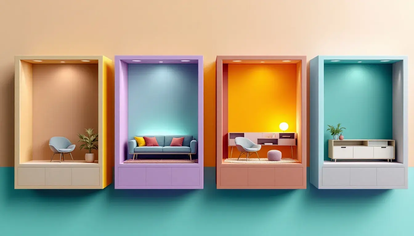
The "Earthy Contrast" palette whispers of slow mornings and quiet evenings. Picture sun-drenched fields fading into twilight; the subtle shift in the season when the air turns crisp. Pale Beige lays the groundwork for gentility. It's the color of aged parchment, a comforting canvas on which to build. Neutral Gray emerges like mist hanging over a still lake, grounding the scheme and lending a sense of solidity. As the eye moves across the spectrum, Plum Purple rises like an unexpected bloom in a late autumn garden, with a complex floral aroma. Rosy Mauve adds a passionate flush, similar to the last embers of a dying fire, hinting at warmth and intimacy. The finish is Dark Gray, an enduring shadow that lends depth and anchors the ensemble, like the solid rocks among the soft flower bed. This palette presents a sense of lived-in elegance, a space that tells a story of comfort over time. It suggests weighty fabrics, antique wood, and soft, diffused lighting. Imagine walls washed in Pale Beige, with furniture upholstered in Neutral Gray and accents of Plum Purple appearing in floral arrangements and textiles layered around the room. Rosy Mauve may appear as a subtle highlight in artwork or accessories, while Dark Gray grounds the space in rugs or architectural features. The effect is one of understated luxury, classic style, and a place where memories are quietly made.
"Modern Contrast" delivers an aura of sharp focus and intellectual intrigue. It evokes the image of a city skyline at dusk, where clean lines meet the soft glow of twilight. Light Lavender begins with a sense of clarity, a quiet sophistication that recalls the first light of dawn on a frosted window. This hue is airy and ethereal, setting a tone of calm resolve. Periwinkle Grey enters as cool steel, reflecting a calculated and efficient approach. It suggests modern decor, where every detail is carefully considered. Taupe Brown grounds the color composition, adding an earthy counterpoint to the cooler tones. This neutral is the warmth of natural wood, bringing a touch of the organic into the space. Dusty Burgundy gives the palette a hint of drama, similar to a splash of deep red wine, stimulating the senses with complexity. Dark Slate brings a powerful anchor, firm and resolute. Think of the night sky filled with millions of stars, vast and unknowable. This palette conveys a sense of forward-thinking innovation and elegant functionality, suiting spaces designed for creativity and focused work. Walls might be painted in Light Lavender, with Periwinkle Grey and Taupe Brown incorporated into furniture and shelving. Dusty Burgundy could offer a bold accent to energize a room, while Dark Slate can define architectural features and add a grounding presence. The overall atmosphere is one of contemporary sophistication, encouraging concentration and inspiring new concepts.
"Vibrant Serenity" captures the feeling of a lush, hidden garden, where sunlight filters through dense foliage. It is a space of both energy and peaceful repose, an invitation to explore and be inspired. Pale Yellow sets the tone like the gentle rays of morning, illuminating the imagination and instilling optimism. Teal Green bursts forth like fresh spring growth, enlivening the senses and energizing the mind with its bold vibrancy. Cool Gray offers a subtle pause, like smooth stones near a babbling brook, grounding the palette and creating a point of centered calm. Deep Teal evokes the depth of a protected lagoon, drawing the user into a space for contemplation and quiet reflection. The darkest tone, Black Olive, acts as a solid, grounding foundation, similar to rich soil that nurtures abundant life. The combination calls for natural light so the colors shift in the breeze. Walls can be painted Pale Yellow, allowing the natural tones to dance across the surface. Furniture and accents upholstered in Teal Green and Deep Teal could create a sense of organic flow throughout the space. Cool Gray then acts as a counter to the more vibrant shades, promoting balanced energy. The overall effect is a haven of creativity and tranquility, suited for both active engagement and peaceful restoration.
The "Nativo Palette" evokes a sense of quiet contemplation, like an observatory on a clear night, or a journey away from the bright lights. It whispers of distant stars and the mysteries of the unknown. Pale Ecru begins with the gentlest invitation, like the first hint of starlight illuminating the atmosphere, creating an experience of serene depth. Dusty Lavender flows in like shadows gathering in the night, lending sophisticated complexity. Muted Khaki presents a neutral grounding like desert sand, suggesting the enduring stability of natural beauty. Vibrant Lilac offers an electric accent, flashing with brilliance as a celestial phenomenon. Finally, Dark Aubergine creates a solid shadow base, providing a grounding anchor to the more ethereal tones, giving depth and gravity. This palette is suited for private, luxurious settings. Imagine walls washed in Pale Ecru, creating an atmosphere of quiet serenity. Textiles and furniture upholstered in Dusty Lavender and Muted Khaki create an unexpected elegance, promoting relaxation and clarity. Vibrant Lilac should then be carefully introduced to enliven the palette. Dark Aubergine acts as an grounding counterpoint, establishing a feeling of deep balance. The complete experience produces a space of refined introspection.
So, which hue truly rules? The answer, it seems, lies not in a single color, but in the relationships they forge. Each palette presented offers much more than just visual arrangement. They are blueprints for experiences, orchestrating moods, and choreographing feelings. "Earthy Contrast" invites us to slow down and savor quiet moments. "Modern Contrast" inspires innovation and forward thinking. "Vibrant Serenity" creates a space where energy and tranquility meet. "Nativo Palette" offers a retreat for introspection and luxurious calm. Every palette becomes its own microclimate of emotion and inspiration. Whether it's cultivating focus, sparking creativity, or simply enveloping us in a sense of peace, color remains the soul of the room.