'%3e%3cpath%20fill-rule='evenodd'%20clip-rule='evenodd'%20d='M51.1303%2019.2492C50.7278%2019.913%2050.1346%2020.4426%2049.3508%2020.838C48.5669%2021.2335%2047.6172%2021.4312%2046.5014%2021.4312C44.8208%2021.4312%2043.4367%2021.0216%2042.3492%2020.2025C41.2617%2019.3833%2040.6686%2018.2394%2040.5697%2016.7706H44.4253C44.4818%2017.3355%2044.6831%2017.7804%2045.0291%2018.1052C45.3751%2018.43%2045.8164%2018.5924%2046.3531%2018.5924C46.8192%2018.5924%2047.1864%2018.4653%2047.4547%2018.2111C47.7231%2017.9569%2047.8572%2017.618%2047.8572%2017.1943C47.8572%2016.8129%2047.7337%2016.4952%2047.4865%2016.241C47.2393%2015.9867%2046.9322%2015.7784%2046.565%2015.616C46.1978%2015.4536%2045.6893%2015.2594%2045.0397%2015.0334C44.0934%2014.7086%2043.3202%2014.3944%2042.72%2014.0907C42.1197%2013.7871%2041.6042%2013.3351%2041.1735%2012.7349C40.7427%2012.1347%2040.5273%2011.3544%2040.5273%2010.394C40.5273%209.50418%2040.7533%208.73448%2041.2053%208.08481C41.6572%207.43515%2042.2821%206.93731%2043.0801%206.5913C43.8781%206.24528%2044.7925%206.07227%2045.8235%206.07227C47.49%206.07227%2048.8141%206.46771%2049.7956%207.25861C50.7772%208.04951%2051.3315%209.13698%2051.4586%2010.5211H47.5395C47.4689%2010.0268%2047.2888%209.63483%2046.9993%209.3453C46.7097%209.05578%2046.3178%208.91102%2045.8235%208.91102C45.3998%208.91102%2045.0573%209.024%2044.7961%209.24997C44.5348%209.47594%2044.4041%209.80783%2044.4041%2010.2457C44.4041%2010.5988%2044.5207%2010.8989%2044.7537%2011.146C44.9867%2011.3932%2045.2798%2011.5944%2045.6328%2011.7498C45.9859%2011.9052%2046.4944%2012.1029%2047.1581%2012.343C48.1185%2012.6678%2048.9023%2012.9891%2049.5096%2013.3069C50.1169%2013.6246%2050.6395%2014.0872%2051.0773%2014.6945C51.5151%2015.3018%2051.734%2016.0927%2051.734%2017.0672C51.734%2017.8581%2051.5328%2018.5854%2051.1303%2019.2492ZM59.0242%206.3053V21.2829H55.4016V6.3053H59.0242ZM73.9409%206.3053V9.18642H69.8734V21.2829H66.2296V9.18642H62.2046V6.3053H73.9409ZM80.7438%209.18642V12.3218H85.8069V15.0546H80.7438V18.3806H86.4425V21.2829H77.1212V6.3053H86.4425V9.18642H80.7438ZM99.667%2016.0291V21.2829H96.0444V6.3053H101.913C103.692%206.3053%20105.048%206.74665%20105.98%207.62934C106.912%208.51204%20107.378%209.7019%20107.378%2011.199C107.378%2012.1311%20107.17%2012.9609%20106.753%2013.6882C106.337%2014.4155%20105.719%2014.9875%20104.9%2015.4042C104.08%2015.8208%20103.085%2016.0291%20101.913%2016.0291H99.667ZM103.692%2011.199C103.692%209.8855%20102.965%209.22879%20101.51%209.22879H99.667V13.1268H101.51C102.965%2013.1268%20103.692%2012.4842%20103.692%2011.199ZM120.092%2018.5501H114.478L113.546%2021.2829H109.732L115.219%206.41123H119.393L124.879%2021.2829H121.024L120.092%2018.5501ZM119.16%2015.7961L117.295%2010.2881L115.41%2015.7961H119.16ZM131.555%2018.5077H136.385V21.2829H127.933V6.3053H131.555V18.5077ZM143.337%209.18642V12.3218H148.4V15.0546H143.337V18.3806H149.035V21.2829H139.714V6.3053H149.035V9.18642H143.337ZM163.507%206.3053V9.18642H159.44V21.2829H155.796V9.18642H151.771V6.3053H163.507ZM177.449%206.3053V9.18642H173.382V21.2829H169.738V9.18642H165.713V6.3053H177.449ZM184.252%209.18642V12.3218H189.315V15.0546H184.252V18.3806H189.951V21.2829H180.629V6.3053H189.951V9.18642H184.252Z'%20fill='%23EEF0ED'/%3e%3cmask%20id='mask0_3101_7327'%20style='mask-type:alpha'%20maskUnits='userSpaceOnUse'%20x='0'%20y='0'%20width='27'%20height='28'%3e%3cpath%20d='M23.8328%200.759766H2.64808C1.18559%200.759766%200%201.94535%200%203.40785V24.5925C0%2026.055%201.18559%2027.2406%202.64808%2027.2406H23.8328C25.2952%2027.2406%2026.4808%2026.055%2026.4808%2024.5925V3.40785C26.4808%201.94535%2025.2952%200.759766%2023.8328%200.759766Z'%20fill='white'/%3e%3c/mask%3e%3cg%20mask='url(%23mask0_3101_7327)'%3e%3cpath%20d='M23.8328%200.759766H2.64808C1.18559%200.759766%200%201.94535%200%203.40785V24.5925C0%2026.055%201.18559%2027.2406%202.64808%2027.2406H23.8328C25.2952%2027.2406%2026.4808%2026.055%2026.4808%2024.5925V3.40785C26.4808%201.94535%2025.2952%200.759766%2023.8328%200.759766Z'%20fill='%23D8D8D8'/%3e%3cpath%20d='M13.2404%200.759766H0V14.0001H13.2404V0.759766Z'%20fill='%238C61FF'/%3e%3cpath%20d='M13.2404%2014H0V27.2404H13.2404V14Z'%20fill='%2336C3FE'/%3e%3cpath%20d='M26.4806%2014H13.2402V27.2404H26.4806V14Z'%20fill='%236592FE'/%3e%3cpath%20d='M26.4806%200.759766H13.2402V14.0002H26.4806V0.759766Z'%20fill='%236059F7'/%3e%3c/g%3e%3c/g%3e%3cdefs%3e%3cclipPath%20id='clip0_3101_7327'%3e%3crect%20width='190'%20height='28'%20fill='white'/%3e%3c/clipPath%3e%3c/defs%3e%3c/svg%3e)
'%3e%3cpath%20d='M23.8328%200.759521H2.64808C1.18559%200.759521%200%201.94511%200%203.40761V24.5923C0%2026.0548%201.18559%2027.2404%202.64808%2027.2404H23.8328C25.2952%2027.2404%2026.4808%2026.0548%2026.4808%2024.5923V3.40761C26.4808%201.94511%2025.2952%200.759521%2023.8328%200.759521Z'%20fill='%23D8D8D8'/%3e%3cpath%20d='M13.2404%200.759521H0V13.9999H13.2404V0.759521Z'%20fill='%238C61FF'/%3e%3cpath%20d='M13.2404%2013.9998H0V27.2402H13.2404V13.9998Z'%20fill='%2336C3FE'/%3e%3cpath%20d='M26.4809%2013.9998H13.2405V27.2402H26.4809V13.9998Z'%20fill='%236592FE'/%3e%3cpath%20d='M26.4809%200.759277H13.2405V13.9997H26.4809V0.759277Z'%20fill='%236059F7'/%3e%3c/g%3e%3c/svg%3e)
Professionalism in Vogue: Mood Trends in Color Palettes
24 Sep 2025 · 5 min readThe allure of color, a silent language spoken across industries, influences our perception of professionalism. Forget the rigid structures of decades past; today, professional aesthetics have evolved into a nuanced arena where creativity and confidence coalesce. Consider how a carefully chosen palette can subtly communicate authority, innovation, and approachability, forging connections in the visual landscape of modern business. It's about more than just looking the part; it's about strategically crafting an environment that inspires trust and fosters collaboration. A muted tone can signal deep expertise; a bold contrast suggests innovative thinking. The workspace, the brand materials, even the virtual meeting background—all become canvases where color choices subtly shape perceptions and drive outcomes. Let us now explore distinct palettes, each offering a different vision of what it means to be professional in the current moment.
The "Modern Contrast" palette suggests an atmosphere of controlled energy. Imagine an office where Sky Blue accents meet Dark Taupe walls, a backdrop for thoughtful discussions and innovative strategies. The presence of Steel Blue adds a layer of contemplative depth, suggesting a space where ideas are carefully considered before being acted upon. This isn’t a riot of color, but rather a harmonious blend where Deep Maroon and Ebony ground the palette, imparting a sense of stability. It conveys confidence without arrogance, competence without rigidity. Picture a tech startup’s headquarters: sharp lines, open spaces, and this palette applied to everything from the website design to the employee lounge. There’s an understanding here that professionalism doesn’t demand conformity, but celebrates a mindful, sophisticated approach. Imagine a finance company embracing change in a vibrant, visually engaging way, projecting progress. Instead of harsh fluorescents and drab cubicles, this combination offers a space that fosters creativity without sacrificing seriousness. It acknowledges the shift in work culture, where personality and professionalism harmonize.
"Nativo Palette" presents a quieter refinement. Picture a room where the subtle glow of Off White walls meets the grounding presence of Deep Charcoal accents. The unexpected inclusion of Bright Lavender and Electric Blue hints at a creative spark, a willingness to explore unconventional ideas. Olive Brown and Grayish Taupe add tactile depth, grounding the brighter tones in a sense of earthiness. The Crimson Red serves as a focal point, like a compelling piece of art that draws attention and imparts character. Consider this palette in a design agency's workspace – not an aggressive display of flash, but composed of tones that foster focus and creative thinking. It suggests that professionalism doesn't always shout, but frequently whispers a sense of understated excellence. The presence of Golden Yellow offers a touch of warmth, conveying trustworthiness, while Dark Indigo whispers of late nights spent fine-tuning ideas. This is not workplace minimalism for pure austerity’s sake; rather, it's a studied balance designed to inspire both confidence and creativity, a place where one can imagine finding both comfort and the spur to innovation.
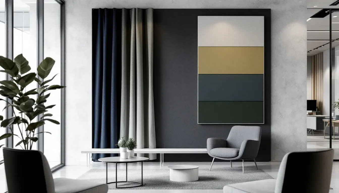
The "Elegant Academia" palette evokes a sense of timeless knowledge. Imagine a library, bathed in natural light, where Pure White walls contrast handsomely the Deep Indigo bookshelves. The inclusion of Bright Gold accents, such as picture frames or desk accessories, adds a touch of sophisticated luxury, lending an air of quiet success. The Steel Blue tones hint at intellectual pursuits, while Dark Crimson adds a touch of gravity, a silent reminder of the weight of history. Consider how Olive Yellow fosters concentration, mirroring the quiet hum of focused thought, while Dusty Rose offers a moment of welcome relief. This is less about flashy innovation and more about the steadfast pursuit of excellence. A finance company might implement it to convey stability and dependability, evoking trust with an enduring style. Imagine applying this palette to a university's branding: not stuffy, but rather confident and timeless, a silent promise of enduring quality. Grayish Beige hints at age, while keeping a modern sensibility. It isn't bound by fleeting trends; it stands as a testament to the enduring power of intellect, a place where ideas are both honored and pushed forward.
The "Automotive Palette" delivers a dynamic sense of action with Off White backdrops. A vibrant blend of Medium Gray and Dark Charcoal grounds the Bright Blue tones to offer a contrasting and energized space. Imagine an innovative technology firm adopting this palette to reflect a forward-thinking sensibility. Vibrant Orange and Bright Red add moments of excitement, like visual punctuations highlighting key information. A subdued Olive Green fosters a sense of pragmatism, while allowing space to experiment with new ideas. Contrast that with a splash of Deep Red and Deep Blue as visual anchors providing a sense of trust. This isn’t a palette of quiet contemplation, but is meant to excite and inspire. Consider how this translates to an automotive company's website: bold, engaging, and confident. It conveys a company that is not afraid to take risks, that prioritizes innovation and performance. The inclusion of Light Gray ensures balance, a steady counterbalance to the palette’s exuberance. It's a place where cutting-edge ideas are born, and the future of speed and technology are reimagined.
"Bold Contrast" brings a playful yet calculated energy. Picture a boardroom where Pure White walls are offset by the commanding presence of Deep Sapphire accents. The subtle inclusion of Light Coral lends a touch of warmth and approachability, while Pale Lavender adds a touch of dreamy creativity. The Bright Azure introduces a splash of vibrant energy, highlighting a willingness to think outside the box. Imagine a marketing agency employing this palette to underscore its innovative solutions: not brash, but intentionally bold. Imagine Burnt Sienna fostering a sense of groundedness, an assurance that even the most daring ideas are rooted in practical experience. This combination speaks to confidence without condescension, creativity without chaos. Mustard Yellow suggests ingenuity. The presence of Earthy Plum adds intrigue, as this is a palette that understands the power of making a striking impression, a signal of a company that dares to be different.
In reflecting on these distinct palettes, a shift in the perception of professionalism becomes evident. It’s no longer enough to simply appear competent; today, it’s about projecting values and visions through color choices. The emphasis is on creating environments that support collaboration, creativity, and innovation, not with drab conformity. "Modern Contrast" projects a controlled enthusiasm, which is important in settings such as technologically based workspaces. "Nativo Palette" embodies hushed excellence, creating spaces that are thoughtful as a counterpoint. "Elegant Academia" transmits lasting intellect for companies looking towards timeless branding, and "Automotive Palette" excites the imagination. The "Bold Contrast" option creates memorable experiences. These curated tones reveal that the language of professionalism is in a state of constant evolution, adapting to the changing demands of this era, where personal expression and corporate identity are not mutually exclusive but interwoven threads.