'%3e%3cpath%20fill-rule='evenodd'%20clip-rule='evenodd'%20d='M51.1303%2019.2492C50.7278%2019.913%2050.1346%2020.4426%2049.3508%2020.838C48.5669%2021.2335%2047.6172%2021.4312%2046.5014%2021.4312C44.8208%2021.4312%2043.4367%2021.0216%2042.3492%2020.2025C41.2617%2019.3833%2040.6686%2018.2394%2040.5697%2016.7706H44.4253C44.4818%2017.3355%2044.6831%2017.7804%2045.0291%2018.1052C45.3751%2018.43%2045.8164%2018.5924%2046.3531%2018.5924C46.8192%2018.5924%2047.1864%2018.4653%2047.4547%2018.2111C47.7231%2017.9569%2047.8572%2017.618%2047.8572%2017.1943C47.8572%2016.8129%2047.7337%2016.4952%2047.4865%2016.241C47.2393%2015.9867%2046.9322%2015.7784%2046.565%2015.616C46.1978%2015.4536%2045.6893%2015.2594%2045.0397%2015.0334C44.0934%2014.7086%2043.3202%2014.3944%2042.72%2014.0907C42.1197%2013.7871%2041.6042%2013.3351%2041.1735%2012.7349C40.7427%2012.1347%2040.5273%2011.3544%2040.5273%2010.394C40.5273%209.50418%2040.7533%208.73448%2041.2053%208.08481C41.6572%207.43515%2042.2821%206.93731%2043.0801%206.5913C43.8781%206.24528%2044.7925%206.07227%2045.8235%206.07227C47.49%206.07227%2048.8141%206.46771%2049.7956%207.25861C50.7772%208.04951%2051.3315%209.13698%2051.4586%2010.5211H47.5395C47.4689%2010.0268%2047.2888%209.63483%2046.9993%209.3453C46.7097%209.05578%2046.3178%208.91102%2045.8235%208.91102C45.3998%208.91102%2045.0573%209.024%2044.7961%209.24997C44.5348%209.47594%2044.4041%209.80783%2044.4041%2010.2457C44.4041%2010.5988%2044.5207%2010.8989%2044.7537%2011.146C44.9867%2011.3932%2045.2798%2011.5944%2045.6328%2011.7498C45.9859%2011.9052%2046.4944%2012.1029%2047.1581%2012.343C48.1185%2012.6678%2048.9023%2012.9891%2049.5096%2013.3069C50.1169%2013.6246%2050.6395%2014.0872%2051.0773%2014.6945C51.5151%2015.3018%2051.734%2016.0927%2051.734%2017.0672C51.734%2017.8581%2051.5328%2018.5854%2051.1303%2019.2492ZM59.0242%206.3053V21.2829H55.4016V6.3053H59.0242ZM73.9409%206.3053V9.18642H69.8734V21.2829H66.2296V9.18642H62.2046V6.3053H73.9409ZM80.7438%209.18642V12.3218H85.8069V15.0546H80.7438V18.3806H86.4425V21.2829H77.1212V6.3053H86.4425V9.18642H80.7438ZM99.667%2016.0291V21.2829H96.0444V6.3053H101.913C103.692%206.3053%20105.048%206.74665%20105.98%207.62934C106.912%208.51204%20107.378%209.7019%20107.378%2011.199C107.378%2012.1311%20107.17%2012.9609%20106.753%2013.6882C106.337%2014.4155%20105.719%2014.9875%20104.9%2015.4042C104.08%2015.8208%20103.085%2016.0291%20101.913%2016.0291H99.667ZM103.692%2011.199C103.692%209.8855%20102.965%209.22879%20101.51%209.22879H99.667V13.1268H101.51C102.965%2013.1268%20103.692%2012.4842%20103.692%2011.199ZM120.092%2018.5501H114.478L113.546%2021.2829H109.732L115.219%206.41123H119.393L124.879%2021.2829H121.024L120.092%2018.5501ZM119.16%2015.7961L117.295%2010.2881L115.41%2015.7961H119.16ZM131.555%2018.5077H136.385V21.2829H127.933V6.3053H131.555V18.5077ZM143.337%209.18642V12.3218H148.4V15.0546H143.337V18.3806H149.035V21.2829H139.714V6.3053H149.035V9.18642H143.337ZM163.507%206.3053V9.18642H159.44V21.2829H155.796V9.18642H151.771V6.3053H163.507ZM177.449%206.3053V9.18642H173.382V21.2829H169.738V9.18642H165.713V6.3053H177.449ZM184.252%209.18642V12.3218H189.315V15.0546H184.252V18.3806H189.951V21.2829H180.629V6.3053H189.951V9.18642H184.252Z'%20fill='%23EEF0ED'/%3e%3cmask%20id='mask0_3101_7327'%20style='mask-type:alpha'%20maskUnits='userSpaceOnUse'%20x='0'%20y='0'%20width='27'%20height='28'%3e%3cpath%20d='M23.8328%200.759766H2.64808C1.18559%200.759766%200%201.94535%200%203.40785V24.5925C0%2026.055%201.18559%2027.2406%202.64808%2027.2406H23.8328C25.2952%2027.2406%2026.4808%2026.055%2026.4808%2024.5925V3.40785C26.4808%201.94535%2025.2952%200.759766%2023.8328%200.759766Z'%20fill='white'/%3e%3c/mask%3e%3cg%20mask='url(%23mask0_3101_7327)'%3e%3cpath%20d='M23.8328%200.759766H2.64808C1.18559%200.759766%200%201.94535%200%203.40785V24.5925C0%2026.055%201.18559%2027.2406%202.64808%2027.2406H23.8328C25.2952%2027.2406%2026.4808%2026.055%2026.4808%2024.5925V3.40785C26.4808%201.94535%2025.2952%200.759766%2023.8328%200.759766Z'%20fill='%23D8D8D8'/%3e%3cpath%20d='M13.2404%200.759766H0V14.0001H13.2404V0.759766Z'%20fill='%238C61FF'/%3e%3cpath%20d='M13.2404%2014H0V27.2404H13.2404V14Z'%20fill='%2336C3FE'/%3e%3cpath%20d='M26.4806%2014H13.2402V27.2404H26.4806V14Z'%20fill='%236592FE'/%3e%3cpath%20d='M26.4806%200.759766H13.2402V14.0002H26.4806V0.759766Z'%20fill='%236059F7'/%3e%3c/g%3e%3c/g%3e%3cdefs%3e%3cclipPath%20id='clip0_3101_7327'%3e%3crect%20width='190'%20height='28'%20fill='white'/%3e%3c/clipPath%3e%3c/defs%3e%3c/svg%3e)
'%3e%3cpath%20d='M23.8328%200.759521H2.64808C1.18559%200.759521%200%201.94511%200%203.40761V24.5923C0%2026.0548%201.18559%2027.2404%202.64808%2027.2404H23.8328C25.2952%2027.2404%2026.4808%2026.0548%2026.4808%2024.5923V3.40761C26.4808%201.94511%2025.2952%200.759521%2023.8328%200.759521Z'%20fill='%23D8D8D8'/%3e%3cpath%20d='M13.2404%200.759521H0V13.9999H13.2404V0.759521Z'%20fill='%238C61FF'/%3e%3cpath%20d='M13.2404%2013.9998H0V27.2402H13.2404V13.9998Z'%20fill='%2336C3FE'/%3e%3cpath%20d='M26.4809%2013.9998H13.2405V27.2402H26.4809V13.9998Z'%20fill='%236592FE'/%3e%3cpath%20d='M26.4809%200.759277H13.2405V13.9997H26.4809V0.759277Z'%20fill='%236059F7'/%3e%3c/g%3e%3c/svg%3e)
Office Oasis: Trending Color Palettes for Modern Productivity
24 Sep 2025 · 3 min readProductivity, as we increasingly understand it, is not merely the churning out of deliverables. It is, instead, inextricably linked to the environments, both digital and physical, that we inhabit. Color, the quiet but ever-present companion to our senses, becomes a crucial element in fostering well-being and focused thought. Imagine a work space where the walls converse with the user, stimulating creativity or providing a sense of calm. Picture interfaces that guide the eye and communicate importance through subtle shifts in hue. The palettes that follow offer just such invitations to reimagine the modern workspace, transforming it from a site of labor into a sanctuary of purposeful activity.
The "Vibrant Burst" palette is a shock to the system, a jolt of creative energy bottled into a carefully curated set of colors. Almost White provides a momentary pause, a grounding element amidst the electrifying dance of Lime Green and Light Sky Blue. Seafoam Green whispers of tranquility, yet even that is quickly swept away by the audacious Bubblegum Pink and Electric Blue. Imagine a concept room, where ideas are tossed around like beach balls, and every surface invites exploration. Bright Violet and Vivid Magenta add a layer of playful sophistication, while the Deep Indigo and Jet Black provide an anchor of contrast against the brightness. This palette rejects the notion of the sterile office, instead promoting an environment where imagination takes center stage. This audacious color statement might just nudge a stagnant team into new realms. This is the antidote to corporate monotony.
"Vibrant Harmony" seeks a delicate balance, a conversation between boldness and serenity. Snow White serves as a canvas for the other colors to play upon, while Dusty Gray adds a touch of understated elegance. The Olive Green evokes a sense of quiet growth, a space for ideas to mature organically. Light Periwinkle offers a whimsical note, like sunlight filtering through a summer sky. Teal Green grounds the palette, its coolness providing a counterpoint to the warmer shades. Salmon Red injects a dose of energy, while Burnt Sienna whispers of tradition and earthiness. The real anchor is Deep Indigo, a color of contemplation and focus, perfect for the long hours of deep work. Bright Red provides a jolt when needed, and Dark Charcoal creates depth. Ideal for a collaborative space or home office where inspiration needs to be both cultivated and contained.
The "Vibrant Contrast" palette pulses with life, a dramatic interplay of light and shadow, warmth and coolness. Pure White asserts itself as a blank page, ready to be filled with ideas. Golden Yellow radiates optimism, a promise of sunny days and fruitful endeavors. The more insistent Bright Yellow drives this feeling forth. Lime Green injects a note of freshness, a reminder of the natural world that exists beyond the walls. Neutral Gray and Dark Gray provide a foundation and then Vivid Blue cuts through like a bolt of electric energy, stirring things up. The palette holds Bright Red and Burnt Sienna in reserve, earthy anchors to the loftier shades. Onyx Black gives the palette power. This is a palette for those who thrive in dynamic environments, where every day presents a new challenge and every project demands a fresh perspective. It would be a welcome sight in a meeting setting, sparking conversations and driving creativity.
"Modern Elegance" speaks of refined taste and subtle sophistication. Pure White is the foundation upon which this palette stands, a symbol of clarity and intention. Pale Gray and Medium Gray whisper of understated luxury, like brushed steel or polished concrete. Raspberry Pink adds a touch of unexpected warmth, the faintest blush on an otherwise neutral canvas. The colors recede just enough to make space for deep thinking, uninterrupted brainstorming, and attention to detail. Charcoal Black provides a grounding presence, anchoring the palette in a sense of timeless style. It is a color set for those who appreciate the quiet beauty of minimalist design, where every detail is carefully considered and nothing is superfluous. A perfect palette for an executive office, a corner of the home dedicated to focus, or even the interface of a productivity app designed for those with discerning tastes.
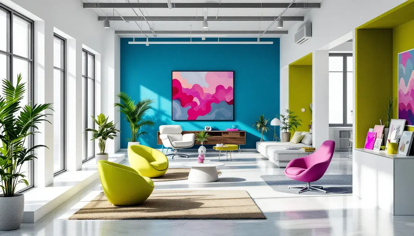
The colors gleaned from the most resonant palettes, those that pulse with creative energy and reflect a modern sensibility, converge to create the "Office Oasis." Imagine snow white to set a strong foundation, lime green for a spark of creativity, vivid blue to cut through the noise, olive green to maintain a steadiness, and raspberry pink for an unexpected twist. These are the hues that transform the mundane into the magnificent, the ordinary into the extraordinary. They speak not just of productivity, but of possibility: in turning a workspace into a place where ideas take flight, where collaboration thrives, and where every day feels like an opportunity to create something new. It is more than just paint or pixels. It's a portal to a more inspired and innovative way of working.