'%3e%3cpath%20fill-rule='evenodd'%20clip-rule='evenodd'%20d='M51.1303%2019.2492C50.7278%2019.913%2050.1346%2020.4426%2049.3508%2020.838C48.5669%2021.2335%2047.6172%2021.4312%2046.5014%2021.4312C44.8208%2021.4312%2043.4367%2021.0216%2042.3492%2020.2025C41.2617%2019.3833%2040.6686%2018.2394%2040.5697%2016.7706H44.4253C44.4818%2017.3355%2044.6831%2017.7804%2045.0291%2018.1052C45.3751%2018.43%2045.8164%2018.5924%2046.3531%2018.5924C46.8192%2018.5924%2047.1864%2018.4653%2047.4547%2018.2111C47.7231%2017.9569%2047.8572%2017.618%2047.8572%2017.1943C47.8572%2016.8129%2047.7337%2016.4952%2047.4865%2016.241C47.2393%2015.9867%2046.9322%2015.7784%2046.565%2015.616C46.1978%2015.4536%2045.6893%2015.2594%2045.0397%2015.0334C44.0934%2014.7086%2043.3202%2014.3944%2042.72%2014.0907C42.1197%2013.7871%2041.6042%2013.3351%2041.1735%2012.7349C40.7427%2012.1347%2040.5273%2011.3544%2040.5273%2010.394C40.5273%209.50418%2040.7533%208.73448%2041.2053%208.08481C41.6572%207.43515%2042.2821%206.93731%2043.0801%206.5913C43.8781%206.24528%2044.7925%206.07227%2045.8235%206.07227C47.49%206.07227%2048.8141%206.46771%2049.7956%207.25861C50.7772%208.04951%2051.3315%209.13698%2051.4586%2010.5211H47.5395C47.4689%2010.0268%2047.2888%209.63483%2046.9993%209.3453C46.7097%209.05578%2046.3178%208.91102%2045.8235%208.91102C45.3998%208.91102%2045.0573%209.024%2044.7961%209.24997C44.5348%209.47594%2044.4041%209.80783%2044.4041%2010.2457C44.4041%2010.5988%2044.5207%2010.8989%2044.7537%2011.146C44.9867%2011.3932%2045.2798%2011.5944%2045.6328%2011.7498C45.9859%2011.9052%2046.4944%2012.1029%2047.1581%2012.343C48.1185%2012.6678%2048.9023%2012.9891%2049.5096%2013.3069C50.1169%2013.6246%2050.6395%2014.0872%2051.0773%2014.6945C51.5151%2015.3018%2051.734%2016.0927%2051.734%2017.0672C51.734%2017.8581%2051.5328%2018.5854%2051.1303%2019.2492ZM59.0242%206.3053V21.2829H55.4016V6.3053H59.0242ZM73.9409%206.3053V9.18642H69.8734V21.2829H66.2296V9.18642H62.2046V6.3053H73.9409ZM80.7438%209.18642V12.3218H85.8069V15.0546H80.7438V18.3806H86.4425V21.2829H77.1212V6.3053H86.4425V9.18642H80.7438ZM99.667%2016.0291V21.2829H96.0444V6.3053H101.913C103.692%206.3053%20105.048%206.74665%20105.98%207.62934C106.912%208.51204%20107.378%209.7019%20107.378%2011.199C107.378%2012.1311%20107.17%2012.9609%20106.753%2013.6882C106.337%2014.4155%20105.719%2014.9875%20104.9%2015.4042C104.08%2015.8208%20103.085%2016.0291%20101.913%2016.0291H99.667ZM103.692%2011.199C103.692%209.8855%20102.965%209.22879%20101.51%209.22879H99.667V13.1268H101.51C102.965%2013.1268%20103.692%2012.4842%20103.692%2011.199ZM120.092%2018.5501H114.478L113.546%2021.2829H109.732L115.219%206.41123H119.393L124.879%2021.2829H121.024L120.092%2018.5501ZM119.16%2015.7961L117.295%2010.2881L115.41%2015.7961H119.16ZM131.555%2018.5077H136.385V21.2829H127.933V6.3053H131.555V18.5077ZM143.337%209.18642V12.3218H148.4V15.0546H143.337V18.3806H149.035V21.2829H139.714V6.3053H149.035V9.18642H143.337ZM163.507%206.3053V9.18642H159.44V21.2829H155.796V9.18642H151.771V6.3053H163.507ZM177.449%206.3053V9.18642H173.382V21.2829H169.738V9.18642H165.713V6.3053H177.449ZM184.252%209.18642V12.3218H189.315V15.0546H184.252V18.3806H189.951V21.2829H180.629V6.3053H189.951V9.18642H184.252Z'%20fill='%23EEF0ED'/%3e%3cmask%20id='mask0_3101_7327'%20style='mask-type:alpha'%20maskUnits='userSpaceOnUse'%20x='0'%20y='0'%20width='27'%20height='28'%3e%3cpath%20d='M23.8328%200.759766H2.64808C1.18559%200.759766%200%201.94535%200%203.40785V24.5925C0%2026.055%201.18559%2027.2406%202.64808%2027.2406H23.8328C25.2952%2027.2406%2026.4808%2026.055%2026.4808%2024.5925V3.40785C26.4808%201.94535%2025.2952%200.759766%2023.8328%200.759766Z'%20fill='white'/%3e%3c/mask%3e%3cg%20mask='url(%23mask0_3101_7327)'%3e%3cpath%20d='M23.8328%200.759766H2.64808C1.18559%200.759766%200%201.94535%200%203.40785V24.5925C0%2026.055%201.18559%2027.2406%202.64808%2027.2406H23.8328C25.2952%2027.2406%2026.4808%2026.055%2026.4808%2024.5925V3.40785C26.4808%201.94535%2025.2952%200.759766%2023.8328%200.759766Z'%20fill='%23D8D8D8'/%3e%3cpath%20d='M13.2404%200.759766H0V14.0001H13.2404V0.759766Z'%20fill='%238C61FF'/%3e%3cpath%20d='M13.2404%2014H0V27.2404H13.2404V14Z'%20fill='%2336C3FE'/%3e%3cpath%20d='M26.4806%2014H13.2402V27.2404H26.4806V14Z'%20fill='%236592FE'/%3e%3cpath%20d='M26.4806%200.759766H13.2402V14.0002H26.4806V0.759766Z'%20fill='%236059F7'/%3e%3c/g%3e%3c/g%3e%3cdefs%3e%3cclipPath%20id='clip0_3101_7327'%3e%3crect%20width='190'%20height='28'%20fill='white'/%3e%3c/clipPath%3e%3c/defs%3e%3c/svg%3e)
'%3e%3cpath%20d='M23.8328%200.759521H2.64808C1.18559%200.759521%200%201.94511%200%203.40761V24.5923C0%2026.0548%201.18559%2027.2404%202.64808%2027.2404H23.8328C25.2952%2027.2404%2026.4808%2026.0548%2026.4808%2024.5923V3.40761C26.4808%201.94511%2025.2952%200.759521%2023.8328%200.759521Z'%20fill='%23D8D8D8'/%3e%3cpath%20d='M13.2404%200.759521H0V13.9999H13.2404V0.759521Z'%20fill='%238C61FF'/%3e%3cpath%20d='M13.2404%2013.9998H0V27.2402H13.2404V13.9998Z'%20fill='%2336C3FE'/%3e%3cpath%20d='M26.4809%2013.9998H13.2405V27.2402H26.4809V13.9998Z'%20fill='%236592FE'/%3e%3cpath%20d='M26.4809%200.759277H13.2405V13.9997H26.4809V0.759277Z'%20fill='%236059F7'/%3e%3c/g%3e%3c/svg%3e)
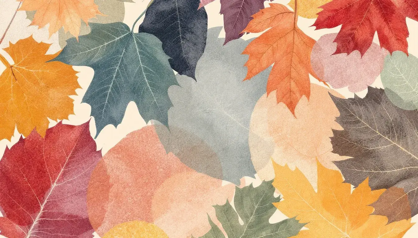
Most Common Color Pairings for Autumn
24 Sep 2025 · 5 min readAutumn, a season of transformation, is more than just falling leaves and pumpkin spice. It’s a feeling: the crisp air against your skin, the scent of woodsmoke hanging in the air, the way golden light filters through the trees. These experiences—deeply personal and universally felt—are expertly captured and communicated through color. Certain colors elicit specific emotions. A particular shade of ochre might recall memories of a favorite sweater, while a blend of brown and crimson could bring to mind a hike through a dense forest, the wet earth crunching underfoot. Think of the way film directors and painters use color to establish mood and place. Every visual storyteller knows that color is a powerful tool. It’s a means of quietly shaping perception, a wordless language that speaks directly to our senses. The palettes collected not only mimic the season’s hues, but also trigger the very sensations we associate with Autumn. They distill its essence into a visual form, offering a way to bottle and share its beauty.
The "Earthy Tones" palette 🍂 presents a landscape of muted warmth. A whisper of Off-White acts as a gentle foundation, reminiscent of early morning mist clinging to fields. The Taupe Gray introduces a grounding element, similar to the weathered bark of ancient trees, a comforting sense of stability. The Olive Drab, though subtle, offers a connection to the lingering green of late season foliage, a reminder of life persisting even as the world prepares for rest. Dusty Rose, a hue like the blush on ripening apples, brings a certain sweetness to the composition. But it’s the introduction of Dark Charcoal that really completes the picture, like the lengthening shadows cast by the setting sun, signaling the transition to cooler nights. Imagine a cottage interior, walls painted in the Off-White, accented with throws and cushions in the Taupe Gray and Olive Drab. A vase of dried flowers, echoing the Dusty Rose, sits on a sturdy wooden table. A crackling fire dances in the hearth, providing both warmth and the deep, anchoring presence of Dark Charcoal. This palette evokes feelings of quiet contentment, safety, and a return to simple pleasures. It is the perfect choice for creating environments that invite relaxation and introspection, like a personal sanctuary. The way different fabrics would interact—the soft touch of linen, the rough texture of wool, the smooth gleam of polished wood—all playing within this range of tones, contributing to a complex and sensory experience. This careful balance invites long conversations, quiet reading, and the simple enjoyment of being present in the moment.
"Earthy Balance" 🎨 offers a tranquil retreat that speaks to the quiet days of autumn. The foundation of Off White provides a clean, airy feel, like a crisp breeze through an open window. The subtle Seafoam Green brings a touch of the sea into this palette, reminiscent of sea glass polished smooth by the waves. Steel Blue contributes a cool depth, similar to an overcast sky reflected in a still lake, a sense of quiet contemplation. Taupe introduces an earthy grounding that prevents the palette from becoming too airy. It's the color of wet sand, of fallen leaves starting to decay back into the soil, a reminder of the cycle of nature. Dark Slate Gray adds an anchor, a solidity that keeps the lighter shades from floating away. Picture a sunlit room with walls in Off White, furnished with a linen sofa accented with cushions in Seafoam Green and Steel Blue. A natural jute rug spreads across the floor, echoing the shades of Taupe. This palette offers a sense of balance and calm, a space to breathe deeply and find peace. The feeling is one of gentle spaciousness, where the air is clear and thoughts flow easily, like a beach house in late October. The textures would be equally important: the smoothness of painted wood, the gentle give of linen, the rough weave of jute, all working together to create a sensory experience that enhances the overall feeling of calm. It’s a space that encourages slowing down, savoring simple moments, and appreciating the beauty of the natural world.
The palette "Modern Heritage" 🇰🇷 speaks of history re-imagined, offering a sophisticated take on the season. Mustard Yellow takes center stage, reminiscent of golden fields ready for harvest, a symbol of abundance and warmth. Neutral Grey provides a counterpoint, a sense of understated elegance, like worn stone steps leading to a grand estate. Tomato Red injects a touch of passion, like the vibrant hues of late autumn berries, or the last embers of a dying fire. Cool Gray adds another layer of depth, a subtle coolness that prevents the red from becoming overwhelming, suggesting the chill in the morning air. Dark Espresso completes the ensemble, providing richness and grounding, like the dark, fertile earth that nourishes the landscape. Imagine a modern living room with walls painted in Neutral Grey, punctuated by statement pieces in Mustard Yellow and Tomato Red. Accents in Cool Gray add visual interest, while furniture upholstered in Dark Espresso grounds the space. This design gives off a composed dignity, tradition updated for the current era. The light shifts through the space, accentuating the colors in ways that feel both familiar and new. This palette suggests a love of art, of history, and of creating a space that is both inviting and inspiring.
"Earthy Contrast" 🎨 offers a sophisticated yet grounded take on the season. Dusty Gray represents the veiled skies of late autumn. Pale Salmon provides subtle warmth and vibrancy, echoing the delicate blush of morning light. Tangerine bursts forth with an unmistakable energy, mimicking the vibrant hues of falling leaves, a fleeting and cherished display. Deep Indigo brings depth and mystery to the palette, suggestive of the twilight hours. Ebony, as the darkest note of the design, forms an anchor. It provides a solid foundation, a quiet strength that balances the more vibrant tones. Picture a dining room with walls painted in Dusty Gray, accented by textiles and artwork featuring Pale Salmon and Tangerine. Deep Indigo upholstery on chairs adds a touch of drama, while an Ebony wood table anchors the space. This arrangement inspires feelings of warmth, connection, and a touch of artistic flair. As the light changes throughout the course of the day, the colors shift and dance, adding depth. The palette is both stimulating and comforting, creating an atmosphere that is perfect for gathering with loved ones, like an intimate gathering. This color scheme celebrates the beauty of simplicity.
As the final leaves fall and the days shorten, these palettes remind us that Autumn is more than just a season; it's a state of mind. They capture something elemental about this time of year—a particular combination of warmth and coolness, vibrancy and stillness—and offer ways to bring those feelings into our lives. They speak of the season’s beauty. They provide a guide to creating spaces that feel both grounded and inspiring, a chance to not only witness the change around us, but to actively participate in it, bringing its magic indoors.