'%3e%3cpath%20fill-rule='evenodd'%20clip-rule='evenodd'%20d='M51.1303%2019.2492C50.7278%2019.913%2050.1346%2020.4426%2049.3508%2020.838C48.5669%2021.2335%2047.6172%2021.4312%2046.5014%2021.4312C44.8208%2021.4312%2043.4367%2021.0216%2042.3492%2020.2025C41.2617%2019.3833%2040.6686%2018.2394%2040.5697%2016.7706H44.4253C44.4818%2017.3355%2044.6831%2017.7804%2045.0291%2018.1052C45.3751%2018.43%2045.8164%2018.5924%2046.3531%2018.5924C46.8192%2018.5924%2047.1864%2018.4653%2047.4547%2018.2111C47.7231%2017.9569%2047.8572%2017.618%2047.8572%2017.1943C47.8572%2016.8129%2047.7337%2016.4952%2047.4865%2016.241C47.2393%2015.9867%2046.9322%2015.7784%2046.565%2015.616C46.1978%2015.4536%2045.6893%2015.2594%2045.0397%2015.0334C44.0934%2014.7086%2043.3202%2014.3944%2042.72%2014.0907C42.1197%2013.7871%2041.6042%2013.3351%2041.1735%2012.7349C40.7427%2012.1347%2040.5273%2011.3544%2040.5273%2010.394C40.5273%209.50418%2040.7533%208.73448%2041.2053%208.08481C41.6572%207.43515%2042.2821%206.93731%2043.0801%206.5913C43.8781%206.24528%2044.7925%206.07227%2045.8235%206.07227C47.49%206.07227%2048.8141%206.46771%2049.7956%207.25861C50.7772%208.04951%2051.3315%209.13698%2051.4586%2010.5211H47.5395C47.4689%2010.0268%2047.2888%209.63483%2046.9993%209.3453C46.7097%209.05578%2046.3178%208.91102%2045.8235%208.91102C45.3998%208.91102%2045.0573%209.024%2044.7961%209.24997C44.5348%209.47594%2044.4041%209.80783%2044.4041%2010.2457C44.4041%2010.5988%2044.5207%2010.8989%2044.7537%2011.146C44.9867%2011.3932%2045.2798%2011.5944%2045.6328%2011.7498C45.9859%2011.9052%2046.4944%2012.1029%2047.1581%2012.343C48.1185%2012.6678%2048.9023%2012.9891%2049.5096%2013.3069C50.1169%2013.6246%2050.6395%2014.0872%2051.0773%2014.6945C51.5151%2015.3018%2051.734%2016.0927%2051.734%2017.0672C51.734%2017.8581%2051.5328%2018.5854%2051.1303%2019.2492ZM59.0242%206.3053V21.2829H55.4016V6.3053H59.0242ZM73.9409%206.3053V9.18642H69.8734V21.2829H66.2296V9.18642H62.2046V6.3053H73.9409ZM80.7438%209.18642V12.3218H85.8069V15.0546H80.7438V18.3806H86.4425V21.2829H77.1212V6.3053H86.4425V9.18642H80.7438ZM99.667%2016.0291V21.2829H96.0444V6.3053H101.913C103.692%206.3053%20105.048%206.74665%20105.98%207.62934C106.912%208.51204%20107.378%209.7019%20107.378%2011.199C107.378%2012.1311%20107.17%2012.9609%20106.753%2013.6882C106.337%2014.4155%20105.719%2014.9875%20104.9%2015.4042C104.08%2015.8208%20103.085%2016.0291%20101.913%2016.0291H99.667ZM103.692%2011.199C103.692%209.8855%20102.965%209.22879%20101.51%209.22879H99.667V13.1268H101.51C102.965%2013.1268%20103.692%2012.4842%20103.692%2011.199ZM120.092%2018.5501H114.478L113.546%2021.2829H109.732L115.219%206.41123H119.393L124.879%2021.2829H121.024L120.092%2018.5501ZM119.16%2015.7961L117.295%2010.2881L115.41%2015.7961H119.16ZM131.555%2018.5077H136.385V21.2829H127.933V6.3053H131.555V18.5077ZM143.337%209.18642V12.3218H148.4V15.0546H143.337V18.3806H149.035V21.2829H139.714V6.3053H149.035V9.18642H143.337ZM163.507%206.3053V9.18642H159.44V21.2829H155.796V9.18642H151.771V6.3053H163.507ZM177.449%206.3053V9.18642H173.382V21.2829H169.738V9.18642H165.713V6.3053H177.449ZM184.252%209.18642V12.3218H189.315V15.0546H184.252V18.3806H189.951V21.2829H180.629V6.3053H189.951V9.18642H184.252Z'%20fill='%23EEF0ED'/%3e%3cmask%20id='mask0_3101_7327'%20style='mask-type:alpha'%20maskUnits='userSpaceOnUse'%20x='0'%20y='0'%20width='27'%20height='28'%3e%3cpath%20d='M23.8328%200.759766H2.64808C1.18559%200.759766%200%201.94535%200%203.40785V24.5925C0%2026.055%201.18559%2027.2406%202.64808%2027.2406H23.8328C25.2952%2027.2406%2026.4808%2026.055%2026.4808%2024.5925V3.40785C26.4808%201.94535%2025.2952%200.759766%2023.8328%200.759766Z'%20fill='white'/%3e%3c/mask%3e%3cg%20mask='url(%23mask0_3101_7327)'%3e%3cpath%20d='M23.8328%200.759766H2.64808C1.18559%200.759766%200%201.94535%200%203.40785V24.5925C0%2026.055%201.18559%2027.2406%202.64808%2027.2406H23.8328C25.2952%2027.2406%2026.4808%2026.055%2026.4808%2024.5925V3.40785C26.4808%201.94535%2025.2952%200.759766%2023.8328%200.759766Z'%20fill='%23D8D8D8'/%3e%3cpath%20d='M13.2404%200.759766H0V14.0001H13.2404V0.759766Z'%20fill='%238C61FF'/%3e%3cpath%20d='M13.2404%2014H0V27.2404H13.2404V14Z'%20fill='%2336C3FE'/%3e%3cpath%20d='M26.4806%2014H13.2402V27.2404H26.4806V14Z'%20fill='%236592FE'/%3e%3cpath%20d='M26.4806%200.759766H13.2402V14.0002H26.4806V0.759766Z'%20fill='%236059F7'/%3e%3c/g%3e%3c/g%3e%3cdefs%3e%3cclipPath%20id='clip0_3101_7327'%3e%3crect%20width='190'%20height='28'%20fill='white'/%3e%3c/clipPath%3e%3c/defs%3e%3c/svg%3e)
'%3e%3cpath%20d='M23.8328%200.759521H2.64808C1.18559%200.759521%200%201.94511%200%203.40761V24.5923C0%2026.0548%201.18559%2027.2404%202.64808%2027.2404H23.8328C25.2952%2027.2404%2026.4808%2026.0548%2026.4808%2024.5923V3.40761C26.4808%201.94511%2025.2952%200.759521%2023.8328%200.759521Z'%20fill='%23D8D8D8'/%3e%3cpath%20d='M13.2404%200.759521H0V13.9999H13.2404V0.759521Z'%20fill='%238C61FF'/%3e%3cpath%20d='M13.2404%2013.9998H0V27.2402H13.2404V13.9998Z'%20fill='%2336C3FE'/%3e%3cpath%20d='M26.4809%2013.9998H13.2405V27.2402H26.4809V13.9998Z'%20fill='%236592FE'/%3e%3cpath%20d='M26.4809%200.759277H13.2405V13.9997H26.4809V0.759277Z'%20fill='%236059F7'/%3e%3c/g%3e%3c/svg%3e)
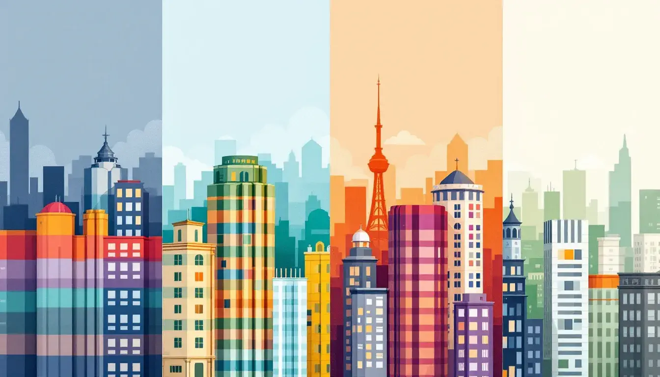
Industry Colors: Palette Choices by Sector
24 Sep 2025 · 3 min readThe colors we choose are rarely arbitrary decorations. They are, instead, fundamental to the atmosphere we wish create. Consider the steely resolve of a bank, often clad in blues and grays, projecting trustworthiness and security. Contrast that with the playful exuberance of a tech startup, splashing across the screen with vibrant corals and electric greens, signaling innovation and disruptive energy. Color selections represent deliberate messages, shaping perceptions and influencing behavior with every carefully calibrated pixel and painted wall. These choices build visual languages that speak volumes, reflecting the very character of the industries they represent. A poorly chosen palette might undermine the most brilliant strategy, while a masterful selection elevates even the most modest brand. The stories colors tell, therefore, are vital to understanding the landscape of modern commerce.
Aqua Depths suggests a calm strength, suitable for the sensitive yet progressive sector of healthcare. Pale Gray hints at sterile environments, projecting cleanliness and clinical efficiency. Juxtapose it against Aqua Green, a subtle nod to growth, vitality, and the healing power of nature. It's a hue that subtly speaks of compassion in a space where such consideration soothes anxious minds. Olive Green is more grounded, representing stability and the years of accumulated wisdom behind medical practice. Consider Slate Gray, a color that offers reassurance and the measured rhythm of a waiting room. Dark Navy brings to mind deep reserves of knowledge offering comfort to patients. The totality creates an environment that instills confidence, one that does not overpower through its presence, but rather lends its quiet strength to the industry and those whom it serves.
Diverse Palette introduces a range of hues to shape the tourism industry. Off White opens the senses and gives a feeling of crisp mornings amidst clean landscapes. Seafoam Green speaks to images of lagoons and tranquil shores, beckoning travelers deeper into aquatic dreams. Periwinkle Blue pulls us into the distance, into far-off horizons. Taupe Brown connects with earthiness, to places that are untouched and pristine. It is through nature's rawness that adventure begins. Dark Charcoal casts shadows, creating mystery and intrigue. These somber notes offset the lighter shades, grounding the palette and suggesting a more immersive, authentic journey. Combined, the spectrum presents a call to adventure, whispering tales of exploration and quiet transformation. This palette builds a sense of comfort, encouraging prospective travelers to discover, to create, and to unearth.
Warm Contrast brings a sophisticated sensibility to design. Antique White provides a foundation of timeless elegance, a canvas upon which more daring accents can play. Taupe Gray offers an understated presence, speaking to refinement and careful consideration. In contrast, Slate Gray provides a grounding presence, suggesting reliability and an air of professional judgement. Khaki Brown adds a touch of warmth, reminiscent of leather-bound notebooks and the quiet diligence of an artist at work. Dark Charcoal anchors the composition, representing precision, careful planning and a refined attention to detail. The ensemble balances the familiar and the exciting, building a rich experience that sparks the imagination while maintaining an air of calm authority. This palette helps design appeal to those deeply immersed in innovation and those who value timelessness.
Dream Engine presents a suite of colors for the finance sector. Light Gray provides the backdrop, a promise to consumers of both safety and peace-of-mind. Vibrant Turquoise adds a touch of the unexpected, a reminder of the dynamism that underpins financial markets. It's a current of energy running through solid foundations. Steel Blue brings to mind impenetrable strength, security, and a sense of traditional values. Dark Sapphire Blue evokes the serious nature of commerce and the weight of fiscal decisions with a hue that is trustworthy and resolute. Onyx provides a feeling of seriousness required for banking. Collectively, this palette conveys an image of competence and stability, inspiring trust and confidence in an industry where those qualities are paramount.
As we consider these palettes, distinct industrial personalities emerge, each conveyed through carefully orchestrated color stories. The cool confidence that characterizes the technology sector, the serene assurance instilled by healthcare, the adventurous spirit evoked by tourism, the curated innovation of design, and the trustworthy competence of finance. The subtle cues these palettes offer speak volumes about the values, ambitions, and experiences of each industry, shaping perception and inviting participation in their distinct worlds. Color is not just ornamentation, but a vital form of communication, whispering messages of intention and identity, shaping the landscape of modern commerce.