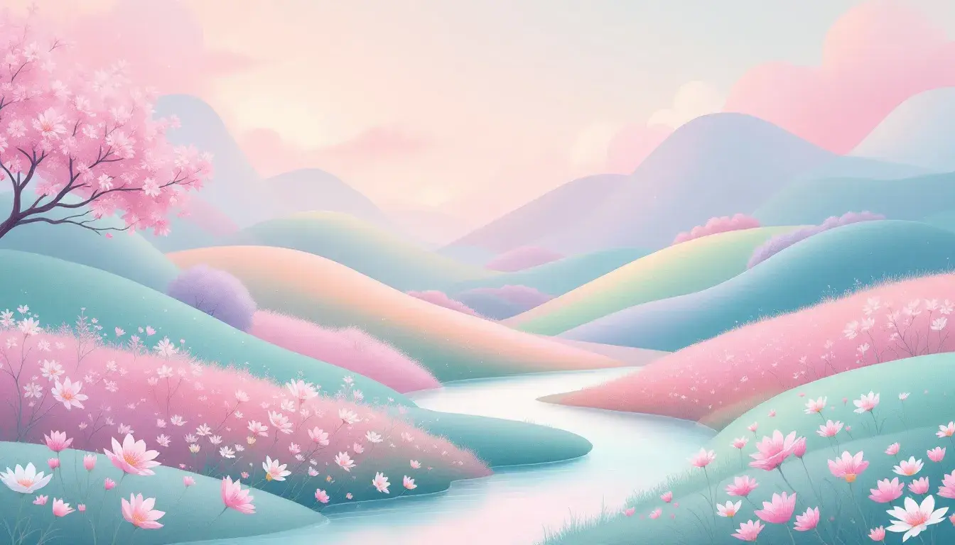
Color Psychology: The Calming Hues for Spring
24 Sep 2025 · 4 min readSpring whispers promises of renewal, a gentle thaw after winter's icy grip. It’s a season of hushed awakenings, where the world edges back to colorful life. Color, in this context, is more than just visual information; it is a key to unlocking an inner sense of peace and equilibrium. The palettes that define a calm spring go beyond simple prettiness; they offer restorative serenity. They are the visual equivalent of that first breath of fresh air after a long hibernation, a soft invitation to slow down and find stillness. Through a carefully curated selection of colors, we explore the quiet power of spring, finding the shades that soothe and revitalize.
The "Subtle Freshness" palette is an invitation to experience a garden waking from its winter slumber. Off White dominates, and its expanse suggests open space and clarity, like the canvas of a bright, airy room. The presence of Pale Yellow lends a gentle warmth; a soft sunlight filtering through sheer curtains. With Lime Green, we find traces of new growth, a hint of vitality that isn't overpowering but quietly assertive. Mustard Yellow introduces a grounded earthiness, similar to seeing patches of rich soil ready for planting. Light Gray brings visual quiet, like smooth stones resting in a shallow stream, providing an area for the eye to rest. Sky Blue evokes the expansive sky, the gentle calmness of water, and contributes to the serene mood. Crimson Red sits unexpectedly, a solitary bloom appearing amidst greenery, adding a burst of energy. Dark Gray finishes the arrangement with an anchor, resembling the shadows under trees. This palette isn’t about bold statements; it revolves around refinement. It’s adaptable for spaces designed for peaceful contemplation. The interaction of cool and warm shades fosters balance, providing a restorative atmosphere. This color story provides a backdrop that is both welcoming and serene, ideal for environments intended for relaxation.
"Teal Serenity" calls to mind the gentle movement of spring tides along a shore. Pure White serves as our point of entry, mirroring the crest of a wave right before it breaks, untouched and pristine. Light Cyan comes in with the soft, diffused light reflecting on shallow water—a color that whispers rather than shouts. Light Gray introduces a grounding presence, resembling pebbles worn smooth by the tide. The palette hinges on Bright Teal, a shade that captures the moment when sunlight and water meet, full of movement and invigoration, yet not overbearing. Muted Gray lends an air of calm, like mist hanging over the surface of the water during the sunrise, offering a reprieve from the sharper tones. Following is Dark Teal, as the deeper parts of the ocean, hinting at the unexplored potential that lies just beneath the surface. Deep Charcoal concludes the story, the solid foundation of the seabed, a reassuring sense of permanence. "Teal Serenity" offers a refuge, transporting you to a space where your sense of time eases, and you’re held by the quiet rhythm of the sea. This arrangement is perfect for individuals looking for clarity, enabling relaxation.
The "Plum Haze" palette is an abstract portrait of a garden at twilight, a balance between clarity and mystery. Pure White offers a clean slate, allowing the imagination to roam freely like diffused moon light. Pale Yellow enters like the faint glow of dusk, lending a touch of warmth to the cooler tones poised to follow. Mint Green evokes the silent, steady pulse of life continuing through the night, reminiscent of the subtle aromas of flora after rain. Light Lavender adds a layer of dreamy otherworldliness. Contrasting this is Bright Coral, unexpectedly brilliant, like a single flamboyant flower that blooms at night, adding a focal point. Teal Cyan suggests a hidden pool, reflecting the surrounding world with muted stillness. Vivid Lavender is an intriguing shade, and it suggests the rich fragrances released after dusk. Burnt Sienna suggests the sturdy earthiness, offering a comforting stability beneath the floral spectacle. Deep Slate is like observing dense shadows in the garden, providing depth and drawing you deeper into the experience. Dark Espresso solidifies the arrangement, the rich soil from which everything grows. This mix inspires creativity and introspection, lending itself to environments that nourish the creative spirit. It mirrors the subtle moment of transition, making it excellent for spaces intended for contemplation.
"Aqua Balance" is evocative of spring skies reflecting on tranquil open sea. This is immediately established with Pure White, suggesting fluffy clouds that open into endless possibilities. Light Cyan brings with it a calming influence, like a soft breeze over the water, inspiring a sense of relaxation. Dusty Tan brings in a sense of grounding, as if walking barefoot on a sandy shore. Bright Orange enters as a burst of sunlight filtering through the clouds, delivering a sense of enthusiasm. Vivid Turquoise echoes the depths of a clear sea, beckoning towards adventure. Neutral Gray reflects the smooth calmness, similar to finding stones along the sea. Royal Blue evokes a sense of adventure, calling to mind faraway places. Deep Indigo appears as a layer of mystery, mirroring unknown depths still yet to be explored. Magenta Red then interrupts with an injection of dramatic beauty, like a sudden sunset reflecting off the waves. Midnight Black completes the experience as the ocean, symbolizing rest, introspection, and a return to one's self. "Aqua Balance" is versatile, able to transform any location into a haven of quiet energy, bestowing a tranquil influence.
The true strength of these palettes lies in their subtlety. They don’t scream "spring," but whisper it, providing atmospheres that are not just beautiful but deeply restorative. These carefully attuned collections of colors encourage a renewed awareness of the world around us, providing tranquil and thoughtful interiors that promote a feeling of balance. By embracing the peaceful tones of the season, quietude is achieved, giving a welcome shift in today's hectic environment. These colors remind us that even the quietest palettes can speak volumes.