'%3e%3cpath%20fill-rule='evenodd'%20clip-rule='evenodd'%20d='M51.1303%2019.2492C50.7278%2019.913%2050.1346%2020.4426%2049.3508%2020.838C48.5669%2021.2335%2047.6172%2021.4312%2046.5014%2021.4312C44.8208%2021.4312%2043.4367%2021.0216%2042.3492%2020.2025C41.2617%2019.3833%2040.6686%2018.2394%2040.5697%2016.7706H44.4253C44.4818%2017.3355%2044.6831%2017.7804%2045.0291%2018.1052C45.3751%2018.43%2045.8164%2018.5924%2046.3531%2018.5924C46.8192%2018.5924%2047.1864%2018.4653%2047.4547%2018.2111C47.7231%2017.9569%2047.8572%2017.618%2047.8572%2017.1943C47.8572%2016.8129%2047.7337%2016.4952%2047.4865%2016.241C47.2393%2015.9867%2046.9322%2015.7784%2046.565%2015.616C46.1978%2015.4536%2045.6893%2015.2594%2045.0397%2015.0334C44.0934%2014.7086%2043.3202%2014.3944%2042.72%2014.0907C42.1197%2013.7871%2041.6042%2013.3351%2041.1735%2012.7349C40.7427%2012.1347%2040.5273%2011.3544%2040.5273%2010.394C40.5273%209.50418%2040.7533%208.73448%2041.2053%208.08481C41.6572%207.43515%2042.2821%206.93731%2043.0801%206.5913C43.8781%206.24528%2044.7925%206.07227%2045.8235%206.07227C47.49%206.07227%2048.8141%206.46771%2049.7956%207.25861C50.7772%208.04951%2051.3315%209.13698%2051.4586%2010.5211H47.5395C47.4689%2010.0268%2047.2888%209.63483%2046.9993%209.3453C46.7097%209.05578%2046.3178%208.91102%2045.8235%208.91102C45.3998%208.91102%2045.0573%209.024%2044.7961%209.24997C44.5348%209.47594%2044.4041%209.80783%2044.4041%2010.2457C44.4041%2010.5988%2044.5207%2010.8989%2044.7537%2011.146C44.9867%2011.3932%2045.2798%2011.5944%2045.6328%2011.7498C45.9859%2011.9052%2046.4944%2012.1029%2047.1581%2012.343C48.1185%2012.6678%2048.9023%2012.9891%2049.5096%2013.3069C50.1169%2013.6246%2050.6395%2014.0872%2051.0773%2014.6945C51.5151%2015.3018%2051.734%2016.0927%2051.734%2017.0672C51.734%2017.8581%2051.5328%2018.5854%2051.1303%2019.2492ZM59.0242%206.3053V21.2829H55.4016V6.3053H59.0242ZM73.9409%206.3053V9.18642H69.8734V21.2829H66.2296V9.18642H62.2046V6.3053H73.9409ZM80.7438%209.18642V12.3218H85.8069V15.0546H80.7438V18.3806H86.4425V21.2829H77.1212V6.3053H86.4425V9.18642H80.7438ZM99.667%2016.0291V21.2829H96.0444V6.3053H101.913C103.692%206.3053%20105.048%206.74665%20105.98%207.62934C106.912%208.51204%20107.378%209.7019%20107.378%2011.199C107.378%2012.1311%20107.17%2012.9609%20106.753%2013.6882C106.337%2014.4155%20105.719%2014.9875%20104.9%2015.4042C104.08%2015.8208%20103.085%2016.0291%20101.913%2016.0291H99.667ZM103.692%2011.199C103.692%209.8855%20102.965%209.22879%20101.51%209.22879H99.667V13.1268H101.51C102.965%2013.1268%20103.692%2012.4842%20103.692%2011.199ZM120.092%2018.5501H114.478L113.546%2021.2829H109.732L115.219%206.41123H119.393L124.879%2021.2829H121.024L120.092%2018.5501ZM119.16%2015.7961L117.295%2010.2881L115.41%2015.7961H119.16ZM131.555%2018.5077H136.385V21.2829H127.933V6.3053H131.555V18.5077ZM143.337%209.18642V12.3218H148.4V15.0546H143.337V18.3806H149.035V21.2829H139.714V6.3053H149.035V9.18642H143.337ZM163.507%206.3053V9.18642H159.44V21.2829H155.796V9.18642H151.771V6.3053H163.507ZM177.449%206.3053V9.18642H173.382V21.2829H169.738V9.18642H165.713V6.3053H177.449ZM184.252%209.18642V12.3218H189.315V15.0546H184.252V18.3806H189.951V21.2829H180.629V6.3053H189.951V9.18642H184.252Z'%20fill='%23EEF0ED'/%3e%3cmask%20id='mask0_3101_7327'%20style='mask-type:alpha'%20maskUnits='userSpaceOnUse'%20x='0'%20y='0'%20width='27'%20height='28'%3e%3cpath%20d='M23.8328%200.759766H2.64808C1.18559%200.759766%200%201.94535%200%203.40785V24.5925C0%2026.055%201.18559%2027.2406%202.64808%2027.2406H23.8328C25.2952%2027.2406%2026.4808%2026.055%2026.4808%2024.5925V3.40785C26.4808%201.94535%2025.2952%200.759766%2023.8328%200.759766Z'%20fill='white'/%3e%3c/mask%3e%3cg%20mask='url(%23mask0_3101_7327)'%3e%3cpath%20d='M23.8328%200.759766H2.64808C1.18559%200.759766%200%201.94535%200%203.40785V24.5925C0%2026.055%201.18559%2027.2406%202.64808%2027.2406H23.8328C25.2952%2027.2406%2026.4808%2026.055%2026.4808%2024.5925V3.40785C26.4808%201.94535%2025.2952%200.759766%2023.8328%200.759766Z'%20fill='%23D8D8D8'/%3e%3cpath%20d='M13.2404%200.759766H0V14.0001H13.2404V0.759766Z'%20fill='%238C61FF'/%3e%3cpath%20d='M13.2404%2014H0V27.2404H13.2404V14Z'%20fill='%2336C3FE'/%3e%3cpath%20d='M26.4806%2014H13.2402V27.2404H26.4806V14Z'%20fill='%236592FE'/%3e%3cpath%20d='M26.4806%200.759766H13.2402V14.0002H26.4806V0.759766Z'%20fill='%236059F7'/%3e%3c/g%3e%3c/g%3e%3cdefs%3e%3cclipPath%20id='clip0_3101_7327'%3e%3crect%20width='190'%20height='28'%20fill='white'/%3e%3c/clipPath%3e%3c/defs%3e%3c/svg%3e)
'%3e%3cpath%20d='M23.8328%200.759521H2.64808C1.18559%200.759521%200%201.94511%200%203.40761V24.5923C0%2026.0548%201.18559%2027.2404%202.64808%2027.2404H23.8328C25.2952%2027.2404%2026.4808%2026.0548%2026.4808%2024.5923V3.40761C26.4808%201.94511%2025.2952%200.759521%2023.8328%200.759521Z'%20fill='%23D8D8D8'/%3e%3cpath%20d='M13.2404%200.759521H0V13.9999H13.2404V0.759521Z'%20fill='%238C61FF'/%3e%3cpath%20d='M13.2404%2013.9998H0V27.2402H13.2404V13.9998Z'%20fill='%2336C3FE'/%3e%3cpath%20d='M26.4809%2013.9998H13.2405V27.2402H26.4809V13.9998Z'%20fill='%236592FE'/%3e%3cpath%20d='M26.4809%200.759277H13.2405V13.9997H26.4809V0.759277Z'%20fill='%236059F7'/%3e%3c/g%3e%3c/svg%3e)
Black & White: What Dominant Color Says About the Application Context
24 Sep 2025 · 3 min readColor holds sway over our perceptions, shaping atmospheres and coloring our emotions. Palettes, in their carefully considered arrangements, wield influence beyond mere aesthetics, guiding our gaze and subtly directing our understanding. Black and white, foundational to visual language, perform beyond simplicity. The choice of which tone leads becomes indicative of the context, revealing strategic intent in shaping experience, whether it concerns the sleek lines of commerce, the cool facade of technology, or the controlled narrative curated in interior design. A wash of white can impart a sense of clinical precision, while grounding with black lends gravitas. These aren’t simply backgrounds or typefaces; they offer a vital key to understanding the story a space, product, or brand seeks to tell.
In "Golden Hour," a clear dominance of Pure White suggests airiness and space, a canvas upon which other hues can play. The palette suggests a transition – the last light before dusk, captured not in harsh contrasts but subtle shifts. The grounding provided by the Jet Black at the edge hints at reliability and permanence, while other colors drift between them. Golden Yellow evokes optimism, while Light Gray provides a neutral bridge between extremes. A touch of Steel Blue whispers of corporate cool, grounding the overall scheme in pragmatism despite the promise of sunset. This palette isn't about bold pronouncements; it's about soft assurances, carefully constructed to foster trust and openness between the pristine and the grounded. The inclusion of Dark Olive whispers in the background, never loud, always present. It feels designed for the quiet confidence of a tech firm's website, or the sophisticated branding of a financial institution. This is more than a color scheme; it's an exercise in carefully measured equilibrium.
The "Rakbank Palette", anchored by a bright whiteness (although not directly displayed within the vibrant set), operates with a different set of dynamics. Here, Charcoal Gray provides a solid foundation, and allows Silver Gray to suggest modernity and efficiency. The addition of Crimson, a bold statement cutting through the neutrality, announces confidence and decisiveness. Golden Brown adds a touch of established elegance, reminiscent of boardrooms. Rose Taupe adds a certain gentle touch. This is not the lightness of a startup but the established presence of an institution. Its color story speaks to legacy and forward momentum, the careful blending of tradition and innovation. The stark contrast provides a compelling visual shorthand for the firm’s values: boldness balanced by careful planning, all set against a canvas of trustworthiness and dependability. The effect is strong and immediate, yet nuanced enough to avoid feeling aggressive. Its intention is clear, and speaks of authority and approachability combined. This set of colors would not only fit right into branding or website designs, but it could easily find its way into the real world too.
In "Clean Corporate," a field of Pure White again takes center stage, signifying transparency and openness. Dark Slate Grey forms the anchor, hinting at the underlying structure and knowledge. A touch of Golden Khaki speaks of gentle wealth. The palette is then softened by Light Grey, ensuring it doesn't feel too austere, while the inclusion of Vivid Sky Blue adds a sense of innovation and forward-thinking. There's a distinct lack of harsh edges, a preference for smooth transitions rather than stark divisions. The result is a quiet confidence, as if the organization doesn't need to shout its credentials. This palette understands the strength of understatement, using color not to shock but to reassure. It suggests a company that values clarity, communication, and a human approach to business. The overall experience is one of trust, professionalism, and careful attention to detail.
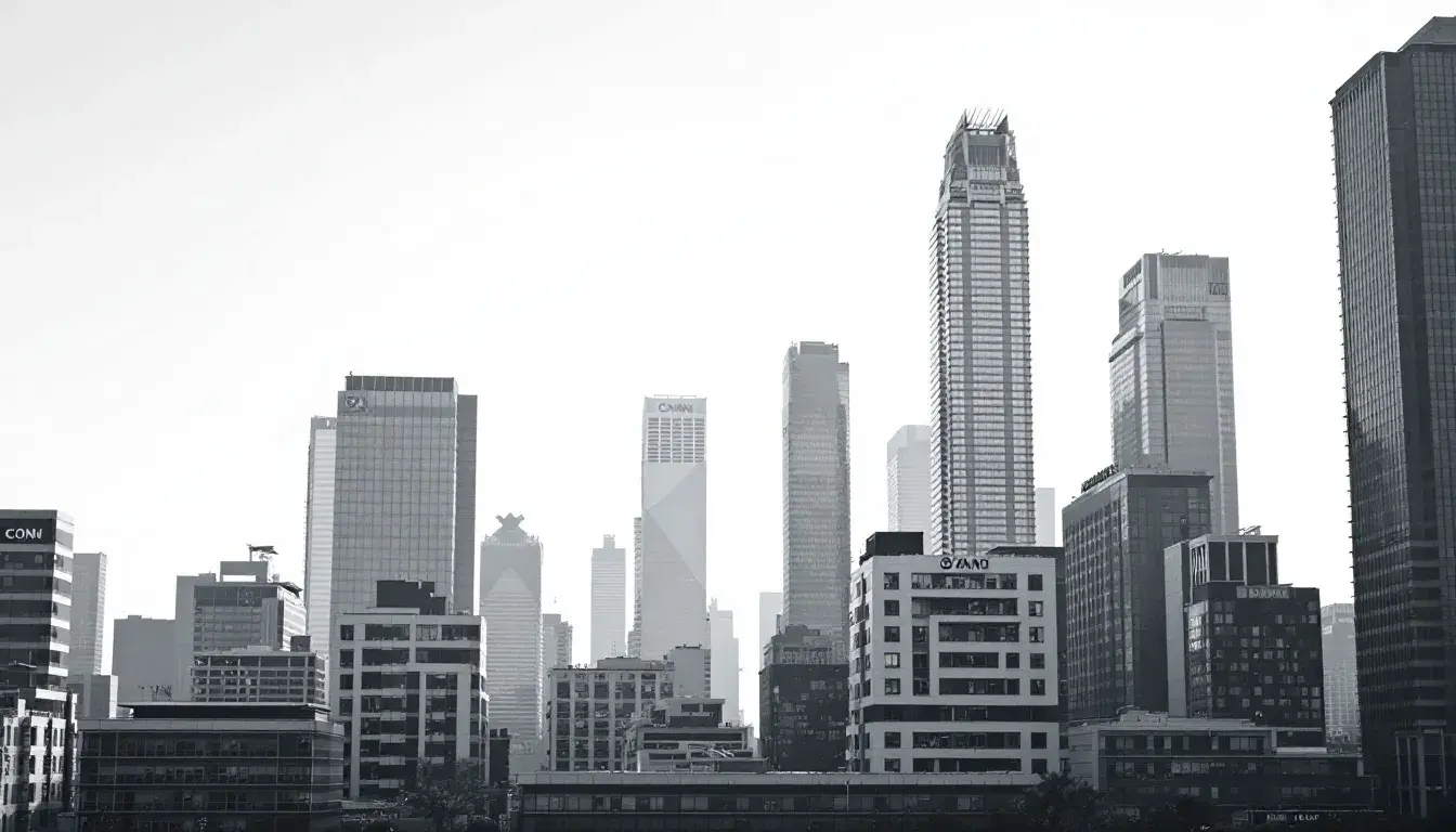
"Metro Vibes" paints a different portrait. With an assumed field of Pure White as its canvas, the palette is focused on depth via the Deep Slate Gray used throughout the design, and it feels less about airy openness and more about curated sophistication. Light Lavender Gray adds a unique, almost digital, aesthetic, while the Olive Drab grounds the whole set of colors in a downbeat sort of realism. A touch of Burgundy Brown balances, adding a warm effect. Muted Blue Gray acts as a bridge between the more energetic shades, ensuring calmness throughout. This isn't the brashness of salesmanship but the quiet hum of expertise and it is meant to be cool and calm. The palette is suited for a tech company wanting to project a sense of quiet cool, or a financial firm communicating stability despite rapid change.
Black and white palettes, far from being simply a lack of color, are deliberate choices that speak volumes. The dominance of white suggests transparency, simplicity, and openness, a desire to create space and allow other elements to shine. Meanwhile, when set against a black background, the tones turn bolder, more authoritative – they imply permanence, strength, and a willingness to assert control. Selecting one over the other is a calculated decision, a strategic move that guides both the eye and the mind. These palettes aren't passive backdrops; they're active agents shaping the world around them. Their beauty lies not just in their arrangements, but in their conscious and considered selection.