'%3e%3cpath%20fill-rule='evenodd'%20clip-rule='evenodd'%20d='M51.1303%2019.2492C50.7278%2019.913%2050.1346%2020.4426%2049.3508%2020.838C48.5669%2021.2335%2047.6172%2021.4312%2046.5014%2021.4312C44.8208%2021.4312%2043.4367%2021.0216%2042.3492%2020.2025C41.2617%2019.3833%2040.6686%2018.2394%2040.5697%2016.7706H44.4253C44.4818%2017.3355%2044.6831%2017.7804%2045.0291%2018.1052C45.3751%2018.43%2045.8164%2018.5924%2046.3531%2018.5924C46.8192%2018.5924%2047.1864%2018.4653%2047.4547%2018.2111C47.7231%2017.9569%2047.8572%2017.618%2047.8572%2017.1943C47.8572%2016.8129%2047.7337%2016.4952%2047.4865%2016.241C47.2393%2015.9867%2046.9322%2015.7784%2046.565%2015.616C46.1978%2015.4536%2045.6893%2015.2594%2045.0397%2015.0334C44.0934%2014.7086%2043.3202%2014.3944%2042.72%2014.0907C42.1197%2013.7871%2041.6042%2013.3351%2041.1735%2012.7349C40.7427%2012.1347%2040.5273%2011.3544%2040.5273%2010.394C40.5273%209.50418%2040.7533%208.73448%2041.2053%208.08481C41.6572%207.43515%2042.2821%206.93731%2043.0801%206.5913C43.8781%206.24528%2044.7925%206.07227%2045.8235%206.07227C47.49%206.07227%2048.8141%206.46771%2049.7956%207.25861C50.7772%208.04951%2051.3315%209.13698%2051.4586%2010.5211H47.5395C47.4689%2010.0268%2047.2888%209.63483%2046.9993%209.3453C46.7097%209.05578%2046.3178%208.91102%2045.8235%208.91102C45.3998%208.91102%2045.0573%209.024%2044.7961%209.24997C44.5348%209.47594%2044.4041%209.80783%2044.4041%2010.2457C44.4041%2010.5988%2044.5207%2010.8989%2044.7537%2011.146C44.9867%2011.3932%2045.2798%2011.5944%2045.6328%2011.7498C45.9859%2011.9052%2046.4944%2012.1029%2047.1581%2012.343C48.1185%2012.6678%2048.9023%2012.9891%2049.5096%2013.3069C50.1169%2013.6246%2050.6395%2014.0872%2051.0773%2014.6945C51.5151%2015.3018%2051.734%2016.0927%2051.734%2017.0672C51.734%2017.8581%2051.5328%2018.5854%2051.1303%2019.2492ZM59.0242%206.3053V21.2829H55.4016V6.3053H59.0242ZM73.9409%206.3053V9.18642H69.8734V21.2829H66.2296V9.18642H62.2046V6.3053H73.9409ZM80.7438%209.18642V12.3218H85.8069V15.0546H80.7438V18.3806H86.4425V21.2829H77.1212V6.3053H86.4425V9.18642H80.7438ZM99.667%2016.0291V21.2829H96.0444V6.3053H101.913C103.692%206.3053%20105.048%206.74665%20105.98%207.62934C106.912%208.51204%20107.378%209.7019%20107.378%2011.199C107.378%2012.1311%20107.17%2012.9609%20106.753%2013.6882C106.337%2014.4155%20105.719%2014.9875%20104.9%2015.4042C104.08%2015.8208%20103.085%2016.0291%20101.913%2016.0291H99.667ZM103.692%2011.199C103.692%209.8855%20102.965%209.22879%20101.51%209.22879H99.667V13.1268H101.51C102.965%2013.1268%20103.692%2012.4842%20103.692%2011.199ZM120.092%2018.5501H114.478L113.546%2021.2829H109.732L115.219%206.41123H119.393L124.879%2021.2829H121.024L120.092%2018.5501ZM119.16%2015.7961L117.295%2010.2881L115.41%2015.7961H119.16ZM131.555%2018.5077H136.385V21.2829H127.933V6.3053H131.555V18.5077ZM143.337%209.18642V12.3218H148.4V15.0546H143.337V18.3806H149.035V21.2829H139.714V6.3053H149.035V9.18642H143.337ZM163.507%206.3053V9.18642H159.44V21.2829H155.796V9.18642H151.771V6.3053H163.507ZM177.449%206.3053V9.18642H173.382V21.2829H169.738V9.18642H165.713V6.3053H177.449ZM184.252%209.18642V12.3218H189.315V15.0546H184.252V18.3806H189.951V21.2829H180.629V6.3053H189.951V9.18642H184.252Z'%20fill='%23EEF0ED'/%3e%3cmask%20id='mask0_3101_7327'%20style='mask-type:alpha'%20maskUnits='userSpaceOnUse'%20x='0'%20y='0'%20width='27'%20height='28'%3e%3cpath%20d='M23.8328%200.759766H2.64808C1.18559%200.759766%200%201.94535%200%203.40785V24.5925C0%2026.055%201.18559%2027.2406%202.64808%2027.2406H23.8328C25.2952%2027.2406%2026.4808%2026.055%2026.4808%2024.5925V3.40785C26.4808%201.94535%2025.2952%200.759766%2023.8328%200.759766Z'%20fill='white'/%3e%3c/mask%3e%3cg%20mask='url(%23mask0_3101_7327)'%3e%3cpath%20d='M23.8328%200.759766H2.64808C1.18559%200.759766%200%201.94535%200%203.40785V24.5925C0%2026.055%201.18559%2027.2406%202.64808%2027.2406H23.8328C25.2952%2027.2406%2026.4808%2026.055%2026.4808%2024.5925V3.40785C26.4808%201.94535%2025.2952%200.759766%2023.8328%200.759766Z'%20fill='%23D8D8D8'/%3e%3cpath%20d='M13.2404%200.759766H0V14.0001H13.2404V0.759766Z'%20fill='%238C61FF'/%3e%3cpath%20d='M13.2404%2014H0V27.2404H13.2404V14Z'%20fill='%2336C3FE'/%3e%3cpath%20d='M26.4806%2014H13.2402V27.2404H26.4806V14Z'%20fill='%236592FE'/%3e%3cpath%20d='M26.4806%200.759766H13.2402V14.0002H26.4806V0.759766Z'%20fill='%236059F7'/%3e%3c/g%3e%3c/g%3e%3cdefs%3e%3cclipPath%20id='clip0_3101_7327'%3e%3crect%20width='190'%20height='28'%20fill='white'/%3e%3c/clipPath%3e%3c/defs%3e%3c/svg%3e)
'%3e%3cpath%20d='M23.8328%200.759521H2.64808C1.18559%200.759521%200%201.94511%200%203.40761V24.5923C0%2026.0548%201.18559%2027.2404%202.64808%2027.2404H23.8328C25.2952%2027.2404%2026.4808%2026.0548%2026.4808%2024.5923V3.40761C26.4808%201.94511%2025.2952%200.759521%2023.8328%200.759521Z'%20fill='%23D8D8D8'/%3e%3cpath%20d='M13.2404%200.759521H0V13.9999H13.2404V0.759521Z'%20fill='%238C61FF'/%3e%3cpath%20d='M13.2404%2013.9998H0V27.2402H13.2404V13.9998Z'%20fill='%2336C3FE'/%3e%3cpath%20d='M26.4809%2013.9998H13.2405V27.2402H26.4809V13.9998Z'%20fill='%236592FE'/%3e%3cpath%20d='M26.4809%200.759277H13.2405V13.9997H26.4809V0.759277Z'%20fill='%236059F7'/%3e%3c/g%3e%3c/svg%3e)
Beyond Websites: Unexpected Industries Embracing Color
24 Sep 2025 · 3 min readColor moves beyond the screen, shifting atmospheres, whispering narratives in places we least expect. Forget the predictable click-throughs and splash pages. Imagine the hushed tones of a library, subtly invigorated. Picture a bustling factory, suddenly finding focus. Or perhaps a quiet research lab, sparking innovation through considered chromatic choices. The world breathes color, and certain palettes offer unforeseen potential far from the glow of our monitors, proposing unexpected life to forgotten corners.
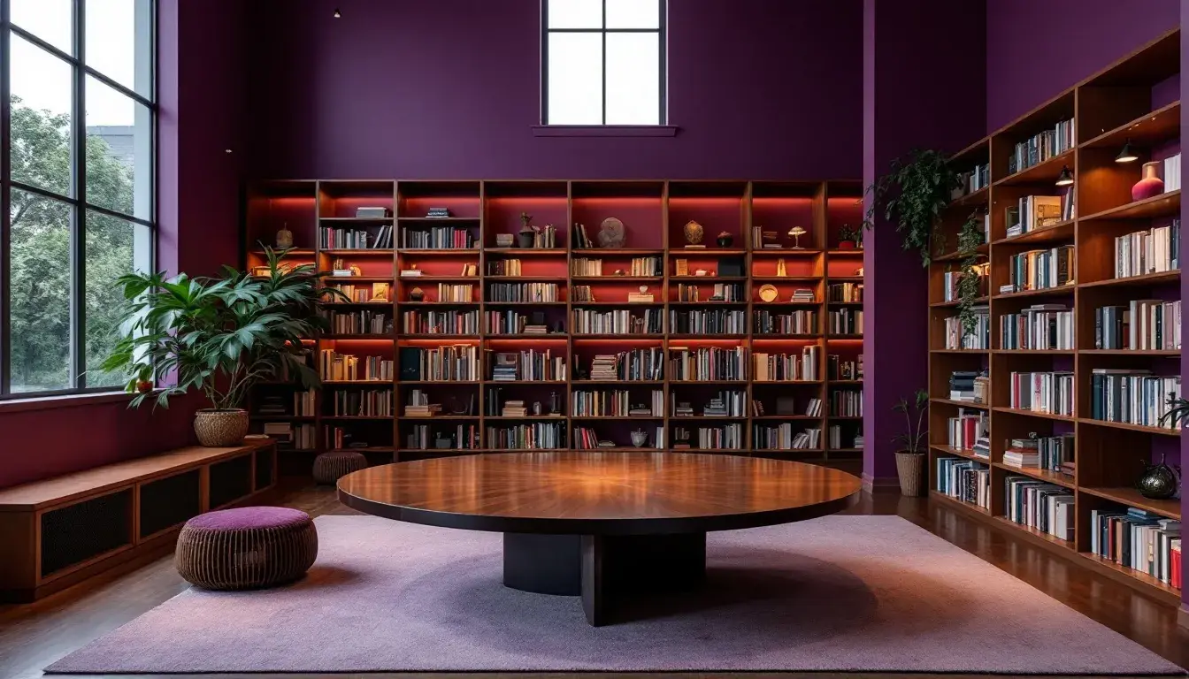
The "Earthy Contrast" 🎨 palette evokes a sense of grounded sophistication, readily placed amongst aged paper and leather-bound books or providing comfort in dimly lit spaces. Pale Beige speaks of undisturbed pages, while Neutral Gray suggests the texture of weathered stone. Plum Purple hints at hidden knowledge or a secret garden flourishing just beyond the library walls. Consider how Rosy Mauve injects a subtle romanticism—a delicate flush of excitement for discovery. This palette could reinvent a tired archive space, moving it from dusty repository to an inviting sanctuary for scholars. Imagine the Dark Gray providing a solid base for signage, juxtaposed with the lighter hues used on the walls and accent pieces. This scheme would be equally suitable for a perfumery seeking to create a sense of timeless elegance. The darker colors become sophisticated backdrops for displaying hand blown bottles, while the lighter shades lend themselves to the branding and packaging. "Earthy Contrast" breathes new life into established environments, cultivating an atmosphere of sophisticated discovery.
"Modern Contrast" 🎨 offers a composed aesthetic, one where precision is paramount. It finds a home in a minimalist workspace, or perhaps on the set of a fashion shoot. Light Lavender whispers of creativity amidst structure, while the Periwinkle Grey suggests a quiet steadiness. Immediately, one sees how Taupe Brown warms the potential sterility of such a controlled environment. This restrained warmth would add a sense of humanity to the often-unbending world of architectural visualization. If the structures are predominantly white and glass, this set of colors brings a sense of earth and belonging. Dusty Burgundy provides an element of refined, almost dangerous, intrigue, a subtle hint of transgression against the ordered space. Think of how "Modern Contrast" finds a place in a contemporary art gallery, where raw cement and strong lines create a backdrop: the art installation would become an exploration of color itself. Even within a industrial mechanic shop, this color palette could be applied to highlight tools and equipment, creating zones of focus and efficiency. A Dark Slate base ensures visual stability, while a Periwinkle Grey can be applied to organization tool boxes.
"Vibrant Serenity" ✨ evokes clarity and focus, equally balanced with energy and dynamism. Imagine a sterile hospital waiting room, transformed by these carefully selected shades. The Off White offers a sense of cleanliness and accessibility, ready to reduce anxiety. Next, picture the Emerald Green bringing life and a sense of the natural world to a space often associated with sterile procedure. Steel Blue inspires confidence; a sense that order and process are valued above all else. Consider then how "Vibrant Serenity" can transform the interior of a research laboratory, suggesting innovation while inspiring confidence in the work produced in within its walls. Dusty Rose injects an element of humanity and warmth, reminding visitors of compassion and care. Even the Dark Olive grounds the palette, imbuing the space with sophistication. Beyond the practical usage, consider how this palette could also be used to reinvigorate the world of scientific education. Children's museums could explode with excitement in this scheme.
"Autumn's Whisper" 🍂 offers an experience of serenity and grounding. This palette would be comfortably at home on the walls of a ceramics studio, where the shades effortlessly reflect the textures and tones of handcrafted objects. Off-White offers a muted backdrop, allowing the tactile qualities of clay to shine. Taupe Gray suggests the smooth feel of polished stone, grounding and balancing the overall scheme. Imagine the Golden Khaki appearing in hand-painted details on the ceramic items themselves, creating a sense of sophisticated warmth. This palette could easily reinvigorate a retirement home. Olive Brown provides a sense of earthiness and tradition, grounding the space in experience and history. A Dark Charcoal becomes an anchor; providing depth and elegance in signage and structural accents. Beyond studio spaces and assisted living facilities, this scheme could reinvigorate a bakery, creating an aesthetic that embraces warmth and freshness.
These palettes remind us that the influence of color extends far beyond the screens we encounter daily. "Earthy Contrast" creates understated sophistication in the mustiest of archives. "Modern Contrast" brings an element of visual delight to architectural visualization. "Vibrant Serenity" brings a clean sense of optimism into medical facilities. "Autumn's Whisper" creates comforting tones in a retirement home. They offer a subtle, almost silent, transformation, turning forgotten or overlooked environments into sensory experiences, improving both performance and perception.