'%3e%3cpath%20fill-rule='evenodd'%20clip-rule='evenodd'%20d='M51.1303%2019.2492C50.7278%2019.913%2050.1346%2020.4426%2049.3508%2020.838C48.5669%2021.2335%2047.6172%2021.4312%2046.5014%2021.4312C44.8208%2021.4312%2043.4367%2021.0216%2042.3492%2020.2025C41.2617%2019.3833%2040.6686%2018.2394%2040.5697%2016.7706H44.4253C44.4818%2017.3355%2044.6831%2017.7804%2045.0291%2018.1052C45.3751%2018.43%2045.8164%2018.5924%2046.3531%2018.5924C46.8192%2018.5924%2047.1864%2018.4653%2047.4547%2018.2111C47.7231%2017.9569%2047.8572%2017.618%2047.8572%2017.1943C47.8572%2016.8129%2047.7337%2016.4952%2047.4865%2016.241C47.2393%2015.9867%2046.9322%2015.7784%2046.565%2015.616C46.1978%2015.4536%2045.6893%2015.2594%2045.0397%2015.0334C44.0934%2014.7086%2043.3202%2014.3944%2042.72%2014.0907C42.1197%2013.7871%2041.6042%2013.3351%2041.1735%2012.7349C40.7427%2012.1347%2040.5273%2011.3544%2040.5273%2010.394C40.5273%209.50418%2040.7533%208.73448%2041.2053%208.08481C41.6572%207.43515%2042.2821%206.93731%2043.0801%206.5913C43.8781%206.24528%2044.7925%206.07227%2045.8235%206.07227C47.49%206.07227%2048.8141%206.46771%2049.7956%207.25861C50.7772%208.04951%2051.3315%209.13698%2051.4586%2010.5211H47.5395C47.4689%2010.0268%2047.2888%209.63483%2046.9993%209.3453C46.7097%209.05578%2046.3178%208.91102%2045.8235%208.91102C45.3998%208.91102%2045.0573%209.024%2044.7961%209.24997C44.5348%209.47594%2044.4041%209.80783%2044.4041%2010.2457C44.4041%2010.5988%2044.5207%2010.8989%2044.7537%2011.146C44.9867%2011.3932%2045.2798%2011.5944%2045.6328%2011.7498C45.9859%2011.9052%2046.4944%2012.1029%2047.1581%2012.343C48.1185%2012.6678%2048.9023%2012.9891%2049.5096%2013.3069C50.1169%2013.6246%2050.6395%2014.0872%2051.0773%2014.6945C51.5151%2015.3018%2051.734%2016.0927%2051.734%2017.0672C51.734%2017.8581%2051.5328%2018.5854%2051.1303%2019.2492ZM59.0242%206.3053V21.2829H55.4016V6.3053H59.0242ZM73.9409%206.3053V9.18642H69.8734V21.2829H66.2296V9.18642H62.2046V6.3053H73.9409ZM80.7438%209.18642V12.3218H85.8069V15.0546H80.7438V18.3806H86.4425V21.2829H77.1212V6.3053H86.4425V9.18642H80.7438ZM99.667%2016.0291V21.2829H96.0444V6.3053H101.913C103.692%206.3053%20105.048%206.74665%20105.98%207.62934C106.912%208.51204%20107.378%209.7019%20107.378%2011.199C107.378%2012.1311%20107.17%2012.9609%20106.753%2013.6882C106.337%2014.4155%20105.719%2014.9875%20104.9%2015.4042C104.08%2015.8208%20103.085%2016.0291%20101.913%2016.0291H99.667ZM103.692%2011.199C103.692%209.8855%20102.965%209.22879%20101.51%209.22879H99.667V13.1268H101.51C102.965%2013.1268%20103.692%2012.4842%20103.692%2011.199ZM120.092%2018.5501H114.478L113.546%2021.2829H109.732L115.219%206.41123H119.393L124.879%2021.2829H121.024L120.092%2018.5501ZM119.16%2015.7961L117.295%2010.2881L115.41%2015.7961H119.16ZM131.555%2018.5077H136.385V21.2829H127.933V6.3053H131.555V18.5077ZM143.337%209.18642V12.3218H148.4V15.0546H143.337V18.3806H149.035V21.2829H139.714V6.3053H149.035V9.18642H143.337ZM163.507%206.3053V9.18642H159.44V21.2829H155.796V9.18642H151.771V6.3053H163.507ZM177.449%206.3053V9.18642H173.382V21.2829H169.738V9.18642H165.713V6.3053H177.449ZM184.252%209.18642V12.3218H189.315V15.0546H184.252V18.3806H189.951V21.2829H180.629V6.3053H189.951V9.18642H184.252Z'%20fill='%23EEF0ED'/%3e%3cmask%20id='mask0_3101_7327'%20style='mask-type:alpha'%20maskUnits='userSpaceOnUse'%20x='0'%20y='0'%20width='27'%20height='28'%3e%3cpath%20d='M23.8328%200.759766H2.64808C1.18559%200.759766%200%201.94535%200%203.40785V24.5925C0%2026.055%201.18559%2027.2406%202.64808%2027.2406H23.8328C25.2952%2027.2406%2026.4808%2026.055%2026.4808%2024.5925V3.40785C26.4808%201.94535%2025.2952%200.759766%2023.8328%200.759766Z'%20fill='white'/%3e%3c/mask%3e%3cg%20mask='url(%23mask0_3101_7327)'%3e%3cpath%20d='M23.8328%200.759766H2.64808C1.18559%200.759766%200%201.94535%200%203.40785V24.5925C0%2026.055%201.18559%2027.2406%202.64808%2027.2406H23.8328C25.2952%2027.2406%2026.4808%2026.055%2026.4808%2024.5925V3.40785C26.4808%201.94535%2025.2952%200.759766%2023.8328%200.759766Z'%20fill='%23D8D8D8'/%3e%3cpath%20d='M13.2404%200.759766H0V14.0001H13.2404V0.759766Z'%20fill='%238C61FF'/%3e%3cpath%20d='M13.2404%2014H0V27.2404H13.2404V14Z'%20fill='%2336C3FE'/%3e%3cpath%20d='M26.4806%2014H13.2402V27.2404H26.4806V14Z'%20fill='%236592FE'/%3e%3cpath%20d='M26.4806%200.759766H13.2402V14.0002H26.4806V0.759766Z'%20fill='%236059F7'/%3e%3c/g%3e%3c/g%3e%3cdefs%3e%3cclipPath%20id='clip0_3101_7327'%3e%3crect%20width='190'%20height='28'%20fill='white'/%3e%3c/clipPath%3e%3c/defs%3e%3c/svg%3e)
'%3e%3cpath%20d='M23.8328%200.759521H2.64808C1.18559%200.759521%200%201.94511%200%203.40761V24.5923C0%2026.0548%201.18559%2027.2404%202.64808%2027.2404H23.8328C25.2952%2027.2404%2026.4808%2026.0548%2026.4808%2024.5923V3.40761C26.4808%201.94511%2025.2952%200.759521%2023.8328%200.759521Z'%20fill='%23D8D8D8'/%3e%3cpath%20d='M13.2404%200.759521H0V13.9999H13.2404V0.759521Z'%20fill='%238C61FF'/%3e%3cpath%20d='M13.2404%2013.9998H0V27.2402H13.2404V13.9998Z'%20fill='%2336C3FE'/%3e%3cpath%20d='M26.4809%2013.9998H13.2405V27.2402H26.4809V13.9998Z'%20fill='%236592FE'/%3e%3cpath%20d='M26.4809%200.759277H13.2405V13.9997H26.4809V0.759277Z'%20fill='%236059F7'/%3e%3c/g%3e%3c/svg%3e)
Beyond Beige: The Unexpected Rise of Olive Drab in Formal Occasions
24 Sep 2025 · 3 min readThe grand ballroom, once awash in predictable creams and predictable ivories, now whispers of a quiet revolution. Forget the safety of vanilla; a new sophistication is taking hold. Think less of champagne bubbles and more of a well-aged whiskey, poured neat. This isn't a brash takeover, but a gentle unfurling – the slow reveal of depths unexplored. Instead of blinding sparkle, imagine the glint of candlelight on antique silver. We are witnessing a shift from the expected to the exceptional, a move away from the expected, that echoes through fabrics, flowers, and even the faintest brush of color on a perfectly set stage. This transformation is not about making a loud statement, but rather adding quiet interest to create a layered atmosphere of subdued richness. The focus shifts from mere brightness to the subtle interplay of shadow and light, creating intimate and memorable moments. What once felt like a safe haven has now grown into an elegant sanctuary.
The palette of Indigo Dusk whispers secrets of twilight gatherings. Imagine a room where the last sliver of sun filters through sheer curtains, casting long shadows across polished floors. It speaks of hushed conversations, the clinking of glasses, and the shared enjoyment of music played at a level to encourage conversation. Creamy Beige acts as a canvas – a soft background against which stronger personalities can shine. Grayish Green and Muted Green introduce a sense of stillness, like a forest glen at dusk where the leaves have just started to change. These hues soften the intensity, keeping things from feeling too stark or severe. They beckon towards the natural world, reminding us of walks in the countryside and landscapes cloaked in heather; a subtle reference to a deeper, more thoughtful elegance. Then, the Deep Indigo and Midnight Blue add depth, like gazing into a star-filled sky. These darker tones are essential to ground the palette, bringing a needed contrast that speaks of seriousness of intention, rather like the weighty drape of velvet curtains or the dark wood of antique furniture. This palette suggests not just an event, but an experience—a memory to be savored long after the evening ends. Imagine this playing against modern floral motifs or as a gradient in table settings.
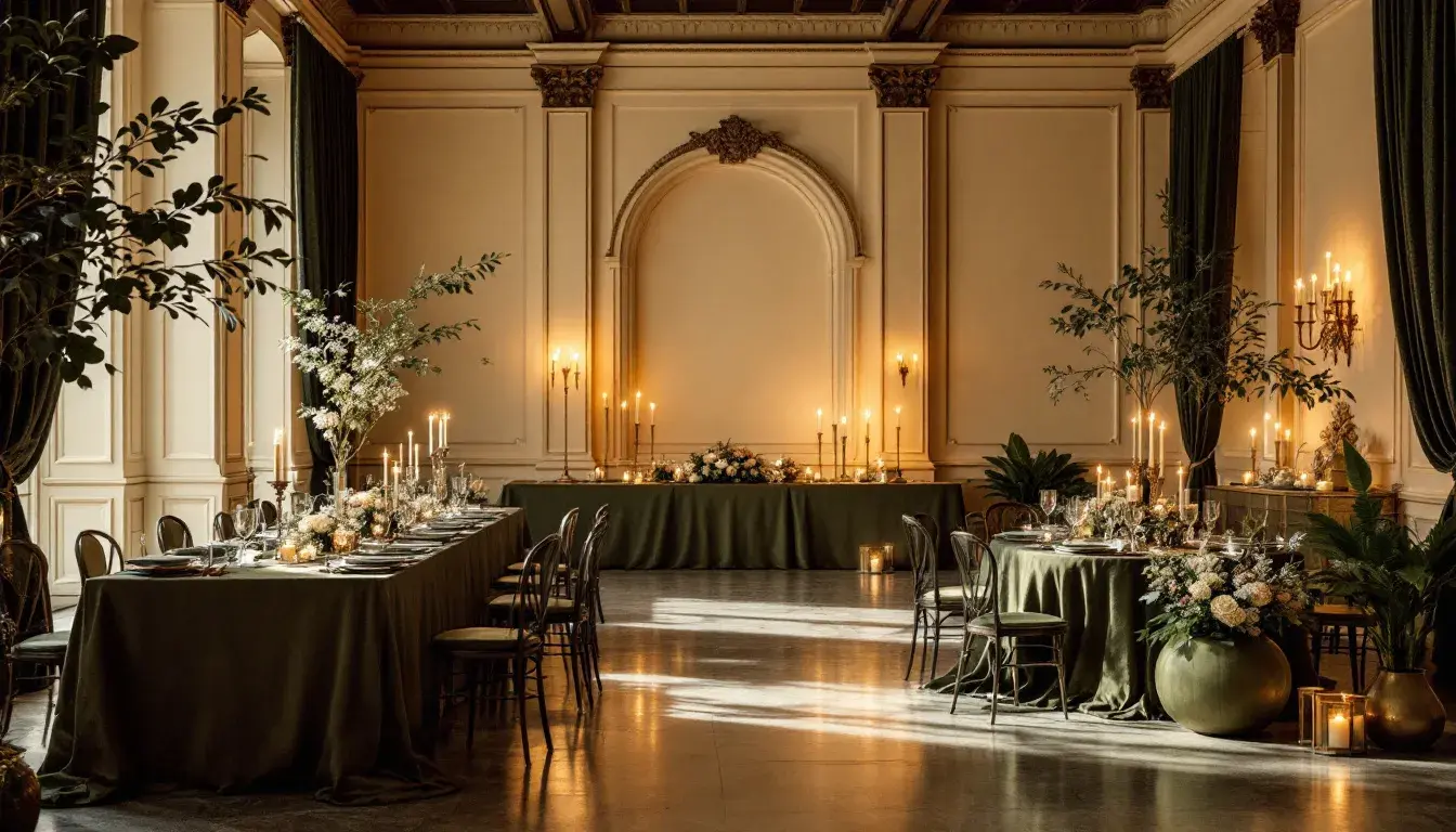
Earthy Contrast moves with deliberation away from the predictable glitter of formal occasions, finding beauty in grounded, almost stoic, hues. This is a palette that favors natural materials – raw silks, aged woods, and hand-thrown ceramics – over synthetic sparkle. It is about quiet confidence, rather than overt exuberance; less about standing out and more about fitting in seamlessly to an environment of understated luxury. Imagine a gathering in a historic home, lit by the soft glow of sconces, or an outdoor, tented wedding celebration. Off White is not just a blank canvas, it provides a gentle foundation upon which the other colors can slowly unfold. Silver Gray lends a quiet strength, reminiscent of aged pewter or weathered stone. It imparts a sense of history, of stories told over time. Khaki Brown brings warmth, conjuring images of leather-bound books and crackling fireplaces, hinting at comfort and familiarity. Slate Blue provides a counterpoint, a breath of fresh air. It suggests a glimpse of sky through a window, bringing in a sense of openness. Finally, Dark Charcoal anchors the palette, like the solid trunk of an ancient tree, grounding the other colors and giving them weight. This palette, therefore, isn't merely about aesthetics; it speaks of a deliberate attitude, a conscious choice to look beyond the conventional, and find beauty in the natural world.
With Austrian Palette, one feels the weight of tradition and the whisper of innovation. Consider a formal event within a grand, European estate, where history echoes through every room. This color scheme understands the concept of timeless elegance. Off White sets the stage for understated grandeur, offering a backdrop of clean sophistication that avoids the starkness of pure white. Mustard Yellow brings a touch of brightness, reminiscent of golden chandeliers and antique frames. This tone is not garish, but adds a subtle warmth and maturity. Slate Gray provides a grounding effect. It acts as a bridge between the lighter and darker hues, ensuring nothing feels jarring. Brick Red interjects boldness – think of the rich tones in a hand-knotted rug, or an intricate floral arrangement. This bold and unexpected pigment ensures this particular aesthetic is never one-dimensional. It adds depth and creates a focal point. Dark Sapphire acts as the foundation, offering both grounding and authority. It echoes the evening sky and speaks of solemn vows or important deals. The richness is like the deep blue found in expensive fabrics, creating an environment ripe with sophistication. This is a classic assortment of shades, perfect for a wedding or gala.
The shift away from expected neutrals signifies more than just a change in taste; it reflects a desire for richer, meaningful experiences. Color palettes are not merely decorative choices, they are instruments capable of stirring emotions, sparking memories, and setting the stage for unforgettable moments. As we begin a new era, it is vital to remember that the essence of elegance lies not in excess, but in a profound appreciation for details. By embracing these more nuanced and layered designs, we are setting the standard for a richer and more thoughtful future, one careful curation at a time.