'%3e%3cpath%20fill-rule='evenodd'%20clip-rule='evenodd'%20d='M51.1303%2019.2492C50.7278%2019.913%2050.1346%2020.4426%2049.3508%2020.838C48.5669%2021.2335%2047.6172%2021.4312%2046.5014%2021.4312C44.8208%2021.4312%2043.4367%2021.0216%2042.3492%2020.2025C41.2617%2019.3833%2040.6686%2018.2394%2040.5697%2016.7706H44.4253C44.4818%2017.3355%2044.6831%2017.7804%2045.0291%2018.1052C45.3751%2018.43%2045.8164%2018.5924%2046.3531%2018.5924C46.8192%2018.5924%2047.1864%2018.4653%2047.4547%2018.2111C47.7231%2017.9569%2047.8572%2017.618%2047.8572%2017.1943C47.8572%2016.8129%2047.7337%2016.4952%2047.4865%2016.241C47.2393%2015.9867%2046.9322%2015.7784%2046.565%2015.616C46.1978%2015.4536%2045.6893%2015.2594%2045.0397%2015.0334C44.0934%2014.7086%2043.3202%2014.3944%2042.72%2014.0907C42.1197%2013.7871%2041.6042%2013.3351%2041.1735%2012.7349C40.7427%2012.1347%2040.5273%2011.3544%2040.5273%2010.394C40.5273%209.50418%2040.7533%208.73448%2041.2053%208.08481C41.6572%207.43515%2042.2821%206.93731%2043.0801%206.5913C43.8781%206.24528%2044.7925%206.07227%2045.8235%206.07227C47.49%206.07227%2048.8141%206.46771%2049.7956%207.25861C50.7772%208.04951%2051.3315%209.13698%2051.4586%2010.5211H47.5395C47.4689%2010.0268%2047.2888%209.63483%2046.9993%209.3453C46.7097%209.05578%2046.3178%208.91102%2045.8235%208.91102C45.3998%208.91102%2045.0573%209.024%2044.7961%209.24997C44.5348%209.47594%2044.4041%209.80783%2044.4041%2010.2457C44.4041%2010.5988%2044.5207%2010.8989%2044.7537%2011.146C44.9867%2011.3932%2045.2798%2011.5944%2045.6328%2011.7498C45.9859%2011.9052%2046.4944%2012.1029%2047.1581%2012.343C48.1185%2012.6678%2048.9023%2012.9891%2049.5096%2013.3069C50.1169%2013.6246%2050.6395%2014.0872%2051.0773%2014.6945C51.5151%2015.3018%2051.734%2016.0927%2051.734%2017.0672C51.734%2017.8581%2051.5328%2018.5854%2051.1303%2019.2492ZM59.0242%206.3053V21.2829H55.4016V6.3053H59.0242ZM73.9409%206.3053V9.18642H69.8734V21.2829H66.2296V9.18642H62.2046V6.3053H73.9409ZM80.7438%209.18642V12.3218H85.8069V15.0546H80.7438V18.3806H86.4425V21.2829H77.1212V6.3053H86.4425V9.18642H80.7438ZM99.667%2016.0291V21.2829H96.0444V6.3053H101.913C103.692%206.3053%20105.048%206.74665%20105.98%207.62934C106.912%208.51204%20107.378%209.7019%20107.378%2011.199C107.378%2012.1311%20107.17%2012.9609%20106.753%2013.6882C106.337%2014.4155%20105.719%2014.9875%20104.9%2015.4042C104.08%2015.8208%20103.085%2016.0291%20101.913%2016.0291H99.667ZM103.692%2011.199C103.692%209.8855%20102.965%209.22879%20101.51%209.22879H99.667V13.1268H101.51C102.965%2013.1268%20103.692%2012.4842%20103.692%2011.199ZM120.092%2018.5501H114.478L113.546%2021.2829H109.732L115.219%206.41123H119.393L124.879%2021.2829H121.024L120.092%2018.5501ZM119.16%2015.7961L117.295%2010.2881L115.41%2015.7961H119.16ZM131.555%2018.5077H136.385V21.2829H127.933V6.3053H131.555V18.5077ZM143.337%209.18642V12.3218H148.4V15.0546H143.337V18.3806H149.035V21.2829H139.714V6.3053H149.035V9.18642H143.337ZM163.507%206.3053V9.18642H159.44V21.2829H155.796V9.18642H151.771V6.3053H163.507ZM177.449%206.3053V9.18642H173.382V21.2829H169.738V9.18642H165.713V6.3053H177.449ZM184.252%209.18642V12.3218H189.315V15.0546H184.252V18.3806H189.951V21.2829H180.629V6.3053H189.951V9.18642H184.252Z'%20fill='%23EEF0ED'/%3e%3cmask%20id='mask0_3101_7327'%20style='mask-type:alpha'%20maskUnits='userSpaceOnUse'%20x='0'%20y='0'%20width='27'%20height='28'%3e%3cpath%20d='M23.8328%200.759766H2.64808C1.18559%200.759766%200%201.94535%200%203.40785V24.5925C0%2026.055%201.18559%2027.2406%202.64808%2027.2406H23.8328C25.2952%2027.2406%2026.4808%2026.055%2026.4808%2024.5925V3.40785C26.4808%201.94535%2025.2952%200.759766%2023.8328%200.759766Z'%20fill='white'/%3e%3c/mask%3e%3cg%20mask='url(%23mask0_3101_7327)'%3e%3cpath%20d='M23.8328%200.759766H2.64808C1.18559%200.759766%200%201.94535%200%203.40785V24.5925C0%2026.055%201.18559%2027.2406%202.64808%2027.2406H23.8328C25.2952%2027.2406%2026.4808%2026.055%2026.4808%2024.5925V3.40785C26.4808%201.94535%2025.2952%200.759766%2023.8328%200.759766Z'%20fill='%23D8D8D8'/%3e%3cpath%20d='M13.2404%200.759766H0V14.0001H13.2404V0.759766Z'%20fill='%238C61FF'/%3e%3cpath%20d='M13.2404%2014H0V27.2404H13.2404V14Z'%20fill='%2336C3FE'/%3e%3cpath%20d='M26.4806%2014H13.2402V27.2404H26.4806V14Z'%20fill='%236592FE'/%3e%3cpath%20d='M26.4806%200.759766H13.2402V14.0002H26.4806V0.759766Z'%20fill='%236059F7'/%3e%3c/g%3e%3c/g%3e%3cdefs%3e%3cclipPath%20id='clip0_3101_7327'%3e%3crect%20width='190'%20height='28'%20fill='white'/%3e%3c/clipPath%3e%3c/defs%3e%3c/svg%3e)
'%3e%3cpath%20d='M23.8328%200.759521H2.64808C1.18559%200.759521%200%201.94511%200%203.40761V24.5923C0%2026.0548%201.18559%2027.2404%202.64808%2027.2404H23.8328C25.2952%2027.2404%2026.4808%2026.0548%2026.4808%2024.5923V3.40761C26.4808%201.94511%2025.2952%200.759521%2023.8328%200.759521Z'%20fill='%23D8D8D8'/%3e%3cpath%20d='M13.2404%200.759521H0V13.9999H13.2404V0.759521Z'%20fill='%238C61FF'/%3e%3cpath%20d='M13.2404%2013.9998H0V27.2402H13.2404V13.9998Z'%20fill='%2336C3FE'/%3e%3cpath%20d='M26.4809%2013.9998H13.2405V27.2402H26.4809V13.9998Z'%20fill='%236592FE'/%3e%3cpath%20d='M26.4809%200.759277H13.2405V13.9997H26.4809V0.759277Z'%20fill='%236059F7'/%3e%3c/g%3e%3c/svg%3e)
Autumn's Palette Powerhouse: Unveiling the Season's Most Frequent Color Pairings
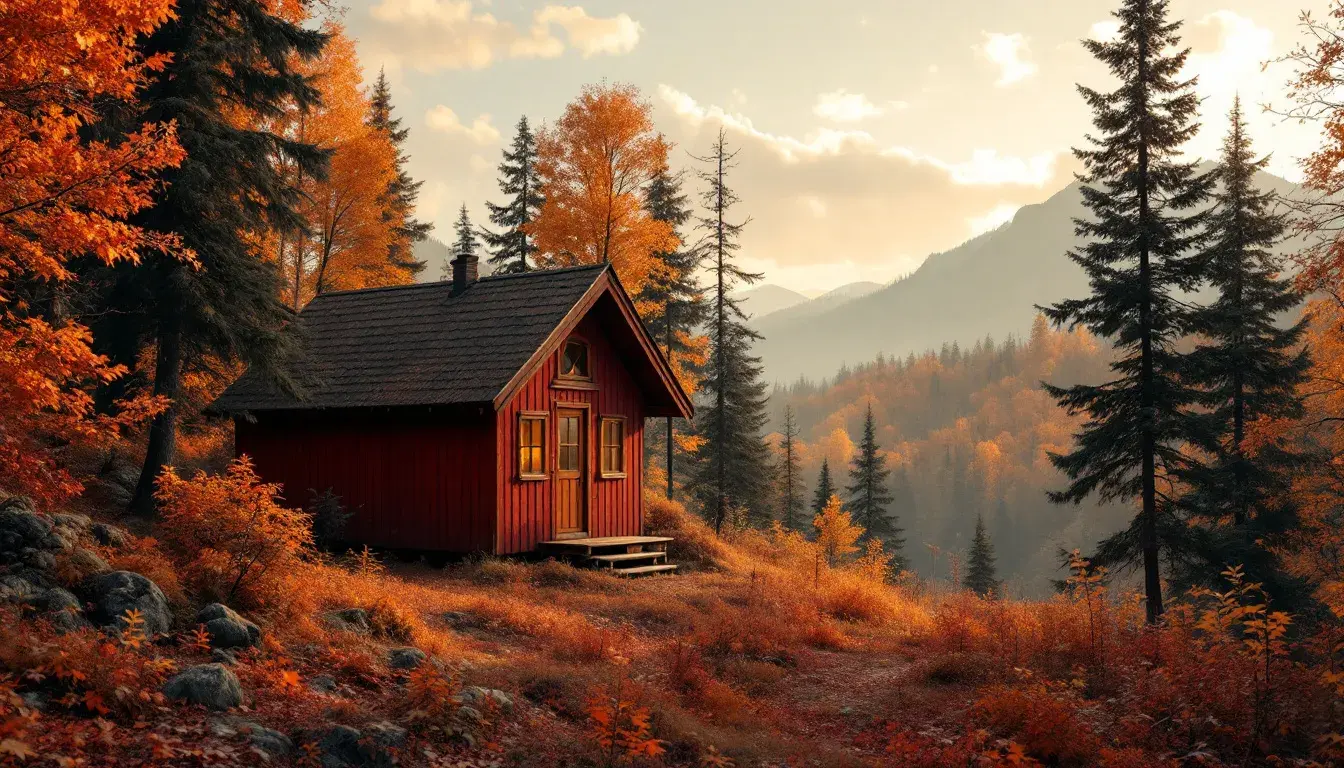
24 Sep 2025 · 3 min readAutumn breathes a particular kind of wonder into the world. The trees, in their slow, grand farewell, transform from emerald to amber, scarlet to rust. This seasonal shift isn't just a visual spectacle; it's a feeling. A sense of warmth against the chill, of gathering together as the days shorten, of savoring the last moments of abundance before winter's quiet descent. Capturing this feeling, translating it into designs that speak to the soul, requires a careful understanding of color. It's not simply about mimicking the shades of falling leaves but rather understanding how these colors interact, how they evoke emotions, and how they can be combined to create spaces and experiences that truly reflect the spirit of autumn. Let’s explore some palettes that can help connect with this potent and evocative season.
"Earthy Contrast" offers a captivating play of light and shadow. Pure White stands as a blank canvas, ready to receive the gentle blush of Pale Peach, reminiscent of a late afternoon sunset. Dusty Lavender carries a certain coolness, like the crisp air of an autumn evening, playing beautifully against the warmth of Olive Drab, reminiscent of moss-covered stones in a forest glen. Crimson Red injects a vital energy, the color of ripe berries and fiery sunsets, grounded by the stoicism of Charcoal Gray and Deep Black. The palette is neither overtly warm nor cool, but a dance between both, a testament to the transitional nature of the season itself. Imagine it woven into a rustic interior: cream-colored walls adorned with framed prints featuring botanical illustrations, an olive green velvet sofa scattered with peach-toned cushions, and a crimson throw blanket adding a touch of drama. Spaces would breathe with a relaxed elegance, encouraging quiet contemplation and comfortable gatherings amidst the turning of the leaves. This palette whispers of cozy nights spent indoors, the crackling of a fireplace, and the comforting aroma of spiced cider.
"Earthy Elegance" presents a more subdued and refined interpretation of autumn. Pure White provides a foundation of understated grace, allowing the quiet sophistication of Light Gray and Medium Gray to truly shine. These neutral tones offer a sense of calm and composure, like a misty autumn morning. Olive Green introduces a touch of organic warmth, its richness deepened by the contrasting Dark Gray. The combination is harmonious, yet quietly powerful, suggestive of a classic style that transitions from the office to a candlelit dinner. Envision this palette in an architecturally-designed space: a gallery wall with grayscale photography complemented by the subtle glow of olive green lamps and neutral, linen-covered seating. Here design becomes less about statement, more about establishing a mood of quiet confidence, akin to the crisp pages of a seasoned book waiting to be read. "Earthy Elegance" quietly celebrates the change of seasons through texture and tone.
"Industrial Harmony" departs from the traditional autumn aesthetic, offering a contemporary twist. Off White provides a soft backdrop, accented by Medium Gray and Olive Drab, which evoke a sense of understated sophistication. However, it's the inclusion of Light Steel Blue that introduces a moment of unexpected brilliance, a spark of creativity in a world of concrete and steel. Dark Charcoal grounds the palette, providing depth and gravitas. Imagine this palette applied to a modern workspace: exposed brick walls painted in Off White, complemented by brushed metal accents and pops of Light Steel Blue in the furniture and artwork. It offers a modern outlook on autumn. It’s about embracing the season's spirit of introspection and turning it into productive energy; a reminder that even in the face of change, fresh visions can emerge. "Industrial Harmony," instead of a familiar harvest celebration, becomes a statement of determination.
"Earthy Tones" is all about nature. Off-White acts as a quiet observer, letting Taupe Gray and Olive Drab tell stories of muted landscapes and aging woods. Dusty Rose whispers of the fleeting beauty found in late-blooming flowers or berries hanging heavy on branches before winter. Dark Charcoal anchors the palette, providing richness, much like shadows in an autumnal forest. These colours recall quiet moments experienced outdoors: long walks through fallen leaves, the comforting smell of damp earth. This palette would shine best in a room dedicated to retreat, somewhere with an old, well-loved armchair. Textures like aged leather, cozy wool blankets, and ceramics in organic shapes would further accentuate the mood. “Earthy Tones” is a warm, familiar hug of a palette; a gentle invitation to slow down, take a breath, and enjoy the simple beauty of autumn.
As autumn paints the world in its breathtaking hues, these palettes provide a range of interpretive keys to understanding and connecting with the season. From the relaxed elegance of "Earthy Contrast" to the muted grace of "Earthy Elegance," the unexpected innovation of "Industrial Harmony," and the familiarity of "Earthy Tones," each offers a unique perspective on the season. Each palette presents a pathway for bringing the textures and emotional complexity of autumn into tangible form. They are invitations to embrace the change, to pause and reflect, and to create spaces that mirror the beauty and tranquility of this special time of year. Consider them then, not just as color schemes, but as reflections of the season contained within a single glance.