The Psychology of Color: Mood-Based Dominant Color Analysis
23 Sep 2025 · 2 min readColor breathes life into our perceptions. It orchestrates emotions, dictates atmospheres, and silently guides our experiences. Consider a room draped in muted tones – the tranquility it offers. Contrast that with the electrifying energy of a neon-lit street – a world away, yet both defined by color's influential hand. We instinctively associate shades with feelings, building subconscious connections between the visual and the emotional. Understanding this connection opens doors to designing spaces, crafting brands, and cultivating experiences that truly speak to the human spirit. This exploration into color palettes and their dominant hues reveals the subtle art of emotional design, offering pathways to connect more deeply with our audiences.
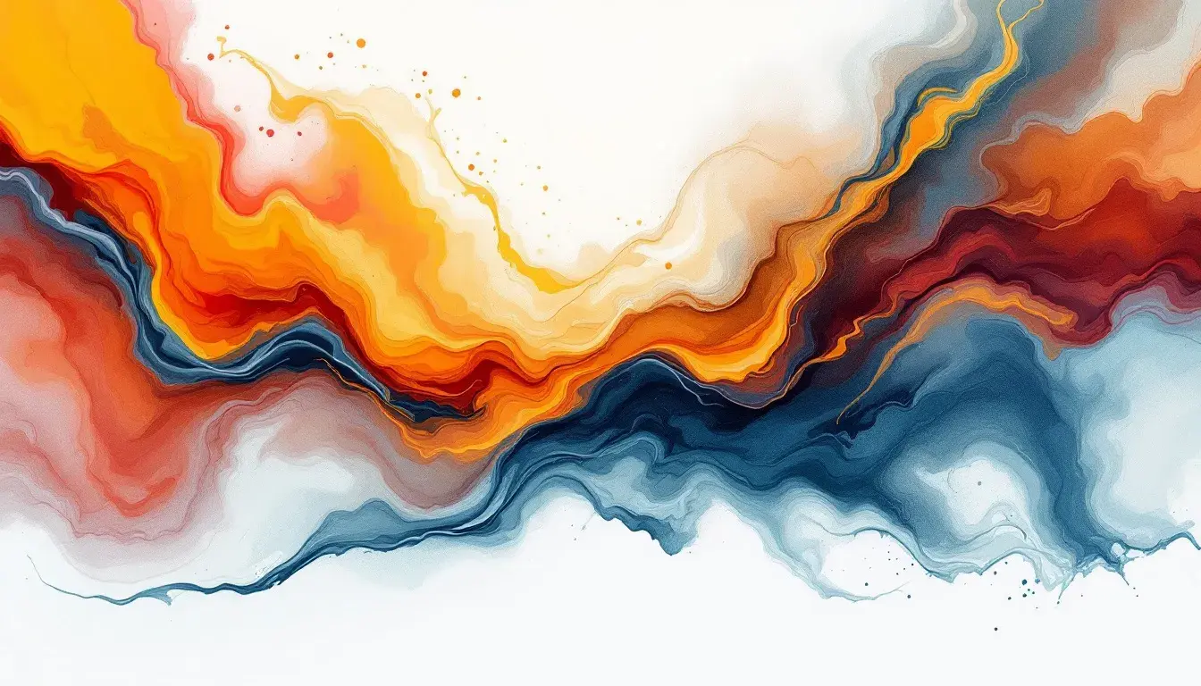
The Fiery Warmth palette instantly calls to mind crackling fireplaces and the spiced aromas of autumn. Bright Vermillion leaps forward, demanding attention like a roaring flame. It’s anchored by the grounding presence of Dark Charcoal, a shade reminiscent of cooling embers, providing a solid base from which the brighter colors can play. The interplay between Pure White and Light Gray adds a touch of refinement, like frost on pumpkin vines, keeping the intensity from overwhelming the senses. Consider the scent of cinnamon and clove; the taste of ginger snaps. This is more than a combination of colors—it’s an invitation to gather, to celebrate, to create memories during moments of transition. It's the feeling of a cozy evening at home, the joy of shared laughter, and the promise of warmth during colder months. It can be used to design festive invitations that radiate excitement, or to create a restaurant atmosphere designed for energetic gatherings.
Modern Flow is a jolt of creative energy, like the sudden spark of a new idea. Electric Blue dominates, suggesting forward motion and intellectual adventure. This vibrant hue, the color of possibility, is tempered with the practicality of Neutral Gray, which offers a sense of calm amidst the excitement. Pure White provides a clean canvas, allowing the other colors to truly pop, acting as a visual breath. Imagine brainstorming sessions in a sunlit studio, surrounded by innovative tools and collaborative spirits. This palette embodies the technological frontier; a dynamic space where imagination meets execution. The Bright Red, with its call to action, pushes the viewer to innovate. This color language encourages exploration and problem-solving, communicating a sense of both limitless potential and grounded progress. Picture a website promoting cutting-edge software, or a marketing campaign designed to launch a groundbreaking product.
The Warm Contrast palette whispers of intellectual pursuits, a library bathed in the soft glow of late-afternoon sunlight. Pure White acts as a grounding force, a backdrop for thoughtful contemplation. Ebony Black offers a sophisticated edge, reminiscent of sharply defined typefaces, while Lemon Yellow hints at intellectual curiosity, like the unexpected turn of a brilliant idea. Envision a minimalist design studio, defined by clean lines and thoughtful details. Or a gallery space designed to showcase cutting-edge contemporary art. The interplay of light and dark suggests the importance of clarity and precision, a commitment to showcasing ideas with bold confidence. The introduction of Salmon Orange and Magenta Red adds an unorthodox energy needed for growth and creativity. This particular collection of colors speaks to those who value both innovation and a sense of considered aesthetic rigor, inviting exploration and critical thought.
Color holds a profound, often subconscious, power over our perceptions. The palettes above demonstrate how specific hues evoke distinct emotional responses, effectively shaping the atmosphere of varied spaces, projects, and industries. "Fiery Warmth" kindles a feeling of joyous celebration and nostalgic comfort, "Modern Flow" cultivates a forward-thinking environment of innovation, and "Warm Contrast" inspires focused creativity with a touch of elegance. By understanding the mood evoked by particular color combinations, designers and artists gain potent tools for shaping how their work is experienced and understood, fostering deeper connections with their audiences.