'%3e%3cpath%20fill-rule='evenodd'%20clip-rule='evenodd'%20d='M51.1303%2019.2492C50.7278%2019.913%2050.1346%2020.4426%2049.3508%2020.838C48.5669%2021.2335%2047.6172%2021.4312%2046.5014%2021.4312C44.8208%2021.4312%2043.4367%2021.0216%2042.3492%2020.2025C41.2617%2019.3833%2040.6686%2018.2394%2040.5697%2016.7706H44.4253C44.4818%2017.3355%2044.6831%2017.7804%2045.0291%2018.1052C45.3751%2018.43%2045.8164%2018.5924%2046.3531%2018.5924C46.8192%2018.5924%2047.1864%2018.4653%2047.4547%2018.2111C47.7231%2017.9569%2047.8572%2017.618%2047.8572%2017.1943C47.8572%2016.8129%2047.7337%2016.4952%2047.4865%2016.241C47.2393%2015.9867%2046.9322%2015.7784%2046.565%2015.616C46.1978%2015.4536%2045.6893%2015.2594%2045.0397%2015.0334C44.0934%2014.7086%2043.3202%2014.3944%2042.72%2014.0907C42.1197%2013.7871%2041.6042%2013.3351%2041.1735%2012.7349C40.7427%2012.1347%2040.5273%2011.3544%2040.5273%2010.394C40.5273%209.50418%2040.7533%208.73448%2041.2053%208.08481C41.6572%207.43515%2042.2821%206.93731%2043.0801%206.5913C43.8781%206.24528%2044.7925%206.07227%2045.8235%206.07227C47.49%206.07227%2048.8141%206.46771%2049.7956%207.25861C50.7772%208.04951%2051.3315%209.13698%2051.4586%2010.5211H47.5395C47.4689%2010.0268%2047.2888%209.63483%2046.9993%209.3453C46.7097%209.05578%2046.3178%208.91102%2045.8235%208.91102C45.3998%208.91102%2045.0573%209.024%2044.7961%209.24997C44.5348%209.47594%2044.4041%209.80783%2044.4041%2010.2457C44.4041%2010.5988%2044.5207%2010.8989%2044.7537%2011.146C44.9867%2011.3932%2045.2798%2011.5944%2045.6328%2011.7498C45.9859%2011.9052%2046.4944%2012.1029%2047.1581%2012.343C48.1185%2012.6678%2048.9023%2012.9891%2049.5096%2013.3069C50.1169%2013.6246%2050.6395%2014.0872%2051.0773%2014.6945C51.5151%2015.3018%2051.734%2016.0927%2051.734%2017.0672C51.734%2017.8581%2051.5328%2018.5854%2051.1303%2019.2492ZM59.0242%206.3053V21.2829H55.4016V6.3053H59.0242ZM73.9409%206.3053V9.18642H69.8734V21.2829H66.2296V9.18642H62.2046V6.3053H73.9409ZM80.7438%209.18642V12.3218H85.8069V15.0546H80.7438V18.3806H86.4425V21.2829H77.1212V6.3053H86.4425V9.18642H80.7438ZM99.667%2016.0291V21.2829H96.0444V6.3053H101.913C103.692%206.3053%20105.048%206.74665%20105.98%207.62934C106.912%208.51204%20107.378%209.7019%20107.378%2011.199C107.378%2012.1311%20107.17%2012.9609%20106.753%2013.6882C106.337%2014.4155%20105.719%2014.9875%20104.9%2015.4042C104.08%2015.8208%20103.085%2016.0291%20101.913%2016.0291H99.667ZM103.692%2011.199C103.692%209.8855%20102.965%209.22879%20101.51%209.22879H99.667V13.1268H101.51C102.965%2013.1268%20103.692%2012.4842%20103.692%2011.199ZM120.092%2018.5501H114.478L113.546%2021.2829H109.732L115.219%206.41123H119.393L124.879%2021.2829H121.024L120.092%2018.5501ZM119.16%2015.7961L117.295%2010.2881L115.41%2015.7961H119.16ZM131.555%2018.5077H136.385V21.2829H127.933V6.3053H131.555V18.5077ZM143.337%209.18642V12.3218H148.4V15.0546H143.337V18.3806H149.035V21.2829H139.714V6.3053H149.035V9.18642H143.337ZM163.507%206.3053V9.18642H159.44V21.2829H155.796V9.18642H151.771V6.3053H163.507ZM177.449%206.3053V9.18642H173.382V21.2829H169.738V9.18642H165.713V6.3053H177.449ZM184.252%209.18642V12.3218H189.315V15.0546H184.252V18.3806H189.951V21.2829H180.629V6.3053H189.951V9.18642H184.252Z'%20fill='%23EEF0ED'/%3e%3cmask%20id='mask0_3101_7327'%20style='mask-type:alpha'%20maskUnits='userSpaceOnUse'%20x='0'%20y='0'%20width='27'%20height='28'%3e%3cpath%20d='M23.8328%200.759766H2.64808C1.18559%200.759766%200%201.94535%200%203.40785V24.5925C0%2026.055%201.18559%2027.2406%202.64808%2027.2406H23.8328C25.2952%2027.2406%2026.4808%2026.055%2026.4808%2024.5925V3.40785C26.4808%201.94535%2025.2952%200.759766%2023.8328%200.759766Z'%20fill='white'/%3e%3c/mask%3e%3cg%20mask='url(%23mask0_3101_7327)'%3e%3cpath%20d='M23.8328%200.759766H2.64808C1.18559%200.759766%200%201.94535%200%203.40785V24.5925C0%2026.055%201.18559%2027.2406%202.64808%2027.2406H23.8328C25.2952%2027.2406%2026.4808%2026.055%2026.4808%2024.5925V3.40785C26.4808%201.94535%2025.2952%200.759766%2023.8328%200.759766Z'%20fill='%23D8D8D8'/%3e%3cpath%20d='M13.2404%200.759766H0V14.0001H13.2404V0.759766Z'%20fill='%238C61FF'/%3e%3cpath%20d='M13.2404%2014H0V27.2404H13.2404V14Z'%20fill='%2336C3FE'/%3e%3cpath%20d='M26.4806%2014H13.2402V27.2404H26.4806V14Z'%20fill='%236592FE'/%3e%3cpath%20d='M26.4806%200.759766H13.2402V14.0002H26.4806V0.759766Z'%20fill='%236059F7'/%3e%3c/g%3e%3c/g%3e%3cdefs%3e%3cclipPath%20id='clip0_3101_7327'%3e%3crect%20width='190'%20height='28'%20fill='white'/%3e%3c/clipPath%3e%3c/defs%3e%3c/svg%3e)
'%3e%3cpath%20d='M23.8328%200.759521H2.64808C1.18559%200.759521%200%201.94511%200%203.40761V24.5923C0%2026.0548%201.18559%2027.2404%202.64808%2027.2404H23.8328C25.2952%2027.2404%2026.4808%2026.0548%2026.4808%2024.5923V3.40761C26.4808%201.94511%2025.2952%200.759521%2023.8328%200.759521Z'%20fill='%23D8D8D8'/%3e%3cpath%20d='M13.2404%200.759521H0V13.9999H13.2404V0.759521Z'%20fill='%238C61FF'/%3e%3cpath%20d='M13.2404%2013.9998H0V27.2402H13.2404V13.9998Z'%20fill='%2336C3FE'/%3e%3cpath%20d='M26.4809%2013.9998H13.2405V27.2402H26.4809V13.9998Z'%20fill='%236592FE'/%3e%3cpath%20d='M26.4809%200.759277H13.2405V13.9997H26.4809V0.759277Z'%20fill='%236059F7'/%3e%3c/g%3e%3c/svg%3e)
Most Versatile Color: What Hue Appears in the Most Palettes?
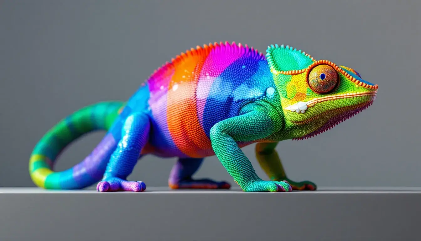
23 Sep 2025 · 5 min readColor breathes life into the mundane. It shapes our perceptions, directs our gaze, and whispers narratives unseen in the stark contrast of black and white. The dance of hues isn't merely decorative; it's a fundamental language, spoken fluently by our subconscious. A single shade can transport us to a sun-drenched meadow, ground us in the cool depths of a forest, or ignite a spark of urban energy. By studying the repetition of colors across diverse palettes, we seek to understand not just popularity, but a deeper versatility – a hue that adapts, complements, and elevates across a multitude of visual landscapes. This exploration isn’t about finding the best color, but rather, revealing the chameleon – the shade capable of whispering different stories in different tongues. It's about identifying that singular tone that can be both anchor and accent, quiet observer and bold protagonist in the ever-evolving drama of visual design.
Poli Pilot projects an image of restrained power. The Off-White suggests clean slates, the possibilities of a half-formed idea waiting to be brought to life. Medium Gray anchors the palette with a sense of corporate reliability, a steady hand on the controls. Then comes Tan Brown, an earthy counterpoint that hints at heritage, at grounded experience informing even the most forward-thinking endeavors. Crimson Red, a sharp exclamation point, arrives as an element of passionate intensity, indicating ambition and drive – the heart of the operation, beating strong. Finally, Dark Charcoal offers a counterweight, grounding the flight in something tangible, a sense of sophistication in the face of innovation. This palette is particularly well-suited to professional environments seeking a balance of approachability and authority. The Crimson Red adds a spark of intrigue, a bold statement in an otherwise conservative landscape, making it a versatile accent for drawing the eye without overwhelming the senses. The color harmony feels like a well-tailored suit, dependable and refined, yet with a dash of personality revealed in the pop of color. It's a palette that says, "We're serious, but not afraid to take risks". The neutrality of Off-White provides endless canvas for bold typography or striking imagery, while the deeper tones ensure a sense of depth and stability. Imagine this scheme applied to a conference room setting – the Off-White on the walls, the Medium Gray in the furnishings, the Tan Brown subtly integrated in the wood finishes. Against this backdrop, the Crimson Red makes a powerful statement in the company logo or presentation materials. It's a palette that inspires confidence and professionalism. This palette's versatility hinges on its ability to communicate both ambition and groundedness, making it a useful communication tool for business wanting to project seriousness.
Earthy Greens whispers of quiet afternoons spent wandering through dappled sunlight. Light Beige lends a warmth, reminiscent of sun-baked earth or weathered linen. Sage Green evokes a feeling of restorative calm, a world away from the digital clamor of modern life. Slate Gray introduces a subtle coolness, like the smooth surface of a river stone, grounding the palette and preventing it from becoming cloying. Muted Moss adds depth and complexity, mimicking the texture of a forest floor, while Deep Forest Green provides a touch of dramatic intensity. The overall effect is one of understated elegance, a palette that feels both timeless and incredibly relevant. Its appeal stems from its ability to evoke a sense of sanctuary, an escape from the ordinary. It’s naturally ideal for spaces designed for relaxation and rejuvenation. Imagine this palette in a bedroom – the Light Beige on the walls, the Sage Green in the bedding, the Slate Gray in subtle accents like lamps or vases. The Muted Moss could find its place in a textured rug, while the Deep Forest Green adds accents in artwork. The palette is equally at home in more social settings, lending a warm and inviting atmosphere to living rooms or even workspaces. Its strength lies in its ability to create a sense of connection to the natural world. Here, the versatility resides in its ability to translate across seasons; it evokes the lushness of spring and summer as equally as it fits with the slower rhythms of autumn and winter. The Light Beige acts a neutral stage with which to play with various natural textures, whether in woven textiles, wood grains, or roughly hewn stone. The interplay of greens invites a sense of natural growth, a symbol that resonates whether applied to personal development or the evolution of a brand.
Agile Fun exudes a playful energy, an invitation to creativity and dynamic action. Pale Blue Green offers a breath of fresh air, like the first glimpse of open water on a summer day. The shock of Electric Cyan jolts the senses, sparking curiosity and a sense of boundless possibility. The grounding combination of Army Green introduces a layer of practicality, a level-headedness that tempers the more exuberant hues. Then comes Deep Evergreen, a reminder of nature’s resilience and enduring strength. Dark Moss Green whispers of secrets hidden in the woods, adding depth and complexity to the overall composition. The palette vibrates with a youthful enthusiasm, making it perfectly suited for projects that aim to capture this energy. It's a visual embodiment of innovative thinking, of pushing boundaries and embracing the unexpected. This palette's strength lies in its ability to balance the bold and the calm, the familiar and the experimental. Imagine this palette used to design a collaborative workspace – the Pale Blue Green on the walls, stimulating focus and concentration. The Electric Cyan adds excitement to accent walls or creative brainstorming zones. The various tones of green provide grounding for more practical spaces, such as meeting rooms or quiet corners. It’s a palette that fosters creativity and promotes a sense of vibrant activity. Think of an advertising campaign targeting a younger demographic, where the Electric Cyan grabs attention and the greens offer a grounding contrast. This range is not just about vibrancy, it’s about agility. The colors interplay offer adaptability. The Pale Blue Green can exist serenely as a backdrop, while Electric Cyan jumps forward to grab focus. What makes the darker green tones versatile is their quality to work as reliable anchors.
Bold Contrast speaks of decisive action and confident expression. Off White lays a foundation of clarity, a space for ideas to take shape. Dusty Blue introduces a sense of sophistication, recalling the elegance of a tailored suit. Vivid Blue bursts forth with energy and dynamism, a visual announcement of innovative approaches. Mauve Gray offers a touch of refinement, preventing the palette from becoming overly assertive. The inclusion of Dark Indigo completes the composition, giving the palette a luxurious depth. This creates an atmosphere of refined confidence, ideal for professional settings desiring a bold yet considered image. Use of these tones in a company brochure would convey a strong brand message. Off White delivers a clean canvas, while the more intense blues add a sense of vibrancy and clear communication. Mauve Gray stops the palette from falling into corporate cliché, adding subtle individuality. Imagine a website design using this color scheme; the Off White as a background, with strong blue graphic elements creating a memorable and professional design. It creates an impression of credibility and innovation, the two crucial elements to engage interest. This selection’s versatility goes down to the ability to walk a tightrope between dynamism and professionalism. The blue's inherent association with trust, coupled with the subtle mauve to offset the colder feel, creates a space that is interesting without being garish. The Off White offers a clean stage on which elements can take shape around it.
Across these palettes, a thread of adaptability emerges. The palette analyses highlight the value of grounded tones, those colors that offer a canvas or an anchor allowing brighter colors to pop and resonate. The interplay among these different shades suggests how palettes function like ecosystems, in which colors play off one another to communicate a range of messages and experiences. Exploring a palette goes beyond what is aesthetically pleasing, and asks the question; what mood is this conjuring, what story is this telling? It is through this approach that we can identify the through lines between seemingly disparate tastes, and perhaps move toward a more complete knowledge of the way color influences our understanding of the world. The most versatile hues are not necessarily the safest, or the most neutral, but those that invite a dynamic interplay, enabling a range of creative possibilities.