'%3e%3cpath%20fill-rule='evenodd'%20clip-rule='evenodd'%20d='M51.1303%2019.2492C50.7278%2019.913%2050.1346%2020.4426%2049.3508%2020.838C48.5669%2021.2335%2047.6172%2021.4312%2046.5014%2021.4312C44.8208%2021.4312%2043.4367%2021.0216%2042.3492%2020.2025C41.2617%2019.3833%2040.6686%2018.2394%2040.5697%2016.7706H44.4253C44.4818%2017.3355%2044.6831%2017.7804%2045.0291%2018.1052C45.3751%2018.43%2045.8164%2018.5924%2046.3531%2018.5924C46.8192%2018.5924%2047.1864%2018.4653%2047.4547%2018.2111C47.7231%2017.9569%2047.8572%2017.618%2047.8572%2017.1943C47.8572%2016.8129%2047.7337%2016.4952%2047.4865%2016.241C47.2393%2015.9867%2046.9322%2015.7784%2046.565%2015.616C46.1978%2015.4536%2045.6893%2015.2594%2045.0397%2015.0334C44.0934%2014.7086%2043.3202%2014.3944%2042.72%2014.0907C42.1197%2013.7871%2041.6042%2013.3351%2041.1735%2012.7349C40.7427%2012.1347%2040.5273%2011.3544%2040.5273%2010.394C40.5273%209.50418%2040.7533%208.73448%2041.2053%208.08481C41.6572%207.43515%2042.2821%206.93731%2043.0801%206.5913C43.8781%206.24528%2044.7925%206.07227%2045.8235%206.07227C47.49%206.07227%2048.8141%206.46771%2049.7956%207.25861C50.7772%208.04951%2051.3315%209.13698%2051.4586%2010.5211H47.5395C47.4689%2010.0268%2047.2888%209.63483%2046.9993%209.3453C46.7097%209.05578%2046.3178%208.91102%2045.8235%208.91102C45.3998%208.91102%2045.0573%209.024%2044.7961%209.24997C44.5348%209.47594%2044.4041%209.80783%2044.4041%2010.2457C44.4041%2010.5988%2044.5207%2010.8989%2044.7537%2011.146C44.9867%2011.3932%2045.2798%2011.5944%2045.6328%2011.7498C45.9859%2011.9052%2046.4944%2012.1029%2047.1581%2012.343C48.1185%2012.6678%2048.9023%2012.9891%2049.5096%2013.3069C50.1169%2013.6246%2050.6395%2014.0872%2051.0773%2014.6945C51.5151%2015.3018%2051.734%2016.0927%2051.734%2017.0672C51.734%2017.8581%2051.5328%2018.5854%2051.1303%2019.2492ZM59.0242%206.3053V21.2829H55.4016V6.3053H59.0242ZM73.9409%206.3053V9.18642H69.8734V21.2829H66.2296V9.18642H62.2046V6.3053H73.9409ZM80.7438%209.18642V12.3218H85.8069V15.0546H80.7438V18.3806H86.4425V21.2829H77.1212V6.3053H86.4425V9.18642H80.7438ZM99.667%2016.0291V21.2829H96.0444V6.3053H101.913C103.692%206.3053%20105.048%206.74665%20105.98%207.62934C106.912%208.51204%20107.378%209.7019%20107.378%2011.199C107.378%2012.1311%20107.17%2012.9609%20106.753%2013.6882C106.337%2014.4155%20105.719%2014.9875%20104.9%2015.4042C104.08%2015.8208%20103.085%2016.0291%20101.913%2016.0291H99.667ZM103.692%2011.199C103.692%209.8855%20102.965%209.22879%20101.51%209.22879H99.667V13.1268H101.51C102.965%2013.1268%20103.692%2012.4842%20103.692%2011.199ZM120.092%2018.5501H114.478L113.546%2021.2829H109.732L115.219%206.41123H119.393L124.879%2021.2829H121.024L120.092%2018.5501ZM119.16%2015.7961L117.295%2010.2881L115.41%2015.7961H119.16ZM131.555%2018.5077H136.385V21.2829H127.933V6.3053H131.555V18.5077ZM143.337%209.18642V12.3218H148.4V15.0546H143.337V18.3806H149.035V21.2829H139.714V6.3053H149.035V9.18642H143.337ZM163.507%206.3053V9.18642H159.44V21.2829H155.796V9.18642H151.771V6.3053H163.507ZM177.449%206.3053V9.18642H173.382V21.2829H169.738V9.18642H165.713V6.3053H177.449ZM184.252%209.18642V12.3218H189.315V15.0546H184.252V18.3806H189.951V21.2829H180.629V6.3053H189.951V9.18642H184.252Z'%20fill='%23EEF0ED'/%3e%3cmask%20id='mask0_3101_7327'%20style='mask-type:alpha'%20maskUnits='userSpaceOnUse'%20x='0'%20y='0'%20width='27'%20height='28'%3e%3cpath%20d='M23.8328%200.759766H2.64808C1.18559%200.759766%200%201.94535%200%203.40785V24.5925C0%2026.055%201.18559%2027.2406%202.64808%2027.2406H23.8328C25.2952%2027.2406%2026.4808%2026.055%2026.4808%2024.5925V3.40785C26.4808%201.94535%2025.2952%200.759766%2023.8328%200.759766Z'%20fill='white'/%3e%3c/mask%3e%3cg%20mask='url(%23mask0_3101_7327)'%3e%3cpath%20d='M23.8328%200.759766H2.64808C1.18559%200.759766%200%201.94535%200%203.40785V24.5925C0%2026.055%201.18559%2027.2406%202.64808%2027.2406H23.8328C25.2952%2027.2406%2026.4808%2026.055%2026.4808%2024.5925V3.40785C26.4808%201.94535%2025.2952%200.759766%2023.8328%200.759766Z'%20fill='%23D8D8D8'/%3e%3cpath%20d='M13.2404%200.759766H0V14.0001H13.2404V0.759766Z'%20fill='%238C61FF'/%3e%3cpath%20d='M13.2404%2014H0V27.2404H13.2404V14Z'%20fill='%2336C3FE'/%3e%3cpath%20d='M26.4806%2014H13.2402V27.2404H26.4806V14Z'%20fill='%236592FE'/%3e%3cpath%20d='M26.4806%200.759766H13.2402V14.0002H26.4806V0.759766Z'%20fill='%236059F7'/%3e%3c/g%3e%3c/g%3e%3cdefs%3e%3cclipPath%20id='clip0_3101_7327'%3e%3crect%20width='190'%20height='28'%20fill='white'/%3e%3c/clipPath%3e%3c/defs%3e%3c/svg%3e)
'%3e%3cpath%20d='M23.8328%200.759521H2.64808C1.18559%200.759521%200%201.94511%200%203.40761V24.5923C0%2026.0548%201.18559%2027.2404%202.64808%2027.2404H23.8328C25.2952%2027.2404%2026.4808%2026.0548%2026.4808%2024.5923V3.40761C26.4808%201.94511%2025.2952%200.759521%2023.8328%200.759521Z'%20fill='%23D8D8D8'/%3e%3cpath%20d='M13.2404%200.759521H0V13.9999H13.2404V0.759521Z'%20fill='%238C61FF'/%3e%3cpath%20d='M13.2404%2013.9998H0V27.2402H13.2404V13.9998Z'%20fill='%2336C3FE'/%3e%3cpath%20d='M26.4809%2013.9998H13.2405V27.2402H26.4809V13.9998Z'%20fill='%236592FE'/%3e%3cpath%20d='M26.4809%200.759277H13.2405V13.9997H26.4809V0.759277Z'%20fill='%236059F7'/%3e%3c/g%3e%3c/svg%3e)
Echoes of Autumn: Finding the Most Common 'Suitable Rooms'
23 Sep 2025 · 3 min readColor holds memory. It whispers of seasons past, of light shifting through leaves, of the particular weight of the air before a storm. These aren't just shades we see; they are the echoes of experiences. As autumn drapes itself across the world, transforming landscapes into mosaics of warm hues and muted tones, our spaces often seek to mirror this profound transformation. This isn't merely about aesthetics; it's about creating environments that nurture, comfort, and inspire during a season of change and reflection. Exploring various color palettes helps to underscore the feelings that arise from simply being present in the season, and more importantly, the spaces we want to be found in during it. Through these palettes, we find pathways into rooms that not only reflect but actively participate in the autumnal narrative.
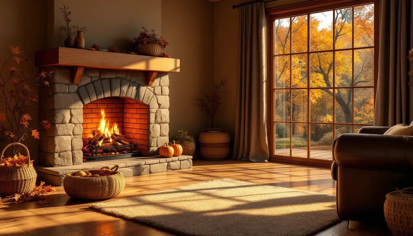
The Earthy Greens 🌳 palette evokes a sense of sheltered tranquility, reminiscent of walking through a forest at twilight, the last rays of sun filtering through the canopy. Bright Yellow hints at the linger of summer, a vibrant memory against the backdrop of cooler days. Grayish Green brings a sense of organic calm, like moss-covered stones or the quiet rustle of leaves underfoot. Tan Brown anchors the palette, providing an element of grounding stability, akin to the rich soil beneath the trees. The inclusion of Burnt Sienna speaks of the harvest, of pumpkins ripening in the fields under a darkening sky, and the warm hearths that become gathering places as the evening fall sooner. Dark Teal acts as a counterpoint, hinting at the depths of the forest, the secrets held in the shadows, and the promise of the coming winter. The palette whispers of retreat, a sanctuary from the chill of the outside world. Imagine it splashed across the walls of living spaces, where warm textiles and natural materials complement its earthy tones. It suggests bedrooms where rest is deep and undisturbed. This palette doesn’t shout; it invites reflection, a feeling of being enveloped by nature’s enduring embrace even when indoors. It is the color of cozy evenings, of shared stories, and of finding peace in the simple, unhurried moments that autumn encourages.
The Bold Contrast 🎨 palette holds a dynamic energy, a crackling fire against the stillness of a twilight sky. Golden Beige brings a sense of subdued elegance, like the warm glow of late afternoon sun illuminating a room. Steel Blue brings a sense of professional resolve, like a clear autumn sky with the promise a crisp and productive day. Fiery Red injects vitality, reminiscent of maple trees ablaze with color or the comforting heat of a crackling fireplace. Dusty Rose lends a sophisticated touch, recalling the muted beauty of autumn blooms fading into winter, or a rich aged leather chair in a wood-paneled library. Deep Midnight provides depth and mystery, like the lengthening shadows of the season or the ink of nighttime. This palette is not for the faint of heart; it demands attention and celebrates the boldness of transition. It finds a home in spaces where energy is cultivated, where innovation thrives. Picture it enlivening offices, fostering creativity and focus. Imagine it gracing living rooms that become stages for vibrant conversations and shared experiences. This is a palette that speaks of confidence, of embracing change, and of creating an environment that both inspires and invigorates. It is the hue of progress, forward momentum and a commitment to bold vision.
With the Earthy Contrast 🎨 palette comes a whisper of understated beauty, mirroring the quiet elegance of a forest floor strewn with fallen leaves. Pale Khaki serves as a gentle foundation, like the soft light filtering through the branches. Rose Taupe adds a touch of subtle allure, reminiscent of dried petals and the soft hues of transitioning foliage. Tan Brown echoes the strength of ancient trees, providing stability and connection to the earth. Russet Red brings a sense of warmth and grounded passion, like the embers of a dying fire or the vibrant blush of changing leaves. Deep Charcoal anchors the palette, invoking both the coming cold and the promise of cozy nights spent indoors. This palette seeks communion with nature, seeking solace in simplicity. It finds its most genuine expression in lived-in spaces where comfort reigns supreme. Imagine it adorning bedrooms and living rooms, creating havens of peace and serenity. It’s a palette best suited for relaxation, reflection, and finding beauty in the imperfect. It speaks of hand-crafted details, of natural fibers, and of spaces intentionally curated for moments of quiet contemplation. It is the color of unwinding, of disconnecting from the noise of the world, and of finding solace in the gentle rhythm of the season.
The Autumn Hush 🍂 palette captures the stillness of the season, the moment before winter truly takes hold. Muted Blue lends a touch of melancholy, like the gray skies that herald the coming change, or the gentle sound of rainfall on a windowpane. Vivid Coral pops into focus, like the last burst of color before the landscape fades into winter’s embrace, a reminder of summer’s warmth. Golden Brown provides a grounding element, echoing the earth tones and the comforting textures of autumn. Sage Green brings a touch of organic balance, reminiscent of the evergreens that persist through the season, or the comforting scent of pine needles. Olive Drab adds depth and complexity, like the shadows that lengthen with each passing day, or the wisdom in quietude. This palette evokes a sense of tranquility, encouraging a turn inwards, and a slowing down to appreciate simplicity. Picture it blanketing bedrooms, creating havens of quiet rest. Imagine it softening living rooms, inviting intimate conversations and shared moments of peace. It’s a palette that speaks of introspection, of finding beauty in simplicity, and of embracing the serenity that autumn offers. It is the color of moments of reflection, of finding peace in the quiet, and of fully embracing the gifts of the present season.
The resonance of autumn extends far beyond mere decoration. It's about cultivating environments that reflect the deeper rhythms of the season – moments of introspection, connection with nature, and the beauty of change. Earthy Greens gently nudges toward tranquil, nature-infused spaces for rest and reconnection. Bold Contrast encourages rooms brimming with vital energy that embolden and inspire. Earthy Contrast gently guides toward havens of simplicity, where one can find solace in the season’s quiet beauty. And Autumn Hush softly stills the spaces, allowing for moments of reflection. These palettes each contribute a distinct interpretation of autumn, underscoring its multifaceted appeal and providing pathways for creating spaces that truly resonate with the spirit of the changing season.