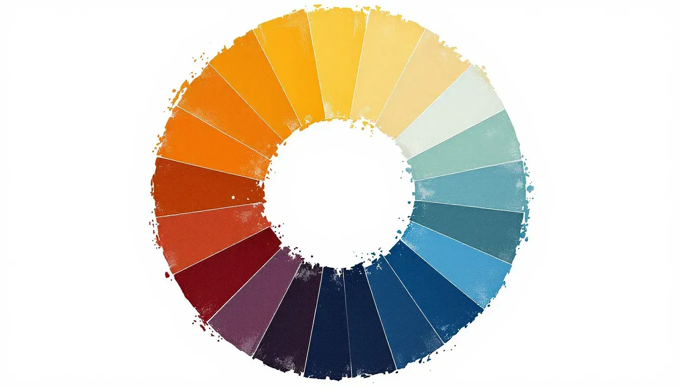
Dominant Warmth: Mapping Warm vs. Cool Industries
23 Sep 2025 · 3 min readColor, it seems, breathes life into the shapes we inhabit and the messages we consume. Imagine, if you will, a world devoid of hue. Sterile, clinical, perhaps efficiently functional, yet utterly devoid of emotional texture. Color speaks volumes where words often fall short. It whisper secrets in the arch of golden yellows and shouts declarations in the boldness of rich maroons. It shapes our perceptions, influences our moods, and ultimately, guides our choices. Nowhere is this truer than in the meticulous world of industries, where the intentional application of color can sway opinion, build trust, and directly impact the bottom line. To understand the pull between colors is to truly understand how businesses operate. Each shade, each tone, a calculated choice designed to resonate with a specific audience and evoke a desired response. The warm embrace of an earthy palette beckons customers in different directions than the cool, calculated tones of a technological interface. So, let us explore the silent language of color and see how it maps upon the industrial landscapes we navigate daily.
🍂 The "Earthy Warmth" palette whispers of crackling fireplaces and crisp autumn air. It evokes a sense of grounded comfort, like a worn leather armchair or a steaming mug of spiced cider. This palette leans heavily into the feeling of the tactile, the handmade, and the authentic. Imagine stepping into a boutique hotel lobby where the walls are painted in a soft Taupe Brown, accented by woven textiles in burnt Sienna and deep Maroon. The overall effect is one of relaxed luxury, a space designed to soothe and welcome. Consider a website for a local farm-to-table restaurant. The background utilizes Lavender Gray, while the food photography is artfully framed with splashes of Bright Orange. The palette tells a story of fresh ingredients, carefully prepared meals, and a connection to the land. In the hospitality sector, this color story translates to a promise of respite and genuine experience. It suggests a slowing down, a savoring of simple pleasures and a return to something real. The Mint Green and Forest Green peek out from the browns and oranges like the last vestiges of summer, tying the color story to the seasonal change. This palette understands the art of creating a comforting illusion - that while life rushes at an ever increasing rate, it says "pause here, and experience."
🎨 "Warm Harmony" pulses with a playful energy, a vintage charm tempered by modern sensibilities. It is the echo of long summer days and the promise of convivial get-togethers. Think of a stylishly designed food truck, its exterior adorned with stripes of bright Coral and Mustard Yellow against a backdrop of Off White. The palette broadcasts a sense of fun and accessibility, beckoning passersby to indulge in a quick, flavorful bite. Visualize a brand identity for a design agency where the logo is rendered in Golden Yellow on a business card with a Dusty Gray border. The effect is sophisticated yet approachable, conveying both creativity and reliability. This palette works because it is a careful balancing act between excitement and reassurance. The Dark Charcoal provides a grounding counterpoint to the brighter hues, preventing the overall impression from being overly sweet or saccharine. In the realm of design, it speaks to a sense of history reimagined for contemporary tastes. It’s the visual equivalent of a well-loved recipe, tweaked and updated for a new generation. These hues convey optimism without sacrificing maturity, showcasing that imagination is welcome while dependability is still key.
🎨 "Cool Harmony" is the calm after a storm, a carefully curated tableau of quiet competence. It suggests a world of clean lines, logical solutions, and understated elegance. Imagine an app interface designed with a Light Gray background and accents of Vivid Blue. The experience is intuitive and trustworthy, encouraging users to explore with confidence. Envision a corporate office space painted in Pure White and Medium Gray, punctuated by the occasional desk lamp in Lime Green. The atmosphere is focused and professional, promoting clear thinking and efficient workflows. This palette communicates stability and innovation, a combination that holds particular significance in the technology and finance sectors. The Deep Indigo anchor point grounds the ephemeral hues, while the Light Sky Blue offers a sense of expansiveness and possibility. This palette shies away from overt displays of emotion, instead favoring a measured approach that emphasizes logic and precision. In many ways, it mirrors the ethos of the industries it suits: a dedication to progress balanced by a commitment to responsibility. Every color choice feels deliberate, devoid of superficiality, reflecting core values.
The application of color, then, becomes a calculated act of visual storytelling. "Earthy Warmth" speaks of homespun authenticity, ideal for endeavors striving to conjure a feeling of comfort and tradition. "Warm Harmony" is for those wanting vintage vibes and a sense of excitement, a perfect fit for enterprises looking to create a playful brand. And "Cool Harmony" positions itself as champion of competence and clarity, a smart choice for industries where trust and precision are essential. Color is more than just a matter of aesthetics; it is an unspoken language that shapes our perceptions and influences our choices.