'%3e%3cpath%20fill-rule='evenodd'%20clip-rule='evenodd'%20d='M51.1303%2019.2492C50.7278%2019.913%2050.1346%2020.4426%2049.3508%2020.838C48.5669%2021.2335%2047.6172%2021.4312%2046.5014%2021.4312C44.8208%2021.4312%2043.4367%2021.0216%2042.3492%2020.2025C41.2617%2019.3833%2040.6686%2018.2394%2040.5697%2016.7706H44.4253C44.4818%2017.3355%2044.6831%2017.7804%2045.0291%2018.1052C45.3751%2018.43%2045.8164%2018.5924%2046.3531%2018.5924C46.8192%2018.5924%2047.1864%2018.4653%2047.4547%2018.2111C47.7231%2017.9569%2047.8572%2017.618%2047.8572%2017.1943C47.8572%2016.8129%2047.7337%2016.4952%2047.4865%2016.241C47.2393%2015.9867%2046.9322%2015.7784%2046.565%2015.616C46.1978%2015.4536%2045.6893%2015.2594%2045.0397%2015.0334C44.0934%2014.7086%2043.3202%2014.3944%2042.72%2014.0907C42.1197%2013.7871%2041.6042%2013.3351%2041.1735%2012.7349C40.7427%2012.1347%2040.5273%2011.3544%2040.5273%2010.394C40.5273%209.50418%2040.7533%208.73448%2041.2053%208.08481C41.6572%207.43515%2042.2821%206.93731%2043.0801%206.5913C43.8781%206.24528%2044.7925%206.07227%2045.8235%206.07227C47.49%206.07227%2048.8141%206.46771%2049.7956%207.25861C50.7772%208.04951%2051.3315%209.13698%2051.4586%2010.5211H47.5395C47.4689%2010.0268%2047.2888%209.63483%2046.9993%209.3453C46.7097%209.05578%2046.3178%208.91102%2045.8235%208.91102C45.3998%208.91102%2045.0573%209.024%2044.7961%209.24997C44.5348%209.47594%2044.4041%209.80783%2044.4041%2010.2457C44.4041%2010.5988%2044.5207%2010.8989%2044.7537%2011.146C44.9867%2011.3932%2045.2798%2011.5944%2045.6328%2011.7498C45.9859%2011.9052%2046.4944%2012.1029%2047.1581%2012.343C48.1185%2012.6678%2048.9023%2012.9891%2049.5096%2013.3069C50.1169%2013.6246%2050.6395%2014.0872%2051.0773%2014.6945C51.5151%2015.3018%2051.734%2016.0927%2051.734%2017.0672C51.734%2017.8581%2051.5328%2018.5854%2051.1303%2019.2492ZM59.0242%206.3053V21.2829H55.4016V6.3053H59.0242ZM73.9409%206.3053V9.18642H69.8734V21.2829H66.2296V9.18642H62.2046V6.3053H73.9409ZM80.7438%209.18642V12.3218H85.8069V15.0546H80.7438V18.3806H86.4425V21.2829H77.1212V6.3053H86.4425V9.18642H80.7438ZM99.667%2016.0291V21.2829H96.0444V6.3053H101.913C103.692%206.3053%20105.048%206.74665%20105.98%207.62934C106.912%208.51204%20107.378%209.7019%20107.378%2011.199C107.378%2012.1311%20107.17%2012.9609%20106.753%2013.6882C106.337%2014.4155%20105.719%2014.9875%20104.9%2015.4042C104.08%2015.8208%20103.085%2016.0291%20101.913%2016.0291H99.667ZM103.692%2011.199C103.692%209.8855%20102.965%209.22879%20101.51%209.22879H99.667V13.1268H101.51C102.965%2013.1268%20103.692%2012.4842%20103.692%2011.199ZM120.092%2018.5501H114.478L113.546%2021.2829H109.732L115.219%206.41123H119.393L124.879%2021.2829H121.024L120.092%2018.5501ZM119.16%2015.7961L117.295%2010.2881L115.41%2015.7961H119.16ZM131.555%2018.5077H136.385V21.2829H127.933V6.3053H131.555V18.5077ZM143.337%209.18642V12.3218H148.4V15.0546H143.337V18.3806H149.035V21.2829H139.714V6.3053H149.035V9.18642H143.337ZM163.507%206.3053V9.18642H159.44V21.2829H155.796V9.18642H151.771V6.3053H163.507ZM177.449%206.3053V9.18642H173.382V21.2829H169.738V9.18642H165.713V6.3053H177.449ZM184.252%209.18642V12.3218H189.315V15.0546H184.252V18.3806H189.951V21.2829H180.629V6.3053H189.951V9.18642H184.252Z'%20fill='%23EEF0ED'/%3e%3cmask%20id='mask0_3101_7327'%20style='mask-type:alpha'%20maskUnits='userSpaceOnUse'%20x='0'%20y='0'%20width='27'%20height='28'%3e%3cpath%20d='M23.8328%200.759766H2.64808C1.18559%200.759766%200%201.94535%200%203.40785V24.5925C0%2026.055%201.18559%2027.2406%202.64808%2027.2406H23.8328C25.2952%2027.2406%2026.4808%2026.055%2026.4808%2024.5925V3.40785C26.4808%201.94535%2025.2952%200.759766%2023.8328%200.759766Z'%20fill='white'/%3e%3c/mask%3e%3cg%20mask='url(%23mask0_3101_7327)'%3e%3cpath%20d='M23.8328%200.759766H2.64808C1.18559%200.759766%200%201.94535%200%203.40785V24.5925C0%2026.055%201.18559%2027.2406%202.64808%2027.2406H23.8328C25.2952%2027.2406%2026.4808%2026.055%2026.4808%2024.5925V3.40785C26.4808%201.94535%2025.2952%200.759766%2023.8328%200.759766Z'%20fill='%23D8D8D8'/%3e%3cpath%20d='M13.2404%200.759766H0V14.0001H13.2404V0.759766Z'%20fill='%238C61FF'/%3e%3cpath%20d='M13.2404%2014H0V27.2404H13.2404V14Z'%20fill='%2336C3FE'/%3e%3cpath%20d='M26.4806%2014H13.2402V27.2404H26.4806V14Z'%20fill='%236592FE'/%3e%3cpath%20d='M26.4806%200.759766H13.2402V14.0002H26.4806V0.759766Z'%20fill='%236059F7'/%3e%3c/g%3e%3c/g%3e%3cdefs%3e%3cclipPath%20id='clip0_3101_7327'%3e%3crect%20width='190'%20height='28'%20fill='white'/%3e%3c/clipPath%3e%3c/defs%3e%3c/svg%3e)
'%3e%3cpath%20d='M23.8328%200.759521H2.64808C1.18559%200.759521%200%201.94511%200%203.40761V24.5923C0%2026.0548%201.18559%2027.2404%202.64808%2027.2404H23.8328C25.2952%2027.2404%2026.4808%2026.0548%2026.4808%2024.5923V3.40761C26.4808%201.94511%2025.2952%200.759521%2023.8328%200.759521Z'%20fill='%23D8D8D8'/%3e%3cpath%20d='M13.2404%200.759521H0V13.9999H13.2404V0.759521Z'%20fill='%238C61FF'/%3e%3cpath%20d='M13.2404%2013.9998H0V27.2402H13.2404V13.9998Z'%20fill='%2336C3FE'/%3e%3cpath%20d='M26.4809%2013.9998H13.2405V27.2402H26.4809V13.9998Z'%20fill='%236592FE'/%3e%3cpath%20d='M26.4809%200.759277H13.2405V13.9997H26.4809V0.759277Z'%20fill='%236059F7'/%3e%3c/g%3e%3c/svg%3e)
Dominant Warmth for Relaxation
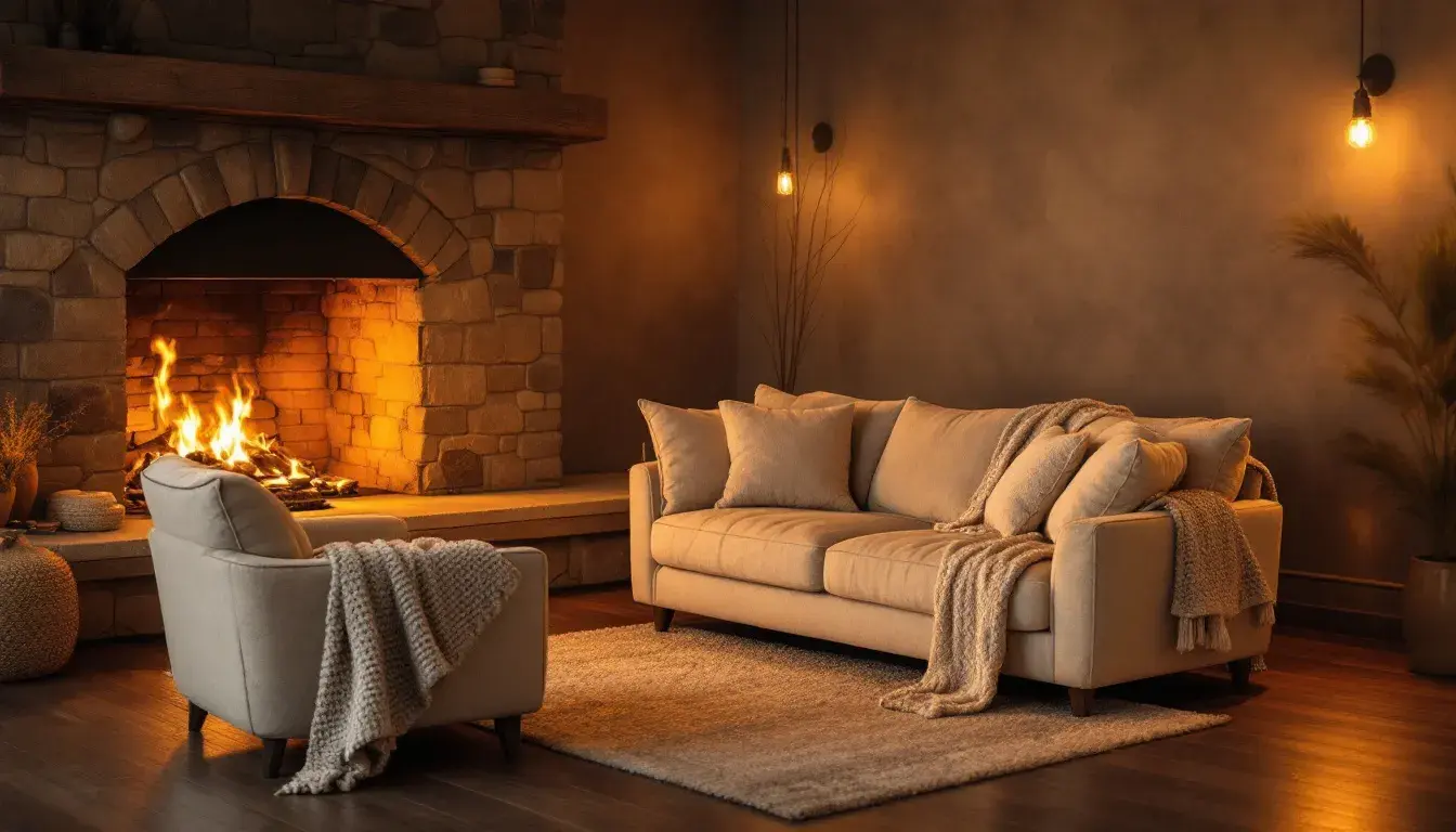
23 Sep 2025 · 3 min readColor possesses a strange alchemy. It can still the mind, whisper promises of ease, and wrap us in a comforting embrace. Consider the way warm hues wrap around the senses like a soft blanket on a chilly evening. They evoke sun-drenched afternoons, the crackling warmth of a fireplace, and the gentle glow of candlelight. The intention is clear: to create an atmosphere where relaxation isn't just an option, but the natural state. It's about painting a world where anxieties soften and everyday stresses dissolve. But how do we achieve this delicate balance? How do we summon warmth without veering into the territory of the overwhelming? By exploring carefully curated palettes, we unlock the secrets to crafting spaces that are havens of peace. These are not mere color schemes; they are blueprints for tranquility, designed to soothe the soul and invite us to simply be.
Earthy Elegance 🌿 whispers of autumnal sunsets and crackling fire pits. The blush pink, like a faint memory of summer roses, softens the edges of mustard yellow, suggesting playful afternoons spent in fields of gold. Sage green adds a whisper of nature's calm, reminiscent of quiet forests and meadows. Dark umber provides a grounding presence, like the rich soil beneath our feet, ensuring the palette does not float away into fleeting fancy. Ebony black offers a stark contrast, defining the shapes and adding depth to the overall composition. Imagine a room cloaked in these colors: soft textures, perhaps a woven tapestry or a plush rug underfoot, dappled sunlight filtering through sheer curtains. This palette understands how to conjure a peaceful sanctuary, offering respite from the sharp, insistent demands of the outside world. It understands that true relaxation blossoms in settings that gently nurture the senses and quiet the internal static. It is a palette that invites one to sink into comfortable armchairs, sip warm tea, and watch the world turn from a place of cozy refuge.
Earthy Calm 🌿 captures the serenity of a misty morning by the sea. Cream white evokes the gentle caress of clouds, its softness blanketing any harsh light. Gray taupe anchors the palette with the sturdy presence of weathered driftwood, lending a sense of stability and time-worn grace. Pale blue hints at the endless expanse of the ocean, offering a breath of fresh air and a sense of boundless possibility. Navy teal grounds the palette in an atmosphere of quiet depth, suggestive of twilight reflections on a serene harbor. Ebony black injects subtle confidence, adding a touch of sophistication and subtle definition. When these tones combine, they transport the user to moments of quiet introspection. Just as a tranquil beach offers a respite from the noise of the city, this scheme envelops you, reminding you the simple pleasures life holds. It’s a pathway to tranquility, where the weight of the world seems to lift, freeing you to sink into meditative repose. The palette feels natural, untouched, and utterly restorative.
Whispering Woods 🌿 paints a portrait of tranquility, inviting the soul to wander through sun-dappled glades and rustling leaves. Pure white, like sunlight filtering through the canopy, illuminates the palette with a soft, ethereal glow. Pale green mimics the subtle hues of moss-covered stones, suggesting a sense of quiet growth and renewal. Steel blue evokes the cool depths of a hidden stream, providing a sense of refreshing clarity. Olive drab recalls the rich tones of decaying leaves, lending an earthy, grounding presence. Forest green captures the verdant glory of the forest floor, bringing a sense of abundance and vitality. Dark coal adds depth and shadow, conveying the feeling of embracing the unknown with curiosity. Let this palette steep into meditation spaces, yoga studios, or quiet bookrooms, where time slows to a gentle rhythm. Imagine soft lighting paired with natural textures, such as linen or wool. It is more than just a visual experience; it’s a holistic sanctuary where the mind can unwind and the spirit can soar.
Earthy Serenity 🌿 captures the soul of a peaceful dawn, when the world is slowly awakening. Pale turquoise, like the first light on the horizon, offers a fresh and inviting presence. Sage green evokes the quiet stillness of a secluded garden, offering a sense of renewal and peace. Grayish green mirrors the muted tones of mossy stones, adding depth and stability. Dark emerald suggests the tranquility of still waters, inviting contemplation. Dark gray anchors the palette, adding a sense of strength and balance. Picture a space designed with these tones: soft natural light, breathable fabrics, and touches of wood. This combination of tones whispers serenity into personal spaces, making it easy to lose oneself in meditative thought; it encourages a deliberate pause, helping one release pent-up stress. This is more than simple design; it's restorative space brought to life.
Of the four palettes considered, all evoke a sense of balanced warmth and coolness. Therefore, each one is equally dominant in creating a space of tranquility. "Earthy Elegance" 🌿 embodies comforting warmth that is reminiscent of sun-drenched autumnal scenes. "Earthy Calm" 🌿 speaks to the stillness of misty mornings and quiet shores. "Whispering Woods" 🌿 invites the senses to explore rich forest spaces. "Earthy Serenity" 🌿 communicates the peace that comes with the break of dawn. Each scheme creates a distinct feeling and sensory impact, yet each still offers a unique pathway to rest. The possibilities, therefore, are not limited, but expanded: a deeper understanding that relaxation is not a single, uniform idea, but a multifaceted experience waiting to be explored.