'%3e%3cpath%20fill-rule='evenodd'%20clip-rule='evenodd'%20d='M51.1303%2019.2492C50.7278%2019.913%2050.1346%2020.4426%2049.3508%2020.838C48.5669%2021.2335%2047.6172%2021.4312%2046.5014%2021.4312C44.8208%2021.4312%2043.4367%2021.0216%2042.3492%2020.2025C41.2617%2019.3833%2040.6686%2018.2394%2040.5697%2016.7706H44.4253C44.4818%2017.3355%2044.6831%2017.7804%2045.0291%2018.1052C45.3751%2018.43%2045.8164%2018.5924%2046.3531%2018.5924C46.8192%2018.5924%2047.1864%2018.4653%2047.4547%2018.2111C47.7231%2017.9569%2047.8572%2017.618%2047.8572%2017.1943C47.8572%2016.8129%2047.7337%2016.4952%2047.4865%2016.241C47.2393%2015.9867%2046.9322%2015.7784%2046.565%2015.616C46.1978%2015.4536%2045.6893%2015.2594%2045.0397%2015.0334C44.0934%2014.7086%2043.3202%2014.3944%2042.72%2014.0907C42.1197%2013.7871%2041.6042%2013.3351%2041.1735%2012.7349C40.7427%2012.1347%2040.5273%2011.3544%2040.5273%2010.394C40.5273%209.50418%2040.7533%208.73448%2041.2053%208.08481C41.6572%207.43515%2042.2821%206.93731%2043.0801%206.5913C43.8781%206.24528%2044.7925%206.07227%2045.8235%206.07227C47.49%206.07227%2048.8141%206.46771%2049.7956%207.25861C50.7772%208.04951%2051.3315%209.13698%2051.4586%2010.5211H47.5395C47.4689%2010.0268%2047.2888%209.63483%2046.9993%209.3453C46.7097%209.05578%2046.3178%208.91102%2045.8235%208.91102C45.3998%208.91102%2045.0573%209.024%2044.7961%209.24997C44.5348%209.47594%2044.4041%209.80783%2044.4041%2010.2457C44.4041%2010.5988%2044.5207%2010.8989%2044.7537%2011.146C44.9867%2011.3932%2045.2798%2011.5944%2045.6328%2011.7498C45.9859%2011.9052%2046.4944%2012.1029%2047.1581%2012.343C48.1185%2012.6678%2048.9023%2012.9891%2049.5096%2013.3069C50.1169%2013.6246%2050.6395%2014.0872%2051.0773%2014.6945C51.5151%2015.3018%2051.734%2016.0927%2051.734%2017.0672C51.734%2017.8581%2051.5328%2018.5854%2051.1303%2019.2492ZM59.0242%206.3053V21.2829H55.4016V6.3053H59.0242ZM73.9409%206.3053V9.18642H69.8734V21.2829H66.2296V9.18642H62.2046V6.3053H73.9409ZM80.7438%209.18642V12.3218H85.8069V15.0546H80.7438V18.3806H86.4425V21.2829H77.1212V6.3053H86.4425V9.18642H80.7438ZM99.667%2016.0291V21.2829H96.0444V6.3053H101.913C103.692%206.3053%20105.048%206.74665%20105.98%207.62934C106.912%208.51204%20107.378%209.7019%20107.378%2011.199C107.378%2012.1311%20107.17%2012.9609%20106.753%2013.6882C106.337%2014.4155%20105.719%2014.9875%20104.9%2015.4042C104.08%2015.8208%20103.085%2016.0291%20101.913%2016.0291H99.667ZM103.692%2011.199C103.692%209.8855%20102.965%209.22879%20101.51%209.22879H99.667V13.1268H101.51C102.965%2013.1268%20103.692%2012.4842%20103.692%2011.199ZM120.092%2018.5501H114.478L113.546%2021.2829H109.732L115.219%206.41123H119.393L124.879%2021.2829H121.024L120.092%2018.5501ZM119.16%2015.7961L117.295%2010.2881L115.41%2015.7961H119.16ZM131.555%2018.5077H136.385V21.2829H127.933V6.3053H131.555V18.5077ZM143.337%209.18642V12.3218H148.4V15.0546H143.337V18.3806H149.035V21.2829H139.714V6.3053H149.035V9.18642H143.337ZM163.507%206.3053V9.18642H159.44V21.2829H155.796V9.18642H151.771V6.3053H163.507ZM177.449%206.3053V9.18642H173.382V21.2829H169.738V9.18642H165.713V6.3053H177.449ZM184.252%209.18642V12.3218H189.315V15.0546H184.252V18.3806H189.951V21.2829H180.629V6.3053H189.951V9.18642H184.252Z'%20fill='%23EEF0ED'/%3e%3cmask%20id='mask0_3101_7327'%20style='mask-type:alpha'%20maskUnits='userSpaceOnUse'%20x='0'%20y='0'%20width='27'%20height='28'%3e%3cpath%20d='M23.8328%200.759766H2.64808C1.18559%200.759766%200%201.94535%200%203.40785V24.5925C0%2026.055%201.18559%2027.2406%202.64808%2027.2406H23.8328C25.2952%2027.2406%2026.4808%2026.055%2026.4808%2024.5925V3.40785C26.4808%201.94535%2025.2952%200.759766%2023.8328%200.759766Z'%20fill='white'/%3e%3c/mask%3e%3cg%20mask='url(%23mask0_3101_7327)'%3e%3cpath%20d='M23.8328%200.759766H2.64808C1.18559%200.759766%200%201.94535%200%203.40785V24.5925C0%2026.055%201.18559%2027.2406%202.64808%2027.2406H23.8328C25.2952%2027.2406%2026.4808%2026.055%2026.4808%2024.5925V3.40785C26.4808%201.94535%2025.2952%200.759766%2023.8328%200.759766Z'%20fill='%23D8D8D8'/%3e%3cpath%20d='M13.2404%200.759766H0V14.0001H13.2404V0.759766Z'%20fill='%238C61FF'/%3e%3cpath%20d='M13.2404%2014H0V27.2404H13.2404V14Z'%20fill='%2336C3FE'/%3e%3cpath%20d='M26.4806%2014H13.2402V27.2404H26.4806V14Z'%20fill='%236592FE'/%3e%3cpath%20d='M26.4806%200.759766H13.2402V14.0002H26.4806V0.759766Z'%20fill='%236059F7'/%3e%3c/g%3e%3c/g%3e%3cdefs%3e%3cclipPath%20id='clip0_3101_7327'%3e%3crect%20width='190'%20height='28'%20fill='white'/%3e%3c/clipPath%3e%3c/defs%3e%3c/svg%3e)
'%3e%3cpath%20d='M23.8328%200.759521H2.64808C1.18559%200.759521%200%201.94511%200%203.40761V24.5923C0%2026.0548%201.18559%2027.2404%202.64808%2027.2404H23.8328C25.2952%2027.2404%2026.4808%2026.0548%2026.4808%2024.5923V3.40761C26.4808%201.94511%2025.2952%200.759521%2023.8328%200.759521Z'%20fill='%23D8D8D8'/%3e%3cpath%20d='M13.2404%200.759521H0V13.9999H13.2404V0.759521Z'%20fill='%238C61FF'/%3e%3cpath%20d='M13.2404%2013.9998H0V27.2402H13.2404V13.9998Z'%20fill='%2336C3FE'/%3e%3cpath%20d='M26.4809%2013.9998H13.2405V27.2402H26.4809V13.9998Z'%20fill='%236592FE'/%3e%3cpath%20d='M26.4809%200.759277H13.2405V13.9997H26.4809V0.759277Z'%20fill='%236059F7'/%3e%3c/g%3e%3c/svg%3e)
Dominant Hex Value for Corporate Branding Projects
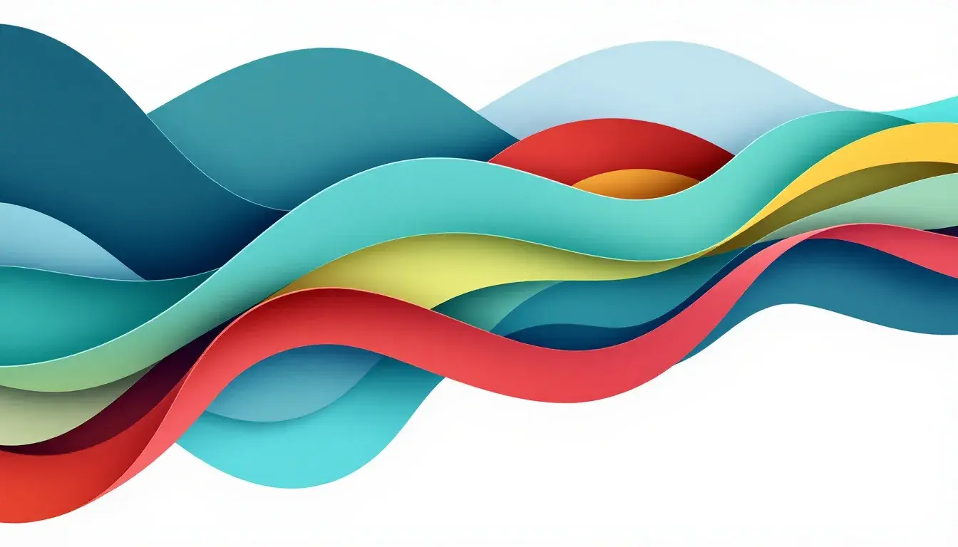
23 Sep 2025 · 3 min readColor breathes. It speaks volumes without uttering a word. A gentle wash of serene hues whispers tranquility. A riot of vibrant tones shouts exuberance. For corporate branding, color is not mere decoration; it's the silent ambassador of a company’s soul. It shapes perception, forges connections, and etches a brand’s identity into the collective consciousness. Think of the cool, confident blue of established tech giants or the playful, engaging yellow of a beloved children’s brand. The right color story isn’t just appealing; it's potent, persuasive, and utterly unforgettable. Choosing wisely means crafting a visual language that speaks directly to the target audience, whispering promises of reliability, innovation, or joy. It’s about building a bridge of association, a silent understanding between brand and consumer. It is crucial to explore palettes that can elevate brands to the new heights.
Teal Serenity whispers of calm waters and tranquil mornings. It suggests a sanctuary, a space free from noise and stress. Pure White initiates the clean slate. Light Cyan evokes airiness, while a touch of Light Gray prevents it from drifting toward clinical sterility. The Bright Teal sings with a quiet confidence, reminiscent of a lush underwater garden swaying gently in the current. Muted Gray, the color of weathered beach stones, brings groundedness to the composition. Dark Teal and Deep Charcoal provide the quiet depths, where profound thoughts can take root. Imagine a wellness brand, their logo rendered in these soft shades: a beacon of peace in a chaotic world. Or a technology company designing a user interface that welcomes all. This palette communicates reliability and innovation with a sensitive touch. The interplay creates a sense of balance, inviting users into an experience that is both soothing and sophisticated. The result is an ecosystem of visual cues that quietly reinforce the brand's values, creating a lasting impression of trustworthiness and artistry. The emotional power of this palette resides in the subtle shifts between tones, each hue working in concert to craft a feeling of serenity and assurance. By integrating these colors, a business can establish a brand that not only stands apart but also resonates profoundly with its audience, becoming a trusted and appreciated presence in their day-to-day lives.
Earthy Greens evokes the serenity of a sun-dappled forest floor. Pure White provides the luminous canvas, allowing the other colors to bloom. Golden Yellow provides a pop of sunshine and happiness, like wildflowers peeking through the canopy. Light Blue adds the whisper of a clear mountain stream. The Soft Green brings to mind moss-covered stones and age-old wisdom, instilling a sense of timelessness. Bright Green speaks of new growth, vitality, and a connection to regenerative practices. Steel Blue is the steady presence, mirroring a wide sky glimpsed through the leaves. Brown Sienna, resembling rich soil, offers a comforting sense of stability. Deep Teal hints at hidden depths and intriguing narratives. Dark Olive and Dark Crimson bring gravitas to the palette, imparting a solemn respect for the natural world. These evocative colors would suit an environmentally conscious organization, their name etched in elegant typography. Or a brand committed to ethical sourcing and sustainable production, visually communicating their dedication through this natural landscape. The palette invites consumers into a relationship built on trust and a shared responsibility towards planetary well-being. It does so by crafting a brand experience that is not only aesthetically appealing but also deeply meaningful, enabling customers to engage with confidence and a sense of purpose.
Bold Contrast declares itself with confidence and flair. Pure White serves as the perfect launching pad for a collection of vivid hues. Light Coral whispers of playful summers and carefree days beneath the sun. Pale Lavender carries the breezy air of sophistication and gentility. Mustard Yellow, reminiscent of vintage markets, brings warmth and an invitation to explore. Bright Vermilion erupts with vibrancy and passion, demanding attention and leaving a trace of energy in its wake. Bright Azure suggests clarity and boundless skies. Grayish Blue instills a sense of steadfastness and collected ease. Burnt Sienna imparts feelings of aged beauty. Earthy Plum evokes the feeling of elegant refinement. Deep Sapphire grounds the palette with strength and authority. Imagine a cutting-edge marketing agency, their website splashed with these electrifying shades, signalling that they are on the pulse. These colors paint a story where innovation meets artistry. Each shade plays its part in demonstrating a brand that embraces audacity and celebrates the extraordinary. It conveys a clear message: be brave, take risks, and embrace the extraordinary. The brand becomes synonymous with forward-thinking ideals and a relentless pursuit of excellence.
Spirit Colors bursts with enthusiasm. Pure White anchors the spectrum, allowing the other shades to freely express their character. Bright Yellow radiates happiness, invoking sunny afternoons. Light Yellow-Green whispers of fresh starts, echoing early spring. Cool Gray offers a moment of quiet contemplation. Lime Green buzzes with invigorating electricity and a sense of fresh growth. Bright Sky Blue inspires expansive possibilities. Neutral Grey projects a sense of understated sophistication. Vivid Crimson ignites the palette with unstoppable passion and dynamism that mirrors the heart of an athletic endeavor. Dark Royal Blue conveys a sense of unwavering trust. Deep Charcoal suggests timeless elegance. This is a fitting ensemble for a brand celebrating the thrill of competition, their colors emblazoned on merchandise, and conveying the message of vibrant athleticism. Or, these tones capture the spirit of community and teamwork – communicating to their audience the pure joy of shared accomplishments. It is a brand that aims to celebrate the power of human spirit, inviting everyone to join in and unleash its potential.
These curated color palettes provide doorways into distinctive brand narratives. Each selection tells a unique story, shaping the viewer's perception and forging a lasting connection. Teal Serenity whispers calm, Earthy Greens echoes nature's wisdom, Bold Contrast commands with audacity, and Spirit Colors pulsates pure energy. The strategic use of color transcends aesthetics, developing into a potent tool for shaping identity and evoking genuine emotional connection with the audience, ensuring that branding speaks with clarity. Color becomes the language through which a company shares its values, its promises, and its unique place in the world.