'%3e%3cpath%20fill-rule='evenodd'%20clip-rule='evenodd'%20d='M51.1303%2019.2492C50.7278%2019.913%2050.1346%2020.4426%2049.3508%2020.838C48.5669%2021.2335%2047.6172%2021.4312%2046.5014%2021.4312C44.8208%2021.4312%2043.4367%2021.0216%2042.3492%2020.2025C41.2617%2019.3833%2040.6686%2018.2394%2040.5697%2016.7706H44.4253C44.4818%2017.3355%2044.6831%2017.7804%2045.0291%2018.1052C45.3751%2018.43%2045.8164%2018.5924%2046.3531%2018.5924C46.8192%2018.5924%2047.1864%2018.4653%2047.4547%2018.2111C47.7231%2017.9569%2047.8572%2017.618%2047.8572%2017.1943C47.8572%2016.8129%2047.7337%2016.4952%2047.4865%2016.241C47.2393%2015.9867%2046.9322%2015.7784%2046.565%2015.616C46.1978%2015.4536%2045.6893%2015.2594%2045.0397%2015.0334C44.0934%2014.7086%2043.3202%2014.3944%2042.72%2014.0907C42.1197%2013.7871%2041.6042%2013.3351%2041.1735%2012.7349C40.7427%2012.1347%2040.5273%2011.3544%2040.5273%2010.394C40.5273%209.50418%2040.7533%208.73448%2041.2053%208.08481C41.6572%207.43515%2042.2821%206.93731%2043.0801%206.5913C43.8781%206.24528%2044.7925%206.07227%2045.8235%206.07227C47.49%206.07227%2048.8141%206.46771%2049.7956%207.25861C50.7772%208.04951%2051.3315%209.13698%2051.4586%2010.5211H47.5395C47.4689%2010.0268%2047.2888%209.63483%2046.9993%209.3453C46.7097%209.05578%2046.3178%208.91102%2045.8235%208.91102C45.3998%208.91102%2045.0573%209.024%2044.7961%209.24997C44.5348%209.47594%2044.4041%209.80783%2044.4041%2010.2457C44.4041%2010.5988%2044.5207%2010.8989%2044.7537%2011.146C44.9867%2011.3932%2045.2798%2011.5944%2045.6328%2011.7498C45.9859%2011.9052%2046.4944%2012.1029%2047.1581%2012.343C48.1185%2012.6678%2048.9023%2012.9891%2049.5096%2013.3069C50.1169%2013.6246%2050.6395%2014.0872%2051.0773%2014.6945C51.5151%2015.3018%2051.734%2016.0927%2051.734%2017.0672C51.734%2017.8581%2051.5328%2018.5854%2051.1303%2019.2492ZM59.0242%206.3053V21.2829H55.4016V6.3053H59.0242ZM73.9409%206.3053V9.18642H69.8734V21.2829H66.2296V9.18642H62.2046V6.3053H73.9409ZM80.7438%209.18642V12.3218H85.8069V15.0546H80.7438V18.3806H86.4425V21.2829H77.1212V6.3053H86.4425V9.18642H80.7438ZM99.667%2016.0291V21.2829H96.0444V6.3053H101.913C103.692%206.3053%20105.048%206.74665%20105.98%207.62934C106.912%208.51204%20107.378%209.7019%20107.378%2011.199C107.378%2012.1311%20107.17%2012.9609%20106.753%2013.6882C106.337%2014.4155%20105.719%2014.9875%20104.9%2015.4042C104.08%2015.8208%20103.085%2016.0291%20101.913%2016.0291H99.667ZM103.692%2011.199C103.692%209.8855%20102.965%209.22879%20101.51%209.22879H99.667V13.1268H101.51C102.965%2013.1268%20103.692%2012.4842%20103.692%2011.199ZM120.092%2018.5501H114.478L113.546%2021.2829H109.732L115.219%206.41123H119.393L124.879%2021.2829H121.024L120.092%2018.5501ZM119.16%2015.7961L117.295%2010.2881L115.41%2015.7961H119.16ZM131.555%2018.5077H136.385V21.2829H127.933V6.3053H131.555V18.5077ZM143.337%209.18642V12.3218H148.4V15.0546H143.337V18.3806H149.035V21.2829H139.714V6.3053H149.035V9.18642H143.337ZM163.507%206.3053V9.18642H159.44V21.2829H155.796V9.18642H151.771V6.3053H163.507ZM177.449%206.3053V9.18642H173.382V21.2829H169.738V9.18642H165.713V6.3053H177.449ZM184.252%209.18642V12.3218H189.315V15.0546H184.252V18.3806H189.951V21.2829H180.629V6.3053H189.951V9.18642H184.252Z'%20fill='%23EEF0ED'/%3e%3cmask%20id='mask0_3101_7327'%20style='mask-type:alpha'%20maskUnits='userSpaceOnUse'%20x='0'%20y='0'%20width='27'%20height='28'%3e%3cpath%20d='M23.8328%200.759766H2.64808C1.18559%200.759766%200%201.94535%200%203.40785V24.5925C0%2026.055%201.18559%2027.2406%202.64808%2027.2406H23.8328C25.2952%2027.2406%2026.4808%2026.055%2026.4808%2024.5925V3.40785C26.4808%201.94535%2025.2952%200.759766%2023.8328%200.759766Z'%20fill='white'/%3e%3c/mask%3e%3cg%20mask='url(%23mask0_3101_7327)'%3e%3cpath%20d='M23.8328%200.759766H2.64808C1.18559%200.759766%200%201.94535%200%203.40785V24.5925C0%2026.055%201.18559%2027.2406%202.64808%2027.2406H23.8328C25.2952%2027.2406%2026.4808%2026.055%2026.4808%2024.5925V3.40785C26.4808%201.94535%2025.2952%200.759766%2023.8328%200.759766Z'%20fill='%23D8D8D8'/%3e%3cpath%20d='M13.2404%200.759766H0V14.0001H13.2404V0.759766Z'%20fill='%238C61FF'/%3e%3cpath%20d='M13.2404%2014H0V27.2404H13.2404V14Z'%20fill='%2336C3FE'/%3e%3cpath%20d='M26.4806%2014H13.2402V27.2404H26.4806V14Z'%20fill='%236592FE'/%3e%3cpath%20d='M26.4806%200.759766H13.2402V14.0002H26.4806V0.759766Z'%20fill='%236059F7'/%3e%3c/g%3e%3c/g%3e%3cdefs%3e%3cclipPath%20id='clip0_3101_7327'%3e%3crect%20width='190'%20height='28'%20fill='white'/%3e%3c/clipPath%3e%3c/defs%3e%3c/svg%3e)
'%3e%3cpath%20d='M23.8328%200.759521H2.64808C1.18559%200.759521%200%201.94511%200%203.40761V24.5923C0%2026.0548%201.18559%2027.2404%202.64808%2027.2404H23.8328C25.2952%2027.2404%2026.4808%2026.0548%2026.4808%2024.5923V3.40761C26.4808%201.94511%2025.2952%200.759521%2023.8328%200.759521Z'%20fill='%23D8D8D8'/%3e%3cpath%20d='M13.2404%200.759521H0V13.9999H13.2404V0.759521Z'%20fill='%238C61FF'/%3e%3cpath%20d='M13.2404%2013.9998H0V27.2402H13.2404V13.9998Z'%20fill='%2336C3FE'/%3e%3cpath%20d='M26.4809%2013.9998H13.2405V27.2402H26.4809V13.9998Z'%20fill='%236592FE'/%3e%3cpath%20d='M26.4809%200.759277H13.2405V13.9997H26.4809V0.759277Z'%20fill='%236059F7'/%3e%3c/g%3e%3c/svg%3e)
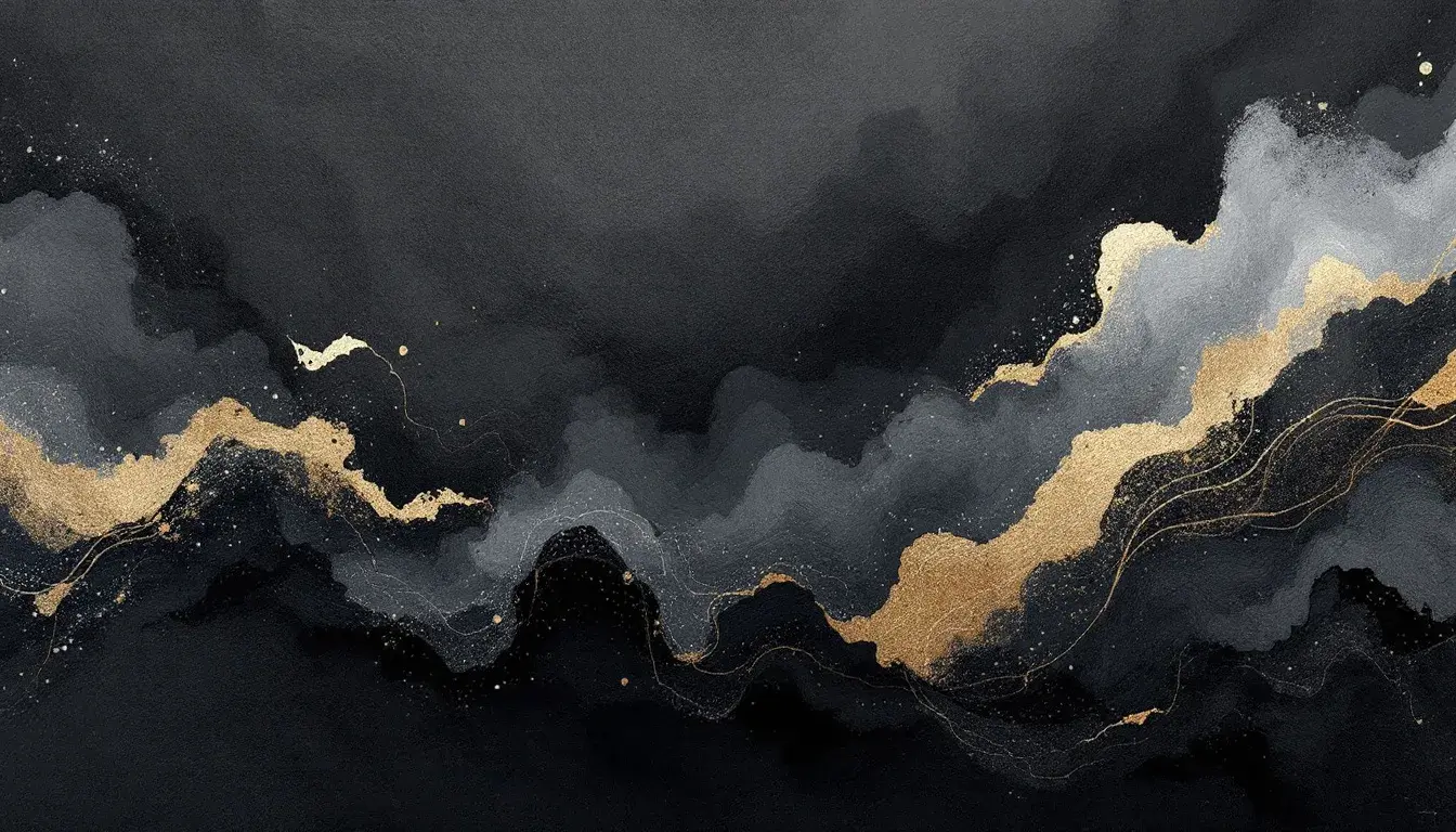
Dark Charcoals's Enduring Reign: A Deep Dive into Dominant Dark Color Adoption
23 Sep 2025 · 5 min readThe pull of deep shadows, the quiet confidence of charcoal, the magnetism of a near-black expanse – these are not simply aesthetic choices, but declarations. They speak of sophistication, of a world observed through a refined lens. Consider the midnight sky, not as a void, but as a canvas speckled with starlight, each glimmer magnified by the darkness that cradles it. Think of a tailored suit, the very definition of power, its presence amplified by the deep, unwavering tone. These dark hues do more than just absorb light; they create depth, command attention, and offer a grounding stillness amidst the visual cacophony of modern life. They allow brighter shades to sing, textures to whisper, and forms to emerge with sharper definition. To navigate a space drenched in dark tones is to enter a realm of heightened sensory experience, a place where understated elegance reigns supreme. The choice of dominant dark shades is a conscious curation of atmosphere, a deliberate rejection of fleeting trends in favor of timeless allure. Let's consider how these sentiments coalesce within specific color compositions.
The "Modern Harmony" palette 🎨, though not overtly dominated by blacks and charcoals, offers a masterclass in how to use contrasting elements to create a sophisticated visual narrative. The inclusion of Off-White provides a crucial counterpoint, preventing the Slate Gray and Light Periwinkle from becoming melancholic. Instead, it lends them an air of breezy sophistication, reminiscent of a sunlit room with views of a storm-tossed sea. The unexpected addition of Russet Brown introduces an element of earthiness, grounding the cooler tones and preventing the palette from drifting into a sterile, overly modern space. Finally, Royal Blue lends the composition a regal quality, suggesting a sense of heritage and timeless elegance. Imagine this palette applied to a study or library; the walls painted in deep Off-White, accented with shelves crafted from dark Russet Brown wood, and punctuated with art featuring the Royal Blue shade. It would be a space that inspires contemplation and creativity. Although vibrant colors like Blue are present, the subdued cast of the entire palette prevents a childish effect and keeps it in the realm of sophisticated, modern interiors. The subtlety allows individual expression without sacrificing an air of elegance and understated authority and helps focus the gaze on chosen features, or, depending on the application, subtly allows the subject of attention to shine.
The "Marine Safety" palette ⚓ presents a powerful study in contrasts, immediately drawing the eye with its stark combination of Pure White, Bright Yellow, and Deep Black. The presence of Deep Black grounds the palette, providing a sense of solidity and unwavering focus. It acts as an anchor, preventing the lighter, more vibrant tones from feeling frivolous. The Vivid Azure and Royal Blue evoke the vastness of the ocean, while the Coral Clay adds a touch of warmth, reminiscent of aged wood accents on a ship. The inclusion of Medium Gray and Light Gray further softens the visual impact, creating a seamless transition between the extremes of light and dark. Imagine a maritime-themed website employing this palette. The Deep Black could serve as the background, allowing the Pure White text and Bright Yellow icons to pop with exceptional clarity. This clear arrangement immediately communicates an unwavering integrity and a confidence in their message. The strategic selection of these colors suggests reliability, a vital attribute for any safety-focused endeavor. It's a palette that speaks of experience, wisdom gleaned from years of navigating treacherous waters. The Dark Charcoal adds a layer of complexity, hinting at the grime and wear that comes with a life spent at sea.
"Tech Elegance" ⏱️ is a study in refined understatement. The Dark Espresso sits as a cornerstone, offering a subtle depth that enhances the other hues. It exudes a quiet confidence, suggesting a world where technology seamlessly integrates into everyday life, not as a brash intrusion, but as a seamless extension of our capabilities. Off White lends an air of openness and approachability, helping to create an inviting ambiance. The Sage Green introduces a natural element, evoking feelings of tranquility and balance. The Khaki Beige contributes to the sense of warmth and sophistication. Brick Red, added sparingly, provides flashes of visual intrigue, suggesting passion without being distracting. Consider a minimalist app interface employing this palette. The Dark Espresso could serve as the background for the navigation bar, providing a subtly luxurious backdrop for icons rendered in Off White and Sage Green. The Brick Red could emphasize notifications or essential actions, drawing the user's attention without jarring the eye. This careful use of color contributes positively to a user experience that is both functional and aesthetically pleasing. The palette exudes a thoughtful intentionality, an understanding that true elegance lies not in ornamentation, but is distilled in purpose and clarity.
"Dark Passion" 🖤, is a symphony of contrasts, where the depth of Onyx meets the fervent glow of Bright Raspberry, presenting a study in visual intensity. The Onyx provides the foundation, a grounding force that adds the other elements. Light Gray and Silver Gray supply subtle variations, creating a sense of depth and textural complexity. The Bright Raspberry acts as an exclamation, injecting the palette with bold energy. Deep Maroon adds a sense of rich, indulgent sophistication, reminiscent of velvet curtains and dimly lit rooms. Dark Indigo, placed strategically, contributes an air of mystery and allure, preventing the palette from becoming overly aggressive. Think of a couture house employing this palette for their branding. The Onyx could dominate the packaging, its starkness offset by a single Bright Raspberry accent, perhaps in the form of a ribbon or a subtle logo. This minimalist approach communicates confidence and strength. The inclusion of Charcoal Gray offers a bridge between the extreme ends of the spectrum, softening the contrast and adding visual intrigue. The palette exudes an aura of timeless elegance, infused with passion and a hint of daring. It makes a statement without screaming, offering an invitation into a world of understated luxury and quiet confidence.
The story of dark charcoals, and near-black depths are more than a stylistic trend; they represent a continuing pursuit of sophistication and carefully curated sensory experience. They are in constant dialogue. The palettes showcase the possibilities of dark shades when paired artfully with complementary hues. The enduring popularity lies in the ability to ground and amplify, inspire attention and foster intimacy with a visual message, whether it be a quiet sense of depth in modern spaces or a bold statement of identity. The key takeaway is the conscious curation of tones, a precise balance between shadow and light, ultimately creating a world where individual expression reigns through understated elegance. The palettes invite us to see the beauty in darkness and to embrace the power of a well-considered contrast. And what could be more contemporary than that?