'%3e%3cpath%20fill-rule='evenodd'%20clip-rule='evenodd'%20d='M51.1303%2019.2492C50.7278%2019.913%2050.1346%2020.4426%2049.3508%2020.838C48.5669%2021.2335%2047.6172%2021.4312%2046.5014%2021.4312C44.8208%2021.4312%2043.4367%2021.0216%2042.3492%2020.2025C41.2617%2019.3833%2040.6686%2018.2394%2040.5697%2016.7706H44.4253C44.4818%2017.3355%2044.6831%2017.7804%2045.0291%2018.1052C45.3751%2018.43%2045.8164%2018.5924%2046.3531%2018.5924C46.8192%2018.5924%2047.1864%2018.4653%2047.4547%2018.2111C47.7231%2017.9569%2047.8572%2017.618%2047.8572%2017.1943C47.8572%2016.8129%2047.7337%2016.4952%2047.4865%2016.241C47.2393%2015.9867%2046.9322%2015.7784%2046.565%2015.616C46.1978%2015.4536%2045.6893%2015.2594%2045.0397%2015.0334C44.0934%2014.7086%2043.3202%2014.3944%2042.72%2014.0907C42.1197%2013.7871%2041.6042%2013.3351%2041.1735%2012.7349C40.7427%2012.1347%2040.5273%2011.3544%2040.5273%2010.394C40.5273%209.50418%2040.7533%208.73448%2041.2053%208.08481C41.6572%207.43515%2042.2821%206.93731%2043.0801%206.5913C43.8781%206.24528%2044.7925%206.07227%2045.8235%206.07227C47.49%206.07227%2048.8141%206.46771%2049.7956%207.25861C50.7772%208.04951%2051.3315%209.13698%2051.4586%2010.5211H47.5395C47.4689%2010.0268%2047.2888%209.63483%2046.9993%209.3453C46.7097%209.05578%2046.3178%208.91102%2045.8235%208.91102C45.3998%208.91102%2045.0573%209.024%2044.7961%209.24997C44.5348%209.47594%2044.4041%209.80783%2044.4041%2010.2457C44.4041%2010.5988%2044.5207%2010.8989%2044.7537%2011.146C44.9867%2011.3932%2045.2798%2011.5944%2045.6328%2011.7498C45.9859%2011.9052%2046.4944%2012.1029%2047.1581%2012.343C48.1185%2012.6678%2048.9023%2012.9891%2049.5096%2013.3069C50.1169%2013.6246%2050.6395%2014.0872%2051.0773%2014.6945C51.5151%2015.3018%2051.734%2016.0927%2051.734%2017.0672C51.734%2017.8581%2051.5328%2018.5854%2051.1303%2019.2492ZM59.0242%206.3053V21.2829H55.4016V6.3053H59.0242ZM73.9409%206.3053V9.18642H69.8734V21.2829H66.2296V9.18642H62.2046V6.3053H73.9409ZM80.7438%209.18642V12.3218H85.8069V15.0546H80.7438V18.3806H86.4425V21.2829H77.1212V6.3053H86.4425V9.18642H80.7438ZM99.667%2016.0291V21.2829H96.0444V6.3053H101.913C103.692%206.3053%20105.048%206.74665%20105.98%207.62934C106.912%208.51204%20107.378%209.7019%20107.378%2011.199C107.378%2012.1311%20107.17%2012.9609%20106.753%2013.6882C106.337%2014.4155%20105.719%2014.9875%20104.9%2015.4042C104.08%2015.8208%20103.085%2016.0291%20101.913%2016.0291H99.667ZM103.692%2011.199C103.692%209.8855%20102.965%209.22879%20101.51%209.22879H99.667V13.1268H101.51C102.965%2013.1268%20103.692%2012.4842%20103.692%2011.199ZM120.092%2018.5501H114.478L113.546%2021.2829H109.732L115.219%206.41123H119.393L124.879%2021.2829H121.024L120.092%2018.5501ZM119.16%2015.7961L117.295%2010.2881L115.41%2015.7961H119.16ZM131.555%2018.5077H136.385V21.2829H127.933V6.3053H131.555V18.5077ZM143.337%209.18642V12.3218H148.4V15.0546H143.337V18.3806H149.035V21.2829H139.714V6.3053H149.035V9.18642H143.337ZM163.507%206.3053V9.18642H159.44V21.2829H155.796V9.18642H151.771V6.3053H163.507ZM177.449%206.3053V9.18642H173.382V21.2829H169.738V9.18642H165.713V6.3053H177.449ZM184.252%209.18642V12.3218H189.315V15.0546H184.252V18.3806H189.951V21.2829H180.629V6.3053H189.951V9.18642H184.252Z'%20fill='%23EEF0ED'/%3e%3cmask%20id='mask0_3101_7327'%20style='mask-type:alpha'%20maskUnits='userSpaceOnUse'%20x='0'%20y='0'%20width='27'%20height='28'%3e%3cpath%20d='M23.8328%200.759766H2.64808C1.18559%200.759766%200%201.94535%200%203.40785V24.5925C0%2026.055%201.18559%2027.2406%202.64808%2027.2406H23.8328C25.2952%2027.2406%2026.4808%2026.055%2026.4808%2024.5925V3.40785C26.4808%201.94535%2025.2952%200.759766%2023.8328%200.759766Z'%20fill='white'/%3e%3c/mask%3e%3cg%20mask='url(%23mask0_3101_7327)'%3e%3cpath%20d='M23.8328%200.759766H2.64808C1.18559%200.759766%200%201.94535%200%203.40785V24.5925C0%2026.055%201.18559%2027.2406%202.64808%2027.2406H23.8328C25.2952%2027.2406%2026.4808%2026.055%2026.4808%2024.5925V3.40785C26.4808%201.94535%2025.2952%200.759766%2023.8328%200.759766Z'%20fill='%23D8D8D8'/%3e%3cpath%20d='M13.2404%200.759766H0V14.0001H13.2404V0.759766Z'%20fill='%238C61FF'/%3e%3cpath%20d='M13.2404%2014H0V27.2404H13.2404V14Z'%20fill='%2336C3FE'/%3e%3cpath%20d='M26.4806%2014H13.2402V27.2404H26.4806V14Z'%20fill='%236592FE'/%3e%3cpath%20d='M26.4806%200.759766H13.2402V14.0002H26.4806V0.759766Z'%20fill='%236059F7'/%3e%3c/g%3e%3c/g%3e%3cdefs%3e%3cclipPath%20id='clip0_3101_7327'%3e%3crect%20width='190'%20height='28'%20fill='white'/%3e%3c/clipPath%3e%3c/defs%3e%3c/svg%3e)
'%3e%3cpath%20d='M23.8328%200.759521H2.64808C1.18559%200.759521%200%201.94511%200%203.40761V24.5923C0%2026.0548%201.18559%2027.2404%202.64808%2027.2404H23.8328C25.2952%2027.2404%2026.4808%2026.0548%2026.4808%2024.5923V3.40761C26.4808%201.94511%2025.2952%200.759521%2023.8328%200.759521Z'%20fill='%23D8D8D8'/%3e%3cpath%20d='M13.2404%200.759521H0V13.9999H13.2404V0.759521Z'%20fill='%238C61FF'/%3e%3cpath%20d='M13.2404%2013.9998H0V27.2402H13.2404V13.9998Z'%20fill='%2336C3FE'/%3e%3cpath%20d='M26.4809%2013.9998H13.2405V27.2402H26.4809V13.9998Z'%20fill='%236592FE'/%3e%3cpath%20d='M26.4809%200.759277H13.2405V13.9997H26.4809V0.759277Z'%20fill='%236059F7'/%3e%3c/g%3e%3c/svg%3e)
Triadic Harmony: Unlocking the Most Effective Color Combinations
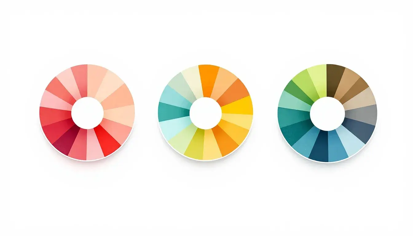
22 Sep 2025 · 3 min readColor: it’s the silent language we all understand, a force that shapes our perceptions and stirs our feelings. A perfectly pitched color scheme can transform the mundane into the magnificent, the sterile into the inviting. Understanding which colors sing together, which unlock a particular mood, is paramount to great design. What lies beyond the singular statement of a monochromatic world, beyond the comfortable embrace of analogous shades? The answer is the vibrant, daring world of triadic palettes, where three carefully chosen hues strike a chord of balance and visual interest. This exploration seeks to present the most striking combinations poised to take center stage, palettes that reflect both sophisticated taste and intuitive understanding of the emotional power of color as we approach the design currents of 2025.
The "Gotham FC" ⚽ palette exists in a realm where urban grit meets athletic grace. Light Sky Blue, the dominant force, speaks of open skies above the stadium, the promise of victory on the horizon. Olive Drab and Seafoam Green introduce a subtle grounding, like well-worn turf underfoot, providing a sense of solid stability. The Hunter Green deepens the composition, an echo of the determination and focus within the team itself, hinting at the quiet intensity beneath the surface. Finally, Prussian Blue enters as a confident declaration, mirroring the electrifying energy of a floodlit game. This is a scheme built for modern, confident branding; think bold typography against textured backgrounds. The balance it strikes is far from gentle; its strength resides in the contrast, providing a stark, memorable look. It is a story woven with shades of quiet determination and exhilarating action, like the feeling of anticipation before the winning goal. This offers a sophisticated visual identity for a professional team, speaking to dedication and unwavering focus, with allusions to the physical landscape of a sport but leaning into the aspirational aspects of team identity.
The "Spirit Colors" ⚽ palette presents a story of raw energy tempered by grounding earth tones. Vibrant Yellow bursts forth with undeniable enthusiasm, a beacon drawing the eye, like a spotlight illuminating center stage. Bright Lime dances alongside, contributing to the overall feeling of exhilaration and zest. Balancing these are Dusty Rose and Dark Coral, acting as anchors, their more muted character calming the heightened senses. Deep Brown provides a foundation, offering a comforting sense of reality. Consider applications in spaces designed for movement and activity; the palette's inherent exuberance translates well to dynamic environments. This is a combination that celebrates the power of opposites, where raw energy meets grounded pragmatism, resulting in a feeling of motivated joy. These colors create an environment akin to a lively fitness studio, imbued with the spirit of challenge and the satisfaction of pushing limits. It's a call to action, a reminder that with energy and focus, anything is possible.
The "Bakery Palette" 🥐 is a feast for the eyes, a sensory indulgence that transcends mere sustenance. Light Coral invites you in with warmth, evoking the gentle blush of a perfectly baked pastry. Cool Teal offers an unexpected, revitalizing counterpoint, like a refreshing glaze that cuts through sweetness. Auburn Brown contributes a rich depth, bringing to mind the aroma of toasted spices and caramelized sugar. Deep Brown further grounds the palette, providing a sense of sturdy comfort, like the crackling crust of a country loaf. A whisper of Off Black adds definition, like delicate chocolate shavings atop a masterpiece. Picture a boutique pastry shop, where artistic confections take center stage against a backdrop of warm textures and subtle contrasts. This scheme allows for delicate details to shine; its strength resides in its ability to balance indulgence with sophistication. The palette evokes feelings found inside a bustling bakery, where the clatter of pans mixes with the irresistible smell of warm desserts.
These carefully conceived triadic palettes offer more than simple visual delight. They speak to our subconscious, stirring feelings of confidence, energy, and comfort. They serve as potent tools for designers and artists alike, providing a framework to translate ideas into resonant experiences. They offer a future design space that values not only beauty, but also the emotional impact colors can produce when combined with care and intention. They suggest that successful design in 2025 will be about creating meaningful environments and experiences; by mastering the interplay of colors, we can build spaces and identities that are not only visually appealing, but also emotionally engaging.