The Psychology of Brown: Mood Trends in Earthy Color Palettes
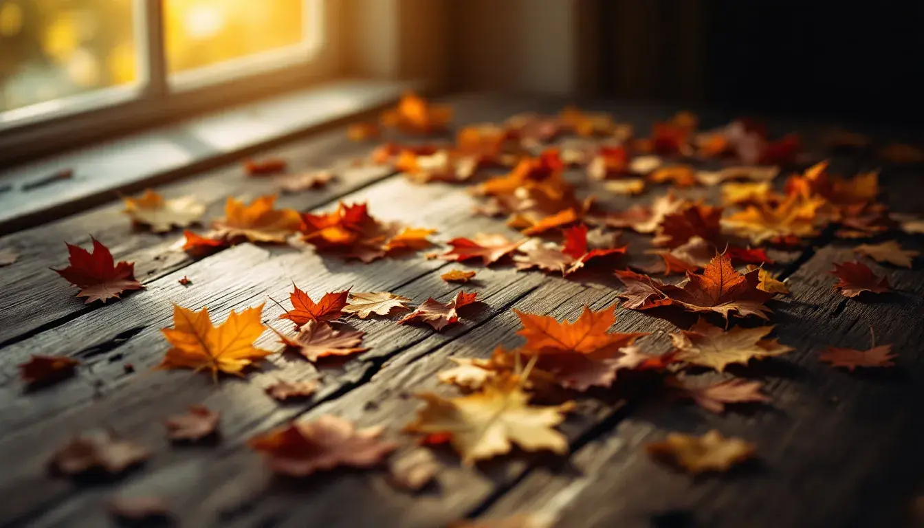
22 Sep 2025 · 3 min readFrom the quiet rustle of fallen leaves to the rich aroma of freshly turned soil, brown anchors us to the earth. It’s the color of home, not in the bright, primary sense, but in a way that speaks of woodsmoke and hearth fires, the worn comfort of well-loved things. But brown is more than just a backdrop. It whispers of hidden depths, the cool, dark earth beneath our feet where secrets are kept and life quietly flourishes. How can we utilize this powerful color to enhance our design and inspire our senses? The palettes explored here offer avenues into understanding this grounding hue. We explore colors reminiscent of aged leather, the muted gold of late summer fields, and the deep shadows of an ancient forest, each one suggesting unique possibilities available through skillful use. These are not just color schemes, they are invitations to craft meaningful experiences through thoughtful choices.
Earthy Elegance offers a tranquil reflection on the natural world, reimagined with sophistication. Soft White gives way to Blue Slate, suggesting the muted reflection on a misty lake at dawn. This hints at a refined sensibility, evoking the feeling of a treasured heirloom, perhaps a piece of antique porcelain, meticulously preserved. The palette transitions into Khaki Green, deepened by Deep Brown, creating a sense of fertile ground. The cool, reserved tones suggest an individual possessed of quiet confidence. This isn't about showy displays, but about the assurance that comes from a deep connection to one’s roots. The use of Dark Forest further enhances this theme. One can imagine this palette gracing the walls of a secluded library, lined with leather-bound books and casting a gentle, inviting atmosphere. Or consider the muted tones of a bespoke tweed suit, conveying quiet competence and refined taste. It speaks of enduring traditions, of objects carefully chosen and cherished for their intrinsic beauty rather than fleeting trends. With its sophisticated layering of neutral tones, this palette is ideal for creating spaces which feel grounded, restorative, and quietly luxurious. It's a subtle, sophisticated ode to understated beauty, a world away from the clamor and noise of modern life.
Harvest Dusk captures the essence of a fading autumn day, the moment when the sun dips below the horizon and the world is bathed in a soft, golden light. The introduction of Bright Gold brings to mind fields of ripened wheat shimmering in the last light of day, a visual representation of abundance and fulfillment. It speaks of gatherings around a crackling fire, sharing stories and laughter as the days grow shorter. The inclusion of Stone Gray introduces a grounding element, the quiet strength of weathered stone walls and ancient pathways. Khaki Green softens the palette, bringing to mind dried foliage. This creates an inviting atmosphere suited to spaces where warmth is prioritized. The presence of Burgundy Wine and Dark Maroon suggests the rich colors of autumn fruits. It indicates feelings of nostalgia and a deep appreciation for the cyclical nature of life. Imagine a cozy cottage nestled in rolling hills, with overflowing baskets of apples and grapes, the air filled with the scent of cinnamon and woodsmoke. This palette would excel in creating intimate and personal spaces, a place to recharge, reconnect, and savor the simple joys of life. It is an invitation to slow down, appreciate the beauty of the present moment, and find comfort in the familiar rhythms of nature.
Gilded Grove evokes a sense of timeless elegance, reminiscent of sunlight filtering through the canopy of an ancient wood. The Pale Yellow introduces a hint of opulence, reflecting light. It suggests precious metals and refined craftsmanship. Khaki Green speaks to the resilience and enduring nature of the natural world. This infuses the scene with a feeling of tranquility and connection to a long and storied past. The palette is grounded by Grayish Taupe and intensified by Dark Olive, providing an important counterpoint of subtlety. It indicates attention to detail and a willingness to embrace natural imperfections. The presence of Charcoal Gray anchors the palette, lending a sense of structure and sophistication to balance a warm, inviting scene. Imagine the interior of a grand estate, filled with antiques and heirlooms. Or consider the design of a classic timepiece, crafted with precision and built to last for generations. This palette is well-suited for creating environments which feel both luxurious and sustainable. It speaks to a deep appreciation for craftsmanship, tradition, and the enduring beauty of the natural world. It's a subtle reminder to seek out lasting experiences and cultivate a sense of mindful appreciation for the world around us.
The thread that binds these palettes together is an understanding of brown as something more than just a neutral backdrop. Brown, in its myriad forms, brings forth a sense of belonging and quiet reflection. From the muted sophistication of "Earthy Elegance" to the cozy warmth of "Harvest Dusk" and the timeless elegance of "Gilded Grove," each palette offers a distinct perspective on how this grounding hue can be used to create spaces and experiences which resonate deeply within us. These explorations encourage us to think beyond fleeting trends, embracing enduring qualities, and establishing a profound appreciation for the quiet but powerful beauty of the earth.