The Art of Saturation: A 2025 Analysis
22 Sep 2025 · 3 min readColor, in its quiet power, dictates the unspoken narrative of our surroundings. It shapes how we feel in a space, influences our choices, and colors our perceptions. In 2025, as our world continues to crave both constant stimulation and pockets of peace, the artful employment of saturation becomes not just a aesthetic choice but a vital element for crafting experiences. What we choose to dial up or down, to mute or amplify, reflects a growing awareness of how color profoundly impacts our collective well-being. These palettes represent a subtle sophistication, acknowledging our desire for both vibrancy and solace. This is an exploration of how designers imagine the world anew, rendered through the lens of carefully considered hues in wellness, personal space, and visual messaging.
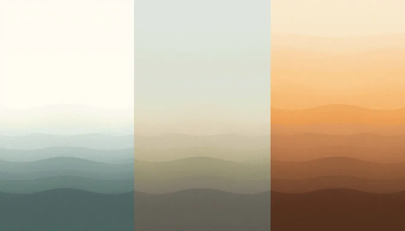
Earthy Serenity 🌿 offers a breath of fresh air, translating the feeling of a tranquil morning into a wash of gentle tones. Imagine stepping into a spa where Pale Off-White walls meet the gentle reflection of Light Blue-Gray tiles. There's an immediate sense of calm, as if the weight of the day simply melts away. The palette's gentle nature suggests a space dedicated to introspection, where the outside world fades into a hushed whisper. Soft Airy Blue hints at open skies and boundless potential, while Neutral Taupe brings a grounding presence, reminiscent of warm earth underfoot. Even Dusty Green introduces a touch of the natural world indoors, not as a statement, but as a subtle reminder of organic life and growth. The overall experience is one of seamless escape, a sanctuary designed to nurture mindfulness and rest. Think of the subtle branding of a wellness retreat, suggesting rejuvenation by association, or the refreshing interface of a healthcare app that instills trust and serenity from the very first click. This palette invites us to slow down, to connect to our breath, and to rediscover the beauty of simplicity.
Earthy Harmony 🌿 whispers of quiet mornings spent in sun-drenched kitchens, the scent of freshly baked bread lingering in the air. This palette evokes the comfort of the familiar, like an old photograph faded at the edges yet rich with feeling. Pale Beige forms the foundation, a soft and welcoming backdrop against which daily life unfolds. Dusty Grey introduces a touch of understated elegance, not flashy but quietly dignified, like time-worn stone. Khaki Green speaks not of bold declarations but cozy environments, where conversations flow easily and warmth spreads organically. Cool Grey, further refines the mood, adding a dose neutrality, like concrete smoothed by the passage of generations. Even Deep Teal, anchors the scheme with its deep saturation, hinting at hidden depths and a sense of reassurance. Imagine the branding for a line of sustainable household goods, subtly communicating durability and environmental consciousness. This palette is not about making a splash, but about cultivating an atmosphere of genuine connection, simple pleasures, and quiet joy.
Earthy Elegance 🍁 presents a sophisticated take on autumnal warmth, reminiscent of leather-bound books and crackling fireplaces. It's the color story of an intimate gathering, where light dances across polished wood and shadows deepen in the corners. Rose Quartz introduces a glimmer of romance, like the flush of sunset on a distant hillside. Burnt Sienna adds a sense of grounded richness, like the texture of well-worn timber or an old brick wall. Taupe Brown provides a comforting neutrality, like a soft blanket inviting us to unwind. Cool Gray brings a dash of modernity, as if chrome accents gleam in the low light while Dark Mahogany anchors the palette with a hint of mystery and drama. Envision a boutique fashion brand, communicating quality and enduring appeal through visual cues as well as craftsmanship. This palette understands there is real beauty in simplicity, that can convey sophistication without shouting, and evoke a sense of timeless comfort without feeling dated.
In 2025 the embrace of softened saturation speaks volumes about our evolving desires. From the wellness sector to the fashion world, these palettes offer a visual language of calm, connection, and understated beauty. They represent a deliberate choice to navigate the digital age with a sense of grounded awareness, crafting environments and experiences that nurture our well-being without sacrificing aesthetic appeal. These colors aren’t just hues; they are invitations to slow down, to connect, and to rediscover the art of mindful living.