'%3e%3cpath%20fill-rule='evenodd'%20clip-rule='evenodd'%20d='M51.1303%2019.2492C50.7278%2019.913%2050.1346%2020.4426%2049.3508%2020.838C48.5669%2021.2335%2047.6172%2021.4312%2046.5014%2021.4312C44.8208%2021.4312%2043.4367%2021.0216%2042.3492%2020.2025C41.2617%2019.3833%2040.6686%2018.2394%2040.5697%2016.7706H44.4253C44.4818%2017.3355%2044.6831%2017.7804%2045.0291%2018.1052C45.3751%2018.43%2045.8164%2018.5924%2046.3531%2018.5924C46.8192%2018.5924%2047.1864%2018.4653%2047.4547%2018.2111C47.7231%2017.9569%2047.8572%2017.618%2047.8572%2017.1943C47.8572%2016.8129%2047.7337%2016.4952%2047.4865%2016.241C47.2393%2015.9867%2046.9322%2015.7784%2046.565%2015.616C46.1978%2015.4536%2045.6893%2015.2594%2045.0397%2015.0334C44.0934%2014.7086%2043.3202%2014.3944%2042.72%2014.0907C42.1197%2013.7871%2041.6042%2013.3351%2041.1735%2012.7349C40.7427%2012.1347%2040.5273%2011.3544%2040.5273%2010.394C40.5273%209.50418%2040.7533%208.73448%2041.2053%208.08481C41.6572%207.43515%2042.2821%206.93731%2043.0801%206.5913C43.8781%206.24528%2044.7925%206.07227%2045.8235%206.07227C47.49%206.07227%2048.8141%206.46771%2049.7956%207.25861C50.7772%208.04951%2051.3315%209.13698%2051.4586%2010.5211H47.5395C47.4689%2010.0268%2047.2888%209.63483%2046.9993%209.3453C46.7097%209.05578%2046.3178%208.91102%2045.8235%208.91102C45.3998%208.91102%2045.0573%209.024%2044.7961%209.24997C44.5348%209.47594%2044.4041%209.80783%2044.4041%2010.2457C44.4041%2010.5988%2044.5207%2010.8989%2044.7537%2011.146C44.9867%2011.3932%2045.2798%2011.5944%2045.6328%2011.7498C45.9859%2011.9052%2046.4944%2012.1029%2047.1581%2012.343C48.1185%2012.6678%2048.9023%2012.9891%2049.5096%2013.3069C50.1169%2013.6246%2050.6395%2014.0872%2051.0773%2014.6945C51.5151%2015.3018%2051.734%2016.0927%2051.734%2017.0672C51.734%2017.8581%2051.5328%2018.5854%2051.1303%2019.2492ZM59.0242%206.3053V21.2829H55.4016V6.3053H59.0242ZM73.9409%206.3053V9.18642H69.8734V21.2829H66.2296V9.18642H62.2046V6.3053H73.9409ZM80.7438%209.18642V12.3218H85.8069V15.0546H80.7438V18.3806H86.4425V21.2829H77.1212V6.3053H86.4425V9.18642H80.7438ZM99.667%2016.0291V21.2829H96.0444V6.3053H101.913C103.692%206.3053%20105.048%206.74665%20105.98%207.62934C106.912%208.51204%20107.378%209.7019%20107.378%2011.199C107.378%2012.1311%20107.17%2012.9609%20106.753%2013.6882C106.337%2014.4155%20105.719%2014.9875%20104.9%2015.4042C104.08%2015.8208%20103.085%2016.0291%20101.913%2016.0291H99.667ZM103.692%2011.199C103.692%209.8855%20102.965%209.22879%20101.51%209.22879H99.667V13.1268H101.51C102.965%2013.1268%20103.692%2012.4842%20103.692%2011.199ZM120.092%2018.5501H114.478L113.546%2021.2829H109.732L115.219%206.41123H119.393L124.879%2021.2829H121.024L120.092%2018.5501ZM119.16%2015.7961L117.295%2010.2881L115.41%2015.7961H119.16ZM131.555%2018.5077H136.385V21.2829H127.933V6.3053H131.555V18.5077ZM143.337%209.18642V12.3218H148.4V15.0546H143.337V18.3806H149.035V21.2829H139.714V6.3053H149.035V9.18642H143.337ZM163.507%206.3053V9.18642H159.44V21.2829H155.796V9.18642H151.771V6.3053H163.507ZM177.449%206.3053V9.18642H173.382V21.2829H169.738V9.18642H165.713V6.3053H177.449ZM184.252%209.18642V12.3218H189.315V15.0546H184.252V18.3806H189.951V21.2829H180.629V6.3053H189.951V9.18642H184.252Z'%20fill='%23EEF0ED'/%3e%3cmask%20id='mask0_3101_7327'%20style='mask-type:alpha'%20maskUnits='userSpaceOnUse'%20x='0'%20y='0'%20width='27'%20height='28'%3e%3cpath%20d='M23.8328%200.759766H2.64808C1.18559%200.759766%200%201.94535%200%203.40785V24.5925C0%2026.055%201.18559%2027.2406%202.64808%2027.2406H23.8328C25.2952%2027.2406%2026.4808%2026.055%2026.4808%2024.5925V3.40785C26.4808%201.94535%2025.2952%200.759766%2023.8328%200.759766Z'%20fill='white'/%3e%3c/mask%3e%3cg%20mask='url(%23mask0_3101_7327)'%3e%3cpath%20d='M23.8328%200.759766H2.64808C1.18559%200.759766%200%201.94535%200%203.40785V24.5925C0%2026.055%201.18559%2027.2406%202.64808%2027.2406H23.8328C25.2952%2027.2406%2026.4808%2026.055%2026.4808%2024.5925V3.40785C26.4808%201.94535%2025.2952%200.759766%2023.8328%200.759766Z'%20fill='%23D8D8D8'/%3e%3cpath%20d='M13.2404%200.759766H0V14.0001H13.2404V0.759766Z'%20fill='%238C61FF'/%3e%3cpath%20d='M13.2404%2014H0V27.2404H13.2404V14Z'%20fill='%2336C3FE'/%3e%3cpath%20d='M26.4806%2014H13.2402V27.2404H26.4806V14Z'%20fill='%236592FE'/%3e%3cpath%20d='M26.4806%200.759766H13.2402V14.0002H26.4806V0.759766Z'%20fill='%236059F7'/%3e%3c/g%3e%3c/g%3e%3cdefs%3e%3cclipPath%20id='clip0_3101_7327'%3e%3crect%20width='190'%20height='28'%20fill='white'/%3e%3c/clipPath%3e%3c/defs%3e%3c/svg%3e)
'%3e%3cpath%20d='M23.8328%200.759521H2.64808C1.18559%200.759521%200%201.94511%200%203.40761V24.5923C0%2026.0548%201.18559%2027.2404%202.64808%2027.2404H23.8328C25.2952%2027.2404%2026.4808%2026.0548%2026.4808%2024.5923V3.40761C26.4808%201.94511%2025.2952%200.759521%2023.8328%200.759521Z'%20fill='%23D8D8D8'/%3e%3cpath%20d='M13.2404%200.759521H0V13.9999H13.2404V0.759521Z'%20fill='%238C61FF'/%3e%3cpath%20d='M13.2404%2013.9998H0V27.2402H13.2404V13.9998Z'%20fill='%2336C3FE'/%3e%3cpath%20d='M26.4809%2013.9998H13.2405V27.2402H26.4809V13.9998Z'%20fill='%236592FE'/%3e%3cpath%20d='M26.4809%200.759277H13.2405V13.9997H26.4809V0.759277Z'%20fill='%236059F7'/%3e%3c/g%3e%3c/svg%3e)
Project Matchmaker: Which Projects Benefit Most From Specific Palettes?
22 Sep 2025 · 3 min readColor: the silent storyteller, the unseen architect of feeling. It whispers intentions, screams declarations, and gently guides the eye through experiences. To choose a palette is to decide the emotional current of a project, dictating how information is received, how brands are perceived, and how spaces feel. Get it wrong, and the message muddies. Nail it, and suddenly a website hums with authority, a report feels immediately trustworthy, or a brand identity solidifies into something deeply resonant. The right colors are the scaffolding upon which compelling narratives are built. We’re venturing into a world where pigments become prose, where hues hold histories, and where the application of color transforms the ordinary into the extraordinary. It's a matchmaker service, but instead of people, we're pairing palettes with their perfect projects.
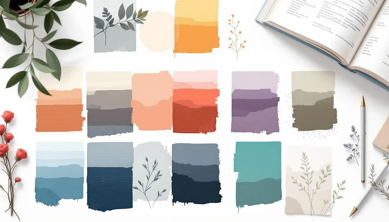
The "London University" palette speaks of hallowed halls and academic pursuits, a quiet strength refined over time. Imagine the weight of well-worn books, the soft glow of library lamps, the intellectual hum of focused minds. There's a distinct air of authority here, but not one that feels overbearing. It's the kind of authority that comes from quiet confidence, from years of accumulated wisdom. The Pale Beige offers a gentle canvas, reminiscent of aged parchment, while the Medium Gray provides a sophisticated balance. Steel Blue introduces a touch of formality, a nod to tradition and established order. Taupe Brown brings an element of groundedness, a connection to the physical world of lecture halls and study spaces. Finally, Dark Indigo adds depth and gravitas, suggesting the profound insights waiting to be discovered. Picture this palette gracing the website of a prestigious institution. It would immediately signal credibility and trustworthiness. Consider it shaping the design of an annual report: its somber elegance would lend weight to the data within. This is a palette that conveys serious intent, a refusal to be frivolous, and a commitment to enduring quality. It whispers of rigorous scholarship and intellectual exploration, making it an ideal choice for projects that demand a sense of history and profound thought. It is the visual equivalent of a leather-bound volume, promising substance and lasting value.
The "Portfolio Palette" navigates the delicate balance of showcasing creativity while maintaining an air of professional composure. It's the visual equivalent of a perfectly tailored suit paired with an unexpected accessory, hinting at artistic flair restrained by a desire for serious consideration. Light Gray acts as a neutral stage, allowing the work to take precedence without feeling sterile. Mustard Yellow injects a dose of personality, a spark of creativity that says, "I'm not afraid to be bold." Cool Gray offers a counterpoint, suggesting a calm and collected demeanor, while Steel Blue reinforces the sense of reliability and competence. Rust Red adds a touch of warmth and passion, hinting at the dedication and energy invested in each project. Envision this palette driving the design of online presentations. Its carefully curated colors would command attention without overwhelming the audience. See it breathing life into a website, where clear communication and visual appeal are blended. This is not a palette for the loud or flamboyant. It's about conveying sophistication, intelligence, and a keen eye for detail. It avoids extremes, instead opting for a harmonious blend of colors that suggest both creativity and reliability. It's a silent advocate, a visual endorsement that reassures clients they are in capable hands.
"Earthy Elegance" offers a quiet retreat from the relentless pace of the modern world, a palette that whispers of organic textures and understated grace. Imagine walking barefoot through a tranquil forest, surrounded by the muted tones of fallen leaves and ancient trees. Light Concrete provides a subtle foundation, reminiscent of smoothed stone, while Neutral Taupe adds a comforting warmth. Muted Olive introduces an element of natural intrigue, suggesting the subtle variations found in the earth. Deep Beige conveys a sense of timelessness, a connection to traditions and enduring values. Dark Umber reinforces the sense of grounding, anchoring the palette in a rich and substantial base. Imagine a brand identity built upon this palette. It would speak of authenticity and a deep respect for nature. Picture it shaping the design of a website, where calm and rejuvenation are the primary goals. This is not a palette for those seeking immediate thrills or attention. It favors quality, depth, and a refined approach to design. It seeks to evoke feelings of serenity, balance, and a sense of belonging. It’s a curated collection of tones that promotes well-being and restfulness.
The language of color extends far beyond mere decoration. The palettes have highlighted how color informs perception, establishes trust, and shapes experience. "London University" illustrated how it conveys authority and academic prestige, lending gravitas to important information. “Portfolio Palette" highlighted a refined approach to professional expression, delicately balancing creativity with competence. Lastly, “Earthy Elegance” offered a case study in understated sophistication, turning away from the frenetic pace of modern life. Let these palettes serve as reminders: color is not merely ornamental. It is the foundation.