'%3e%3cpath%20fill-rule='evenodd'%20clip-rule='evenodd'%20d='M51.1303%2019.2492C50.7278%2019.913%2050.1346%2020.4426%2049.3508%2020.838C48.5669%2021.2335%2047.6172%2021.4312%2046.5014%2021.4312C44.8208%2021.4312%2043.4367%2021.0216%2042.3492%2020.2025C41.2617%2019.3833%2040.6686%2018.2394%2040.5697%2016.7706H44.4253C44.4818%2017.3355%2044.6831%2017.7804%2045.0291%2018.1052C45.3751%2018.43%2045.8164%2018.5924%2046.3531%2018.5924C46.8192%2018.5924%2047.1864%2018.4653%2047.4547%2018.2111C47.7231%2017.9569%2047.8572%2017.618%2047.8572%2017.1943C47.8572%2016.8129%2047.7337%2016.4952%2047.4865%2016.241C47.2393%2015.9867%2046.9322%2015.7784%2046.565%2015.616C46.1978%2015.4536%2045.6893%2015.2594%2045.0397%2015.0334C44.0934%2014.7086%2043.3202%2014.3944%2042.72%2014.0907C42.1197%2013.7871%2041.6042%2013.3351%2041.1735%2012.7349C40.7427%2012.1347%2040.5273%2011.3544%2040.5273%2010.394C40.5273%209.50418%2040.7533%208.73448%2041.2053%208.08481C41.6572%207.43515%2042.2821%206.93731%2043.0801%206.5913C43.8781%206.24528%2044.7925%206.07227%2045.8235%206.07227C47.49%206.07227%2048.8141%206.46771%2049.7956%207.25861C50.7772%208.04951%2051.3315%209.13698%2051.4586%2010.5211H47.5395C47.4689%2010.0268%2047.2888%209.63483%2046.9993%209.3453C46.7097%209.05578%2046.3178%208.91102%2045.8235%208.91102C45.3998%208.91102%2045.0573%209.024%2044.7961%209.24997C44.5348%209.47594%2044.4041%209.80783%2044.4041%2010.2457C44.4041%2010.5988%2044.5207%2010.8989%2044.7537%2011.146C44.9867%2011.3932%2045.2798%2011.5944%2045.6328%2011.7498C45.9859%2011.9052%2046.4944%2012.1029%2047.1581%2012.343C48.1185%2012.6678%2048.9023%2012.9891%2049.5096%2013.3069C50.1169%2013.6246%2050.6395%2014.0872%2051.0773%2014.6945C51.5151%2015.3018%2051.734%2016.0927%2051.734%2017.0672C51.734%2017.8581%2051.5328%2018.5854%2051.1303%2019.2492ZM59.0242%206.3053V21.2829H55.4016V6.3053H59.0242ZM73.9409%206.3053V9.18642H69.8734V21.2829H66.2296V9.18642H62.2046V6.3053H73.9409ZM80.7438%209.18642V12.3218H85.8069V15.0546H80.7438V18.3806H86.4425V21.2829H77.1212V6.3053H86.4425V9.18642H80.7438ZM99.667%2016.0291V21.2829H96.0444V6.3053H101.913C103.692%206.3053%20105.048%206.74665%20105.98%207.62934C106.912%208.51204%20107.378%209.7019%20107.378%2011.199C107.378%2012.1311%20107.17%2012.9609%20106.753%2013.6882C106.337%2014.4155%20105.719%2014.9875%20104.9%2015.4042C104.08%2015.8208%20103.085%2016.0291%20101.913%2016.0291H99.667ZM103.692%2011.199C103.692%209.8855%20102.965%209.22879%20101.51%209.22879H99.667V13.1268H101.51C102.965%2013.1268%20103.692%2012.4842%20103.692%2011.199ZM120.092%2018.5501H114.478L113.546%2021.2829H109.732L115.219%206.41123H119.393L124.879%2021.2829H121.024L120.092%2018.5501ZM119.16%2015.7961L117.295%2010.2881L115.41%2015.7961H119.16ZM131.555%2018.5077H136.385V21.2829H127.933V6.3053H131.555V18.5077ZM143.337%209.18642V12.3218H148.4V15.0546H143.337V18.3806H149.035V21.2829H139.714V6.3053H149.035V9.18642H143.337ZM163.507%206.3053V9.18642H159.44V21.2829H155.796V9.18642H151.771V6.3053H163.507ZM177.449%206.3053V9.18642H173.382V21.2829H169.738V9.18642H165.713V6.3053H177.449ZM184.252%209.18642V12.3218H189.315V15.0546H184.252V18.3806H189.951V21.2829H180.629V6.3053H189.951V9.18642H184.252Z'%20fill='%23EEF0ED'/%3e%3cmask%20id='mask0_3101_7327'%20style='mask-type:alpha'%20maskUnits='userSpaceOnUse'%20x='0'%20y='0'%20width='27'%20height='28'%3e%3cpath%20d='M23.8328%200.759766H2.64808C1.18559%200.759766%200%201.94535%200%203.40785V24.5925C0%2026.055%201.18559%2027.2406%202.64808%2027.2406H23.8328C25.2952%2027.2406%2026.4808%2026.055%2026.4808%2024.5925V3.40785C26.4808%201.94535%2025.2952%200.759766%2023.8328%200.759766Z'%20fill='white'/%3e%3c/mask%3e%3cg%20mask='url(%23mask0_3101_7327)'%3e%3cpath%20d='M23.8328%200.759766H2.64808C1.18559%200.759766%200%201.94535%200%203.40785V24.5925C0%2026.055%201.18559%2027.2406%202.64808%2027.2406H23.8328C25.2952%2027.2406%2026.4808%2026.055%2026.4808%2024.5925V3.40785C26.4808%201.94535%2025.2952%200.759766%2023.8328%200.759766Z'%20fill='%23D8D8D8'/%3e%3cpath%20d='M13.2404%200.759766H0V14.0001H13.2404V0.759766Z'%20fill='%238C61FF'/%3e%3cpath%20d='M13.2404%2014H0V27.2404H13.2404V14Z'%20fill='%2336C3FE'/%3e%3cpath%20d='M26.4806%2014H13.2402V27.2404H26.4806V14Z'%20fill='%236592FE'/%3e%3cpath%20d='M26.4806%200.759766H13.2402V14.0002H26.4806V0.759766Z'%20fill='%236059F7'/%3e%3c/g%3e%3c/g%3e%3cdefs%3e%3cclipPath%20id='clip0_3101_7327'%3e%3crect%20width='190'%20height='28'%20fill='white'/%3e%3c/clipPath%3e%3c/defs%3e%3c/svg%3e)
'%3e%3cpath%20d='M23.8328%200.759521H2.64808C1.18559%200.759521%200%201.94511%200%203.40761V24.5923C0%2026.0548%201.18559%2027.2404%202.64808%2027.2404H23.8328C25.2952%2027.2404%2026.4808%2026.0548%2026.4808%2024.5923V3.40761C26.4808%201.94511%2025.2952%200.759521%2023.8328%200.759521Z'%20fill='%23D8D8D8'/%3e%3cpath%20d='M13.2404%200.759521H0V13.9999H13.2404V0.759521Z'%20fill='%238C61FF'/%3e%3cpath%20d='M13.2404%2013.9998H0V27.2402H13.2404V13.9998Z'%20fill='%2336C3FE'/%3e%3cpath%20d='M26.4809%2013.9998H13.2405V27.2402H26.4809V13.9998Z'%20fill='%236592FE'/%3e%3cpath%20d='M26.4809%200.759277H13.2405V13.9997H26.4809V0.759277Z'%20fill='%236059F7'/%3e%3c/g%3e%3c/svg%3e)
Feeling Moody? Decoding the Emotional Landscape of Color Palettes
22 Sep 2025 · 3 min readThe shades we choose are never neutral. They narrate silent stories of our inner weather, our aspirations, the memories we unconsciously carry. A carefully curated palette feels like a shortcut to emotional expression because it is. Whether seeking to soothe anxieties, spark creativity, or simply reflect an authentic sense of self, the language of color offers a path through the labyrinth of feelings. A home cloaked in certain tones can be both sanctuary and statement. An outfit comprised of thoughtful hues projects confidence or softens the edges. To skillfully select and apply a color story is to deliberately shape your experience — and to subtly influence the perceptions of those around you. Color is rarely just aesthetic; it is atmosphere, memory, and emotion made visible. Let's explore how these emotional currents ripple through specific collections. Creating a refuge, perhaps? Or boldly setting a different stage.
Imagine strolling through a sun-dappled orchard in late autumn, the air crisp and the leaves crunching underfoot. This is the essence of "Earthy Contrast". This palette feels grounded, offering a sense of stability and connection to the natural world. Imagine a living space designed around these colors: the soft Muted Blue on the walls echoing the open sky, juxtaposed with the pop of the Vivid Coral in decorative pillows. The Golden Brown of wooden furniture, the calming Sage Green of potted plants, and the subtle Olive Drab of woven textiles further ground the space. It's a color scheme that breathes a sense of quiet confidence, perfect for cultivating moments of mindfulness. The pairing dances between cool serenity and invigorating warmth, a visual translation of emotional balance that might settle restless thoughts. If the question is how a room might feel like a pause button, this color recipe certainly lays the foundation. This palette creates a feeling of collected calm and belonging.
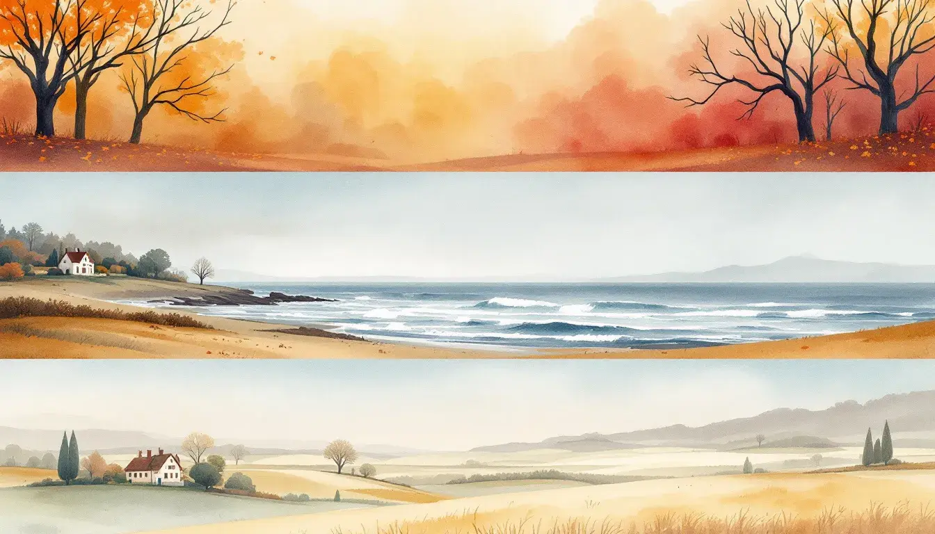
"Liberty Palette" evokes the feeling of standing on a wind-swept coastline, the air filled with the scent of salt and the distant cry of gulls. Think of the rhythmic wash of waves against the shore—a continuous, cleansing action. These colors suggest intellectual clarity and measured tranquility. Imagine this palette translated into a collaborative workspace. Light Cyan walls foster a sense of openness and innovation, while Steel Gray accents provide structure and focus. Cyan Blue furnishings add subtle energy, tempered by the grounding Dark Cyan in architectural details and the depth of Ebony in accent pieces. The feeling is purposeful, calming, and creatively charged. Those drawn to these hues likely appreciate spaces that feel efficient, elegant, perhaps even a bit detached. It's a color story for minds that find comfort in clean lines and streamlined thinking. It speaks of a place where ideas are sharpened and executed with precision. It's a palette of productivity poised to inspire.
With "Earthy Elegance," one can easily envision a grand estate nestled in the rolling hills of the countryside, bathed in the golden hour light. The feeling is both timeless and welcoming, suggesting stories etched into every surface. Envision the experience of a luxurious spa utilizing this palette: walls painted in the luminous Bright Gold, accented by the calming Stone Gray of natural stone features. Khaki Green linens envelop the space, with subtle notes of Burgundy Wine and Dark Maroon in decorative accents. It’s a palette that invites deep breaths and moments of self-reflection. It resonates with individuals seeking refuge from the chaos of modern life, yearning for a sense of history and permanence. This curated narrative of nature’s best is sure to make one feel pampered and present. Beyond aesthetics, it's a color story promising a feeling of both belonging and understated opulence.
The emotional narrative woven into a palette is a delicate conversation between color and experience. Each presented collection offers a distinct pathway to shaping our surroundings and, indeed, our inner states. "Earthy Contrast" balances serenity with invigorating energy, ideal for moments of mindful connection. "Liberty Palette" suggests focus and clarity, channeling a sense of productive calm. Finally, "Earthy Elegance" aims for a timeless narrative of understated luxury. The impact lies not just in visual harmony, but in how these color stories amplify and shape the way we feel—and, ultimately, how we want to relate to our world. From these collections we know that Calm appears the most at 3 times.