'%3e%3cpath%20fill-rule='evenodd'%20clip-rule='evenodd'%20d='M51.1303%2019.2492C50.7278%2019.913%2050.1346%2020.4426%2049.3508%2020.838C48.5669%2021.2335%2047.6172%2021.4312%2046.5014%2021.4312C44.8208%2021.4312%2043.4367%2021.0216%2042.3492%2020.2025C41.2617%2019.3833%2040.6686%2018.2394%2040.5697%2016.7706H44.4253C44.4818%2017.3355%2044.6831%2017.7804%2045.0291%2018.1052C45.3751%2018.43%2045.8164%2018.5924%2046.3531%2018.5924C46.8192%2018.5924%2047.1864%2018.4653%2047.4547%2018.2111C47.7231%2017.9569%2047.8572%2017.618%2047.8572%2017.1943C47.8572%2016.8129%2047.7337%2016.4952%2047.4865%2016.241C47.2393%2015.9867%2046.9322%2015.7784%2046.565%2015.616C46.1978%2015.4536%2045.6893%2015.2594%2045.0397%2015.0334C44.0934%2014.7086%2043.3202%2014.3944%2042.72%2014.0907C42.1197%2013.7871%2041.6042%2013.3351%2041.1735%2012.7349C40.7427%2012.1347%2040.5273%2011.3544%2040.5273%2010.394C40.5273%209.50418%2040.7533%208.73448%2041.2053%208.08481C41.6572%207.43515%2042.2821%206.93731%2043.0801%206.5913C43.8781%206.24528%2044.7925%206.07227%2045.8235%206.07227C47.49%206.07227%2048.8141%206.46771%2049.7956%207.25861C50.7772%208.04951%2051.3315%209.13698%2051.4586%2010.5211H47.5395C47.4689%2010.0268%2047.2888%209.63483%2046.9993%209.3453C46.7097%209.05578%2046.3178%208.91102%2045.8235%208.91102C45.3998%208.91102%2045.0573%209.024%2044.7961%209.24997C44.5348%209.47594%2044.4041%209.80783%2044.4041%2010.2457C44.4041%2010.5988%2044.5207%2010.8989%2044.7537%2011.146C44.9867%2011.3932%2045.2798%2011.5944%2045.6328%2011.7498C45.9859%2011.9052%2046.4944%2012.1029%2047.1581%2012.343C48.1185%2012.6678%2048.9023%2012.9891%2049.5096%2013.3069C50.1169%2013.6246%2050.6395%2014.0872%2051.0773%2014.6945C51.5151%2015.3018%2051.734%2016.0927%2051.734%2017.0672C51.734%2017.8581%2051.5328%2018.5854%2051.1303%2019.2492ZM59.0242%206.3053V21.2829H55.4016V6.3053H59.0242ZM73.9409%206.3053V9.18642H69.8734V21.2829H66.2296V9.18642H62.2046V6.3053H73.9409ZM80.7438%209.18642V12.3218H85.8069V15.0546H80.7438V18.3806H86.4425V21.2829H77.1212V6.3053H86.4425V9.18642H80.7438ZM99.667%2016.0291V21.2829H96.0444V6.3053H101.913C103.692%206.3053%20105.048%206.74665%20105.98%207.62934C106.912%208.51204%20107.378%209.7019%20107.378%2011.199C107.378%2012.1311%20107.17%2012.9609%20106.753%2013.6882C106.337%2014.4155%20105.719%2014.9875%20104.9%2015.4042C104.08%2015.8208%20103.085%2016.0291%20101.913%2016.0291H99.667ZM103.692%2011.199C103.692%209.8855%20102.965%209.22879%20101.51%209.22879H99.667V13.1268H101.51C102.965%2013.1268%20103.692%2012.4842%20103.692%2011.199ZM120.092%2018.5501H114.478L113.546%2021.2829H109.732L115.219%206.41123H119.393L124.879%2021.2829H121.024L120.092%2018.5501ZM119.16%2015.7961L117.295%2010.2881L115.41%2015.7961H119.16ZM131.555%2018.5077H136.385V21.2829H127.933V6.3053H131.555V18.5077ZM143.337%209.18642V12.3218H148.4V15.0546H143.337V18.3806H149.035V21.2829H139.714V6.3053H149.035V9.18642H143.337ZM163.507%206.3053V9.18642H159.44V21.2829H155.796V9.18642H151.771V6.3053H163.507ZM177.449%206.3053V9.18642H173.382V21.2829H169.738V9.18642H165.713V6.3053H177.449ZM184.252%209.18642V12.3218H189.315V15.0546H184.252V18.3806H189.951V21.2829H180.629V6.3053H189.951V9.18642H184.252Z'%20fill='%23EEF0ED'/%3e%3cmask%20id='mask0_3101_7327'%20style='mask-type:alpha'%20maskUnits='userSpaceOnUse'%20x='0'%20y='0'%20width='27'%20height='28'%3e%3cpath%20d='M23.8328%200.759766H2.64808C1.18559%200.759766%200%201.94535%200%203.40785V24.5925C0%2026.055%201.18559%2027.2406%202.64808%2027.2406H23.8328C25.2952%2027.2406%2026.4808%2026.055%2026.4808%2024.5925V3.40785C26.4808%201.94535%2025.2952%200.759766%2023.8328%200.759766Z'%20fill='white'/%3e%3c/mask%3e%3cg%20mask='url(%23mask0_3101_7327)'%3e%3cpath%20d='M23.8328%200.759766H2.64808C1.18559%200.759766%200%201.94535%200%203.40785V24.5925C0%2026.055%201.18559%2027.2406%202.64808%2027.2406H23.8328C25.2952%2027.2406%2026.4808%2026.055%2026.4808%2024.5925V3.40785C26.4808%201.94535%2025.2952%200.759766%2023.8328%200.759766Z'%20fill='%23D8D8D8'/%3e%3cpath%20d='M13.2404%200.759766H0V14.0001H13.2404V0.759766Z'%20fill='%238C61FF'/%3e%3cpath%20d='M13.2404%2014H0V27.2404H13.2404V14Z'%20fill='%2336C3FE'/%3e%3cpath%20d='M26.4806%2014H13.2402V27.2404H26.4806V14Z'%20fill='%236592FE'/%3e%3cpath%20d='M26.4806%200.759766H13.2402V14.0002H26.4806V0.759766Z'%20fill='%236059F7'/%3e%3c/g%3e%3c/g%3e%3cdefs%3e%3cclipPath%20id='clip0_3101_7327'%3e%3crect%20width='190'%20height='28'%20fill='white'/%3e%3c/clipPath%3e%3c/defs%3e%3c/svg%3e)
'%3e%3cpath%20d='M23.8328%200.759521H2.64808C1.18559%200.759521%200%201.94511%200%203.40761V24.5923C0%2026.0548%201.18559%2027.2404%202.64808%2027.2404H23.8328C25.2952%2027.2404%2026.4808%2026.0548%2026.4808%2024.5923V3.40761C26.4808%201.94511%2025.2952%200.759521%2023.8328%200.759521Z'%20fill='%23D8D8D8'/%3e%3cpath%20d='M13.2404%200.759521H0V13.9999H13.2404V0.759521Z'%20fill='%238C61FF'/%3e%3cpath%20d='M13.2404%2013.9998H0V27.2402H13.2404V13.9998Z'%20fill='%2336C3FE'/%3e%3cpath%20d='M26.4809%2013.9998H13.2405V27.2402H26.4809V13.9998Z'%20fill='%236592FE'/%3e%3cpath%20d='M26.4809%200.759277H13.2405V13.9997H26.4809V0.759277Z'%20fill='%236059F7'/%3e%3c/g%3e%3c/svg%3e)
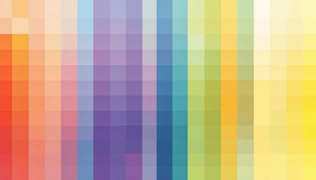
Dominant Hue Heatmap: Visualizing Color Dominance by Associated Emotion
22 Sep 2025 · 2 min readColor transcends simple optics; it strikes directly at our feelings. Imagine charting this immediate, almost involuntary, relationship – the blush of a color wash across a mood, the cold certainty of another. A dominant hue heatmap, then, reveals a landscape of emotional connections, a cartography not of the earth, but of our states of mind. It's about visualizing which colors most strikingly influence our experiences. The arrangement of tones can become a story, painting pictures even before words can form. Understanding these arrangements opens new passages for visual design, crafting subtle yet distinct experiences that meet the viewer where words cannot.
Urban Sunset conjures the close of day reflected in city windows, not with sentiment, but with grit. Light Steel Blue, though serene in name, appears almost metallic against the boldness of Vibrant Orange and Crimson Red. This is not the rosy nostalgia of a fading summer, but a tougher beauty – concrete softened by fleeting warmth. The Mauve Rose adds a muted layer, like exhaust tinged with blush. Dark Charcoal grounds the palette with a shadow, the promise of night enveloping everything. To chart this palette across a domain of emotions is to understand where the urban fabric meets raw feeling. Imagine the heatmap highlighting the connection between this suite of colors to the disquiet of a city at dusk, to the fleeting freedom of a rooftop view. It’s a story told in asphalt and reflected lights, a visual dialogue where orange fights against encroaching gray. Each shade pulls the viewer between worlds: the stark reality of the city, contrasted against the dreamlike haze of the skyline, where the horizon blurs between fire and darkness. The palette becomes a signifier of transient beauty found within hard edges.
Modern Serenity whispers of quiet mornings, cool and composed. Think of fog lifting off still waters, a moment held before a busy day. Misty Blue and Light Indigo blend as if two sides of a single, tranquil vision. Slate Gray offers a steadying presence, akin to smooth, worn stone. Compared to those, the touch of Deep BlackishBlue is not harsh, but rather like the depth of a twilight sky: a calm, embracing darkness. The palette is clean and focused; it doesn't shout, but rather guides senses towards a meditative state. Seen through a heatmap, colors here become gentle markers connecting specific, peaceful emotional states. Imagine the softest region mapping to relief after a stressful encounter, or an area defining focused calm against a backdrop of distraction. This experience makes it possible to visually communicate spaces of rest, areas that welcome quiet engagement; more than just a background to daily life, it becomes a space of deliberate emotional curation. These colors, when visualized, lead to understanding which combinations create serenity.
Korean Essence evokes memories of tea ceremonies and quiet gardens. Pale Apricot hints at parchment and delicate blossom petals, while Steel Blue brings a surprising modern edge. The combination of those two with Deep Teal Gray creates subtle tension: traditional against the contemporary, whispers of both the ancient and new. Olive Drab and Dark Coffee Bean add richness, like polished wood or the intensity of dark spices. This is a palette that speaks of heritage re-imagined, a blend of time with a touch of bold contrast. Visualizing how its colors map onto corresponding emotions is to connect directly with cultural experiences. Imagine a heatmap indicating a powerful blending of reverence and optimism. One area highlights comfort derived from familiar tradition; another, forward-looking excitement. This kind of mapping enables designers to understand which color combinations can best convey an appreciation of heritage while embracing a spirit of progress, creating authentic, visually meaningful experiences. It shows how to balance the familiar comfort of the past with the intrigue of the future.
Dominant hue heatmaps unlock a nuanced understanding of color's effect on emotional resonance. The edginess captured in Urban Sunset, the serenity found within Modern Serenity, and the cultural embrace of Korean Essence all reveal the ways color can be a visual language. Each palette, when visualized in this way, adds a layer of understanding of emotions, offering a nuanced understanding that goes beyond mere decoration. The relationships that appear provide the knowledge to design visual environments that speak directly to experience, crafting spaces that truly respond to the human heart.