'%3e%3cpath%20fill-rule='evenodd'%20clip-rule='evenodd'%20d='M51.1303%2019.2492C50.7278%2019.913%2050.1346%2020.4426%2049.3508%2020.838C48.5669%2021.2335%2047.6172%2021.4312%2046.5014%2021.4312C44.8208%2021.4312%2043.4367%2021.0216%2042.3492%2020.2025C41.2617%2019.3833%2040.6686%2018.2394%2040.5697%2016.7706H44.4253C44.4818%2017.3355%2044.6831%2017.7804%2045.0291%2018.1052C45.3751%2018.43%2045.8164%2018.5924%2046.3531%2018.5924C46.8192%2018.5924%2047.1864%2018.4653%2047.4547%2018.2111C47.7231%2017.9569%2047.8572%2017.618%2047.8572%2017.1943C47.8572%2016.8129%2047.7337%2016.4952%2047.4865%2016.241C47.2393%2015.9867%2046.9322%2015.7784%2046.565%2015.616C46.1978%2015.4536%2045.6893%2015.2594%2045.0397%2015.0334C44.0934%2014.7086%2043.3202%2014.3944%2042.72%2014.0907C42.1197%2013.7871%2041.6042%2013.3351%2041.1735%2012.7349C40.7427%2012.1347%2040.5273%2011.3544%2040.5273%2010.394C40.5273%209.50418%2040.7533%208.73448%2041.2053%208.08481C41.6572%207.43515%2042.2821%206.93731%2043.0801%206.5913C43.8781%206.24528%2044.7925%206.07227%2045.8235%206.07227C47.49%206.07227%2048.8141%206.46771%2049.7956%207.25861C50.7772%208.04951%2051.3315%209.13698%2051.4586%2010.5211H47.5395C47.4689%2010.0268%2047.2888%209.63483%2046.9993%209.3453C46.7097%209.05578%2046.3178%208.91102%2045.8235%208.91102C45.3998%208.91102%2045.0573%209.024%2044.7961%209.24997C44.5348%209.47594%2044.4041%209.80783%2044.4041%2010.2457C44.4041%2010.5988%2044.5207%2010.8989%2044.7537%2011.146C44.9867%2011.3932%2045.2798%2011.5944%2045.6328%2011.7498C45.9859%2011.9052%2046.4944%2012.1029%2047.1581%2012.343C48.1185%2012.6678%2048.9023%2012.9891%2049.5096%2013.3069C50.1169%2013.6246%2050.6395%2014.0872%2051.0773%2014.6945C51.5151%2015.3018%2051.734%2016.0927%2051.734%2017.0672C51.734%2017.8581%2051.5328%2018.5854%2051.1303%2019.2492ZM59.0242%206.3053V21.2829H55.4016V6.3053H59.0242ZM73.9409%206.3053V9.18642H69.8734V21.2829H66.2296V9.18642H62.2046V6.3053H73.9409ZM80.7438%209.18642V12.3218H85.8069V15.0546H80.7438V18.3806H86.4425V21.2829H77.1212V6.3053H86.4425V9.18642H80.7438ZM99.667%2016.0291V21.2829H96.0444V6.3053H101.913C103.692%206.3053%20105.048%206.74665%20105.98%207.62934C106.912%208.51204%20107.378%209.7019%20107.378%2011.199C107.378%2012.1311%20107.17%2012.9609%20106.753%2013.6882C106.337%2014.4155%20105.719%2014.9875%20104.9%2015.4042C104.08%2015.8208%20103.085%2016.0291%20101.913%2016.0291H99.667ZM103.692%2011.199C103.692%209.8855%20102.965%209.22879%20101.51%209.22879H99.667V13.1268H101.51C102.965%2013.1268%20103.692%2012.4842%20103.692%2011.199ZM120.092%2018.5501H114.478L113.546%2021.2829H109.732L115.219%206.41123H119.393L124.879%2021.2829H121.024L120.092%2018.5501ZM119.16%2015.7961L117.295%2010.2881L115.41%2015.7961H119.16ZM131.555%2018.5077H136.385V21.2829H127.933V6.3053H131.555V18.5077ZM143.337%209.18642V12.3218H148.4V15.0546H143.337V18.3806H149.035V21.2829H139.714V6.3053H149.035V9.18642H143.337ZM163.507%206.3053V9.18642H159.44V21.2829H155.796V9.18642H151.771V6.3053H163.507ZM177.449%206.3053V9.18642H173.382V21.2829H169.738V9.18642H165.713V6.3053H177.449ZM184.252%209.18642V12.3218H189.315V15.0546H184.252V18.3806H189.951V21.2829H180.629V6.3053H189.951V9.18642H184.252Z'%20fill='%23EEF0ED'/%3e%3cmask%20id='mask0_3101_7327'%20style='mask-type:alpha'%20maskUnits='userSpaceOnUse'%20x='0'%20y='0'%20width='27'%20height='28'%3e%3cpath%20d='M23.8328%200.759766H2.64808C1.18559%200.759766%200%201.94535%200%203.40785V24.5925C0%2026.055%201.18559%2027.2406%202.64808%2027.2406H23.8328C25.2952%2027.2406%2026.4808%2026.055%2026.4808%2024.5925V3.40785C26.4808%201.94535%2025.2952%200.759766%2023.8328%200.759766Z'%20fill='white'/%3e%3c/mask%3e%3cg%20mask='url(%23mask0_3101_7327)'%3e%3cpath%20d='M23.8328%200.759766H2.64808C1.18559%200.759766%200%201.94535%200%203.40785V24.5925C0%2026.055%201.18559%2027.2406%202.64808%2027.2406H23.8328C25.2952%2027.2406%2026.4808%2026.055%2026.4808%2024.5925V3.40785C26.4808%201.94535%2025.2952%200.759766%2023.8328%200.759766Z'%20fill='%23D8D8D8'/%3e%3cpath%20d='M13.2404%200.759766H0V14.0001H13.2404V0.759766Z'%20fill='%238C61FF'/%3e%3cpath%20d='M13.2404%2014H0V27.2404H13.2404V14Z'%20fill='%2336C3FE'/%3e%3cpath%20d='M26.4806%2014H13.2402V27.2404H26.4806V14Z'%20fill='%236592FE'/%3e%3cpath%20d='M26.4806%200.759766H13.2402V14.0002H26.4806V0.759766Z'%20fill='%236059F7'/%3e%3c/g%3e%3c/g%3e%3cdefs%3e%3cclipPath%20id='clip0_3101_7327'%3e%3crect%20width='190'%20height='28'%20fill='white'/%3e%3c/clipPath%3e%3c/defs%3e%3c/svg%3e)
'%3e%3cpath%20d='M23.8328%200.759521H2.64808C1.18559%200.759521%200%201.94511%200%203.40761V24.5923C0%2026.0548%201.18559%2027.2404%202.64808%2027.2404H23.8328C25.2952%2027.2404%2026.4808%2026.0548%2026.4808%2024.5923V3.40761C26.4808%201.94511%2025.2952%200.759521%2023.8328%200.759521Z'%20fill='%23D8D8D8'/%3e%3cpath%20d='M13.2404%200.759521H0V13.9999H13.2404V0.759521Z'%20fill='%238C61FF'/%3e%3cpath%20d='M13.2404%2013.9998H0V27.2402H13.2404V13.9998Z'%20fill='%2336C3FE'/%3e%3cpath%20d='M26.4809%2013.9998H13.2405V27.2402H26.4809V13.9998Z'%20fill='%236592FE'/%3e%3cpath%20d='M26.4809%200.759277H13.2405V13.9997H26.4809V0.759277Z'%20fill='%236059F7'/%3e%3c/g%3e%3c/svg%3e)
Decoding Design Styles: Correlating Color Schemes and Interiors
22 Sep 2025 · 3 min readColor sets the stage. It whispers narratives into brick and mortar, breathes life into pixels, and shapes the very air we inhabit. The chromatic choices we make aren't merely decorative; they're fundamental acts of world-building. Imagine, if you will, the stark difference between a sun-drenched Mediterranean villa and a minimalist Tokyo apartment – each space, a distinct universe governed by its own particular visual language. From the quiet drama of a dimly lit study to the vibrant energy of a bustling collaborative space, color orchestrates our emotional responses and guides our subconscious interpretations. To understand interior styles, therefore, is to understand their elemental vocabulary of color – the particular shades, tones, and juxtapositions that define their character and influence how we navigate the designed world, especially as we encounter it in the increasingly immersive spaces of gaming and virtual design. Exploring this connection, we unearth how specific families of color evoke moods, suggest histories, and propose entirely new possible realities. We see how color helps us construct, deconstruct, and play with the spaces that, in turn, shape us.
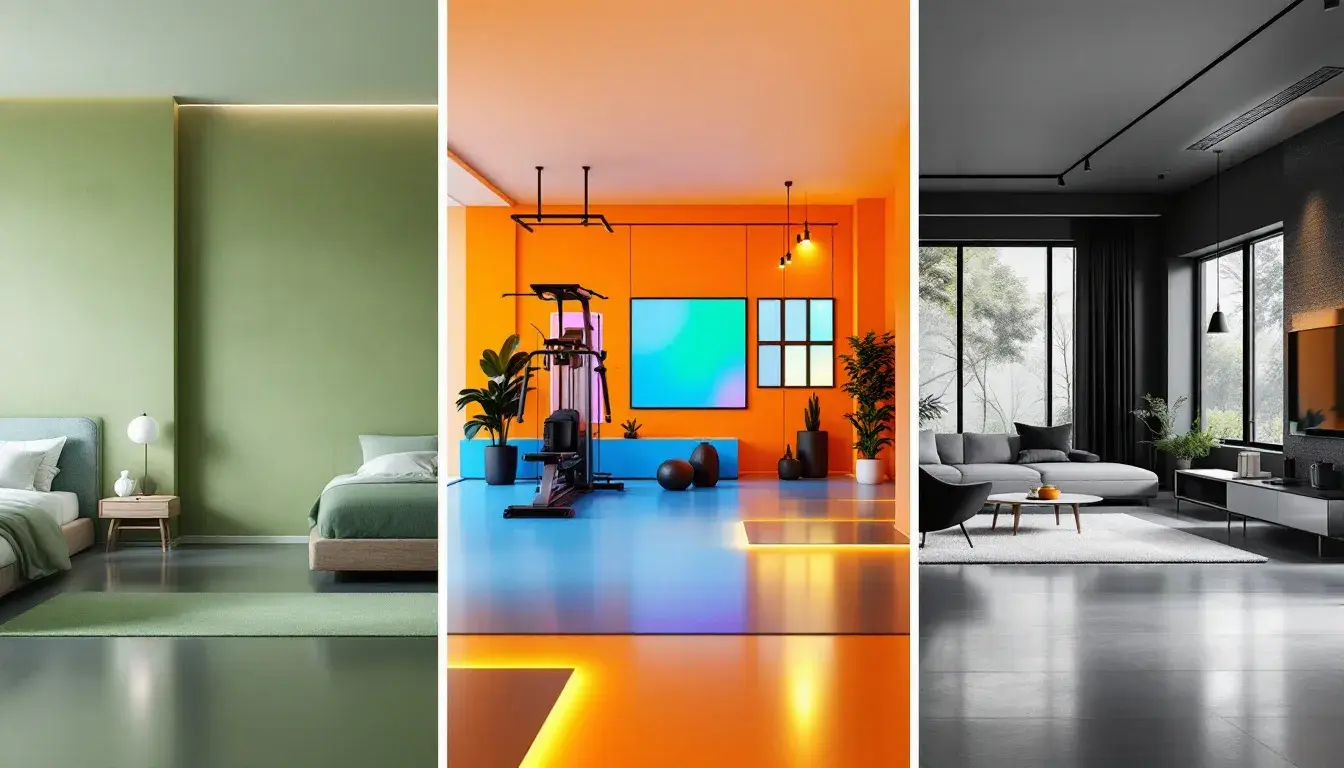
The "Earthy Green" palette 🌿 summons images of light filtering through a canopy, the hushed tones of a forest floor, and the crisp air of a mountain morning. It whispers of sustainable practices and natural textures, making it ideal for spaces seeking a grounded connection to the outside world. Imagine a sunlit bedroom where Creamy White walls meet the subtle greens echoed in woven rugs and potted plants. This is more than just decoration; it’s an invitation to breathe deeply and reconnect with a sense of calm. The marriage of Bright Green and Muted Olive creates a dynamic contrast, like sunlight playing upon leaves, while the grounding influence of Dark Espresso anchors the space in a sense of stability. Picture a minimalist living room where the architectural lines are softened by the organic presence of these greens. Consider the power of Vibrant Green in a piece of statement art, providing a focal point that subtly energizes the room without disrupting the overall sense of serenity. The ability to integrate this earthy palette into the virtual realm presents fascinating possibilities, allowing designers to recreate the restorative power of nature in our simulated environments. It transcends simple aesthetics, instead forming the basis for environments promoting wellbeing and relaxation, regardless of physical location. This creates experiences reflecting an escape to serene landscapes, and that fosters a sense of peace, even within fast-paced digital spaces. The interplay of these colors fosters a feeling of casual luxury, hinting at a conscious lifestyle aligned with the beauty and bounty of nature.
"Spirit Colors" ⚽ speaks of exertion and exhilaration, dynamism and drive. It is not a palette for the faint of heart, but rather one for spaces dedicated to movement, growth, and the joyful pursuit of physical limits. Visualize a modern gym bathed in the assertive glow of Bright Lime and Vibrant Yellow, colors that invigorate the senses and beckon you to push harder. These are the hues of ambition, the shades of striving. Contrast this with the grounding influence of Deep Brown, anchoring the energetic palette and adding a touch of earthy resolve. Imagine walls painted in muted tones of Dusty Rose, providing a quiet counterpoint to the high-voltage energy of the space, a visual cue to maintain balance. Dark Coral accents could energize the space, reminiscent of post-workout blush, promoting an impression of increased physical vigor. Such a palette wouldn't confine itself to simply paint choices, instead making its way into gear, fitness tech, and even ambient lighting – creating a fully immersive environment designed to enhance the athletic experience. In spaces beyond gyms, the “Spirit Colors” could fuel creative thinking in an office, promoting mental agility and enthusiastic team engagement. These are complex color choices, intended to promote forward momentum in both body and mind.
The "Bold Contrast" palette 🌹 exudes sophistication and an undeniable sense of visual drama. It speaks to spaces where confidence reigns, where design choices are intentional, and where a touch of intensity elevates the ordinary. Picture a living room awash in Rose Beige, its understated elegance providing a backdrop for strategically placed accents of Cherry Red. The immediate impression is one of curated luxury – not ostentatious, but definitively refined. Light Crimson offers a softer, more romantic counterpoint to the bolder reds, while Dark Gray anchors the palette with a sense of gravitas. Consider how Deep Crimson leather seating in an office offers an opulent focal point, projecting power and sophistication. These deeper shades are then softened with the grounding of the Beige. This palette is not just about aesthetics; it's about communicating a specific message – a message of discerning taste and unapologetic individualism. In the realm of website design, such a palette can project exclusivity, enticing users to explore further, drawn in by the promise of elevated experiences. Its power lies not only in the striking contrast between light and dark shades, but also in the emotional tensions it creates – a delicate dance between boldness and restraint, inviting people into a very considered space.
In closing, we observe that color's function extends far beyond merely pleasing the eye. It interacts directly with our senses, shaping how we feel and, crucially, how we interpret the spaces around us. Consider how the "Earthy Green" palette creates restorative environments, while the "Spirit Colors" fuel the kinetic ambition we observe within a modern gym, and "Bold Contrast" projects an aura of sophistication and intentionality into elegant spaces. Seen together, these palettes underscore the fact that successful interior design isn't simply about choosing aesthetically pleasing shades, yet about translating feeling into a visual language, that resonates with individuals and enhances the experiences that are meaningful to each. As we increasingly interact with designed environments in both physical and virtual realms, a keen awareness of color's power becomes ever more essential.