'%3e%3cpath%20fill-rule='evenodd'%20clip-rule='evenodd'%20d='M51.1303%2019.2492C50.7278%2019.913%2050.1346%2020.4426%2049.3508%2020.838C48.5669%2021.2335%2047.6172%2021.4312%2046.5014%2021.4312C44.8208%2021.4312%2043.4367%2021.0216%2042.3492%2020.2025C41.2617%2019.3833%2040.6686%2018.2394%2040.5697%2016.7706H44.4253C44.4818%2017.3355%2044.6831%2017.7804%2045.0291%2018.1052C45.3751%2018.43%2045.8164%2018.5924%2046.3531%2018.5924C46.8192%2018.5924%2047.1864%2018.4653%2047.4547%2018.2111C47.7231%2017.9569%2047.8572%2017.618%2047.8572%2017.1943C47.8572%2016.8129%2047.7337%2016.4952%2047.4865%2016.241C47.2393%2015.9867%2046.9322%2015.7784%2046.565%2015.616C46.1978%2015.4536%2045.6893%2015.2594%2045.0397%2015.0334C44.0934%2014.7086%2043.3202%2014.3944%2042.72%2014.0907C42.1197%2013.7871%2041.6042%2013.3351%2041.1735%2012.7349C40.7427%2012.1347%2040.5273%2011.3544%2040.5273%2010.394C40.5273%209.50418%2040.7533%208.73448%2041.2053%208.08481C41.6572%207.43515%2042.2821%206.93731%2043.0801%206.5913C43.8781%206.24528%2044.7925%206.07227%2045.8235%206.07227C47.49%206.07227%2048.8141%206.46771%2049.7956%207.25861C50.7772%208.04951%2051.3315%209.13698%2051.4586%2010.5211H47.5395C47.4689%2010.0268%2047.2888%209.63483%2046.9993%209.3453C46.7097%209.05578%2046.3178%208.91102%2045.8235%208.91102C45.3998%208.91102%2045.0573%209.024%2044.7961%209.24997C44.5348%209.47594%2044.4041%209.80783%2044.4041%2010.2457C44.4041%2010.5988%2044.5207%2010.8989%2044.7537%2011.146C44.9867%2011.3932%2045.2798%2011.5944%2045.6328%2011.7498C45.9859%2011.9052%2046.4944%2012.1029%2047.1581%2012.343C48.1185%2012.6678%2048.9023%2012.9891%2049.5096%2013.3069C50.1169%2013.6246%2050.6395%2014.0872%2051.0773%2014.6945C51.5151%2015.3018%2051.734%2016.0927%2051.734%2017.0672C51.734%2017.8581%2051.5328%2018.5854%2051.1303%2019.2492ZM59.0242%206.3053V21.2829H55.4016V6.3053H59.0242ZM73.9409%206.3053V9.18642H69.8734V21.2829H66.2296V9.18642H62.2046V6.3053H73.9409ZM80.7438%209.18642V12.3218H85.8069V15.0546H80.7438V18.3806H86.4425V21.2829H77.1212V6.3053H86.4425V9.18642H80.7438ZM99.667%2016.0291V21.2829H96.0444V6.3053H101.913C103.692%206.3053%20105.048%206.74665%20105.98%207.62934C106.912%208.51204%20107.378%209.7019%20107.378%2011.199C107.378%2012.1311%20107.17%2012.9609%20106.753%2013.6882C106.337%2014.4155%20105.719%2014.9875%20104.9%2015.4042C104.08%2015.8208%20103.085%2016.0291%20101.913%2016.0291H99.667ZM103.692%2011.199C103.692%209.8855%20102.965%209.22879%20101.51%209.22879H99.667V13.1268H101.51C102.965%2013.1268%20103.692%2012.4842%20103.692%2011.199ZM120.092%2018.5501H114.478L113.546%2021.2829H109.732L115.219%206.41123H119.393L124.879%2021.2829H121.024L120.092%2018.5501ZM119.16%2015.7961L117.295%2010.2881L115.41%2015.7961H119.16ZM131.555%2018.5077H136.385V21.2829H127.933V6.3053H131.555V18.5077ZM143.337%209.18642V12.3218H148.4V15.0546H143.337V18.3806H149.035V21.2829H139.714V6.3053H149.035V9.18642H143.337ZM163.507%206.3053V9.18642H159.44V21.2829H155.796V9.18642H151.771V6.3053H163.507ZM177.449%206.3053V9.18642H173.382V21.2829H169.738V9.18642H165.713V6.3053H177.449ZM184.252%209.18642V12.3218H189.315V15.0546H184.252V18.3806H189.951V21.2829H180.629V6.3053H189.951V9.18642H184.252Z'%20fill='%23EEF0ED'/%3e%3cmask%20id='mask0_3101_7327'%20style='mask-type:alpha'%20maskUnits='userSpaceOnUse'%20x='0'%20y='0'%20width='27'%20height='28'%3e%3cpath%20d='M23.8328%200.759766H2.64808C1.18559%200.759766%200%201.94535%200%203.40785V24.5925C0%2026.055%201.18559%2027.2406%202.64808%2027.2406H23.8328C25.2952%2027.2406%2026.4808%2026.055%2026.4808%2024.5925V3.40785C26.4808%201.94535%2025.2952%200.759766%2023.8328%200.759766Z'%20fill='white'/%3e%3c/mask%3e%3cg%20mask='url(%23mask0_3101_7327)'%3e%3cpath%20d='M23.8328%200.759766H2.64808C1.18559%200.759766%200%201.94535%200%203.40785V24.5925C0%2026.055%201.18559%2027.2406%202.64808%2027.2406H23.8328C25.2952%2027.2406%2026.4808%2026.055%2026.4808%2024.5925V3.40785C26.4808%201.94535%2025.2952%200.759766%2023.8328%200.759766Z'%20fill='%23D8D8D8'/%3e%3cpath%20d='M13.2404%200.759766H0V14.0001H13.2404V0.759766Z'%20fill='%238C61FF'/%3e%3cpath%20d='M13.2404%2014H0V27.2404H13.2404V14Z'%20fill='%2336C3FE'/%3e%3cpath%20d='M26.4806%2014H13.2402V27.2404H26.4806V14Z'%20fill='%236592FE'/%3e%3cpath%20d='M26.4806%200.759766H13.2402V14.0002H26.4806V0.759766Z'%20fill='%236059F7'/%3e%3c/g%3e%3c/g%3e%3cdefs%3e%3cclipPath%20id='clip0_3101_7327'%3e%3crect%20width='190'%20height='28'%20fill='white'/%3e%3c/clipPath%3e%3c/defs%3e%3c/svg%3e)
'%3e%3cpath%20d='M23.8328%200.759521H2.64808C1.18559%200.759521%200%201.94511%200%203.40761V24.5923C0%2026.0548%201.18559%2027.2404%202.64808%2027.2404H23.8328C25.2952%2027.2404%2026.4808%2026.0548%2026.4808%2024.5923V3.40761C26.4808%201.94511%2025.2952%200.759521%2023.8328%200.759521Z'%20fill='%23D8D8D8'/%3e%3cpath%20d='M13.2404%200.759521H0V13.9999H13.2404V0.759521Z'%20fill='%238C61FF'/%3e%3cpath%20d='M13.2404%2013.9998H0V27.2402H13.2404V13.9998Z'%20fill='%2336C3FE'/%3e%3cpath%20d='M26.4809%2013.9998H13.2405V27.2402H26.4809V13.9998Z'%20fill='%236592FE'/%3e%3cpath%20d='M26.4809%200.759277H13.2405V13.9997H26.4809V0.759277Z'%20fill='%236059F7'/%3e%3c/g%3e%3c/svg%3e)
Brightness on the Rise? A Comparative Analysis of Brightness Levels
22 Sep 2025 · 3 min readColor, often the silent herald of change, dictates our reception of the world. Its impact transcends mere aesthetics, shaping our feelings, guiding our choices, and coloring our memories. As light bends and shifts, it reveals an array of shades, each with a distinct voice. What narratives do they tell, especially when examining the growing push towards radiance in our environments? Are we drawn to higher illumination, to spaces bursting with airy tones, or do shadows still hold their dominion? Through contrasting shades, from the deepest indigos to the airiest grays, we uncover where our collective imagination is headed. Considering the interplay of bold expression and subdued calm, we ask: are we truly on an ascendant path toward pervasive light, or is the story far more complex?
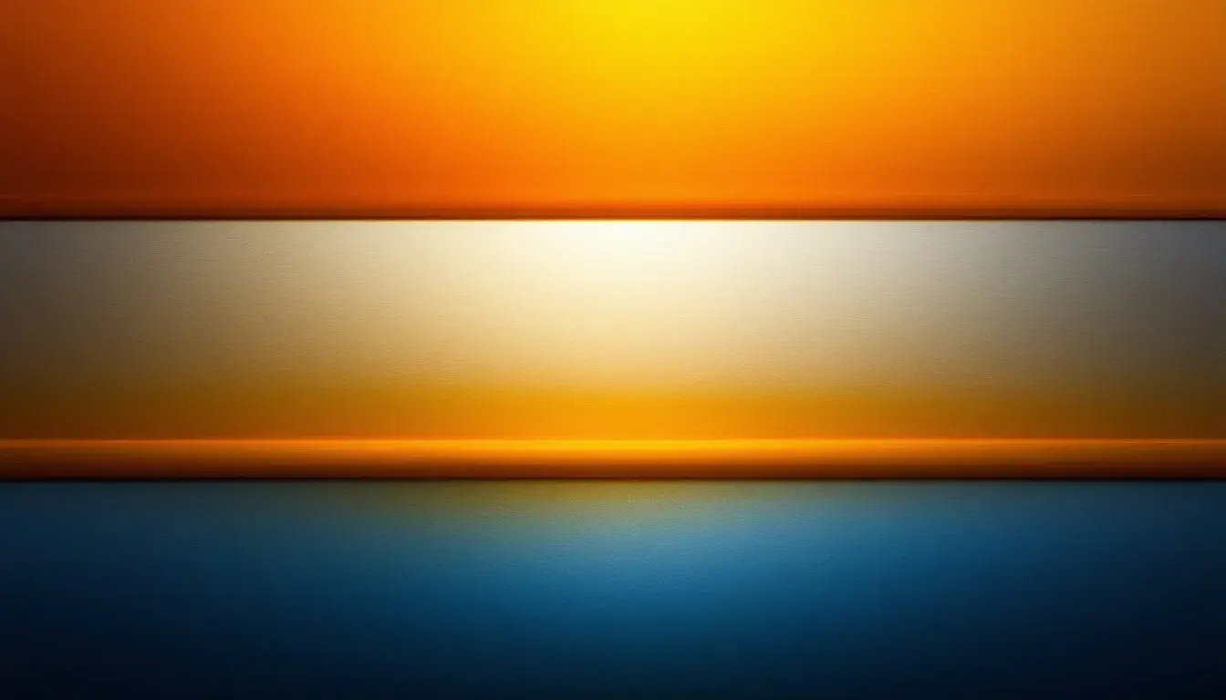
Imagine a gallery bathed in the glow of a late spring afternoon. Here, the “Bold & Bright” palette captures the eye, a dynamic composition that speaks of confidence and forward momentum. A whisper of Light Grayish White sets a pristine stage, the blank canvas before inspiration takes hold. Adjacent, Olive Drab offers a grounding contrast, a touch of earthiness that hints at natural growth and organic development. The introduction of Soft Cyan is like a breath of fresh air, an injection of the sky's limitless potential. There is a certain vitality, an unrestrained eagerness to experiment and redefine boundaries. Yet, the inclusion of Slate Gray is a reminder of measured intention, of intellectual weight guiding exuberant creativity. Finally, Deep Indigo acts as a bookend, a profound note that anchors the entire composition and establishes a sense of credibility. It’s a combination that’s not afraid to make a statement, but one that understands the importance of clarity and purpose. This careful assemblage would be comfortably at home in a tech startup’s collaborative workspace, or informing the look of a boundary-pushing marketing campaign, a visual signature for those keen on innovation. It is a space where ideas are not just born, but vigorously refined and brought to fruition. Instead of pure ostentation, this palette balances boldness with a sophisticated perspective, a vision of a future illuminated by progressive ideas tempered by timeless restraint.
Imagine stepping into a room bathed in the warm glow of “Earthy Brightness,” a space that somehow manages to feel both invigorating and comforting. A foundation of Light Gray offers a tranquil backdrop, a breathable expanse that allows the other shades to fully express their character. The golden warmth is amplified by layers of Golden Yellow and Bright Yellow, invoking the gentle radiance of the late afternoon sun filtering through autumn leaves. There is optimism here, a suggestion of abundance and creative energy. Light Blue appears like the first glimpse of a clear sky after a refreshing rain, lending a sense of openness and possibility. Taupe adds a touch of sophistication, a whisper of the enduring beauty found in natural materials and vintage charm. Then comes a surprising twist with Magenta Pink, vibrant and vivacious, a burst of pure joy. Mustard Yellow enters as a counterpoint, a grounding presence that resonates with the season's earthy tones while speaking towards enduring quality. The inclusion of Royal Blue adds a regal touch of elegance and credibility, instilling confidence and assurance. With the Slate Gray deepening the tonal range and the inclusion of the Black, these colors are able to create a dynamic range. Rather than a relentless barrage of light, the palette presents a nuanced interpretation: Brightness as it appears interwoven with depth, texture, and character. It would seem fitting within a collaborative workspace in a design agency, or used to define a brand identity for a conscious company. It’s an embrace of illumination paired with the recognition that true radiance needs grounded foundation and complexity.
Consider a cozy, sun-drenched library, the walls painted in the hues of the “Earthy Bright” palette. It’s an amalgamation that strikes a delicate balance, echoing the shifting nature of light itself. The golden poppy hue bursts forward like the first rays of dawn, while the teal green offers a balancing serene coolness, similar to the soothing embrace of a forest canopy. The persimmon orange provides warmth and vigor, recalling the glow from a fireplace on an autumn dusk. The introduction of plum purple injects a note of imaginative sophistication, resonating with the quiet contemplation found with creativity. It all rests against the charcoal gray, that lends sophistication, not the overwhelming assertion of pure light, but the comfortable embrace of nuanced illumination. Think of a modern home, or used as a foundation for a forward-thinking technology company. It's not just about high-intensity visuals, but about crafting immersive, authentic environments. This palette embodies the spirit of well defined spaces to encourage ingenuity.
Across these contrasting visions, a compelling narrative emerges. While the Bold & Bright palette makes a confident claim for unreserved radiance, a clear vision of progressive clarity, the Earthy Brightness palette takes a more nuanced stand, embracing luminescence as one facet of a bigger picture. The latter balances highlights with shadows, suggesting that true vibrancy is not just about pure brightness, but the intelligent interplay of light and depth. "Earthy Bright" echoes this sentiment further, finding equilibrium amidst both cool and fiery shades. It points to a movement away from simplistic extremes and toward something deeper and more complex. This is a direction in which illumination is not a goal unto itself, but a tool used thoughtfully.