'%3e%3cpath%20fill-rule='evenodd'%20clip-rule='evenodd'%20d='M51.1303%2019.2492C50.7278%2019.913%2050.1346%2020.4426%2049.3508%2020.838C48.5669%2021.2335%2047.6172%2021.4312%2046.5014%2021.4312C44.8208%2021.4312%2043.4367%2021.0216%2042.3492%2020.2025C41.2617%2019.3833%2040.6686%2018.2394%2040.5697%2016.7706H44.4253C44.4818%2017.3355%2044.6831%2017.7804%2045.0291%2018.1052C45.3751%2018.43%2045.8164%2018.5924%2046.3531%2018.5924C46.8192%2018.5924%2047.1864%2018.4653%2047.4547%2018.2111C47.7231%2017.9569%2047.8572%2017.618%2047.8572%2017.1943C47.8572%2016.8129%2047.7337%2016.4952%2047.4865%2016.241C47.2393%2015.9867%2046.9322%2015.7784%2046.565%2015.616C46.1978%2015.4536%2045.6893%2015.2594%2045.0397%2015.0334C44.0934%2014.7086%2043.3202%2014.3944%2042.72%2014.0907C42.1197%2013.7871%2041.6042%2013.3351%2041.1735%2012.7349C40.7427%2012.1347%2040.5273%2011.3544%2040.5273%2010.394C40.5273%209.50418%2040.7533%208.73448%2041.2053%208.08481C41.6572%207.43515%2042.2821%206.93731%2043.0801%206.5913C43.8781%206.24528%2044.7925%206.07227%2045.8235%206.07227C47.49%206.07227%2048.8141%206.46771%2049.7956%207.25861C50.7772%208.04951%2051.3315%209.13698%2051.4586%2010.5211H47.5395C47.4689%2010.0268%2047.2888%209.63483%2046.9993%209.3453C46.7097%209.05578%2046.3178%208.91102%2045.8235%208.91102C45.3998%208.91102%2045.0573%209.024%2044.7961%209.24997C44.5348%209.47594%2044.4041%209.80783%2044.4041%2010.2457C44.4041%2010.5988%2044.5207%2010.8989%2044.7537%2011.146C44.9867%2011.3932%2045.2798%2011.5944%2045.6328%2011.7498C45.9859%2011.9052%2046.4944%2012.1029%2047.1581%2012.343C48.1185%2012.6678%2048.9023%2012.9891%2049.5096%2013.3069C50.1169%2013.6246%2050.6395%2014.0872%2051.0773%2014.6945C51.5151%2015.3018%2051.734%2016.0927%2051.734%2017.0672C51.734%2017.8581%2051.5328%2018.5854%2051.1303%2019.2492ZM59.0242%206.3053V21.2829H55.4016V6.3053H59.0242ZM73.9409%206.3053V9.18642H69.8734V21.2829H66.2296V9.18642H62.2046V6.3053H73.9409ZM80.7438%209.18642V12.3218H85.8069V15.0546H80.7438V18.3806H86.4425V21.2829H77.1212V6.3053H86.4425V9.18642H80.7438ZM99.667%2016.0291V21.2829H96.0444V6.3053H101.913C103.692%206.3053%20105.048%206.74665%20105.98%207.62934C106.912%208.51204%20107.378%209.7019%20107.378%2011.199C107.378%2012.1311%20107.17%2012.9609%20106.753%2013.6882C106.337%2014.4155%20105.719%2014.9875%20104.9%2015.4042C104.08%2015.8208%20103.085%2016.0291%20101.913%2016.0291H99.667ZM103.692%2011.199C103.692%209.8855%20102.965%209.22879%20101.51%209.22879H99.667V13.1268H101.51C102.965%2013.1268%20103.692%2012.4842%20103.692%2011.199ZM120.092%2018.5501H114.478L113.546%2021.2829H109.732L115.219%206.41123H119.393L124.879%2021.2829H121.024L120.092%2018.5501ZM119.16%2015.7961L117.295%2010.2881L115.41%2015.7961H119.16ZM131.555%2018.5077H136.385V21.2829H127.933V6.3053H131.555V18.5077ZM143.337%209.18642V12.3218H148.4V15.0546H143.337V18.3806H149.035V21.2829H139.714V6.3053H149.035V9.18642H143.337ZM163.507%206.3053V9.18642H159.44V21.2829H155.796V9.18642H151.771V6.3053H163.507ZM177.449%206.3053V9.18642H173.382V21.2829H169.738V9.18642H165.713V6.3053H177.449ZM184.252%209.18642V12.3218H189.315V15.0546H184.252V18.3806H189.951V21.2829H180.629V6.3053H189.951V9.18642H184.252Z'%20fill='%23EEF0ED'/%3e%3cmask%20id='mask0_3101_7327'%20style='mask-type:alpha'%20maskUnits='userSpaceOnUse'%20x='0'%20y='0'%20width='27'%20height='28'%3e%3cpath%20d='M23.8328%200.759766H2.64808C1.18559%200.759766%200%201.94535%200%203.40785V24.5925C0%2026.055%201.18559%2027.2406%202.64808%2027.2406H23.8328C25.2952%2027.2406%2026.4808%2026.055%2026.4808%2024.5925V3.40785C26.4808%201.94535%2025.2952%200.759766%2023.8328%200.759766Z'%20fill='white'/%3e%3c/mask%3e%3cg%20mask='url(%23mask0_3101_7327)'%3e%3cpath%20d='M23.8328%200.759766H2.64808C1.18559%200.759766%200%201.94535%200%203.40785V24.5925C0%2026.055%201.18559%2027.2406%202.64808%2027.2406H23.8328C25.2952%2027.2406%2026.4808%2026.055%2026.4808%2024.5925V3.40785C26.4808%201.94535%2025.2952%200.759766%2023.8328%200.759766Z'%20fill='%23D8D8D8'/%3e%3cpath%20d='M13.2404%200.759766H0V14.0001H13.2404V0.759766Z'%20fill='%238C61FF'/%3e%3cpath%20d='M13.2404%2014H0V27.2404H13.2404V14Z'%20fill='%2336C3FE'/%3e%3cpath%20d='M26.4806%2014H13.2402V27.2404H26.4806V14Z'%20fill='%236592FE'/%3e%3cpath%20d='M26.4806%200.759766H13.2402V14.0002H26.4806V0.759766Z'%20fill='%236059F7'/%3e%3c/g%3e%3c/g%3e%3cdefs%3e%3cclipPath%20id='clip0_3101_7327'%3e%3crect%20width='190'%20height='28'%20fill='white'/%3e%3c/clipPath%3e%3c/defs%3e%3c/svg%3e)
'%3e%3cpath%20d='M23.8328%200.759521H2.64808C1.18559%200.759521%200%201.94511%200%203.40761V24.5923C0%2026.0548%201.18559%2027.2404%202.64808%2027.2404H23.8328C25.2952%2027.2404%2026.4808%2026.0548%2026.4808%2024.5923V3.40761C26.4808%201.94511%2025.2952%200.759521%2023.8328%200.759521Z'%20fill='%23D8D8D8'/%3e%3cpath%20d='M13.2404%200.759521H0V13.9999H13.2404V0.759521Z'%20fill='%238C61FF'/%3e%3cpath%20d='M13.2404%2013.9998H0V27.2402H13.2404V13.9998Z'%20fill='%2336C3FE'/%3e%3cpath%20d='M26.4809%2013.9998H13.2405V27.2402H26.4809V13.9998Z'%20fill='%236592FE'/%3e%3cpath%20d='M26.4809%200.759277H13.2405V13.9997H26.4809V0.759277Z'%20fill='%236059F7'/%3e%3c/g%3e%3c/svg%3e)
Decoding the 'Energetic' Mood: Color Correlations
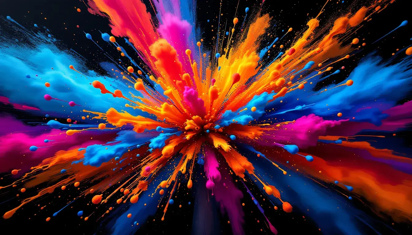
19 Sep 2025 · 3 min readWhen the pulse quickens, when the air crackles with anticipation, when the horizon seems to stretch into endless possibility – these are the moments "Energetic" lives. To capture this elusive yet utterly palpable mood, one must understand the visual language that speaks directly to our sense of vitality. Color, in its myriad forms, holds the key. It's not simply about brightness or boldness; it's about the interplay of shades, the unexpected combinations that jolt us awake, the carefully calibrated contrasts that mimic the exhilarating dance of life itself. Each palette offers a different interpretation, a unique pathway to understanding how color transforms into feeling. We're not just looking at hues, we're deciphering experiences. The goal is to define a sense of vigor, translating it into visual cues that stimulate mind and body. This extends beyond a single choice. It's the spectrum of expression, the potential for capturing the human spirit at its most dynamic.
"Vibrant Contrast" delivers on its promise, offering a journey from hushed whispers to full-throated declarations. The Pure White acts as a grounding element, but it is the Lime Green that seizes attention, a jolt of springtime energy injected into the composition. Nearby, Amber Gold glows, suggesting a sun-drenched afternoon, while Vivid Azure evokes feelings of open sky and boundless adventure. But the unexpected touches, the jolts, are what signal true dynamism. Orchid Plum deepens the narrative introducing an edge of mystery, a hint of something untamed, while Fuchsia Pink offers pure exuberance, a celebration of individuality and boldness. Contrast is key, and the palette achieves this with the juxtaposition of bright shades alongside Dark Crimson and Deep Charcoal. These darker tones act as anchors, preventing the brightness from becoming overwhelming. They provide the weight needed to ground the experience, like the satisfying thrum of a bass line beneath soaring vocals. The Dusty Lavender offers a respite, a place for the eye to rest before being swept away again by the bolder tones. Ultimately, "Vibrant Contrast" understands that energy isn't just about shouting; it's about the carefully orchestrated interplay of loud and quiet, bright and dark, expected and surprising, ensuring a truly memorable experience. The Pale Beige offers a whisper of warmth, a soft counterpoint to the more assertive tones that prevent the scheme from becoming too overtly declarative, adding depth and dimension to the story that the combination of colors tells.
In "Bold Contrast," there's a sense of grounded vibrancy, a vitality born from rich, saturated hues that speak of confidence and conviction. The Bright Amber sings, a call to attention, but is balanced by the grounding Teal Blue. The inclusion of Vivid Magenta is compelling– a flash of unrestrained joy, adding a layer of audaciousness to the mix. It speaks of individuality and a willingness to stand out, to embrace the spotlight. The palette feels both contemporary and timeless, reflecting a sophisticated energy rather than a fleeting trend. Even the Neutral Gray has a purpose, offering a breath of calm amidst the intensity, a space for the eye to regroup before diving back into the chromatic intensity. Deep Indigo, the anchor of the palette, offers depth and stability; its presence assures that the brighter hues don't float aimlessly, ensuring a balanced experience. Burnt Orange bridges the warmer shades seamlessly. The Pale Yellow softens the impact of the bold combinations elsewhere, offering the eye a moment of respite. Finally, the Dark Maroon adds a dramatic touch, a hint of mystery and intrigue, preventing the overall tone from being overly cheerful. The Pure White grounds the palette preventing the heavier colors from suffocating all sense of possibility. The inclusion helps to balance the other shades. This creates a sense of excitement and also confidence.
"Fiery Warmth", feels intimate and visceral. Instead of explosive energy, this palette suggests embers of possibility – a smoldering dynamism that builds slowly, inexorably. It favors nuance over outright spectacle. The Bright Vermillion is not simply red; it's the flushed anticipation, while the Coral Pink whispers of sun-kissed skin. Instead of shouting, these shades murmur with intensity. The Deep Slate offers a cooling contrast, providing a shadow against which the warmer tones can truly glow. It's a reminder that energy is not always loud; sometimes, it simmers beneath the surface, building towards a quiet intensity. Without shades of grey to act as a counterpoint, the palette might overwhelm. The inclusion of Light Gray allows the intense tones to shine while also feeling comforting and organic. Dark Crimson evokes feelings of passion, adventure and power. The Pure White breaks up the dominance of richer pigments, while Dark Charcoal grounds everything. The combination is less immediately exciting, and more likely to have a slow-burn effect.
Looking back at these varied palettes, we observe that 'Energetic' is not a monolithic entity but a multifaceted experience. It is found in the interplay of opposites as much as in the presence of bright shades, in the quiet simmer as much as in the flamboyant burst. Each palette, despite its contrasts illuminates key paths. If "Vibrant Contrast" shouts a joyful invitation to the world, then "Bold Contrast" offers a sense of poised confidence, and "Fiery Warmth" speaks of simmering passions and possibilities. The journey reveals that energy is not just about surface; it's about depth, balance, and the carefully calibrated dance between light and shadow. The answer isn't one color, but the careful orchestration of many. The colors evoke a specific mood, bringing vitality and enthusiasm to mind, proving how color communicates far beyond utility.