'%3e%3cpath%20fill-rule='evenodd'%20clip-rule='evenodd'%20d='M51.1303%2019.2492C50.7278%2019.913%2050.1346%2020.4426%2049.3508%2020.838C48.5669%2021.2335%2047.6172%2021.4312%2046.5014%2021.4312C44.8208%2021.4312%2043.4367%2021.0216%2042.3492%2020.2025C41.2617%2019.3833%2040.6686%2018.2394%2040.5697%2016.7706H44.4253C44.4818%2017.3355%2044.6831%2017.7804%2045.0291%2018.1052C45.3751%2018.43%2045.8164%2018.5924%2046.3531%2018.5924C46.8192%2018.5924%2047.1864%2018.4653%2047.4547%2018.2111C47.7231%2017.9569%2047.8572%2017.618%2047.8572%2017.1943C47.8572%2016.8129%2047.7337%2016.4952%2047.4865%2016.241C47.2393%2015.9867%2046.9322%2015.7784%2046.565%2015.616C46.1978%2015.4536%2045.6893%2015.2594%2045.0397%2015.0334C44.0934%2014.7086%2043.3202%2014.3944%2042.72%2014.0907C42.1197%2013.7871%2041.6042%2013.3351%2041.1735%2012.7349C40.7427%2012.1347%2040.5273%2011.3544%2040.5273%2010.394C40.5273%209.50418%2040.7533%208.73448%2041.2053%208.08481C41.6572%207.43515%2042.2821%206.93731%2043.0801%206.5913C43.8781%206.24528%2044.7925%206.07227%2045.8235%206.07227C47.49%206.07227%2048.8141%206.46771%2049.7956%207.25861C50.7772%208.04951%2051.3315%209.13698%2051.4586%2010.5211H47.5395C47.4689%2010.0268%2047.2888%209.63483%2046.9993%209.3453C46.7097%209.05578%2046.3178%208.91102%2045.8235%208.91102C45.3998%208.91102%2045.0573%209.024%2044.7961%209.24997C44.5348%209.47594%2044.4041%209.80783%2044.4041%2010.2457C44.4041%2010.5988%2044.5207%2010.8989%2044.7537%2011.146C44.9867%2011.3932%2045.2798%2011.5944%2045.6328%2011.7498C45.9859%2011.9052%2046.4944%2012.1029%2047.1581%2012.343C48.1185%2012.6678%2048.9023%2012.9891%2049.5096%2013.3069C50.1169%2013.6246%2050.6395%2014.0872%2051.0773%2014.6945C51.5151%2015.3018%2051.734%2016.0927%2051.734%2017.0672C51.734%2017.8581%2051.5328%2018.5854%2051.1303%2019.2492ZM59.0242%206.3053V21.2829H55.4016V6.3053H59.0242ZM73.9409%206.3053V9.18642H69.8734V21.2829H66.2296V9.18642H62.2046V6.3053H73.9409ZM80.7438%209.18642V12.3218H85.8069V15.0546H80.7438V18.3806H86.4425V21.2829H77.1212V6.3053H86.4425V9.18642H80.7438ZM99.667%2016.0291V21.2829H96.0444V6.3053H101.913C103.692%206.3053%20105.048%206.74665%20105.98%207.62934C106.912%208.51204%20107.378%209.7019%20107.378%2011.199C107.378%2012.1311%20107.17%2012.9609%20106.753%2013.6882C106.337%2014.4155%20105.719%2014.9875%20104.9%2015.4042C104.08%2015.8208%20103.085%2016.0291%20101.913%2016.0291H99.667ZM103.692%2011.199C103.692%209.8855%20102.965%209.22879%20101.51%209.22879H99.667V13.1268H101.51C102.965%2013.1268%20103.692%2012.4842%20103.692%2011.199ZM120.092%2018.5501H114.478L113.546%2021.2829H109.732L115.219%206.41123H119.393L124.879%2021.2829H121.024L120.092%2018.5501ZM119.16%2015.7961L117.295%2010.2881L115.41%2015.7961H119.16ZM131.555%2018.5077H136.385V21.2829H127.933V6.3053H131.555V18.5077ZM143.337%209.18642V12.3218H148.4V15.0546H143.337V18.3806H149.035V21.2829H139.714V6.3053H149.035V9.18642H143.337ZM163.507%206.3053V9.18642H159.44V21.2829H155.796V9.18642H151.771V6.3053H163.507ZM177.449%206.3053V9.18642H173.382V21.2829H169.738V9.18642H165.713V6.3053H177.449ZM184.252%209.18642V12.3218H189.315V15.0546H184.252V18.3806H189.951V21.2829H180.629V6.3053H189.951V9.18642H184.252Z'%20fill='%23EEF0ED'/%3e%3cmask%20id='mask0_3101_7327'%20style='mask-type:alpha'%20maskUnits='userSpaceOnUse'%20x='0'%20y='0'%20width='27'%20height='28'%3e%3cpath%20d='M23.8328%200.759766H2.64808C1.18559%200.759766%200%201.94535%200%203.40785V24.5925C0%2026.055%201.18559%2027.2406%202.64808%2027.2406H23.8328C25.2952%2027.2406%2026.4808%2026.055%2026.4808%2024.5925V3.40785C26.4808%201.94535%2025.2952%200.759766%2023.8328%200.759766Z'%20fill='white'/%3e%3c/mask%3e%3cg%20mask='url(%23mask0_3101_7327)'%3e%3cpath%20d='M23.8328%200.759766H2.64808C1.18559%200.759766%200%201.94535%200%203.40785V24.5925C0%2026.055%201.18559%2027.2406%202.64808%2027.2406H23.8328C25.2952%2027.2406%2026.4808%2026.055%2026.4808%2024.5925V3.40785C26.4808%201.94535%2025.2952%200.759766%2023.8328%200.759766Z'%20fill='%23D8D8D8'/%3e%3cpath%20d='M13.2404%200.759766H0V14.0001H13.2404V0.759766Z'%20fill='%238C61FF'/%3e%3cpath%20d='M13.2404%2014H0V27.2404H13.2404V14Z'%20fill='%2336C3FE'/%3e%3cpath%20d='M26.4806%2014H13.2402V27.2404H26.4806V14Z'%20fill='%236592FE'/%3e%3cpath%20d='M26.4806%200.759766H13.2402V14.0002H26.4806V0.759766Z'%20fill='%236059F7'/%3e%3c/g%3e%3c/g%3e%3cdefs%3e%3cclipPath%20id='clip0_3101_7327'%3e%3crect%20width='190'%20height='28'%20fill='white'/%3e%3c/clipPath%3e%3c/defs%3e%3c/svg%3e)
'%3e%3cpath%20d='M23.8328%200.759521H2.64808C1.18559%200.759521%200%201.94511%200%203.40761V24.5923C0%2026.0548%201.18559%2027.2404%202.64808%2027.2404H23.8328C25.2952%2027.2404%2026.4808%2026.0548%2026.4808%2024.5923V3.40761C26.4808%201.94511%2025.2952%200.759521%2023.8328%200.759521Z'%20fill='%23D8D8D8'/%3e%3cpath%20d='M13.2404%200.759521H0V13.9999H13.2404V0.759521Z'%20fill='%238C61FF'/%3e%3cpath%20d='M13.2404%2013.9998H0V27.2402H13.2404V13.9998Z'%20fill='%2336C3FE'/%3e%3cpath%20d='M26.4809%2013.9998H13.2405V27.2402H26.4809V13.9998Z'%20fill='%236592FE'/%3e%3cpath%20d='M26.4809%200.759277H13.2405V13.9997H26.4809V0.759277Z'%20fill='%236059F7'/%3e%3c/g%3e%3c/svg%3e)
The Rise of Muted Greens: A Year-Long Retrospective
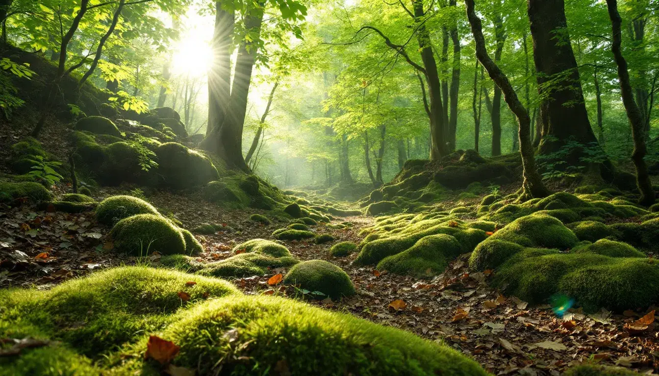
18 Sep 2025 · 3 min readMuted greens, often overlooked, possess a quiet strength. They whisper of ancient forests, sun-drenched meadows just past their peak, and the subtle shift of seasons. More than mere color, they are an evocation of grounded tranquility, a visual balm in a world saturated with relentless vibrancy. A retrospective glance at their presence in recent palettes reveals not just a trend, but a yearning for the natural world in our manufactured lives. These colors shape our perception, shifting moods, inviting calm where chaos once resided. They are the quiet revolution in our visual landscape, a return to a natural source. Greens, in this subdued state, capture the light with a unique filtering lens, creating a world where shadows embrace the light, where details emerge softly, and where the eye can finally rest.
Serene Teal 🌿 offers a landscape of hushed sophistication. It's the color of quiet reflection, of fog-shrouded mornings where the world holds its breath. Imagine a secluded cove, the water a Grayish Teal blending seamlessly with the rocky shore. Soft Olive Green emerges like moss clinging to stone, providing a subtle counterpoint to the Cool Grayish Blue hinting at the depths below. Light Grayish Beige recalls the smooth, weathered stones worn smooth by tides, solid and timeless. Deep Forest Green stands in for the tenacious evergreens clinging to the cliff tops, their strength a soft contrast to the gentle palette. This selection creates an atmosphere of restorative calm and the quiet promise of renewal. It evokes the feeling of a sanctuary where the elements converge in silent artistry. This is not a story that shouts, but one that unfolds slowly, patiently, revealing the intricate details of a world that values introspection above all else. It's a retreat, both visually and emotionally, a space where one can breathe deeply and find solace in the understated beauty of the natural world.
Korea Vibe 🇰🇷 transports us to a vivid, yet grounded space. This is a different breed of harmony. Light Steel Blue adds depth, like the sky after a soft spring rain. Light Grayish Beige brings a touch of the familiar, like the gentle hue of aged paper. The core is formed by the richness of Olive Drab and Dark Olive Green, reminiscent of ancient pottery. Burnt Sienna adds the boldness of autumnal earth. The juxtaposition presents nature reclaimed. This palette captures the vitality of a culture deeply rooted in its history, while always reaching forward. Imagine ancient temples framed by budding cherry blossoms, the scent of earth mingling with the sweet fragrance of spring. These colors dance together to recall a place steeped in tradition, yet alive with modern innovation. This combination suggests strength, growth, and a certain quiet confidence.
Vibrant Harmony 🎨 speaks of nature's embrace. Imagine a forest floor, where dappled sunlight filters through the canopy, illuminating the various shades of green. Seafoam Green takes the spotlight, like new growth pushing through the soil, bringing an uplifting energy. The grounding element comes from the deep, Dark Olive Green and Deep Forest Green, anchoring the palette with a sense of stability and quiet strength. Dusty Beige adds a touch of lightness. The unexpected presence of Indigo Purple adds a layer of depth, creating an intriguing contrast. These colors are a testament to the power of nature to nurture. One can get lost imagining a tranquil forest after a gentle rain, the air filled with the scent of damp earth and the soft rustling of leaves. The scene is both calming and invigorating, a reminder of the beauty and vitality of the natural world.
Earthy Harmony 🍃 feels like stepping into a painter's dream. The Light Beige sets a soft foundation, allowing the other tones to subtly flourish. Soft Green gently unfolds, like springtime leaves unfurling, providing a sense of freshness. Olive Drab adds substance, reminiscent of sun-baked earth. Neutral Gray whispers of ancient stone, providing a tranquil backdrop. Dark Hunter Green anchors the assemblage with its rich, grounded presence. Imagine a vista of rolling hills bathed in sunlight, the air filled with the scent of wildflowers and the warmth of the sun. These colors combine quietly to evoke the allure of nature. This palette is both restorative and invigorating, a reminder of nature’s grounding power.
The subtle presence of muted greens across diverse palettes speaks volumes. Serene Teal offers sanctuary, Korea Vibe whispers of balance, Vibrant Harmony embodies renewal, and Earthy Harmony provides the solace of nature. These greens aren’t merely a trend; they represent a shift in visual preferences toward colors that instill calm, offer depth, and connect us to the natural world. They remind us that beauty can be found in imperfection, in quietness, and in the profound simplicity of the earth itself. They are, in a way, a visual exhale for a world that often forgets to breathe.