'%3e%3cpath%20fill-rule='evenodd'%20clip-rule='evenodd'%20d='M51.1303%2019.2492C50.7278%2019.913%2050.1346%2020.4426%2049.3508%2020.838C48.5669%2021.2335%2047.6172%2021.4312%2046.5014%2021.4312C44.8208%2021.4312%2043.4367%2021.0216%2042.3492%2020.2025C41.2617%2019.3833%2040.6686%2018.2394%2040.5697%2016.7706H44.4253C44.4818%2017.3355%2044.6831%2017.7804%2045.0291%2018.1052C45.3751%2018.43%2045.8164%2018.5924%2046.3531%2018.5924C46.8192%2018.5924%2047.1864%2018.4653%2047.4547%2018.2111C47.7231%2017.9569%2047.8572%2017.618%2047.8572%2017.1943C47.8572%2016.8129%2047.7337%2016.4952%2047.4865%2016.241C47.2393%2015.9867%2046.9322%2015.7784%2046.565%2015.616C46.1978%2015.4536%2045.6893%2015.2594%2045.0397%2015.0334C44.0934%2014.7086%2043.3202%2014.3944%2042.72%2014.0907C42.1197%2013.7871%2041.6042%2013.3351%2041.1735%2012.7349C40.7427%2012.1347%2040.5273%2011.3544%2040.5273%2010.394C40.5273%209.50418%2040.7533%208.73448%2041.2053%208.08481C41.6572%207.43515%2042.2821%206.93731%2043.0801%206.5913C43.8781%206.24528%2044.7925%206.07227%2045.8235%206.07227C47.49%206.07227%2048.8141%206.46771%2049.7956%207.25861C50.7772%208.04951%2051.3315%209.13698%2051.4586%2010.5211H47.5395C47.4689%2010.0268%2047.2888%209.63483%2046.9993%209.3453C46.7097%209.05578%2046.3178%208.91102%2045.8235%208.91102C45.3998%208.91102%2045.0573%209.024%2044.7961%209.24997C44.5348%209.47594%2044.4041%209.80783%2044.4041%2010.2457C44.4041%2010.5988%2044.5207%2010.8989%2044.7537%2011.146C44.9867%2011.3932%2045.2798%2011.5944%2045.6328%2011.7498C45.9859%2011.9052%2046.4944%2012.1029%2047.1581%2012.343C48.1185%2012.6678%2048.9023%2012.9891%2049.5096%2013.3069C50.1169%2013.6246%2050.6395%2014.0872%2051.0773%2014.6945C51.5151%2015.3018%2051.734%2016.0927%2051.734%2017.0672C51.734%2017.8581%2051.5328%2018.5854%2051.1303%2019.2492ZM59.0242%206.3053V21.2829H55.4016V6.3053H59.0242ZM73.9409%206.3053V9.18642H69.8734V21.2829H66.2296V9.18642H62.2046V6.3053H73.9409ZM80.7438%209.18642V12.3218H85.8069V15.0546H80.7438V18.3806H86.4425V21.2829H77.1212V6.3053H86.4425V9.18642H80.7438ZM99.667%2016.0291V21.2829H96.0444V6.3053H101.913C103.692%206.3053%20105.048%206.74665%20105.98%207.62934C106.912%208.51204%20107.378%209.7019%20107.378%2011.199C107.378%2012.1311%20107.17%2012.9609%20106.753%2013.6882C106.337%2014.4155%20105.719%2014.9875%20104.9%2015.4042C104.08%2015.8208%20103.085%2016.0291%20101.913%2016.0291H99.667ZM103.692%2011.199C103.692%209.8855%20102.965%209.22879%20101.51%209.22879H99.667V13.1268H101.51C102.965%2013.1268%20103.692%2012.4842%20103.692%2011.199ZM120.092%2018.5501H114.478L113.546%2021.2829H109.732L115.219%206.41123H119.393L124.879%2021.2829H121.024L120.092%2018.5501ZM119.16%2015.7961L117.295%2010.2881L115.41%2015.7961H119.16ZM131.555%2018.5077H136.385V21.2829H127.933V6.3053H131.555V18.5077ZM143.337%209.18642V12.3218H148.4V15.0546H143.337V18.3806H149.035V21.2829H139.714V6.3053H149.035V9.18642H143.337ZM163.507%206.3053V9.18642H159.44V21.2829H155.796V9.18642H151.771V6.3053H163.507ZM177.449%206.3053V9.18642H173.382V21.2829H169.738V9.18642H165.713V6.3053H177.449ZM184.252%209.18642V12.3218H189.315V15.0546H184.252V18.3806H189.951V21.2829H180.629V6.3053H189.951V9.18642H184.252Z'%20fill='%23EEF0ED'/%3e%3cmask%20id='mask0_3101_7327'%20style='mask-type:alpha'%20maskUnits='userSpaceOnUse'%20x='0'%20y='0'%20width='27'%20height='28'%3e%3cpath%20d='M23.8328%200.759766H2.64808C1.18559%200.759766%200%201.94535%200%203.40785V24.5925C0%2026.055%201.18559%2027.2406%202.64808%2027.2406H23.8328C25.2952%2027.2406%2026.4808%2026.055%2026.4808%2024.5925V3.40785C26.4808%201.94535%2025.2952%200.759766%2023.8328%200.759766Z'%20fill='white'/%3e%3c/mask%3e%3cg%20mask='url(%23mask0_3101_7327)'%3e%3cpath%20d='M23.8328%200.759766H2.64808C1.18559%200.759766%200%201.94535%200%203.40785V24.5925C0%2026.055%201.18559%2027.2406%202.64808%2027.2406H23.8328C25.2952%2027.2406%2026.4808%2026.055%2026.4808%2024.5925V3.40785C26.4808%201.94535%2025.2952%200.759766%2023.8328%200.759766Z'%20fill='%23D8D8D8'/%3e%3cpath%20d='M13.2404%200.759766H0V14.0001H13.2404V0.759766Z'%20fill='%238C61FF'/%3e%3cpath%20d='M13.2404%2014H0V27.2404H13.2404V14Z'%20fill='%2336C3FE'/%3e%3cpath%20d='M26.4806%2014H13.2402V27.2404H26.4806V14Z'%20fill='%236592FE'/%3e%3cpath%20d='M26.4806%200.759766H13.2402V14.0002H26.4806V0.759766Z'%20fill='%236059F7'/%3e%3c/g%3e%3c/g%3e%3cdefs%3e%3cclipPath%20id='clip0_3101_7327'%3e%3crect%20width='190'%20height='28'%20fill='white'/%3e%3c/clipPath%3e%3c/defs%3e%3c/svg%3e)
'%3e%3cpath%20d='M23.8328%200.759521H2.64808C1.18559%200.759521%200%201.94511%200%203.40761V24.5923C0%2026.0548%201.18559%2027.2404%202.64808%2027.2404H23.8328C25.2952%2027.2404%2026.4808%2026.0548%2026.4808%2024.5923V3.40761C26.4808%201.94511%2025.2952%200.759521%2023.8328%200.759521Z'%20fill='%23D8D8D8'/%3e%3cpath%20d='M13.2404%200.759521H0V13.9999H13.2404V0.759521Z'%20fill='%238C61FF'/%3e%3cpath%20d='M13.2404%2013.9998H0V27.2402H13.2404V13.9998Z'%20fill='%2336C3FE'/%3e%3cpath%20d='M26.4809%2013.9998H13.2405V27.2402H26.4809V13.9998Z'%20fill='%236592FE'/%3e%3cpath%20d='M26.4809%200.759277H13.2405V13.9997H26.4809V0.759277Z'%20fill='%236059F7'/%3e%3c/g%3e%3c/svg%3e)
The 2025 Corporate Hues: A Dominant Color Forecast
18 Sep 2025 · 3 min readThe psychological weight of a corporation, its identity distilled into a spectrum of carefully chosen hues, speaks volumes. A color, strategically applied, can project stability, innovation, or even a quiet revolution. These aren't just shades on a screen or walls painted in identical office spaces; they are silent storytellers, shaping perceptions and subtly influencing behavior. As we look toward the future of corporate branding, particularly in the ever-evolving landscape of 2025, the power of these color palettes becomes increasingly amplified. They are the visual equivalent of a company's mission statement, instantly communicating values and aspirations. The following palettes offer a glimpse into the potential chromatic narratives that will define the coming year, reflecting a sophisticated understanding of how color impacts experience.
The Warm Contrast palette could be envisioned as the interior of a bustling tech start-up, buzzing with activity and innovative ideas. It avoids the predictable coolness of minimalist offices by incorporating warmer shades that spark interest: imagine a communal workspace where sleek, white desks are set against accent walls painted in Salmon Orange or Magenta Red. The Lemon Yellow inspires alertness, while the grounding effect of Olive Drab contributes a sense of stability amidst the rapid pace. Burgundy's deep resonance echoes in leather furniture details, offering a touch of timelessness. Ebony Black, used strategically, frames the space and provides necessary definition, preventing the overall effect from becoming overwhelming. This palette speaks to a company that values collaboration and bold ideas, but is also mindful of creating an inviting environment. The balanced effect of the Warm Contrast hints at a forward-thinking approach, signalling an organization unafraid to break from the expected norms. This palette can represent innovation, not by being purely modern and sleek, but in expressing what it means to be human in a technological world. There's an acknowledgement of the vibrant messiness in the development process, while also pointing to the sleek finish of the end product. Together, the palette creates a sensation of contained energy and an optimistic sense that it is possible to move into the future with a grounded view on the past.
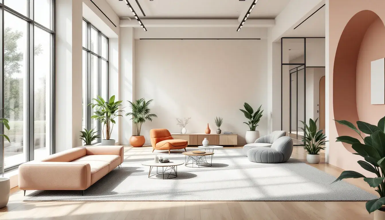
The Tech Palette suggests a different approach to corporate atmosphere, one that prioritizes calm and considered thinking. The Cool Gray Green brings a sense of natural tranquility, like stepping into a room suffused with soft, diffused light. Dusty Rose brings a touch of warmth and humanity to the mix. These shades evoke a corporate environment that values clarity and focus. The Lavender Blue suggests forward-thinking, while the Deep Midnight provides depth. This palette would be ideal for spaces needing to promote thought, such as consulting firms. Rather than aiming for flashy displays, it leans into the quiet confidence of expertise. Imagine a boardroom where important decisions are made, or a private office where strategic plans are carefully laid out. The palette gives a sense of sophisticated calm, where the surroundings enable clear thinking and creativity. The high-contrast elements ensure that the aesthetic is interesting enough to stay present, but relaxing enough that it doesn't distract from the thought or task at hand. The Tech Palette communicates strategic stability, precision, and a deep understanding of the business landscape.
The Tierone Palette, with its range of colors, gives a versatile representation of a modern corporation. Pure White and Jet Black anchor the palette, instilling a sense of polished professionalism. The palette avoids being too serious or stark through the implementation of colours such as Pale Gold and Vibrant Yellow. These shades suggest a company that is dynamic and innovative. The Electric Violet inspires intrigue, whilst the Light Gray offers a safe and neutral space. Olive Brown and Forest Green bring a touch of nature, indicating a company with sustainable values. Deep Indigo adds an element of sophistication that might suit a Finance industry client. Dark Burgundy gives the feeling of timeless excellence. Imagine a company that utilizes digital platforms to the greatest scope, and also holds true to a classic way of life. The Tierone Palette is well equipped to convey this message. Overall, it is designed to be sleek and modern.
Looking ahead to 2025, these palettes signal a shift in the way corporations visualize themselves. The rigid, often cold, aesthetics of the past are giving way to more nuanced, human-centered approaches. Color palettes are no longer just about adhering to brand guidelines; they are about constructing experiences, conveying values, and ultimately, forging deeper connections with employees, clients, and the world at large. By thoughtfully selecting and deploying color, businesses can create environments that not only reflect their identities but also inspire creativity, foster well-being, and communicate their place in society. The future of corporate color is a story of intentional design, where understanding the emotional and visual impact of each shade becomes a vital tool to achieving success.