'%3e%3cpath%20fill-rule='evenodd'%20clip-rule='evenodd'%20d='M51.1303%2019.2492C50.7278%2019.913%2050.1346%2020.4426%2049.3508%2020.838C48.5669%2021.2335%2047.6172%2021.4312%2046.5014%2021.4312C44.8208%2021.4312%2043.4367%2021.0216%2042.3492%2020.2025C41.2617%2019.3833%2040.6686%2018.2394%2040.5697%2016.7706H44.4253C44.4818%2017.3355%2044.6831%2017.7804%2045.0291%2018.1052C45.3751%2018.43%2045.8164%2018.5924%2046.3531%2018.5924C46.8192%2018.5924%2047.1864%2018.4653%2047.4547%2018.2111C47.7231%2017.9569%2047.8572%2017.618%2047.8572%2017.1943C47.8572%2016.8129%2047.7337%2016.4952%2047.4865%2016.241C47.2393%2015.9867%2046.9322%2015.7784%2046.565%2015.616C46.1978%2015.4536%2045.6893%2015.2594%2045.0397%2015.0334C44.0934%2014.7086%2043.3202%2014.3944%2042.72%2014.0907C42.1197%2013.7871%2041.6042%2013.3351%2041.1735%2012.7349C40.7427%2012.1347%2040.5273%2011.3544%2040.5273%2010.394C40.5273%209.50418%2040.7533%208.73448%2041.2053%208.08481C41.6572%207.43515%2042.2821%206.93731%2043.0801%206.5913C43.8781%206.24528%2044.7925%206.07227%2045.8235%206.07227C47.49%206.07227%2048.8141%206.46771%2049.7956%207.25861C50.7772%208.04951%2051.3315%209.13698%2051.4586%2010.5211H47.5395C47.4689%2010.0268%2047.2888%209.63483%2046.9993%209.3453C46.7097%209.05578%2046.3178%208.91102%2045.8235%208.91102C45.3998%208.91102%2045.0573%209.024%2044.7961%209.24997C44.5348%209.47594%2044.4041%209.80783%2044.4041%2010.2457C44.4041%2010.5988%2044.5207%2010.8989%2044.7537%2011.146C44.9867%2011.3932%2045.2798%2011.5944%2045.6328%2011.7498C45.9859%2011.9052%2046.4944%2012.1029%2047.1581%2012.343C48.1185%2012.6678%2048.9023%2012.9891%2049.5096%2013.3069C50.1169%2013.6246%2050.6395%2014.0872%2051.0773%2014.6945C51.5151%2015.3018%2051.734%2016.0927%2051.734%2017.0672C51.734%2017.8581%2051.5328%2018.5854%2051.1303%2019.2492ZM59.0242%206.3053V21.2829H55.4016V6.3053H59.0242ZM73.9409%206.3053V9.18642H69.8734V21.2829H66.2296V9.18642H62.2046V6.3053H73.9409ZM80.7438%209.18642V12.3218H85.8069V15.0546H80.7438V18.3806H86.4425V21.2829H77.1212V6.3053H86.4425V9.18642H80.7438ZM99.667%2016.0291V21.2829H96.0444V6.3053H101.913C103.692%206.3053%20105.048%206.74665%20105.98%207.62934C106.912%208.51204%20107.378%209.7019%20107.378%2011.199C107.378%2012.1311%20107.17%2012.9609%20106.753%2013.6882C106.337%2014.4155%20105.719%2014.9875%20104.9%2015.4042C104.08%2015.8208%20103.085%2016.0291%20101.913%2016.0291H99.667ZM103.692%2011.199C103.692%209.8855%20102.965%209.22879%20101.51%209.22879H99.667V13.1268H101.51C102.965%2013.1268%20103.692%2012.4842%20103.692%2011.199ZM120.092%2018.5501H114.478L113.546%2021.2829H109.732L115.219%206.41123H119.393L124.879%2021.2829H121.024L120.092%2018.5501ZM119.16%2015.7961L117.295%2010.2881L115.41%2015.7961H119.16ZM131.555%2018.5077H136.385V21.2829H127.933V6.3053H131.555V18.5077ZM143.337%209.18642V12.3218H148.4V15.0546H143.337V18.3806H149.035V21.2829H139.714V6.3053H149.035V9.18642H143.337ZM163.507%206.3053V9.18642H159.44V21.2829H155.796V9.18642H151.771V6.3053H163.507ZM177.449%206.3053V9.18642H173.382V21.2829H169.738V9.18642H165.713V6.3053H177.449ZM184.252%209.18642V12.3218H189.315V15.0546H184.252V18.3806H189.951V21.2829H180.629V6.3053H189.951V9.18642H184.252Z'%20fill='%23EEF0ED'/%3e%3cmask%20id='mask0_3101_7327'%20style='mask-type:alpha'%20maskUnits='userSpaceOnUse'%20x='0'%20y='0'%20width='27'%20height='28'%3e%3cpath%20d='M23.8328%200.759766H2.64808C1.18559%200.759766%200%201.94535%200%203.40785V24.5925C0%2026.055%201.18559%2027.2406%202.64808%2027.2406H23.8328C25.2952%2027.2406%2026.4808%2026.055%2026.4808%2024.5925V3.40785C26.4808%201.94535%2025.2952%200.759766%2023.8328%200.759766Z'%20fill='white'/%3e%3c/mask%3e%3cg%20mask='url(%23mask0_3101_7327)'%3e%3cpath%20d='M23.8328%200.759766H2.64808C1.18559%200.759766%200%201.94535%200%203.40785V24.5925C0%2026.055%201.18559%2027.2406%202.64808%2027.2406H23.8328C25.2952%2027.2406%2026.4808%2026.055%2026.4808%2024.5925V3.40785C26.4808%201.94535%2025.2952%200.759766%2023.8328%200.759766Z'%20fill='%23D8D8D8'/%3e%3cpath%20d='M13.2404%200.759766H0V14.0001H13.2404V0.759766Z'%20fill='%238C61FF'/%3e%3cpath%20d='M13.2404%2014H0V27.2404H13.2404V14Z'%20fill='%2336C3FE'/%3e%3cpath%20d='M26.4806%2014H13.2402V27.2404H26.4806V14Z'%20fill='%236592FE'/%3e%3cpath%20d='M26.4806%200.759766H13.2402V14.0002H26.4806V0.759766Z'%20fill='%236059F7'/%3e%3c/g%3e%3c/g%3e%3cdefs%3e%3cclipPath%20id='clip0_3101_7327'%3e%3crect%20width='190'%20height='28'%20fill='white'/%3e%3c/clipPath%3e%3c/defs%3e%3c/svg%3e)
'%3e%3cpath%20d='M23.8328%200.759521H2.64808C1.18559%200.759521%200%201.94511%200%203.40761V24.5923C0%2026.0548%201.18559%2027.2404%202.64808%2027.2404H23.8328C25.2952%2027.2404%2026.4808%2026.0548%2026.4808%2024.5923V3.40761C26.4808%201.94511%2025.2952%200.759521%2023.8328%200.759521Z'%20fill='%23D8D8D8'/%3e%3cpath%20d='M13.2404%200.759521H0V13.9999H13.2404V0.759521Z'%20fill='%238C61FF'/%3e%3cpath%20d='M13.2404%2013.9998H0V27.2402H13.2404V13.9998Z'%20fill='%2336C3FE'/%3e%3cpath%20d='M26.4809%2013.9998H13.2405V27.2402H26.4809V13.9998Z'%20fill='%236592FE'/%3e%3cpath%20d='M26.4809%200.759277H13.2405V13.9997H26.4809V0.759277Z'%20fill='%236059F7'/%3e%3c/g%3e%3c/svg%3e)
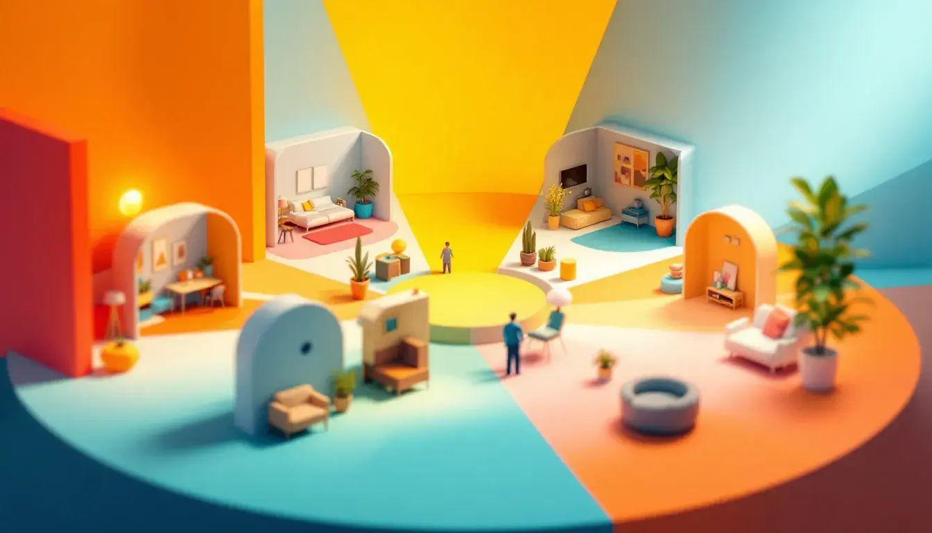
Room by Room: Best Colors for Different Spaces
18 Sep 2025 · 3 min readColor is more than mere decoration; it's the atmosphere we inhabit, the silent narrator of our daily lives. It whispers of warmth and coolness, shouts of energy or lulls us into tranquility. Choosing the right colors for our living spaces is akin to composing a symphony, each hue a note contributing to the overall harmony. It's about understanding how color can transform a room, amplify certain feelings, and ultimately, shape the way we experience the world within our walls. Consider the quiet focus a study demands, the vibrant energy a kitchen thrives on, or the restful calm a bedroom should inspire. The right colors can unlock these potentials, creating environments that not only look beautiful but also feel inherently right. Colors are emotional shorthand, triggering memories, influencing moods, and creating a sense of belonging. This isn't simply about aesthetics; it's about crafting environments that support our well-being.
The palette named "Modern Heritage" 🎨 suggests a sophisticated sense of comfort, ideal for spaces where conversation and contemplation intertwine. Imagine a living room bathed in the soft glow of Mustard Yellow, a hue that brings sunshine even on a cloudy day. Walls painted in Neutral Grey offer a grounding balance, preventing the yellow from becoming overwhelming. A daring statement wall in Tomato Red could add a touch of drama, a visual spark that ignites the imagination. Ground the entire space with furniture in Cool Gray, providing a contemporary anchor, while accents of Dark Espresso in wood finishes add depth and richness, reminding one of well-loved antiques and whispered stories. This combination dances on the edge of traditional and modern, allowing you create a space that feels both current and timeless. Consider how these colors might play off natural light, reflecting warmth and inviting you to linger. This isn't a palette for fleeting trends; it’s about building a foundation, layer by layer. Picture framed artwork with flashes of red against the gray walls, a vase of autumnal blooms echoing the mustard tones, and the comfort of deep, espresso-colored armchairs. This palette whispers of heritage, of stories passed down through generations, and of a cozy atmosphere where memories are made. It is a nod to the past, thoughtfully reimagined for the present.
"Diverse Palette" 🎨 opens up a universe of possibilities, perfect for those who crave a space that feels curated and collected. It asks you to embrace the unexpected, to weave together seemingly disparate textures and forms. Imagine an office where the walls are a soothing Steel Blue, promoting focus and concentration. Accents of Rose Pink in soft furnishings like cushions or throws introduce a touch of warmth and playfulness, preventing the space from feeling too sterile. A bold statement piece in Rust Orange could add a vibrant focal point, injecting energy and passion into the work environment. Shelving in Mustard Yellow introduces a note of understated sophistication. It allows for displaying objects and books with style and flair. Lastly, use Indigo Blue in smaller details, adding punches of color that give an enigmatic quality to the space. This palette encourages exploration, inviting you to experiment with different combinations and find what resonates with your personal taste. Think of a gallery wall featuring artwork with hints of each of the colors creating a visual tapestry. Or consider fabrics with complementary patterns layered upon one another, adding visual depth and narrative. This palette isn’t about following rules; it’s about creating a space that tells your story, a space that feels uniquely yours. It's a tapestry of elements you love that when woven together, make your soul sing.
The "Global Finance" 💰 palette suggests quiet confidence and understated sophistication, perfect for spaces where trust and reliability are paramount. Imagine an office embracing Pale Gold on the walls, creating a warm and inviting atmosphere without being overly ostentatious. Furniture in Deep Taupe grounds the space, conveying a sense of stability and resilience. Small splashes of Mustard Brown, in accessories like desk organizers or picture frames, add moments of visual interest, creating depth and richness. The carefully chosen hue of Grayish Green adds an element of subtlety that prevents it from appearing flat. Darks splashes of color using Dark Olive gives an air of refined character. Imagine a world map with the various regions in gradient colors that are easily separated for use. This subtle nod to nature and life brings vitality. Think of a boardroom where important decisions are made, a space that fosters both collaboration and discretion. This palette isn’t about flashy statements but rather about projecting an image of competence and dependability. A minimalist aesthetic, with clean lines and carefully curated details, would showcase the best of this palette. It's about building confidence and trust, creating an environment where clients and colleagues alike feel secure and respected.
The "Modern Harmony" 🎨 palette evokes a sense of balance and serenity, ideal for spaces where creativity and collaboration thrive. An office painted in the soft hue of Periwinkle promotes a sense of calm and focus, reducing distractions and fostering productivity. Furniture in Medium Gray provides a neutral foundation, allowing the other colors to shine without overwhelming the space. Bold accents of Electric Blue in artwork or accessories inject an element of energy and excitement, signaling innovation and dynamism. Subtle hints of Rusty Orange in textiles or lighting fixtures add a touch of warmth and approachability, preventing the space from feeling too clinical. Cool Gray, used sparingly, can frame the entire effect into a clear result. Imagine a collaborative workspace where ideas flow freely, a space that encourages both individual focus and team brainstorming. This palette isn’t about being rigid; it’s about fostering an environment where people feel comfortable expressing themselves and pushing boundaries. The colors should balance each other, creating an atmosphere that is both stimulating and relaxing. It's about finding that sweet spot where creativity and productivity intertwine, resulting in spaces that are functional and inspiring.
Ultimately, selecting colors for our living spaces is a deeply personal journey. It’s about understanding how colors impact us on an emotional level, considering the light within each room, and daring to embrace combinations that reflect our truest selves. The palettes explored offer just a starting point, a glimpse into the vast world of color and its transformative power. Each offers a unique mood, a particular way of interacting with the world. Let these be your guides, your inspiration, and your invitation to create environments that don't just look beautiful, but truly feel like home. These subtle, or sometimes overt, messages of color, can completely change the way we interact with a space on a regular basis. The choice is ultimately yours.