Red Alert: Investigating Red Color Saturation for Web Design Projects
18 Sep 2025 · 3 min readThe color red: a warning flare, a flush of excitement, the steady throb of a vital organ exposed. It commands attention, a visual imperative that can stop you in your tracks or urge you onward. In the online realm, where fleeting impressions dictate success, judicious use of red can be transformative. But wield it carelessly, and the result is jarring, even repellent. The web designer treads a fine line, needing to capture the eye without inciting alarm. Finding the perfect shade, the ideal saturation point, becomes a crucial balancing act. This exploration will scrutinize how different palettes utilize the power of "red alert" to craft compelling, yet comfortable, digital experiences. How much fire is too much? Where does allure turn to aversion? These are the questions worth asking when red stakes its claim in the virtual landscape.
The palette named "Korean Autumn" 🍂 whispers of changing leaves and crisp air, evoking a familiar warmth tempered with a touch of melancholy. Absent is the boisterous vibrance of summer; instead, the feeling is of cherished moments fading gracefully. The overall impression is akin to paging through an old photo album, catching glimpses of a past steeped in tradition. The "Rusty Red" pulls one toward hearth and home, an anchor in the swirl of passing seasons. It’s a color suggesting baked earth under a harvest sun, or perhaps the patina on an antique bronze bell. A webpage designed with such tones would invite the user to linger, to browse slowly, to connect with the content on a personal level. The "Off White" acts as a gentle canvas, preventing the richer hues from becoming overwhelming. Consider a travel blog utilizing these shades: The "Mustard Yellow" could highlight points of interest on a map, while the "Dusty Taupe" could soften the edges of photographs, creating a sense of timeless beauty. The "Dark Charcoal" grounds the scheme, offering a contrasting depth that prevents the visual experience from becoming saccharine. This palette understands that subtlety is captivating. It's less a shriek of "Red Alert", and more a comforting awareness of embers glowing. Its impact is gentle, nurturing a desire for exploration and discovery in a way that is reassuringly familiar.
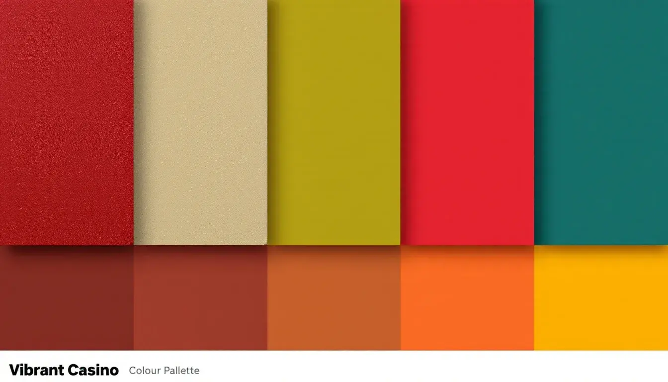
"Vibrant Casino" 🎰 Risk, reward, and the dizzying thrill of chance. Here, we find a palette calibrated to excite, its ambition being to keep the user's adrenaline peaking. The "Crimson Red" serves as a constant signal, a siren's call promising high stakes and higher payouts and a palpable sense of danger. This is not the demure red of a fading rose; this is the aggressive red of a roulette wheel, spinning wildly and daring you to place your bet. The "Pale Yellow" provides moments of respite, preventing complete sensory overload and conjuring mental images of gleaming brass fixtures and the clinking of champagne glasses. The "Moss Green" contributes a touch of grounded elegance, a nod to the luxurious carpets underfoot. Imagine an online gaming platform adopting these colors: the layout would pulse with energy, enticing visitors to explore the endless possibilities within. The "Muddy Brown" acts as a steadying influence, reminding one of plush leather seating and the weight of tradition. It is the "Deep Teal", however, that provides the most crucial contrast, its coolness effectively sharpening the heat of the other colors. This is "Red Alert" dialed up to eleven. The visceral impact is undeniable, urging users to embrace the reckless abandon of the game.
The "Modern Comfort" 🛋️ palette offers a study in contrasts, a soothing blend of contemporary restraint and inviting reassurance. The effect is akin to sinking into a well-worn armchair after a long day, feeling both stylishly current and utterly at ease. The "Crimson Red" appears here not as a strident alarm, but as punctuation, the precisely placed period at the end of a carefully crafted sentence. It's the subtle flash of firelight flickering in a minimalist fireplace, a single bold cushion upon a dove-grey sofa. The "Light Gray" functions as a calming expanse, an ethereal backdrop that allows the other colors to breathe. The "Muted Taupe" evokes brushed wool blankets and handcrafted ceramics, gently nudging at the senses. Consider a furniture retailer employing this palette: It would immediately convey a sense of elegant affordability. The "Tan Brown" provides a grounded connection to the natural world, suggestive of handcrafted wood and organic textures. The "Teal Green" maintains a cool, level-headed tone, preventing sentimentality from descending into mawkishness. This palette understands that true luxury lies in simplicity, embracing sophistication with a touch of understated warmth. It signals "Red Alert" in the form of a subtle invitation, guiding the user toward serene indulgence with quiet confidence.
Ultimately, the power of "red alert" in web design rests on calculated intent and discerning application. The "Korean Autumn" palette demonstrates the persuasive charm of subtle warmth, while "Vibrant Casino" showcases the adrenaline-pumping efficacy of unbridled intensity. Simultaneously, "Modern Comfort" unveils a sophisticated restraint, displaying a measured confidence. Each palette offers a unique strategy for capturing attention and influencing interaction, proving that emotional impact hinges not just on color, but on the story it is meant to tell.