'%3e%3cpath%20fill-rule='evenodd'%20clip-rule='evenodd'%20d='M51.1303%2019.2492C50.7278%2019.913%2050.1346%2020.4426%2049.3508%2020.838C48.5669%2021.2335%2047.6172%2021.4312%2046.5014%2021.4312C44.8208%2021.4312%2043.4367%2021.0216%2042.3492%2020.2025C41.2617%2019.3833%2040.6686%2018.2394%2040.5697%2016.7706H44.4253C44.4818%2017.3355%2044.6831%2017.7804%2045.0291%2018.1052C45.3751%2018.43%2045.8164%2018.5924%2046.3531%2018.5924C46.8192%2018.5924%2047.1864%2018.4653%2047.4547%2018.2111C47.7231%2017.9569%2047.8572%2017.618%2047.8572%2017.1943C47.8572%2016.8129%2047.7337%2016.4952%2047.4865%2016.241C47.2393%2015.9867%2046.9322%2015.7784%2046.565%2015.616C46.1978%2015.4536%2045.6893%2015.2594%2045.0397%2015.0334C44.0934%2014.7086%2043.3202%2014.3944%2042.72%2014.0907C42.1197%2013.7871%2041.6042%2013.3351%2041.1735%2012.7349C40.7427%2012.1347%2040.5273%2011.3544%2040.5273%2010.394C40.5273%209.50418%2040.7533%208.73448%2041.2053%208.08481C41.6572%207.43515%2042.2821%206.93731%2043.0801%206.5913C43.8781%206.24528%2044.7925%206.07227%2045.8235%206.07227C47.49%206.07227%2048.8141%206.46771%2049.7956%207.25861C50.7772%208.04951%2051.3315%209.13698%2051.4586%2010.5211H47.5395C47.4689%2010.0268%2047.2888%209.63483%2046.9993%209.3453C46.7097%209.05578%2046.3178%208.91102%2045.8235%208.91102C45.3998%208.91102%2045.0573%209.024%2044.7961%209.24997C44.5348%209.47594%2044.4041%209.80783%2044.4041%2010.2457C44.4041%2010.5988%2044.5207%2010.8989%2044.7537%2011.146C44.9867%2011.3932%2045.2798%2011.5944%2045.6328%2011.7498C45.9859%2011.9052%2046.4944%2012.1029%2047.1581%2012.343C48.1185%2012.6678%2048.9023%2012.9891%2049.5096%2013.3069C50.1169%2013.6246%2050.6395%2014.0872%2051.0773%2014.6945C51.5151%2015.3018%2051.734%2016.0927%2051.734%2017.0672C51.734%2017.8581%2051.5328%2018.5854%2051.1303%2019.2492ZM59.0242%206.3053V21.2829H55.4016V6.3053H59.0242ZM73.9409%206.3053V9.18642H69.8734V21.2829H66.2296V9.18642H62.2046V6.3053H73.9409ZM80.7438%209.18642V12.3218H85.8069V15.0546H80.7438V18.3806H86.4425V21.2829H77.1212V6.3053H86.4425V9.18642H80.7438ZM99.667%2016.0291V21.2829H96.0444V6.3053H101.913C103.692%206.3053%20105.048%206.74665%20105.98%207.62934C106.912%208.51204%20107.378%209.7019%20107.378%2011.199C107.378%2012.1311%20107.17%2012.9609%20106.753%2013.6882C106.337%2014.4155%20105.719%2014.9875%20104.9%2015.4042C104.08%2015.8208%20103.085%2016.0291%20101.913%2016.0291H99.667ZM103.692%2011.199C103.692%209.8855%20102.965%209.22879%20101.51%209.22879H99.667V13.1268H101.51C102.965%2013.1268%20103.692%2012.4842%20103.692%2011.199ZM120.092%2018.5501H114.478L113.546%2021.2829H109.732L115.219%206.41123H119.393L124.879%2021.2829H121.024L120.092%2018.5501ZM119.16%2015.7961L117.295%2010.2881L115.41%2015.7961H119.16ZM131.555%2018.5077H136.385V21.2829H127.933V6.3053H131.555V18.5077ZM143.337%209.18642V12.3218H148.4V15.0546H143.337V18.3806H149.035V21.2829H139.714V6.3053H149.035V9.18642H143.337ZM163.507%206.3053V9.18642H159.44V21.2829H155.796V9.18642H151.771V6.3053H163.507ZM177.449%206.3053V9.18642H173.382V21.2829H169.738V9.18642H165.713V6.3053H177.449ZM184.252%209.18642V12.3218H189.315V15.0546H184.252V18.3806H189.951V21.2829H180.629V6.3053H189.951V9.18642H184.252Z'%20fill='%23EEF0ED'/%3e%3cmask%20id='mask0_3101_7327'%20style='mask-type:alpha'%20maskUnits='userSpaceOnUse'%20x='0'%20y='0'%20width='27'%20height='28'%3e%3cpath%20d='M23.8328%200.759766H2.64808C1.18559%200.759766%200%201.94535%200%203.40785V24.5925C0%2026.055%201.18559%2027.2406%202.64808%2027.2406H23.8328C25.2952%2027.2406%2026.4808%2026.055%2026.4808%2024.5925V3.40785C26.4808%201.94535%2025.2952%200.759766%2023.8328%200.759766Z'%20fill='white'/%3e%3c/mask%3e%3cg%20mask='url(%23mask0_3101_7327)'%3e%3cpath%20d='M23.8328%200.759766H2.64808C1.18559%200.759766%200%201.94535%200%203.40785V24.5925C0%2026.055%201.18559%2027.2406%202.64808%2027.2406H23.8328C25.2952%2027.2406%2026.4808%2026.055%2026.4808%2024.5925V3.40785C26.4808%201.94535%2025.2952%200.759766%2023.8328%200.759766Z'%20fill='%23D8D8D8'/%3e%3cpath%20d='M13.2404%200.759766H0V14.0001H13.2404V0.759766Z'%20fill='%238C61FF'/%3e%3cpath%20d='M13.2404%2014H0V27.2404H13.2404V14Z'%20fill='%2336C3FE'/%3e%3cpath%20d='M26.4806%2014H13.2402V27.2404H26.4806V14Z'%20fill='%236592FE'/%3e%3cpath%20d='M26.4806%200.759766H13.2402V14.0002H26.4806V0.759766Z'%20fill='%236059F7'/%3e%3c/g%3e%3c/g%3e%3cdefs%3e%3cclipPath%20id='clip0_3101_7327'%3e%3crect%20width='190'%20height='28'%20fill='white'/%3e%3c/clipPath%3e%3c/defs%3e%3c/svg%3e)
'%3e%3cpath%20d='M23.8328%200.759521H2.64808C1.18559%200.759521%200%201.94511%200%203.40761V24.5923C0%2026.0548%201.18559%2027.2404%202.64808%2027.2404H23.8328C25.2952%2027.2404%2026.4808%2026.0548%2026.4808%2024.5923V3.40761C26.4808%201.94511%2025.2952%200.759521%2023.8328%200.759521Z'%20fill='%23D8D8D8'/%3e%3cpath%20d='M13.2404%200.759521H0V13.9999H13.2404V0.759521Z'%20fill='%238C61FF'/%3e%3cpath%20d='M13.2404%2013.9998H0V27.2402H13.2404V13.9998Z'%20fill='%2336C3FE'/%3e%3cpath%20d='M26.4809%2013.9998H13.2405V27.2402H26.4809V13.9998Z'%20fill='%236592FE'/%3e%3cpath%20d='M26.4809%200.759277H13.2405V13.9997H26.4809V0.759277Z'%20fill='%236059F7'/%3e%3c/g%3e%3c/svg%3e)
From Beige to Bold: Mapping the Saturation Shift in Interior Design Styles
18 Sep 2025 · 5 min readThe whisper of greige walls, once the anthem of sophisticated interiors, is slowly fading. A new chorus of color is rising, not in a chaotic shriek, but a considered crescendo. We're witnessing the quiet rebellion against neutrality, a deliberate embrace of hues that speak louder, feel deeper. It's not just about adding any color; it's about understanding how saturation shapes the emotional landscape of our living spaces. Think of saturation as the volume knob of a color. Turned low, it murmurs; cranked high, it sings. And interior design is learning to find the perfect pitch. The shift isn't about banishing calm, but about redefining it – trading sterile emptiness for vibrant serenity. We’re painting our emotions onto the walls, crafting sanctuaries that inspire and invigorate. The beige of yesteryear, a symbol of understated elegance, is now being challenged by personalities eager to express themselves within their homes. Homes are becoming reflections of our inner selves, not just curated showrooms. The question then becomes: how far are we willing to turn up the volume? How much saturation is too much, or just enough to ignite the senses and transform a house into a home? The following palettes offer a glimpse into this ongoing chromatic evolution.
The Corporate Calm 🏢 palette offers a sophisticated tension. It hints at a world where the boundaries between the professional and the personal are intentionally blurred. Imagine an executive suite bathed not in predictable grays, but in an Off White, its warmth subtly offsetting the crispness of the design. Teal Gray acts as a grounding force, a whispered promise of stability amidst the flurry of corporate ambition. But then, the Navy Blue arrives, a jolt of authority, tempered by the grounding presence of Dark Olive – a natural hue that suggests growth and resilience. Forest Green, in a supporting role, brings an element of calm focus. This palette doesn’t abandon neutrality entirely, but rather elevates it. It’s a neutrality imbued with purpose, depth, and quiet confidence. It allows for moments of introspection, even within high-pressure environments. The interplay of these particular hues suggests a space designed for mindful decision-making. Picture sunlight filtering through sheer curtains in an office space, illuminating a conference table adorned with natural textures. The colors create a sense of serenity to improve any business deal made at that table. The palette whispers: we take our work seriously, but also value our well-being. It’s a palette that understands the importance of a restorative environment, even when deadlines loom and stakes are high. The integration of these colors reflects a new understanding of what it means to be productive. Not sterile, but calm. Not empty, but inspired.
The Fiery Warmth 🔥 palette burns with a controlled intensity, mirroring the heart of a beautifully designed haven. A quiet canvas of Off White sets the stage. Then, the Muted Sage creeps in, hinting at botanical serenity. Steel Grey lends a sense of groundedness, much like the metallic structure of a modern loft. All these form a strong base for the spark that is Vibrant Orange. But this isn’t the brash orange of traffic cones; it’s the warm glow of a setting sun, a carefully considered accent that draws the eye without overwhelming the space. The Dark Espresso offers a deep, grounding note, like the rich aroma of coffee in the morning. Imagine a kitchen bathed in natural light, where the cabinets are brushed with a soft grey and the backsplash pops with that singular shade of orange. A copper kettle whistles on the stove, and the scent of freshly baked bread fills the air. This palette speaks of shared meals, lively conversation, and the comforting ritual of home. It’s a space that invites you to linger, to connect, to create memories. It’s a confident space, unafraid of color, but mindful of balance. The warmth isn’t just visual; it’s emotional. It creates a sense of intimacy and refuge, a welcome escape from the coldness of the outside world. The careful selection prevents it from ever feeling garish. It’s a controlled dance between fiery expression and cozy comfort.
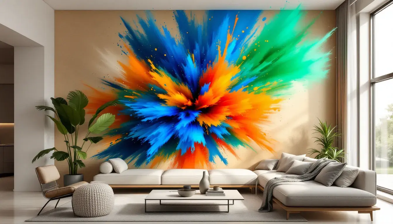
Electric Breeze 🌬️ captures the very essence of a daring, modern aesthetic. It's the kind of palette that makes a statement, that refuses to be ignored. The foundation of Pale Rose adds an unexpected softness. Light Turquoise then bursts onto the scene, a refreshing wave of aquatic brightness that conjures images of tropical lagoons and endless skies. The heart of the palette lies in the interplay between the Vivid Azure and Dark Magenta pairing – electricity incarnate, a bold contrast that pulsates with energy. Anchoring it all, Deep Indigo lends a touch of mystery, like the depth of the ocean. Envision a living room that embraces this palette fully, bringing a digital world into a brick and mortar structure. Abstract art adorns the walls, each piece reflecting the spectrum of colors, all set in geometric patterns. Lighting fixtures cast an ethereal glow, accentuating the vibrancy of the space. It’s a space designed for creatives, for innovators, for those who thrive on inspiration. It's exciting and immersive. This isn't a palette for the faint of heart; it’s for those who dare to push boundaries, to embrace the unexpected, to transform their living spaces into works of art. It presents a future where maximalism celebrates individuality.
The journey from beige to bold isn’t simply about adding color; it’s about crafting spaces that truly reflect who we are. These palettes highlight that there is no right or wrong when choosing a style that speaks to you. Corporate Calm reminds us that even in the most professional environments, we can find ways to foster a sense of peace and well-being, subtly adding color without dominating. Fiery Warmth invites us to embrace the comforting power of color, creating spaces that are both inviting and emotionally resonant. And Electric Breeze dares us to break free from convention, to express our individuality with unapologetic vibrancy. As we move forward, let’s remember that the most beautiful spaces are not those that adhere to fleeting trends, but those that tell a story – our story – in the language of color. Let the walls be a canvas.