'%3e%3cpath%20fill-rule='evenodd'%20clip-rule='evenodd'%20d='M51.1303%2019.2492C50.7278%2019.913%2050.1346%2020.4426%2049.3508%2020.838C48.5669%2021.2335%2047.6172%2021.4312%2046.5014%2021.4312C44.8208%2021.4312%2043.4367%2021.0216%2042.3492%2020.2025C41.2617%2019.3833%2040.6686%2018.2394%2040.5697%2016.7706H44.4253C44.4818%2017.3355%2044.6831%2017.7804%2045.0291%2018.1052C45.3751%2018.43%2045.8164%2018.5924%2046.3531%2018.5924C46.8192%2018.5924%2047.1864%2018.4653%2047.4547%2018.2111C47.7231%2017.9569%2047.8572%2017.618%2047.8572%2017.1943C47.8572%2016.8129%2047.7337%2016.4952%2047.4865%2016.241C47.2393%2015.9867%2046.9322%2015.7784%2046.565%2015.616C46.1978%2015.4536%2045.6893%2015.2594%2045.0397%2015.0334C44.0934%2014.7086%2043.3202%2014.3944%2042.72%2014.0907C42.1197%2013.7871%2041.6042%2013.3351%2041.1735%2012.7349C40.7427%2012.1347%2040.5273%2011.3544%2040.5273%2010.394C40.5273%209.50418%2040.7533%208.73448%2041.2053%208.08481C41.6572%207.43515%2042.2821%206.93731%2043.0801%206.5913C43.8781%206.24528%2044.7925%206.07227%2045.8235%206.07227C47.49%206.07227%2048.8141%206.46771%2049.7956%207.25861C50.7772%208.04951%2051.3315%209.13698%2051.4586%2010.5211H47.5395C47.4689%2010.0268%2047.2888%209.63483%2046.9993%209.3453C46.7097%209.05578%2046.3178%208.91102%2045.8235%208.91102C45.3998%208.91102%2045.0573%209.024%2044.7961%209.24997C44.5348%209.47594%2044.4041%209.80783%2044.4041%2010.2457C44.4041%2010.5988%2044.5207%2010.8989%2044.7537%2011.146C44.9867%2011.3932%2045.2798%2011.5944%2045.6328%2011.7498C45.9859%2011.9052%2046.4944%2012.1029%2047.1581%2012.343C48.1185%2012.6678%2048.9023%2012.9891%2049.5096%2013.3069C50.1169%2013.6246%2050.6395%2014.0872%2051.0773%2014.6945C51.5151%2015.3018%2051.734%2016.0927%2051.734%2017.0672C51.734%2017.8581%2051.5328%2018.5854%2051.1303%2019.2492ZM59.0242%206.3053V21.2829H55.4016V6.3053H59.0242ZM73.9409%206.3053V9.18642H69.8734V21.2829H66.2296V9.18642H62.2046V6.3053H73.9409ZM80.7438%209.18642V12.3218H85.8069V15.0546H80.7438V18.3806H86.4425V21.2829H77.1212V6.3053H86.4425V9.18642H80.7438ZM99.667%2016.0291V21.2829H96.0444V6.3053H101.913C103.692%206.3053%20105.048%206.74665%20105.98%207.62934C106.912%208.51204%20107.378%209.7019%20107.378%2011.199C107.378%2012.1311%20107.17%2012.9609%20106.753%2013.6882C106.337%2014.4155%20105.719%2014.9875%20104.9%2015.4042C104.08%2015.8208%20103.085%2016.0291%20101.913%2016.0291H99.667ZM103.692%2011.199C103.692%209.8855%20102.965%209.22879%20101.51%209.22879H99.667V13.1268H101.51C102.965%2013.1268%20103.692%2012.4842%20103.692%2011.199ZM120.092%2018.5501H114.478L113.546%2021.2829H109.732L115.219%206.41123H119.393L124.879%2021.2829H121.024L120.092%2018.5501ZM119.16%2015.7961L117.295%2010.2881L115.41%2015.7961H119.16ZM131.555%2018.5077H136.385V21.2829H127.933V6.3053H131.555V18.5077ZM143.337%209.18642V12.3218H148.4V15.0546H143.337V18.3806H149.035V21.2829H139.714V6.3053H149.035V9.18642H143.337ZM163.507%206.3053V9.18642H159.44V21.2829H155.796V9.18642H151.771V6.3053H163.507ZM177.449%206.3053V9.18642H173.382V21.2829H169.738V9.18642H165.713V6.3053H177.449ZM184.252%209.18642V12.3218H189.315V15.0546H184.252V18.3806H189.951V21.2829H180.629V6.3053H189.951V9.18642H184.252Z'%20fill='%23EEF0ED'/%3e%3cmask%20id='mask0_3101_7327'%20style='mask-type:alpha'%20maskUnits='userSpaceOnUse'%20x='0'%20y='0'%20width='27'%20height='28'%3e%3cpath%20d='M23.8328%200.759766H2.64808C1.18559%200.759766%200%201.94535%200%203.40785V24.5925C0%2026.055%201.18559%2027.2406%202.64808%2027.2406H23.8328C25.2952%2027.2406%2026.4808%2026.055%2026.4808%2024.5925V3.40785C26.4808%201.94535%2025.2952%200.759766%2023.8328%200.759766Z'%20fill='white'/%3e%3c/mask%3e%3cg%20mask='url(%23mask0_3101_7327)'%3e%3cpath%20d='M23.8328%200.759766H2.64808C1.18559%200.759766%200%201.94535%200%203.40785V24.5925C0%2026.055%201.18559%2027.2406%202.64808%2027.2406H23.8328C25.2952%2027.2406%2026.4808%2026.055%2026.4808%2024.5925V3.40785C26.4808%201.94535%2025.2952%200.759766%2023.8328%200.759766Z'%20fill='%23D8D8D8'/%3e%3cpath%20d='M13.2404%200.759766H0V14.0001H13.2404V0.759766Z'%20fill='%238C61FF'/%3e%3cpath%20d='M13.2404%2014H0V27.2404H13.2404V14Z'%20fill='%2336C3FE'/%3e%3cpath%20d='M26.4806%2014H13.2402V27.2404H26.4806V14Z'%20fill='%236592FE'/%3e%3cpath%20d='M26.4806%200.759766H13.2402V14.0002H26.4806V0.759766Z'%20fill='%236059F7'/%3e%3c/g%3e%3c/g%3e%3cdefs%3e%3cclipPath%20id='clip0_3101_7327'%3e%3crect%20width='190'%20height='28'%20fill='white'/%3e%3c/clipPath%3e%3c/defs%3e%3c/svg%3e)
'%3e%3cpath%20d='M23.8328%200.759521H2.64808C1.18559%200.759521%200%201.94511%200%203.40761V24.5923C0%2026.0548%201.18559%2027.2404%202.64808%2027.2404H23.8328C25.2952%2027.2404%2026.4808%2026.0548%2026.4808%2024.5923V3.40761C26.4808%201.94511%2025.2952%200.759521%2023.8328%200.759521Z'%20fill='%23D8D8D8'/%3e%3cpath%20d='M13.2404%200.759521H0V13.9999H13.2404V0.759521Z'%20fill='%238C61FF'/%3e%3cpath%20d='M13.2404%2013.9998H0V27.2402H13.2404V13.9998Z'%20fill='%2336C3FE'/%3e%3cpath%20d='M26.4809%2013.9998H13.2405V27.2402H26.4809V13.9998Z'%20fill='%236592FE'/%3e%3cpath%20d='M26.4809%200.759277H13.2405V13.9997H26.4809V0.759277Z'%20fill='%236059F7'/%3e%3c/g%3e%3c/svg%3e)
Color Psychology: How Saturation Affects Professional Look?
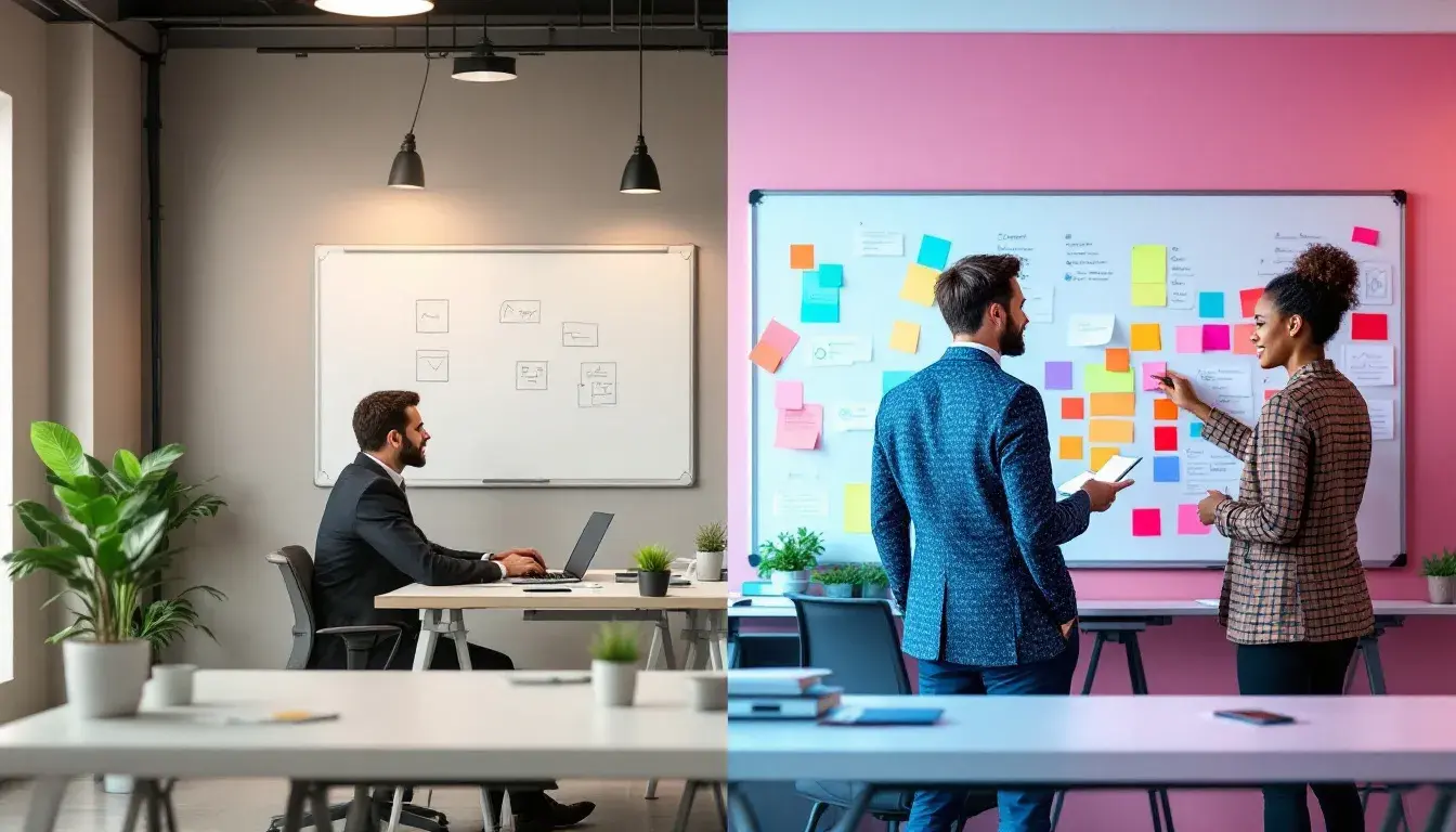
18 Sep 2025 · 3 min readColor possesses an uncanny ability to whisper volumes where words fall short. Think of walking into a room washed in muted tones – a sense of calm descends, a feeling of quiet authority. Conversely, imagine bold, saturated hues vying for attention; the air crackles with energy, a sense of spirited innovation. The choices we make in color, particularly concerning saturation, profoundly influence how we are perceived, especially in professional spheres. Saturation isn't merely about brightness; it’s the intensity, the purity, the very soul of a color. In the workplace, where first impressions are vital and unspoken cues guide interactions, the strategic deployment of saturation can mean the difference between projecting competence and confidence, or appearing brash and unfocused. The palettes we choose build the spaces around us; the places we meet in, the websites that lead us, and the presentations that inform us.
The "Corporate Palette" speaks of measured confidence, a place where innovation meets established practice. Imagine a sun-drenched corner office; the walls, a shade of Pure White, provide a canvas for bold statements – perhaps a piece of art featuring the Teal Green or a rug woven with threads of Dusty Rose. The Vibrant Yellow sings of creativity and forward-thinking, while the grounding presence of Deep Navy Blue instills trust. The Pale Yellow whispers assurances without overwhelming, a visual promise of transparency. Notice the balanced dance between the striking and the subtle; the neutrality of the Gray lends an air of dependability, like a trusted colleague whose opinion you value. The overall sensation is one of restrained optimism, a space conducive to brainstorming sessions and weighty decisions alike. Think of websites that use these colors for easy navigation and calming backgrounds, with the bold yellows and blues used only as action items. This palette offers a road map for establishing authority not through bombast, but through carefully curated visual cues. The Dark Burgundy hints at tradition, while the Steel Blue brings a touch of the future. No single color dominates – together, these make the feeling of a considered and comprehensive approach.
The "Corporate Modern" palette offers a more daring take, a visual language of swift adaptation and bold vision. Picture a tech startup's headquarters: exposed brick, sleek furniture, and splashes of Bright Orange and Crimson Red breaking up the monotony of concrete and steel. The Off White lends a sense of airiness, while the Deep Navy anchors the space, hinting at reliability beneath the veneer of innovation. The Light Orange brings thoughts of digital screens and interface, while the Olive Green reminds us of the real world bleeding in. The Cool Gray of the furniture evokes modernity. Envision a slide presentation using these colors, presenting research, in a way that is not only informative but also visually striking. The Burnt Orange and Dark Magenta represent calculated risks, a willingness to push boundaries. The Slate Blue gives the feel of trust in numbers. This combination avoids becoming chaotic, instead delivering a message of controlled creativity, a space where fresh ideas are encouraged, but within a framework of proven expertise. The visual effect is one of confident progress, a workspace ready for tomorrow's challenges. This palette recognizes the value of commanding attention without sacrificing sophistication.
"Corporate Balance" paints a picture of understated power, a professional world where composure and clarity reign. A law firm's library comes to mind: walls in Pure White, accents of Deep Navy in the shelving, and the warmth of Golden Yellow filtering through stained glass. The Pale Lavender adds a touch of grace and quiet intelligence, suggesting a space that fosters reflection and thoughtful counsel. The Grayish Blue of the upholstery creates a sense of trust and reliability. Imagine this palette gracing a website, with Bright Cyan calls to action – the colors speak of transparency and integrity, reinforcing confidence in the reliability of the information provided. Onyx Black provides a foundation of seriousness, while Olive Drab reminds us that practical solutions are found in the real world. The Rose Carmine represents a warm bedside manner with clients. This palette shies away from the overtly assertive, choosing instead to project a quiet strength and enduring wisdom. The Brick Red speaks to experience, and the palette as a whole to a carefully considered approach.
The colors we choose are not merely aesthetic preferences; they are powerful tools that can consciously shape our perceptions in the professional arena. Each palette analyzed carries its own distinct message. Where one announces confidence through bold strokes of saturation, another whispers of strength through a balanced, more subdued approach. Color is a language that demands careful consideration, not just to reflect our own tastes, but to actively shape the narrative we wish to project to the world. By working with these variations, we can start to find the exact tone that meets our needs.