'%3e%3cpath%20fill-rule='evenodd'%20clip-rule='evenodd'%20d='M51.1303%2019.2492C50.7278%2019.913%2050.1346%2020.4426%2049.3508%2020.838C48.5669%2021.2335%2047.6172%2021.4312%2046.5014%2021.4312C44.8208%2021.4312%2043.4367%2021.0216%2042.3492%2020.2025C41.2617%2019.3833%2040.6686%2018.2394%2040.5697%2016.7706H44.4253C44.4818%2017.3355%2044.6831%2017.7804%2045.0291%2018.1052C45.3751%2018.43%2045.8164%2018.5924%2046.3531%2018.5924C46.8192%2018.5924%2047.1864%2018.4653%2047.4547%2018.2111C47.7231%2017.9569%2047.8572%2017.618%2047.8572%2017.1943C47.8572%2016.8129%2047.7337%2016.4952%2047.4865%2016.241C47.2393%2015.9867%2046.9322%2015.7784%2046.565%2015.616C46.1978%2015.4536%2045.6893%2015.2594%2045.0397%2015.0334C44.0934%2014.7086%2043.3202%2014.3944%2042.72%2014.0907C42.1197%2013.7871%2041.6042%2013.3351%2041.1735%2012.7349C40.7427%2012.1347%2040.5273%2011.3544%2040.5273%2010.394C40.5273%209.50418%2040.7533%208.73448%2041.2053%208.08481C41.6572%207.43515%2042.2821%206.93731%2043.0801%206.5913C43.8781%206.24528%2044.7925%206.07227%2045.8235%206.07227C47.49%206.07227%2048.8141%206.46771%2049.7956%207.25861C50.7772%208.04951%2051.3315%209.13698%2051.4586%2010.5211H47.5395C47.4689%2010.0268%2047.2888%209.63483%2046.9993%209.3453C46.7097%209.05578%2046.3178%208.91102%2045.8235%208.91102C45.3998%208.91102%2045.0573%209.024%2044.7961%209.24997C44.5348%209.47594%2044.4041%209.80783%2044.4041%2010.2457C44.4041%2010.5988%2044.5207%2010.8989%2044.7537%2011.146C44.9867%2011.3932%2045.2798%2011.5944%2045.6328%2011.7498C45.9859%2011.9052%2046.4944%2012.1029%2047.1581%2012.343C48.1185%2012.6678%2048.9023%2012.9891%2049.5096%2013.3069C50.1169%2013.6246%2050.6395%2014.0872%2051.0773%2014.6945C51.5151%2015.3018%2051.734%2016.0927%2051.734%2017.0672C51.734%2017.8581%2051.5328%2018.5854%2051.1303%2019.2492ZM59.0242%206.3053V21.2829H55.4016V6.3053H59.0242ZM73.9409%206.3053V9.18642H69.8734V21.2829H66.2296V9.18642H62.2046V6.3053H73.9409ZM80.7438%209.18642V12.3218H85.8069V15.0546H80.7438V18.3806H86.4425V21.2829H77.1212V6.3053H86.4425V9.18642H80.7438ZM99.667%2016.0291V21.2829H96.0444V6.3053H101.913C103.692%206.3053%20105.048%206.74665%20105.98%207.62934C106.912%208.51204%20107.378%209.7019%20107.378%2011.199C107.378%2012.1311%20107.17%2012.9609%20106.753%2013.6882C106.337%2014.4155%20105.719%2014.9875%20104.9%2015.4042C104.08%2015.8208%20103.085%2016.0291%20101.913%2016.0291H99.667ZM103.692%2011.199C103.692%209.8855%20102.965%209.22879%20101.51%209.22879H99.667V13.1268H101.51C102.965%2013.1268%20103.692%2012.4842%20103.692%2011.199ZM120.092%2018.5501H114.478L113.546%2021.2829H109.732L115.219%206.41123H119.393L124.879%2021.2829H121.024L120.092%2018.5501ZM119.16%2015.7961L117.295%2010.2881L115.41%2015.7961H119.16ZM131.555%2018.5077H136.385V21.2829H127.933V6.3053H131.555V18.5077ZM143.337%209.18642V12.3218H148.4V15.0546H143.337V18.3806H149.035V21.2829H139.714V6.3053H149.035V9.18642H143.337ZM163.507%206.3053V9.18642H159.44V21.2829H155.796V9.18642H151.771V6.3053H163.507ZM177.449%206.3053V9.18642H173.382V21.2829H169.738V9.18642H165.713V6.3053H177.449ZM184.252%209.18642V12.3218H189.315V15.0546H184.252V18.3806H189.951V21.2829H180.629V6.3053H189.951V9.18642H184.252Z'%20fill='%23EEF0ED'/%3e%3cmask%20id='mask0_3101_7327'%20style='mask-type:alpha'%20maskUnits='userSpaceOnUse'%20x='0'%20y='0'%20width='27'%20height='28'%3e%3cpath%20d='M23.8328%200.759766H2.64808C1.18559%200.759766%200%201.94535%200%203.40785V24.5925C0%2026.055%201.18559%2027.2406%202.64808%2027.2406H23.8328C25.2952%2027.2406%2026.4808%2026.055%2026.4808%2024.5925V3.40785C26.4808%201.94535%2025.2952%200.759766%2023.8328%200.759766Z'%20fill='white'/%3e%3c/mask%3e%3cg%20mask='url(%23mask0_3101_7327)'%3e%3cpath%20d='M23.8328%200.759766H2.64808C1.18559%200.759766%200%201.94535%200%203.40785V24.5925C0%2026.055%201.18559%2027.2406%202.64808%2027.2406H23.8328C25.2952%2027.2406%2026.4808%2026.055%2026.4808%2024.5925V3.40785C26.4808%201.94535%2025.2952%200.759766%2023.8328%200.759766Z'%20fill='%23D8D8D8'/%3e%3cpath%20d='M13.2404%200.759766H0V14.0001H13.2404V0.759766Z'%20fill='%238C61FF'/%3e%3cpath%20d='M13.2404%2014H0V27.2404H13.2404V14Z'%20fill='%2336C3FE'/%3e%3cpath%20d='M26.4806%2014H13.2402V27.2404H26.4806V14Z'%20fill='%236592FE'/%3e%3cpath%20d='M26.4806%200.759766H13.2402V14.0002H26.4806V0.759766Z'%20fill='%236059F7'/%3e%3c/g%3e%3c/g%3e%3cdefs%3e%3cclipPath%20id='clip0_3101_7327'%3e%3crect%20width='190'%20height='28'%20fill='white'/%3e%3c/clipPath%3e%3c/defs%3e%3c/svg%3e)
'%3e%3cpath%20d='M23.8328%200.759521H2.64808C1.18559%200.759521%200%201.94511%200%203.40761V24.5923C0%2026.0548%201.18559%2027.2404%202.64808%2027.2404H23.8328C25.2952%2027.2404%2026.4808%2026.0548%2026.4808%2024.5923V3.40761C26.4808%201.94511%2025.2952%200.759521%2023.8328%200.759521Z'%20fill='%23D8D8D8'/%3e%3cpath%20d='M13.2404%200.759521H0V13.9999H13.2404V0.759521Z'%20fill='%238C61FF'/%3e%3cpath%20d='M13.2404%2013.9998H0V27.2402H13.2404V13.9998Z'%20fill='%2336C3FE'/%3e%3cpath%20d='M26.4809%2013.9998H13.2405V27.2402H26.4809V13.9998Z'%20fill='%236592FE'/%3e%3cpath%20d='M26.4809%200.759277H13.2405V13.9997H26.4809V0.759277Z'%20fill='%236059F7'/%3e%3c/g%3e%3c/svg%3e)
Autumn's Hues: Top 5 Colors for Natural Style Palettes
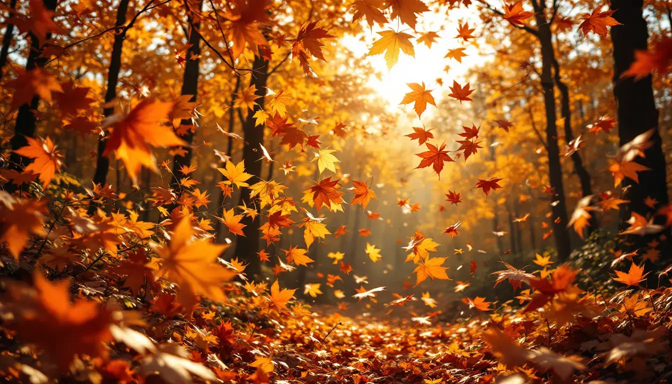
18 Sep 2025 · 2 min readAcross whispering fields and beneath canopies ablaze, autumn breathes a particular kind of magic. It’s a tactile season, one where the crunch of leaves underfoot and the brisk air on skin conjure distinct memories. The colors, of course, participate deeply in this sensory experience. They’re not just visual cues, but emotional anchors, grounding us in a sense of warmth and belonging. But how do we translate this wealth of outdoor feeling into something we can carry with us, inspire us? Perhaps it lies in capturing the most elemental hues, the ones that speak of nature's own artistry. A select gathering promises the most honest and grounding interpretation of nature’s last fiery bow before winter’s rest.
The Earthy Contrast palette strikes a commanding chord, reminiscent of sun-drenched meadows at the cusp of twilight. Imagine the last sliver of sunlight catching the edge of a field, painted with Canary Yellow against the somber tones of approaching dusk. The inclusion of Off White speaks to the ethereal mists that cling to the hollows, while Amber Orange and Burnt Sienna capture the transformation of falling leaves. Taupe Gray provides a quiet, stable foundation, like fertile soil resting beneath. Slate Blue offers a surprising but welcome complement. Consider the way a twilight sky deepens in color as the sun dips below the horizon. The Crimson Red then echoes the bittersweet intensity of fading life, like the last embers of a dying fire. These colors together offer a study in opposition – a vibrant dance between light and shadow, warmth and coolness. This palette could find a home in spaces designed for reflection and contemplation or for celebrating the raw beauty that thrives in transitions. The Olive Drab lends an unexpected depth, while Jet Black speaks to the crispness of the season’s close, a final profound silence before the world changes.
Earthy Elegance presents a story of muted grandeur, like a forgotten estate slowly returning to nature. Light Beige acts as a canvas, evoking the delicate light filtering through aged windowpanes. Sage Green is the presence of ivy climbing ancient stone walls, a gentle reclaiming of space by the wild. Slate Gray mirrors the weathered slate roof, its surface softened by years of exposure to the elements. Golden Brown suggests the rich patina of antique wood furniture, holding tales within its grain. Dark Coffee then brings a sense of grounded stillness, like the deep shadows cast by towering trees. The combined effect is both comforting and sophisticated – a celebration of survival and gentle decay. Picture this palette in a space adorned with linen fabrics, aged brass accents, and flickering candlelight. It invites stillness and encourages a close examination of the objects inhabiting it.
With Earthy Energy, the palette ignites a sense of vital awakening, capturing the essence of an autumn hike on a brisk morning. Pale Yellow brings to mind the crisp, sunlight-dappled leaves of birch trees. Vibrant Orange perfectly captures the intense warmth radiating from a sunset. Khaki Green whispers of resilient moss clinging steadfastly to rocks. Dusty Olive is the embodiment of damp earth beneath fallen leaves, a grounding force both resilient and yielding. Deep Teal, like a shaded forest pool, injects an invigorating cool tone. This amalgamation invigorates, offering a pathway to both serenity and movement, akin to that restorative pause halfway up a woodland trail. When envisioned, it breathes life to the space with its blend of sun-kissed warmth and soothing earthiness.
In considering these palettes, we're not merely selecting colors but rather curating sensory experiences. Earthy Contrast pulls us into the drama of changing seasons while embracing the stark beauty of a moment in transition. Earthy Elegance offers a romantic whisper of time, conjuring quiet moments amidst the elegance of natural rhythms. Earthy Energy renews us with the vigour that comes from outdoor immersion, as if recalling the clarity of crisp air. These hues, captured in careful balance, can create spaces that feel not just visually appealing but also emotionally resonant, grounding us in the heart of autumnal experience.