'%3e%3cpath%20fill-rule='evenodd'%20clip-rule='evenodd'%20d='M51.1303%2019.2492C50.7278%2019.913%2050.1346%2020.4426%2049.3508%2020.838C48.5669%2021.2335%2047.6172%2021.4312%2046.5014%2021.4312C44.8208%2021.4312%2043.4367%2021.0216%2042.3492%2020.2025C41.2617%2019.3833%2040.6686%2018.2394%2040.5697%2016.7706H44.4253C44.4818%2017.3355%2044.6831%2017.7804%2045.0291%2018.1052C45.3751%2018.43%2045.8164%2018.5924%2046.3531%2018.5924C46.8192%2018.5924%2047.1864%2018.4653%2047.4547%2018.2111C47.7231%2017.9569%2047.8572%2017.618%2047.8572%2017.1943C47.8572%2016.8129%2047.7337%2016.4952%2047.4865%2016.241C47.2393%2015.9867%2046.9322%2015.7784%2046.565%2015.616C46.1978%2015.4536%2045.6893%2015.2594%2045.0397%2015.0334C44.0934%2014.7086%2043.3202%2014.3944%2042.72%2014.0907C42.1197%2013.7871%2041.6042%2013.3351%2041.1735%2012.7349C40.7427%2012.1347%2040.5273%2011.3544%2040.5273%2010.394C40.5273%209.50418%2040.7533%208.73448%2041.2053%208.08481C41.6572%207.43515%2042.2821%206.93731%2043.0801%206.5913C43.8781%206.24528%2044.7925%206.07227%2045.8235%206.07227C47.49%206.07227%2048.8141%206.46771%2049.7956%207.25861C50.7772%208.04951%2051.3315%209.13698%2051.4586%2010.5211H47.5395C47.4689%2010.0268%2047.2888%209.63483%2046.9993%209.3453C46.7097%209.05578%2046.3178%208.91102%2045.8235%208.91102C45.3998%208.91102%2045.0573%209.024%2044.7961%209.24997C44.5348%209.47594%2044.4041%209.80783%2044.4041%2010.2457C44.4041%2010.5988%2044.5207%2010.8989%2044.7537%2011.146C44.9867%2011.3932%2045.2798%2011.5944%2045.6328%2011.7498C45.9859%2011.9052%2046.4944%2012.1029%2047.1581%2012.343C48.1185%2012.6678%2048.9023%2012.9891%2049.5096%2013.3069C50.1169%2013.6246%2050.6395%2014.0872%2051.0773%2014.6945C51.5151%2015.3018%2051.734%2016.0927%2051.734%2017.0672C51.734%2017.8581%2051.5328%2018.5854%2051.1303%2019.2492ZM59.0242%206.3053V21.2829H55.4016V6.3053H59.0242ZM73.9409%206.3053V9.18642H69.8734V21.2829H66.2296V9.18642H62.2046V6.3053H73.9409ZM80.7438%209.18642V12.3218H85.8069V15.0546H80.7438V18.3806H86.4425V21.2829H77.1212V6.3053H86.4425V9.18642H80.7438ZM99.667%2016.0291V21.2829H96.0444V6.3053H101.913C103.692%206.3053%20105.048%206.74665%20105.98%207.62934C106.912%208.51204%20107.378%209.7019%20107.378%2011.199C107.378%2012.1311%20107.17%2012.9609%20106.753%2013.6882C106.337%2014.4155%20105.719%2014.9875%20104.9%2015.4042C104.08%2015.8208%20103.085%2016.0291%20101.913%2016.0291H99.667ZM103.692%2011.199C103.692%209.8855%20102.965%209.22879%20101.51%209.22879H99.667V13.1268H101.51C102.965%2013.1268%20103.692%2012.4842%20103.692%2011.199ZM120.092%2018.5501H114.478L113.546%2021.2829H109.732L115.219%206.41123H119.393L124.879%2021.2829H121.024L120.092%2018.5501ZM119.16%2015.7961L117.295%2010.2881L115.41%2015.7961H119.16ZM131.555%2018.5077H136.385V21.2829H127.933V6.3053H131.555V18.5077ZM143.337%209.18642V12.3218H148.4V15.0546H143.337V18.3806H149.035V21.2829H139.714V6.3053H149.035V9.18642H143.337ZM163.507%206.3053V9.18642H159.44V21.2829H155.796V9.18642H151.771V6.3053H163.507ZM177.449%206.3053V9.18642H173.382V21.2829H169.738V9.18642H165.713V6.3053H177.449ZM184.252%209.18642V12.3218H189.315V15.0546H184.252V18.3806H189.951V21.2829H180.629V6.3053H189.951V9.18642H184.252Z'%20fill='%23EEF0ED'/%3e%3cmask%20id='mask0_3101_7327'%20style='mask-type:alpha'%20maskUnits='userSpaceOnUse'%20x='0'%20y='0'%20width='27'%20height='28'%3e%3cpath%20d='M23.8328%200.759766H2.64808C1.18559%200.759766%200%201.94535%200%203.40785V24.5925C0%2026.055%201.18559%2027.2406%202.64808%2027.2406H23.8328C25.2952%2027.2406%2026.4808%2026.055%2026.4808%2024.5925V3.40785C26.4808%201.94535%2025.2952%200.759766%2023.8328%200.759766Z'%20fill='white'/%3e%3c/mask%3e%3cg%20mask='url(%23mask0_3101_7327)'%3e%3cpath%20d='M23.8328%200.759766H2.64808C1.18559%200.759766%200%201.94535%200%203.40785V24.5925C0%2026.055%201.18559%2027.2406%202.64808%2027.2406H23.8328C25.2952%2027.2406%2026.4808%2026.055%2026.4808%2024.5925V3.40785C26.4808%201.94535%2025.2952%200.759766%2023.8328%200.759766Z'%20fill='%23D8D8D8'/%3e%3cpath%20d='M13.2404%200.759766H0V14.0001H13.2404V0.759766Z'%20fill='%238C61FF'/%3e%3cpath%20d='M13.2404%2014H0V27.2404H13.2404V14Z'%20fill='%2336C3FE'/%3e%3cpath%20d='M26.4806%2014H13.2402V27.2404H26.4806V14Z'%20fill='%236592FE'/%3e%3cpath%20d='M26.4806%200.759766H13.2402V14.0002H26.4806V0.759766Z'%20fill='%236059F7'/%3e%3c/g%3e%3c/g%3e%3cdefs%3e%3cclipPath%20id='clip0_3101_7327'%3e%3crect%20width='190'%20height='28'%20fill='white'/%3e%3c/clipPath%3e%3c/defs%3e%3c/svg%3e)
'%3e%3cpath%20d='M23.8328%200.759521H2.64808C1.18559%200.759521%200%201.94511%200%203.40761V24.5923C0%2026.0548%201.18559%2027.2404%202.64808%2027.2404H23.8328C25.2952%2027.2404%2026.4808%2026.0548%2026.4808%2024.5923V3.40761C26.4808%201.94511%2025.2952%200.759521%2023.8328%200.759521Z'%20fill='%23D8D8D8'/%3e%3cpath%20d='M13.2404%200.759521H0V13.9999H13.2404V0.759521Z'%20fill='%238C61FF'/%3e%3cpath%20d='M13.2404%2013.9998H0V27.2402H13.2404V13.9998Z'%20fill='%2336C3FE'/%3e%3cpath%20d='M26.4809%2013.9998H13.2405V27.2402H26.4809V13.9998Z'%20fill='%236592FE'/%3e%3cpath%20d='M26.4809%200.759277H13.2405V13.9997H26.4809V0.759277Z'%20fill='%236059F7'/%3e%3c/g%3e%3c/svg%3e)
Project Preferences: The Signature Palette of Web Designers
16 Sep 2025 · 3 min readColor—it’s the quiet architect of our online world, silently shaping perception and guiding emotion. Forget the bombast of trends; understand the quiet power of considered hues. A website’s palette operates as a subtle code, whispering volumes about brand identity and user experience. The seemingly simple act of choosing colors becomes an exercise in crafting digital atmosphere. What makes a web designer's palette sing? It's the capacity to create an instant, wordless communication that resonates profoundly with the viewer. It’s about building trust and inviting exploration through the language of light itself. A brilliant palette doesn't just look good; it feels right. It's the visual equivalent of a perfectly tuned instrument, playing a symphony of accessibility, usability, and unforgettable impressions that linger long after the screen fades to black. The choices we make with color are the key to unlock our ability to create websites that are usable, intuitive, and enduring.
The "Korea Tourism" palette whispers of serene landscapes and rich, woven histories. Off White anchors the composition with a sense of airy openness, a digital breath of fresh air. Pale Blue Gray evokes distant mountain ranges shrouded in mist, lending the palette a touch of contemplative coolness. The judicious use of Mustard Yellow introduces a spark of energy, reminiscent of sun-drenched fields or the intricate gold leaf accents found within ancient temples. Russet Brown, like aged wood or baked earth, grounds the scheme in warmth and familiarity, while Slate Gray harmonizes the overall effect, adding depth without overpowering. This color collection feels custom-made for the modern traveler: a journey defined by quiet discovery and appreciation of understated elegance. For a website aesthetic, this palette evokes a responsive, adaptable design. Think clean lines, ample spacing, and subtle animations that mirror the gentle rustling of leaves in a Korean garden. It promises a curated experience, leading the user through an odyssey of cultural immersion. It is sophisticated and inviting.
"Historic Harmony" unfolds as a carefully considered narrative of time and tradition. Light Gray provides a gentle canvas, suggesting a weathered page in a historical text. Golden Yellow adds a glint of opulence reminiscent of antique frames. Cool Gray offers a restful counterpoint, evoking the enduring strength of stone structures. Burnt Sienna infuses a sense of age and authenticity, like pigments faded by the passage of years. Steel Blue contributes a refreshing clarity, reminiscent of a pristine stream flowing through verdant landscapes. Slate Gray further deepens the overall composition, lending depth and dimension. Olive Drab evokes autumnal tones, while Charcoal Black provides elegant definition. This ensemble speaks of heritage without feeling antiquated. It is mature without being old. Applied to website design, it could manifest as an experience of respectful navigation. Imagine restrained typography, interactive timelines, and subtle parallax scrolling to create an illusion of three-dimensionality. This is not just a site; it is an immersion.
"Korean Heritage" feels like stepping into a hushed, ancient courtyard. Light Mist hovers like early morning cloud cover, a gentle introduction. Golden Tan hints at sun-baked earth and woven textiles, adding a touch of warmth and rustic authenticity. Slate Blue grounds the ensemble with steadfastness, reminiscent of roof tiles weathered by centuries of wind and rain. Dark Teal deepens the experience, suggesting tranquil garden ponds reflecting age-old trees. Finally, Deep Navy offers gravity, a bottomless sense of heritage and timelessness. A palette of depth and quiet dignity, suited for a heritage site. When translated into the interactive realm, it could result in a seamless journey through time. Think carefully curated visual experiences, with restrained animations that echo traditional brushstrokes used in ancient calligraphy. Each click becomes a meditation, transporting the user to a different era with grace and consideration.
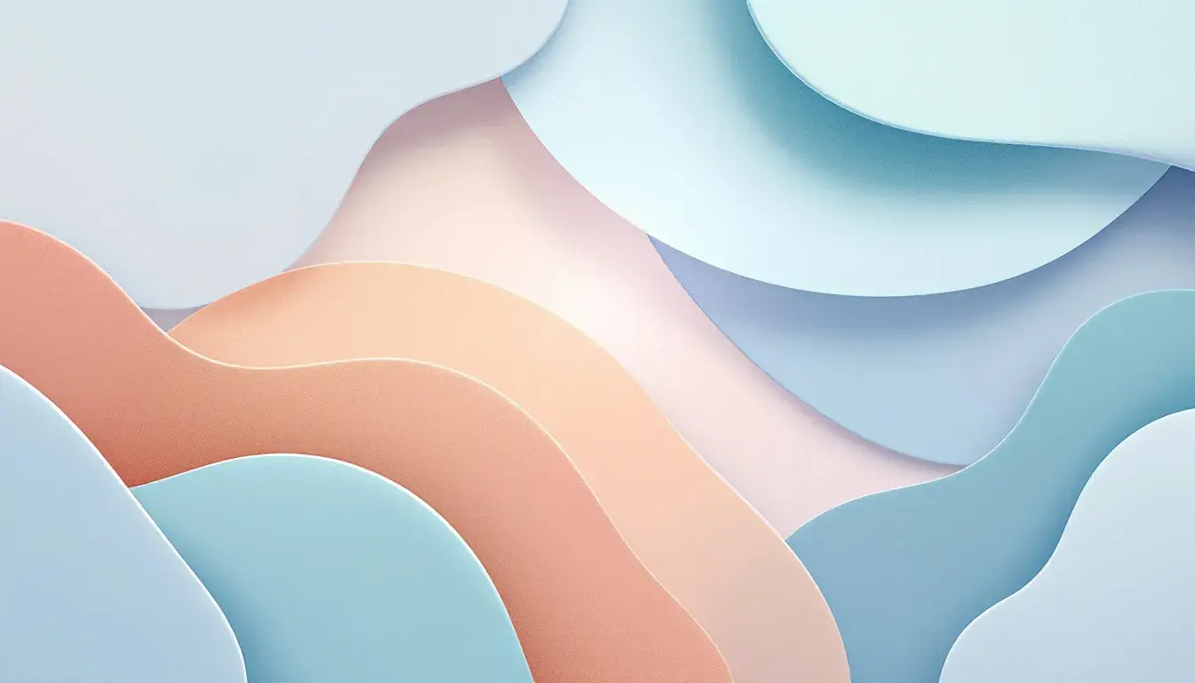
"Modern Heritage" unfolds as a study in understated sophistication, subtly blending history and innovation. Creamy Beige provides a foundation of neutral elegance, reminiscent of handmade paper or aged parchment. Grayish Green introduces an element of natural tranquility, like moss clinging to ancient stones. Muted Green adds a layer of depth, evoking the hushed atmosphere of a private library or a gallery filled with priceless artifacts. Deep Indigo provides depth and definition, acting like a binding thread that ties the past to the present. Finally, Midnight Blue introduces a hint of contemporary cool. Visualize it as a digitally responsive experience: effortless navigation, intuitive interactions, and subtly shifting layers of content that reveal themselves gracefully as the user scrolls. Clean lines, ample whitespace, and refined typography combine to create an impression of restrained eloquence. This is a website that respects the past while fully embracing the future.
These palettes reveal that selecting colors for the digital space is a meticulous dance between aesthetic appeal and emotional impact. Each palette illustrates a distinct approach to visual communication, showing how designers leverage color to shape user perception and craft unforgettable online experiences. The power of color invites designers to see beyond the immediate and create lasting impressions that resonate deeply with users.