'%3e%3cpath%20fill-rule='evenodd'%20clip-rule='evenodd'%20d='M51.1303%2019.2492C50.7278%2019.913%2050.1346%2020.4426%2049.3508%2020.838C48.5669%2021.2335%2047.6172%2021.4312%2046.5014%2021.4312C44.8208%2021.4312%2043.4367%2021.0216%2042.3492%2020.2025C41.2617%2019.3833%2040.6686%2018.2394%2040.5697%2016.7706H44.4253C44.4818%2017.3355%2044.6831%2017.7804%2045.0291%2018.1052C45.3751%2018.43%2045.8164%2018.5924%2046.3531%2018.5924C46.8192%2018.5924%2047.1864%2018.4653%2047.4547%2018.2111C47.7231%2017.9569%2047.8572%2017.618%2047.8572%2017.1943C47.8572%2016.8129%2047.7337%2016.4952%2047.4865%2016.241C47.2393%2015.9867%2046.9322%2015.7784%2046.565%2015.616C46.1978%2015.4536%2045.6893%2015.2594%2045.0397%2015.0334C44.0934%2014.7086%2043.3202%2014.3944%2042.72%2014.0907C42.1197%2013.7871%2041.6042%2013.3351%2041.1735%2012.7349C40.7427%2012.1347%2040.5273%2011.3544%2040.5273%2010.394C40.5273%209.50418%2040.7533%208.73448%2041.2053%208.08481C41.6572%207.43515%2042.2821%206.93731%2043.0801%206.5913C43.8781%206.24528%2044.7925%206.07227%2045.8235%206.07227C47.49%206.07227%2048.8141%206.46771%2049.7956%207.25861C50.7772%208.04951%2051.3315%209.13698%2051.4586%2010.5211H47.5395C47.4689%2010.0268%2047.2888%209.63483%2046.9993%209.3453C46.7097%209.05578%2046.3178%208.91102%2045.8235%208.91102C45.3998%208.91102%2045.0573%209.024%2044.7961%209.24997C44.5348%209.47594%2044.4041%209.80783%2044.4041%2010.2457C44.4041%2010.5988%2044.5207%2010.8989%2044.7537%2011.146C44.9867%2011.3932%2045.2798%2011.5944%2045.6328%2011.7498C45.9859%2011.9052%2046.4944%2012.1029%2047.1581%2012.343C48.1185%2012.6678%2048.9023%2012.9891%2049.5096%2013.3069C50.1169%2013.6246%2050.6395%2014.0872%2051.0773%2014.6945C51.5151%2015.3018%2051.734%2016.0927%2051.734%2017.0672C51.734%2017.8581%2051.5328%2018.5854%2051.1303%2019.2492ZM59.0242%206.3053V21.2829H55.4016V6.3053H59.0242ZM73.9409%206.3053V9.18642H69.8734V21.2829H66.2296V9.18642H62.2046V6.3053H73.9409ZM80.7438%209.18642V12.3218H85.8069V15.0546H80.7438V18.3806H86.4425V21.2829H77.1212V6.3053H86.4425V9.18642H80.7438ZM99.667%2016.0291V21.2829H96.0444V6.3053H101.913C103.692%206.3053%20105.048%206.74665%20105.98%207.62934C106.912%208.51204%20107.378%209.7019%20107.378%2011.199C107.378%2012.1311%20107.17%2012.9609%20106.753%2013.6882C106.337%2014.4155%20105.719%2014.9875%20104.9%2015.4042C104.08%2015.8208%20103.085%2016.0291%20101.913%2016.0291H99.667ZM103.692%2011.199C103.692%209.8855%20102.965%209.22879%20101.51%209.22879H99.667V13.1268H101.51C102.965%2013.1268%20103.692%2012.4842%20103.692%2011.199ZM120.092%2018.5501H114.478L113.546%2021.2829H109.732L115.219%206.41123H119.393L124.879%2021.2829H121.024L120.092%2018.5501ZM119.16%2015.7961L117.295%2010.2881L115.41%2015.7961H119.16ZM131.555%2018.5077H136.385V21.2829H127.933V6.3053H131.555V18.5077ZM143.337%209.18642V12.3218H148.4V15.0546H143.337V18.3806H149.035V21.2829H139.714V6.3053H149.035V9.18642H143.337ZM163.507%206.3053V9.18642H159.44V21.2829H155.796V9.18642H151.771V6.3053H163.507ZM177.449%206.3053V9.18642H173.382V21.2829H169.738V9.18642H165.713V6.3053H177.449ZM184.252%209.18642V12.3218H189.315V15.0546H184.252V18.3806H189.951V21.2829H180.629V6.3053H189.951V9.18642H184.252Z'%20fill='%23EEF0ED'/%3e%3cmask%20id='mask0_3101_7327'%20style='mask-type:alpha'%20maskUnits='userSpaceOnUse'%20x='0'%20y='0'%20width='27'%20height='28'%3e%3cpath%20d='M23.8328%200.759766H2.64808C1.18559%200.759766%200%201.94535%200%203.40785V24.5925C0%2026.055%201.18559%2027.2406%202.64808%2027.2406H23.8328C25.2952%2027.2406%2026.4808%2026.055%2026.4808%2024.5925V3.40785C26.4808%201.94535%2025.2952%200.759766%2023.8328%200.759766Z'%20fill='white'/%3e%3c/mask%3e%3cg%20mask='url(%23mask0_3101_7327)'%3e%3cpath%20d='M23.8328%200.759766H2.64808C1.18559%200.759766%200%201.94535%200%203.40785V24.5925C0%2026.055%201.18559%2027.2406%202.64808%2027.2406H23.8328C25.2952%2027.2406%2026.4808%2026.055%2026.4808%2024.5925V3.40785C26.4808%201.94535%2025.2952%200.759766%2023.8328%200.759766Z'%20fill='%23D8D8D8'/%3e%3cpath%20d='M13.2404%200.759766H0V14.0001H13.2404V0.759766Z'%20fill='%238C61FF'/%3e%3cpath%20d='M13.2404%2014H0V27.2404H13.2404V14Z'%20fill='%2336C3FE'/%3e%3cpath%20d='M26.4806%2014H13.2402V27.2404H26.4806V14Z'%20fill='%236592FE'/%3e%3cpath%20d='M26.4806%200.759766H13.2402V14.0002H26.4806V0.759766Z'%20fill='%236059F7'/%3e%3c/g%3e%3c/g%3e%3cdefs%3e%3cclipPath%20id='clip0_3101_7327'%3e%3crect%20width='190'%20height='28'%20fill='white'/%3e%3c/clipPath%3e%3c/defs%3e%3c/svg%3e)
'%3e%3cpath%20d='M23.8328%200.759521H2.64808C1.18559%200.759521%200%201.94511%200%203.40761V24.5923C0%2026.0548%201.18559%2027.2404%202.64808%2027.2404H23.8328C25.2952%2027.2404%2026.4808%2026.0548%2026.4808%2024.5923V3.40761C26.4808%201.94511%2025.2952%200.759521%2023.8328%200.759521Z'%20fill='%23D8D8D8'/%3e%3cpath%20d='M13.2404%200.759521H0V13.9999H13.2404V0.759521Z'%20fill='%238C61FF'/%3e%3cpath%20d='M13.2404%2013.9998H0V27.2402H13.2404V13.9998Z'%20fill='%2336C3FE'/%3e%3cpath%20d='M26.4809%2013.9998H13.2405V27.2402H26.4809V13.9998Z'%20fill='%236592FE'/%3e%3cpath%20d='M26.4809%200.759277H13.2405V13.9997H26.4809V0.759277Z'%20fill='%236059F7'/%3e%3c/g%3e%3c/svg%3e)
From Cube to Thief: Quantifying Color Loss in Abstraction
16 Sep 2025 · 4 min readColor, in its boundless array, shapes our perceptions and dictates emotional responses. It's the silent language of design, capable of whispering tranquility or shouting urgency. Consider a painter's canvas, an architect's blueprint, or a web designer's interface: all are symphonies orchestrated with color. But what happens when this intricate language is simplified, distilled, or, dare we say, abstracted? The transformation from a full spectrum to a curated selection is precisely what we're examining. Color palettes, those carefully chosen sets, offer a lens through which to view this journey, exposing the delicate dance between fidelity and reduction. We seek not to judge this process, but to understand it; to quantify the color loss and observe the impact on the overall aesthetic and emotional response. Examining how specific palette compositions influence how people perceive and respond to streamlined visual information. This is an exploration of controlled chromatic subtraction, where limitations breed possibility.
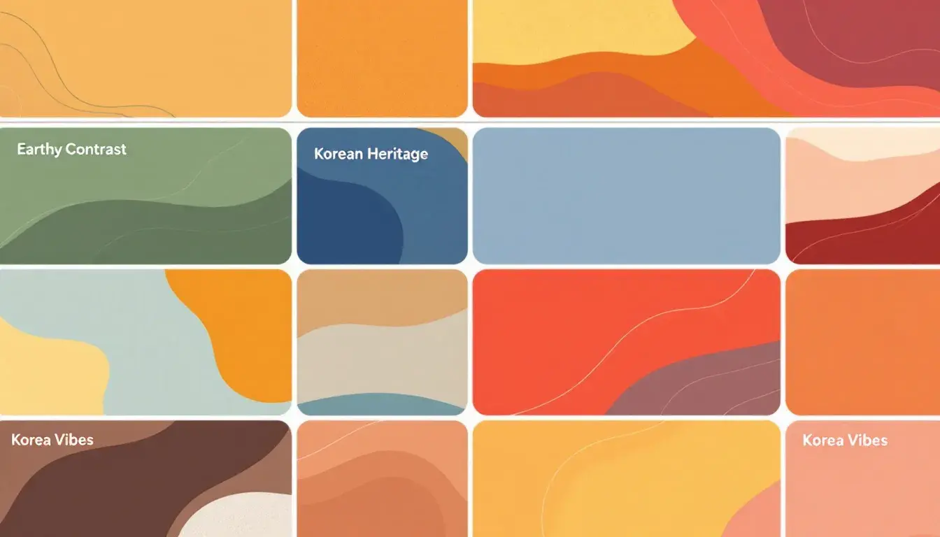
The "Earthy Contrast" palette whispers of fallen leaves and crackling fireplaces. It's the feeling of wrapping a warm scarf around your neck on a crisp autumn day. Light Peach hints at the last vestiges of summer sun, while Burnt Orange evokes the vibrant hues of changing foliage. Taupe Gray grounds the composition, like the sturdy trunk of an ancient oak, leading to Forest Green, reminiscent of shaded groves and earth. Finally, Deep Crimson adds a touch of drama, the color of ripening berries hidden amongst the brush. Imagine a rustic cabin nestled deep in the woods, bathed in the soft glow of twilight. This palette would be right at home, adorning woven textiles, earthenware pottery, and perhaps even a hand-painted mural on a weathered wooden wall. Picture it as the backdrop for a lifestyle brand promoting outdoor adventures, evoking memories of simpler times and the quiet beauty of nature's cycle. Alternatively, consider the color direction for a film set in the countryside; these shades could tell the story of generations connected to the land. This stripped-down collection of pigments distills a vast and varied terrain into a concise visual poem, a testament to the power of suggestion and the beauty of considered restraint. It's a narrative told not through complexity, but through careful selection.
"Korean Heritage" conjures images of ancient temples veiled in morning mist, and the quiet rhythm of artisans diligently practicing their craft. Light Mist is like the pale silk of a traditional hanbok, almost ethereal in its delicacy. Golden Tan echoes the rich warmth of aged wood, the intricate carvings that grace palace doors, and is reminiscent of Gilt artwork. Slate Blue suggests the deep indigo dyes used in traditional textiles, a color that carries centuries of history within its threads. Dark Teal whispers of the jade ornaments worn by royalty, embodying sophistication and reserved elegance. Finally, Deep Navy evokes the depths of a moonless night sky, the expanse that inspired countless poems and legends. Imagine this palette gracing the interiors of a museum dedicated to preserving cultural artifacts, used to illuminate delicate porcelain and highlight the subtle beauty of traditional paintings. Consider a brand identity for a tea house, where the colors create a sense of serene contemplation and the aroma of jasmine hangs softly in the air. It is the art of paring down a rich cultural history to its most essential elements, retaining the spirit of a nation within a carefully chosen arrangement of hues. A painter might seek to capture the atmosphere of a royal garden, the interplay of serenity and opulence distilled into five distinct shades. It is a visual homage to a heritage both timeless and enduring.
"Korea Vibes" pulsates with the energy of a bustling market street. Goldenrod Yellow shines and gleams with street food vendors displaying their wares, while Grayish Brown holds a sense of earthiness that comes from architectural elements that provide shade throughout the area. Tomato Red grabs attention, like the flashing neon signs of modern city life. Slate Blue brings a touch of sophistication, a nod to the sleek and innovative technology that defines the nation's future. Midnight Blue anchors the palette, as deep and inviting as the tranquil waters of the Han River. Picture a website designed to promote tourism, using these colors to capture the vibrant contrast between ancient traditions and contemporary innovation. This is the palette of the modern traveler, seeking authentic experiences, not just staged attractions. Picture the marketing material for a cultural festival, where the colors mirror the diverse performances. Imagine these shades on the walls of a trendy cafe in Seoul, where the aroma of coffee blends seamlessly with the sounds of K-pop. In its simplicity, this palette speaks a dynamic narrative—a fusion of the old and the new, distilled into a modern visual language. The artist captures the soul of a thriving metropolis, telling a compelling story through the power of limited chromatic expression.
Abstraction, at its finest, doesn’t diminish; it focuses. These palettes, in their reduction, become potent storytellers. "Earthy Contrast" evokes the quiet beauty of the natural world; "Korean Heritage" whispers tales of history and cultural pride; and "Korea Vibes" vibrates with the energy of a nation embracing the future. It is through these carefully chosen color stories that designers, artists, and storytellers find new avenues to explore the human experience, reminding us that less can indeed be more. Even a journey of color loss and the impact on emotions can be an interesting endeavor.