'%3e%3cpath%20fill-rule='evenodd'%20clip-rule='evenodd'%20d='M51.1303%2019.2492C50.7278%2019.913%2050.1346%2020.4426%2049.3508%2020.838C48.5669%2021.2335%2047.6172%2021.4312%2046.5014%2021.4312C44.8208%2021.4312%2043.4367%2021.0216%2042.3492%2020.2025C41.2617%2019.3833%2040.6686%2018.2394%2040.5697%2016.7706H44.4253C44.4818%2017.3355%2044.6831%2017.7804%2045.0291%2018.1052C45.3751%2018.43%2045.8164%2018.5924%2046.3531%2018.5924C46.8192%2018.5924%2047.1864%2018.4653%2047.4547%2018.2111C47.7231%2017.9569%2047.8572%2017.618%2047.8572%2017.1943C47.8572%2016.8129%2047.7337%2016.4952%2047.4865%2016.241C47.2393%2015.9867%2046.9322%2015.7784%2046.565%2015.616C46.1978%2015.4536%2045.6893%2015.2594%2045.0397%2015.0334C44.0934%2014.7086%2043.3202%2014.3944%2042.72%2014.0907C42.1197%2013.7871%2041.6042%2013.3351%2041.1735%2012.7349C40.7427%2012.1347%2040.5273%2011.3544%2040.5273%2010.394C40.5273%209.50418%2040.7533%208.73448%2041.2053%208.08481C41.6572%207.43515%2042.2821%206.93731%2043.0801%206.5913C43.8781%206.24528%2044.7925%206.07227%2045.8235%206.07227C47.49%206.07227%2048.8141%206.46771%2049.7956%207.25861C50.7772%208.04951%2051.3315%209.13698%2051.4586%2010.5211H47.5395C47.4689%2010.0268%2047.2888%209.63483%2046.9993%209.3453C46.7097%209.05578%2046.3178%208.91102%2045.8235%208.91102C45.3998%208.91102%2045.0573%209.024%2044.7961%209.24997C44.5348%209.47594%2044.4041%209.80783%2044.4041%2010.2457C44.4041%2010.5988%2044.5207%2010.8989%2044.7537%2011.146C44.9867%2011.3932%2045.2798%2011.5944%2045.6328%2011.7498C45.9859%2011.9052%2046.4944%2012.1029%2047.1581%2012.343C48.1185%2012.6678%2048.9023%2012.9891%2049.5096%2013.3069C50.1169%2013.6246%2050.6395%2014.0872%2051.0773%2014.6945C51.5151%2015.3018%2051.734%2016.0927%2051.734%2017.0672C51.734%2017.8581%2051.5328%2018.5854%2051.1303%2019.2492ZM59.0242%206.3053V21.2829H55.4016V6.3053H59.0242ZM73.9409%206.3053V9.18642H69.8734V21.2829H66.2296V9.18642H62.2046V6.3053H73.9409ZM80.7438%209.18642V12.3218H85.8069V15.0546H80.7438V18.3806H86.4425V21.2829H77.1212V6.3053H86.4425V9.18642H80.7438ZM99.667%2016.0291V21.2829H96.0444V6.3053H101.913C103.692%206.3053%20105.048%206.74665%20105.98%207.62934C106.912%208.51204%20107.378%209.7019%20107.378%2011.199C107.378%2012.1311%20107.17%2012.9609%20106.753%2013.6882C106.337%2014.4155%20105.719%2014.9875%20104.9%2015.4042C104.08%2015.8208%20103.085%2016.0291%20101.913%2016.0291H99.667ZM103.692%2011.199C103.692%209.8855%20102.965%209.22879%20101.51%209.22879H99.667V13.1268H101.51C102.965%2013.1268%20103.692%2012.4842%20103.692%2011.199ZM120.092%2018.5501H114.478L113.546%2021.2829H109.732L115.219%206.41123H119.393L124.879%2021.2829H121.024L120.092%2018.5501ZM119.16%2015.7961L117.295%2010.2881L115.41%2015.7961H119.16ZM131.555%2018.5077H136.385V21.2829H127.933V6.3053H131.555V18.5077ZM143.337%209.18642V12.3218H148.4V15.0546H143.337V18.3806H149.035V21.2829H139.714V6.3053H149.035V9.18642H143.337ZM163.507%206.3053V9.18642H159.44V21.2829H155.796V9.18642H151.771V6.3053H163.507ZM177.449%206.3053V9.18642H173.382V21.2829H169.738V9.18642H165.713V6.3053H177.449ZM184.252%209.18642V12.3218H189.315V15.0546H184.252V18.3806H189.951V21.2829H180.629V6.3053H189.951V9.18642H184.252Z'%20fill='%23EEF0ED'/%3e%3cmask%20id='mask0_3101_7327'%20style='mask-type:alpha'%20maskUnits='userSpaceOnUse'%20x='0'%20y='0'%20width='27'%20height='28'%3e%3cpath%20d='M23.8328%200.759766H2.64808C1.18559%200.759766%200%201.94535%200%203.40785V24.5925C0%2026.055%201.18559%2027.2406%202.64808%2027.2406H23.8328C25.2952%2027.2406%2026.4808%2026.055%2026.4808%2024.5925V3.40785C26.4808%201.94535%2025.2952%200.759766%2023.8328%200.759766Z'%20fill='white'/%3e%3c/mask%3e%3cg%20mask='url(%23mask0_3101_7327)'%3e%3cpath%20d='M23.8328%200.759766H2.64808C1.18559%200.759766%200%201.94535%200%203.40785V24.5925C0%2026.055%201.18559%2027.2406%202.64808%2027.2406H23.8328C25.2952%2027.2406%2026.4808%2026.055%2026.4808%2024.5925V3.40785C26.4808%201.94535%2025.2952%200.759766%2023.8328%200.759766Z'%20fill='%23D8D8D8'/%3e%3cpath%20d='M13.2404%200.759766H0V14.0001H13.2404V0.759766Z'%20fill='%238C61FF'/%3e%3cpath%20d='M13.2404%2014H0V27.2404H13.2404V14Z'%20fill='%2336C3FE'/%3e%3cpath%20d='M26.4806%2014H13.2402V27.2404H26.4806V14Z'%20fill='%236592FE'/%3e%3cpath%20d='M26.4806%200.759766H13.2402V14.0002H26.4806V0.759766Z'%20fill='%236059F7'/%3e%3c/g%3e%3c/g%3e%3cdefs%3e%3cclipPath%20id='clip0_3101_7327'%3e%3crect%20width='190'%20height='28'%20fill='white'/%3e%3c/clipPath%3e%3c/defs%3e%3c/svg%3e)
'%3e%3cpath%20d='M23.8328%200.759521H2.64808C1.18559%200.759521%200%201.94511%200%203.40761V24.5923C0%2026.0548%201.18559%2027.2404%202.64808%2027.2404H23.8328C25.2952%2027.2404%2026.4808%2026.0548%2026.4808%2024.5923V3.40761C26.4808%201.94511%2025.2952%200.759521%2023.8328%200.759521Z'%20fill='%23D8D8D8'/%3e%3cpath%20d='M13.2404%200.759521H0V13.9999H13.2404V0.759521Z'%20fill='%238C61FF'/%3e%3cpath%20d='M13.2404%2013.9998H0V27.2402H13.2404V13.9998Z'%20fill='%2336C3FE'/%3e%3cpath%20d='M26.4809%2013.9998H13.2405V27.2402H26.4809V13.9998Z'%20fill='%236592FE'/%3e%3cpath%20d='M26.4809%200.759277H13.2405V13.9997H26.4809V0.759277Z'%20fill='%236059F7'/%3e%3c/g%3e%3c/svg%3e)
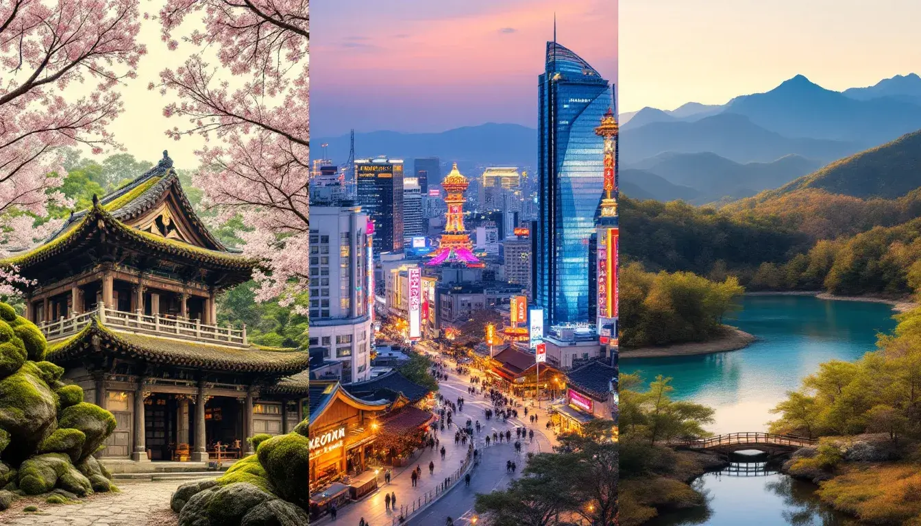
Dominant Hues of Korean Tourism: A Transseasonal Spectrum
16 Sep 2025 · 3 min readColors, in their silent eloquence, shape our perceptions of a place. More than just decoration, they are the emotional scaffolding upon which we construct memories and associations. Think of a vibrant market, overflowing with local produce bathed in the warm glow of the sun, or a serene temple courtyard, its ancient stones softened by the cool embrace of the shade. These sensory cues subtly inform our understanding, coloring our experience with a distinctive hue. In the context of Korean tourism, the selection of color becomes a deliberate act of storytelling, a way to convey the nation's diverse narratives, from its ancient traditions to its contemporary spirit. The following palettes seek to capture these narratives, translating them into a visual language designed to entice and entrance. Each palette serves as a distilled essence of Korea, a transseasonal glimpse into its soul.
The "Korean Heritage" palette evokes a sense of seasoned elegance, suggestive of aged scrolls and time-worn temples. The "Pale Apricot" whispers of sun-drenched hanoks against a clear sky, while "Steel Grey" echoes the imposing presence of ancient stone pagodas weathered by centuries of wind and rain. "Vibrant Blue" mirrors the mesmerizing depths of royal porcelain, a symbol of artistry and refined taste. "Olive Green," suggestive of tranquil bamboo forests, promises respite from the bustling city, offering a moment of quiet contemplation. And lastly, "Dark Chocolate" hints at the comforting warmth of traditional teas enjoyed in dimly lit rooms. The collective impression created is one of reverence and respect. It speaks to an audience that appreciates the subtle beauty of imperfection, finding joy in the stories etched onto the faces of history. The overall sensory experience is one of restrained luxury, less about ostentatious displays and more about appreciation for fine craftsmanship and cultural depth. This is a palette perfect for communicating a sense of enduring quality and quiet sophistication. It resonates most gracefully with those who search for a connection to something beyond the surface, promising an authentic journey into Korea’s historical heart.
"Korean Travel" introduces an element of invigorating discovery, presenting a visual invitation to explore. "Light Beige," reflective of sandy shores kissed by the sun, fosters anticipation of seaside escapes and coastal walks. "Teal Green" conjures visions of pristine waters teeming with marine life, prompting wanderlust and the desire to immerse oneself in nature. "Dull Silver" subtly reflects the polished surfaces of contemporary architecture, hinting at the vibrant urban landscapes awaiting exploration. "Olive Drab" evokes the earthy aromas of dense forests and trails promising adventure and exploration. Grounding the arrangement, "Ebony Black" adds a touch of sleek sophistication, suggesting a cosmopolitan elegance. This combination is confident, bold, and youthful, appealing to travelers who seeks a balance of relaxation and stimulation. It carries a feeling of freedom and endless possibilities, inspiring those dreaming of adventure beyond the familiar. Consider a sweeping panoramic shot of Seoul's skyline at dusk; the lights shimmer against a velvet sky, or the sun reflecting off the calm sea during a tranquil fishing trip. A gentle breeze carrying the scent of pine and the sound of rolling waves. It is an alluring mix, promising experiences to savor visually and emotionally and is perfect for generating interest.
The "Korean Tourism" palette offers a more diverse spectrum, intending to communicate the many facets of the nation's appeal. "Off White" mimics the delicate hue of traditional Korean paper, creating a canvas of subtle elegance, representing an enduring cultural legacy. "Steel Blue Gray" brings to mind the misty landscapes of mountainous regions, imparting a sense of serene exploration and inviting a yearning for a place of escape. "Brass Yellow" channels the radiant glow of gilded temples and palaces, signifying wealth and prosperity. "Russet Brown" captures the earthy tones of the land, hinting at rich agricultural traditions and fostering a sense of genuine connection. Anchoring the ensemble, "Dark Slate Gray" resembles the night sky studded with stars, sparking visions of peaceful evenings and captivating urban environments. Taken as a whole, these colors create a world of contrasts, mirroring the historical and contemporary, rural and metropolitan, tranquil and stimulating. It’s a call to all travel styles, inviting viewers to craft their particular journey, from quiet contemplations in serene temples to thrilling adventures in vibrant cities. An immersive brand experience of local cuisine and historical legacy.
Across these curated visions, a common thread emerges: the celebration of duality. Whether it's the balance of tradition and modernity, nature and urbanity, calm and vibrancy, these palettes signal the richness of what Korea presents to the world. While each palette carries its distinct emotional profile, the absence in all of hex values across the cube color sets suggests tourism professionals prefer using other types of color schemes. They move beyond static representation, becoming dynamic instruments in shaping perceptions and fostering engagement. What remains is the invitation, whispered in shades of earth and sky: Come, see, experience.