'%3e%3cpath%20fill-rule='evenodd'%20clip-rule='evenodd'%20d='M51.1303%2019.2492C50.7278%2019.913%2050.1346%2020.4426%2049.3508%2020.838C48.5669%2021.2335%2047.6172%2021.4312%2046.5014%2021.4312C44.8208%2021.4312%2043.4367%2021.0216%2042.3492%2020.2025C41.2617%2019.3833%2040.6686%2018.2394%2040.5697%2016.7706H44.4253C44.4818%2017.3355%2044.6831%2017.7804%2045.0291%2018.1052C45.3751%2018.43%2045.8164%2018.5924%2046.3531%2018.5924C46.8192%2018.5924%2047.1864%2018.4653%2047.4547%2018.2111C47.7231%2017.9569%2047.8572%2017.618%2047.8572%2017.1943C47.8572%2016.8129%2047.7337%2016.4952%2047.4865%2016.241C47.2393%2015.9867%2046.9322%2015.7784%2046.565%2015.616C46.1978%2015.4536%2045.6893%2015.2594%2045.0397%2015.0334C44.0934%2014.7086%2043.3202%2014.3944%2042.72%2014.0907C42.1197%2013.7871%2041.6042%2013.3351%2041.1735%2012.7349C40.7427%2012.1347%2040.5273%2011.3544%2040.5273%2010.394C40.5273%209.50418%2040.7533%208.73448%2041.2053%208.08481C41.6572%207.43515%2042.2821%206.93731%2043.0801%206.5913C43.8781%206.24528%2044.7925%206.07227%2045.8235%206.07227C47.49%206.07227%2048.8141%206.46771%2049.7956%207.25861C50.7772%208.04951%2051.3315%209.13698%2051.4586%2010.5211H47.5395C47.4689%2010.0268%2047.2888%209.63483%2046.9993%209.3453C46.7097%209.05578%2046.3178%208.91102%2045.8235%208.91102C45.3998%208.91102%2045.0573%209.024%2044.7961%209.24997C44.5348%209.47594%2044.4041%209.80783%2044.4041%2010.2457C44.4041%2010.5988%2044.5207%2010.8989%2044.7537%2011.146C44.9867%2011.3932%2045.2798%2011.5944%2045.6328%2011.7498C45.9859%2011.9052%2046.4944%2012.1029%2047.1581%2012.343C48.1185%2012.6678%2048.9023%2012.9891%2049.5096%2013.3069C50.1169%2013.6246%2050.6395%2014.0872%2051.0773%2014.6945C51.5151%2015.3018%2051.734%2016.0927%2051.734%2017.0672C51.734%2017.8581%2051.5328%2018.5854%2051.1303%2019.2492ZM59.0242%206.3053V21.2829H55.4016V6.3053H59.0242ZM73.9409%206.3053V9.18642H69.8734V21.2829H66.2296V9.18642H62.2046V6.3053H73.9409ZM80.7438%209.18642V12.3218H85.8069V15.0546H80.7438V18.3806H86.4425V21.2829H77.1212V6.3053H86.4425V9.18642H80.7438ZM99.667%2016.0291V21.2829H96.0444V6.3053H101.913C103.692%206.3053%20105.048%206.74665%20105.98%207.62934C106.912%208.51204%20107.378%209.7019%20107.378%2011.199C107.378%2012.1311%20107.17%2012.9609%20106.753%2013.6882C106.337%2014.4155%20105.719%2014.9875%20104.9%2015.4042C104.08%2015.8208%20103.085%2016.0291%20101.913%2016.0291H99.667ZM103.692%2011.199C103.692%209.8855%20102.965%209.22879%20101.51%209.22879H99.667V13.1268H101.51C102.965%2013.1268%20103.692%2012.4842%20103.692%2011.199ZM120.092%2018.5501H114.478L113.546%2021.2829H109.732L115.219%206.41123H119.393L124.879%2021.2829H121.024L120.092%2018.5501ZM119.16%2015.7961L117.295%2010.2881L115.41%2015.7961H119.16ZM131.555%2018.5077H136.385V21.2829H127.933V6.3053H131.555V18.5077ZM143.337%209.18642V12.3218H148.4V15.0546H143.337V18.3806H149.035V21.2829H139.714V6.3053H149.035V9.18642H143.337ZM163.507%206.3053V9.18642H159.44V21.2829H155.796V9.18642H151.771V6.3053H163.507ZM177.449%206.3053V9.18642H173.382V21.2829H169.738V9.18642H165.713V6.3053H177.449ZM184.252%209.18642V12.3218H189.315V15.0546H184.252V18.3806H189.951V21.2829H180.629V6.3053H189.951V9.18642H184.252Z'%20fill='%23EEF0ED'/%3e%3cmask%20id='mask0_3101_7327'%20style='mask-type:alpha'%20maskUnits='userSpaceOnUse'%20x='0'%20y='0'%20width='27'%20height='28'%3e%3cpath%20d='M23.8328%200.759766H2.64808C1.18559%200.759766%200%201.94535%200%203.40785V24.5925C0%2026.055%201.18559%2027.2406%202.64808%2027.2406H23.8328C25.2952%2027.2406%2026.4808%2026.055%2026.4808%2024.5925V3.40785C26.4808%201.94535%2025.2952%200.759766%2023.8328%200.759766Z'%20fill='white'/%3e%3c/mask%3e%3cg%20mask='url(%23mask0_3101_7327)'%3e%3cpath%20d='M23.8328%200.759766H2.64808C1.18559%200.759766%200%201.94535%200%203.40785V24.5925C0%2026.055%201.18559%2027.2406%202.64808%2027.2406H23.8328C25.2952%2027.2406%2026.4808%2026.055%2026.4808%2024.5925V3.40785C26.4808%201.94535%2025.2952%200.759766%2023.8328%200.759766Z'%20fill='%23D8D8D8'/%3e%3cpath%20d='M13.2404%200.759766H0V14.0001H13.2404V0.759766Z'%20fill='%238C61FF'/%3e%3cpath%20d='M13.2404%2014H0V27.2404H13.2404V14Z'%20fill='%2336C3FE'/%3e%3cpath%20d='M26.4806%2014H13.2402V27.2404H26.4806V14Z'%20fill='%236592FE'/%3e%3cpath%20d='M26.4806%200.759766H13.2402V14.0002H26.4806V0.759766Z'%20fill='%236059F7'/%3e%3c/g%3e%3c/g%3e%3cdefs%3e%3cclipPath%20id='clip0_3101_7327'%3e%3crect%20width='190'%20height='28'%20fill='white'/%3e%3c/clipPath%3e%3c/defs%3e%3c/svg%3e)
'%3e%3cpath%20d='M23.8328%200.759521H2.64808C1.18559%200.759521%200%201.94511%200%203.40761V24.5923C0%2026.0548%201.18559%2027.2404%202.64808%2027.2404H23.8328C25.2952%2027.2404%2026.4808%2026.0548%2026.4808%2024.5923V3.40761C26.4808%201.94511%2025.2952%200.759521%2023.8328%200.759521Z'%20fill='%23D8D8D8'/%3e%3cpath%20d='M13.2404%200.759521H0V13.9999H13.2404V0.759521Z'%20fill='%238C61FF'/%3e%3cpath%20d='M13.2404%2013.9998H0V27.2402H13.2404V13.9998Z'%20fill='%2336C3FE'/%3e%3cpath%20d='M26.4809%2013.9998H13.2405V27.2402H26.4809V13.9998Z'%20fill='%236592FE'/%3e%3cpath%20d='M26.4809%200.759277H13.2405V13.9997H26.4809V0.759277Z'%20fill='%236059F7'/%3e%3c/g%3e%3c/svg%3e)
Branding Blueprint: Dominant Colors and Industry Connections
16 Sep 2025 · 3 min readColor is more than just a visual element; it's a language. It whispers meanings, stirs emotions, and crafts the first impression. In branding, color paints the personality of a company long before a word is read or a product is experienced. It’s the primal seduction, a silent messenger conveying trustworthiness, innovation, or tradition. The right color scheme doesn't just look good; it feels right, aligning with a brand's values and sparking a connection with its audience. The wrong choice? A jarring discord that disconnects and repels. Think of a financial institution draped in neon pink, or a children's hospital swathed in somber gray. The visual simply doesn't resonate, creating an immediate sense of unease. Conversely, imagine a sleek tech startup using shades of calm blue to reflect innovation, instantly fostering a sense of reliability. This is the power of dominant hues: shaping perceptions, influencing choices, and building lasting brand identities – a silent force that speaks volumes.
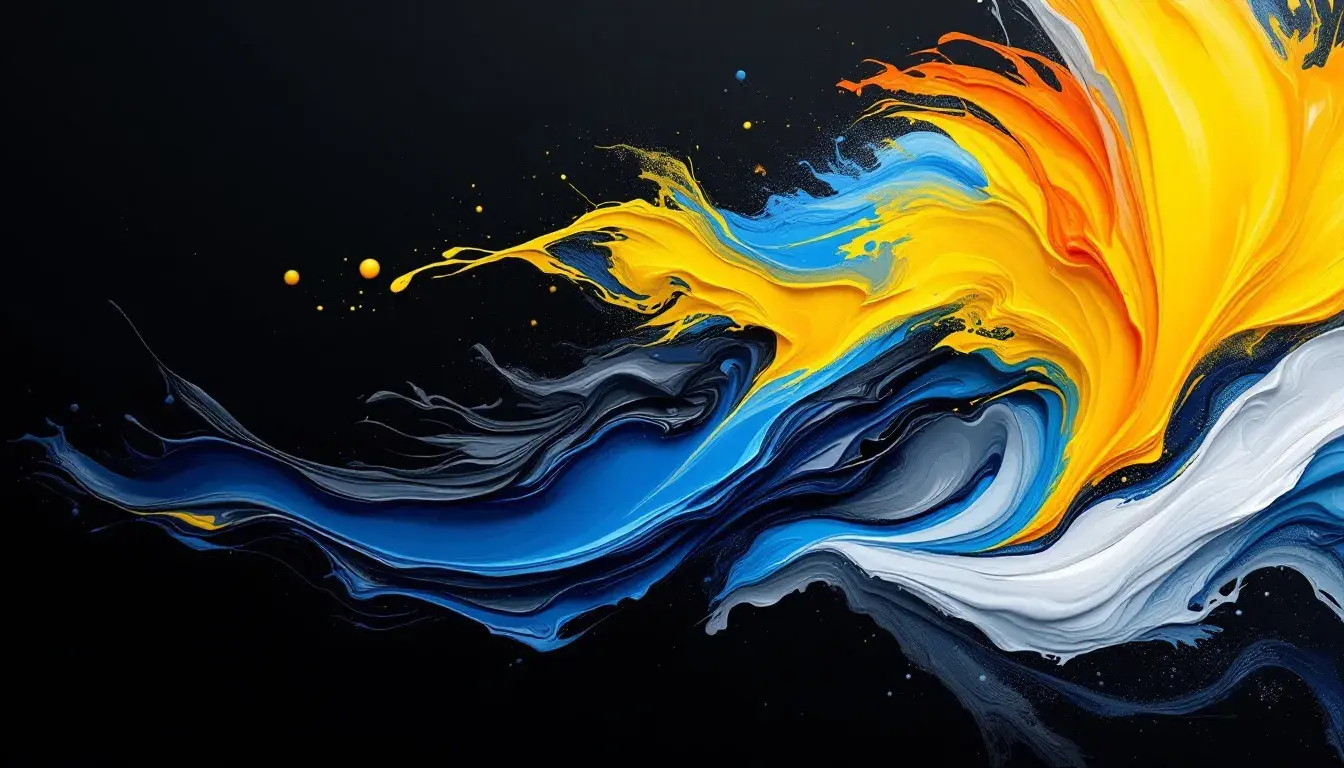
The "Warm Contrast" palette suggests dynamic energy, not quite explosive, but a vibrant, contained force. Pure White and Ebony Black provide the foundation, the stark contrast that sharpens every other color. Lemon Yellow infuses a jolt of optimism, like sunshine filtering through a window. Light Gray softens the contrast, introducing a subdued elegance. Salmon Orange hints at creativity, like an artist's unexpected brushstroke, while Olive Drab adds a sense of grounded sophistication. Steel Blue contributes a cerebral depth, like a moment of focused introspection. Magenta Red adds a bolt of passion and excitement that demands to be seen, while Burgundy offers a subtle richness. Imagine this design applied to a groundbreaking tech firm that values both innovation and tradition. Pure White and Ebony Black can signify clarity and boldness, while the splash of Lemon Yellow illustrates youthful energy. The other shades blend together to form a feeling of sophisticated confidence. Its design feels like looking at the latest smartphone while sipping a freshly made espresso.
Here, "Tech Palette" presents quiet confidence, a sophistication that speaks to a forward-thinking mindset. The colors evoke images of a serene atmosphere, of carefully considered design. Dusty Rose whispers of understated elegance, providing a gentle counterbalance to the otherwise cool tones. Lavender Blue adds an element of calm innovation, like a glimpse into a tranquil, digitally connected future. Cool Gray Green projects stability, reminding me of lush landscapes shrouded in calm mists. Cool Taupe contributes a subdued sense of assurance, like expert craftsmanship. Deep Midnight anchors the composition with a firm foundation from which everything else flows. Consider a digital marketing agency, this color scheme would convey sophistication that would convey stability and trust. Think of a sleek user interface that uses Dusty Rose as a highlight color, drawing customers in through grace and charm.
The "Artcraft Palette" suggests a blend of tradition and innovation, a brand that honors the past while embracing the future. Light Gray offers a sense of familiarity like looking at an old photograph or painting. Sandy Brown speaks of artisanal quality, like the rich shade of hand-tooled leather. Aqua Blue contributes a modern freshness, reminiscent of clear blue skies. Dusty Rose tempers the composition with an understated elegance, like the soft glow of vintage textiles. Dark Charcoal underpins the entire artwork with grounded confidence. Envision an inventive design firm: this palette showcases a commitment to beauty and innovation. Imagine a website design where Sandy Brown forms the background, offering a comforting familiarity, while Aqua Blue highlights the latest projects, capturing contemporary artistry.
"Modern Tech" whispers sophistication and calm, a design intended to instill confidence. Dusty Rose offers a refined sophistication, like walking through a serene art gallery. Cool Gray generates a sense of thoughtful neutrality, a subtle backdrop inviting contemplation. Deep Indigo introduces a cerebral depth, hinting at hidden depths of knowledge. Mauve Burgundy evokes understated luxury, conjuring images of rich velvet curtains. Charcoal Black establishes a sense of firm professionalism. Imagine a pioneering marketing firm leveraging this palette: its projects are distinguished by innovation and refined execution. See a mobile app using Cool Gray for the primary interface, fostering a clean and user-friendly experience, while Deep Indigo accents invite exploration.
In scrutinizing these palettes, we’ve seen how color acts as a powerful conduit to identity, its capacity to sculpt perception and shape emotional connection. The Warm Contrast palette embodies innovation and daring; Tech Palette, calm confidence; Artcraft Palette, refined tradition; and Modern Tech, quiet professionalism. Each combination whispers a distinct brand story, confirming that the careful curation of colors is not merely decoration, but a powerful form of communication. These color narratives underscore that effective branding goes beyond mere aesthetics, working with a refined understanding of emotions, vision, and culture to create a lasting and impactful connection.