'%3e%3cpath%20fill-rule='evenodd'%20clip-rule='evenodd'%20d='M51.1303%2019.2492C50.7278%2019.913%2050.1346%2020.4426%2049.3508%2020.838C48.5669%2021.2335%2047.6172%2021.4312%2046.5014%2021.4312C44.8208%2021.4312%2043.4367%2021.0216%2042.3492%2020.2025C41.2617%2019.3833%2040.6686%2018.2394%2040.5697%2016.7706H44.4253C44.4818%2017.3355%2044.6831%2017.7804%2045.0291%2018.1052C45.3751%2018.43%2045.8164%2018.5924%2046.3531%2018.5924C46.8192%2018.5924%2047.1864%2018.4653%2047.4547%2018.2111C47.7231%2017.9569%2047.8572%2017.618%2047.8572%2017.1943C47.8572%2016.8129%2047.7337%2016.4952%2047.4865%2016.241C47.2393%2015.9867%2046.9322%2015.7784%2046.565%2015.616C46.1978%2015.4536%2045.6893%2015.2594%2045.0397%2015.0334C44.0934%2014.7086%2043.3202%2014.3944%2042.72%2014.0907C42.1197%2013.7871%2041.6042%2013.3351%2041.1735%2012.7349C40.7427%2012.1347%2040.5273%2011.3544%2040.5273%2010.394C40.5273%209.50418%2040.7533%208.73448%2041.2053%208.08481C41.6572%207.43515%2042.2821%206.93731%2043.0801%206.5913C43.8781%206.24528%2044.7925%206.07227%2045.8235%206.07227C47.49%206.07227%2048.8141%206.46771%2049.7956%207.25861C50.7772%208.04951%2051.3315%209.13698%2051.4586%2010.5211H47.5395C47.4689%2010.0268%2047.2888%209.63483%2046.9993%209.3453C46.7097%209.05578%2046.3178%208.91102%2045.8235%208.91102C45.3998%208.91102%2045.0573%209.024%2044.7961%209.24997C44.5348%209.47594%2044.4041%209.80783%2044.4041%2010.2457C44.4041%2010.5988%2044.5207%2010.8989%2044.7537%2011.146C44.9867%2011.3932%2045.2798%2011.5944%2045.6328%2011.7498C45.9859%2011.9052%2046.4944%2012.1029%2047.1581%2012.343C48.1185%2012.6678%2048.9023%2012.9891%2049.5096%2013.3069C50.1169%2013.6246%2050.6395%2014.0872%2051.0773%2014.6945C51.5151%2015.3018%2051.734%2016.0927%2051.734%2017.0672C51.734%2017.8581%2051.5328%2018.5854%2051.1303%2019.2492ZM59.0242%206.3053V21.2829H55.4016V6.3053H59.0242ZM73.9409%206.3053V9.18642H69.8734V21.2829H66.2296V9.18642H62.2046V6.3053H73.9409ZM80.7438%209.18642V12.3218H85.8069V15.0546H80.7438V18.3806H86.4425V21.2829H77.1212V6.3053H86.4425V9.18642H80.7438ZM99.667%2016.0291V21.2829H96.0444V6.3053H101.913C103.692%206.3053%20105.048%206.74665%20105.98%207.62934C106.912%208.51204%20107.378%209.7019%20107.378%2011.199C107.378%2012.1311%20107.17%2012.9609%20106.753%2013.6882C106.337%2014.4155%20105.719%2014.9875%20104.9%2015.4042C104.08%2015.8208%20103.085%2016.0291%20101.913%2016.0291H99.667ZM103.692%2011.199C103.692%209.8855%20102.965%209.22879%20101.51%209.22879H99.667V13.1268H101.51C102.965%2013.1268%20103.692%2012.4842%20103.692%2011.199ZM120.092%2018.5501H114.478L113.546%2021.2829H109.732L115.219%206.41123H119.393L124.879%2021.2829H121.024L120.092%2018.5501ZM119.16%2015.7961L117.295%2010.2881L115.41%2015.7961H119.16ZM131.555%2018.5077H136.385V21.2829H127.933V6.3053H131.555V18.5077ZM143.337%209.18642V12.3218H148.4V15.0546H143.337V18.3806H149.035V21.2829H139.714V6.3053H149.035V9.18642H143.337ZM163.507%206.3053V9.18642H159.44V21.2829H155.796V9.18642H151.771V6.3053H163.507ZM177.449%206.3053V9.18642H173.382V21.2829H169.738V9.18642H165.713V6.3053H177.449ZM184.252%209.18642V12.3218H189.315V15.0546H184.252V18.3806H189.951V21.2829H180.629V6.3053H189.951V9.18642H184.252Z'%20fill='%23EEF0ED'/%3e%3cmask%20id='mask0_3101_7327'%20style='mask-type:alpha'%20maskUnits='userSpaceOnUse'%20x='0'%20y='0'%20width='27'%20height='28'%3e%3cpath%20d='M23.8328%200.759766H2.64808C1.18559%200.759766%200%201.94535%200%203.40785V24.5925C0%2026.055%201.18559%2027.2406%202.64808%2027.2406H23.8328C25.2952%2027.2406%2026.4808%2026.055%2026.4808%2024.5925V3.40785C26.4808%201.94535%2025.2952%200.759766%2023.8328%200.759766Z'%20fill='white'/%3e%3c/mask%3e%3cg%20mask='url(%23mask0_3101_7327)'%3e%3cpath%20d='M23.8328%200.759766H2.64808C1.18559%200.759766%200%201.94535%200%203.40785V24.5925C0%2026.055%201.18559%2027.2406%202.64808%2027.2406H23.8328C25.2952%2027.2406%2026.4808%2026.055%2026.4808%2024.5925V3.40785C26.4808%201.94535%2025.2952%200.759766%2023.8328%200.759766Z'%20fill='%23D8D8D8'/%3e%3cpath%20d='M13.2404%200.759766H0V14.0001H13.2404V0.759766Z'%20fill='%238C61FF'/%3e%3cpath%20d='M13.2404%2014H0V27.2404H13.2404V14Z'%20fill='%2336C3FE'/%3e%3cpath%20d='M26.4806%2014H13.2402V27.2404H26.4806V14Z'%20fill='%236592FE'/%3e%3cpath%20d='M26.4806%200.759766H13.2402V14.0002H26.4806V0.759766Z'%20fill='%236059F7'/%3e%3c/g%3e%3c/g%3e%3cdefs%3e%3cclipPath%20id='clip0_3101_7327'%3e%3crect%20width='190'%20height='28'%20fill='white'/%3e%3c/clipPath%3e%3c/defs%3e%3c/svg%3e)
'%3e%3cpath%20d='M23.8328%200.759521H2.64808C1.18559%200.759521%200%201.94511%200%203.40761V24.5923C0%2026.0548%201.18559%2027.2404%202.64808%2027.2404H23.8328C25.2952%2027.2404%2026.4808%2026.0548%2026.4808%2024.5923V3.40761C26.4808%201.94511%2025.2952%200.759521%2023.8328%200.759521Z'%20fill='%23D8D8D8'/%3e%3cpath%20d='M13.2404%200.759521H0V13.9999H13.2404V0.759521Z'%20fill='%238C61FF'/%3e%3cpath%20d='M13.2404%2013.9998H0V27.2402H13.2404V13.9998Z'%20fill='%2336C3FE'/%3e%3cpath%20d='M26.4809%2013.9998H13.2405V27.2402H26.4809V13.9998Z'%20fill='%236592FE'/%3e%3cpath%20d='M26.4809%200.759277H13.2405V13.9997H26.4809V0.759277Z'%20fill='%236059F7'/%3e%3c/g%3e%3c/svg%3e)
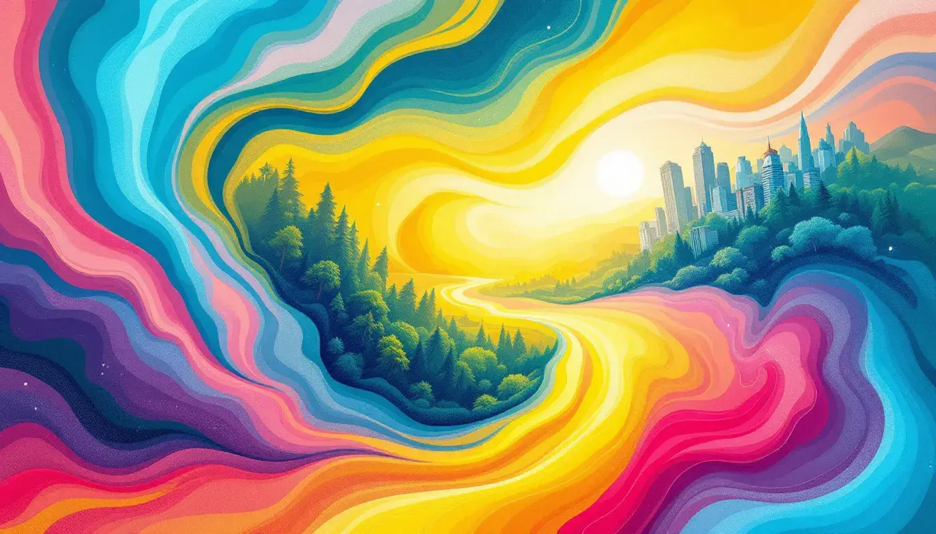
Beyond Inviting: The Tourism Mood
16 Sep 2025 · 4 min readColor is the silent ambassador of experience. It whispers promises of adventures untold, of cultures waiting to be embraced, of landscapes begging to be explored. When curating the visual narrative of tourism, the palette chosen is far more than a simple aesthetic preference; it’s an invitation, a sensory prelude to the journey itself. These colors must extend beyond simple attractiveness, communicating the core values, unique identities, and aspirational destinations that define the world of travel. Think of the sun-drenched advertisement promising a coastal getaway, or the deep, earthy tones evoking a sense of grounded exploration. Each carefully chosen hue contributes to an emotional landscape, gently nudging potential travelers toward their next great adventure. The right palette can transform a simple suggestion to visit, into a potent whisper of wanderlust, crafting unforgettable imagery before a single bag is packed. It offers a means of shaping perception, setting the tone, and ultimately, driving desire.
The palette known as "Earthy Balance" has a grounding effect, suggesting stability and connection. Aquamarine hints at serene waters, and Grayish Teal introduces an element of reflective calm, like the quiet moments spent gazing out at a misty landscape. The inclusion of Medium Gray adds a touch of sophistication, a subtle nod to the refined aspects of travel. Russet Brown then steps in, a warm embrace, evoking feelings of exploration through wooded areas and scenic trails. Deep Indigo offers a sense of depth and mystery, like the vast expanse of a night sky in a remote location. Together, these are the colors of hiking through ancient forests and sitting by cool, reflective lakes, while the sun sets. It is the mood of quiet contemplation, of disconnecting from the frenetic pace of everyday life and reconnecting with the natural world. This palette would work admirably for destinations focused on ecotourism, wellness retreats nestled in nature, or adventures where understated luxury complements the raw beauty of the planet. It subtly communicates the idea of sustainable exploration, inviting travelers to experience destinations in a manner that is both enriching and respectful of the environment. It doesn’t shout for attention, but rather it whispers a promise of authenticity and revitalization.
"Korea Tourism" presents a more complex and layered visual story. Grayish Taupe lays the foundation, providing a muted backdrop that hints at the ancient history and timeless beauty of the region. Gold Ochre evokes the vibrant temples and palaces, the gilded roofs glinting under the sun. Dusty Rose hints at the cherry blossoms in bloom, offering a gentle touch of femininity and renewal. Dark Olive is a grounding force, representing the lush forests and serene landscapes that are integral to the Korean experience. Finally, Jet Black adds an element of sophistication and modernity, mirroring the bustling cityscapes and the sleek designs that characterize contemporary Korea. This palette speaks of both tradition and innovation, of serenity and excitement. It captures the dynamism of a country where ancient customs coexist harmoniously with cutting-edge technology. Picture a marketing campaign illustrating the journey from a serene tea ceremony in a traditional hanok to the illuminated skyscrapers of Seoul. Or a branding package for a luxury travel experience designed to blend cultural immersion with stylish, urban exploration. The overall feeling is one of intrigue and excitement, inviting travelers to discover the many faces of Korea, a land of contrasts and harmonious fusion.
The "Korean Essence" palette evokes a quieter, more introspective journey. Off White is like the crisp, clean lines of traditional Korean architecture, the understated elegance of hanji paper lanterns casting a soft glow. Light Steel Blue mirrors the misty mountainscapes visible from ancient temples, offering a sense of peace and tranquility. Mustard Yellow is the warm hue of golden fields, and sun-drenched rice paddies stretching toward the horizon. Russet Brown harkens back to ancient pottery, a connection with time, tradition, and artistry. Slate Gray is a grounding element, like the smooth stones found in zen gardens, the calm amidst busy lives. This palette evokes a sense of mindful exploration, of seeking beauty in simplicity, and finding connection through cultural immersion. It would be exceptionally suited to representing destinations that promote wellness, spiritual connection, or cultural exchange. Think of a yoga retreat nestled in the Korean countryside and a branding campaign for curated experiences that explore historical sites. The overall mood is one of quietude, inviting travelers to slow down, connect with themselves and the surrounding culture, and discover the beauty that lies in the details.
"Bahamian Escape" delivers a potent dose of tropical allure. Light Taupe evokes the soft, sun-kissed sands of pristine beaches, inviting travellers to sink their toes in and unwind. Teal Green recalls the crystal-clear waters, lapping gently at the shore, enticing visitors to dive in and explore. Olive Drab gives a glimpse of palm trees swaying in the gentle tropical breeze. Tomato Red injects an element of vibrant energy, hinting at the warmth of the sun and the vibrant culture of the islands. Dark Roast brings a touch of grounding earthiness, like the rich soil that nurtures the island’s exotic plants. This palette is perfect for selling the promise of sun-soaked vacations, of effortless relaxation and carefree adventures. Just visualise advertisements portraying colourful cocktails sipped by the ocean, or branding for boutique hotels that offer a blend of sophisticated luxury and bohemian charm. The overriding sensation is a feeling of pure joy and revitalization, inspiring escapism and a longing for a taste of island life.
Each of these distinct palettes, in their own way, holds the promise to transport travelers even before they have boarded their planes or booked their hotels. Earthy Balance whispers of natural wonder and calm contemplation. Korea Tourism hints at a fusion of heritage and urban exploration. Korean Essence sings a song of simple beauty and cultural immersion. Bahamian Escape screams of sunny skies and breezy beaches. Together they demonstrate the crucial role that color plays in crafting the narrative of tourism, and its power to move us beyond inviting, toward fully immersive experiences. They are not just color schemes, but entry points; visual keys that unlock the desires and dreams that fuel our wanderlust. By thoughtfully considering the emotions these palettes evoke, and the experiences they suggest, the tourism industry can continue to use color to shape our perceptions, guide our choices and color our world.