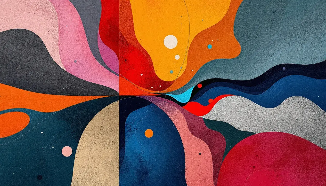
The Yin and Yang of the Color Wheel: Examining Complementary Color Trend
15 Sep 2025 · 3 min readColor. A conversation without words. And when colors meet as opposites, a vibrant narrative unfolds: hot met by cool, dark dancing with light, stillness punctuated by motion: the very picture of complementary contrast. These are palettes not merely chosen, but discovered, revealing themselves as balances already present, latent in the world, awaiting only our eye to give them purpose. They whisper of equilibrium, of the push and pull that fuels creative endeavor. They speak to our emotional selves, suggesting comfort in tension, and beauty born of opposition. Let's explore a few such visual poems.
The Bold Contrast palette sings of a modern sensibility, a space where the ethereal meets the grounded. Imagine a gallery wall, bathed in Pure White, punctuated by a sculpture in Vibrant Orange. The eye dances between the serenity and the spark. A Deep Blue accent grounds the composition, ensuring the brightness remains an invitation, not an assault. As for that Bright Red calling to mind the last leaves of autumn? It’s a daring stroke, a reminder that even in restraint, passion can ignite. Consider the juxtaposition of Lavender Blue against Dark Gray; a quiet tension that builds anticipation. In this schema, each color does not compete, but elevates; they are voices in dynamic dialogue. The brilliance of Bright Blue is balanced by Brown Sienna and Neutral Gray, achieving poise through the strategic use of opposites. Here, stillness and movement coexist. In this story told in colors, one never overwhelms the other, but rather they create a visual conversation, as complementary tones are perfectly poised. The palette understands there can exist great boldness in serenity, and peace in boldness. The complementary relationship unfolds through a measured and controlled aesthetic, a structured contrast that suggests a space of great purpose. The hexidecimal complement of Pure White appears nowhere else within this particular cast of players.
In the Vibrant Contrast palette, imagine a sun-drenched afternoon. The palette evokes the feel of a vibrant marketplace. The canvas tote on your arm is Soft White, adorned with a vibrant logo rendered in Dusty Rose. You haggle for spices beneath an awning, bathed in the warm glow of Light Mustard. This is a palette of immediate joy, of moments seized and savored. Teal Blue enters as a respite, a cool drink on a warm day; a reminder that even in energy, we need pause. The beauty of Muted Gray lies in its ability to temper the brightness, to provide a landing place for the eye. One must consider the dance that unfolds between the cool hues and the warmer tones. It's a delicate equilibrium, a celebration of contrasts where each shade amplifies the beauty of the other. This palette refuses to be confined; it speaks of open spaces and the freedom to explore. It whispers on the wind across sun-parched landscapes, it echoes in the laughter of children playing in the street. Here, the energy is palpable, the excitement infectious. Color, in this scenario, is an invitation to experience the world with open arms.
The Vibrant Harmony palette is a story of contrasts beautifully resolved. Picture a tranquil study, the walls painted in Off White, providing a soft, diffused light. A vase of dried flowers sits on a desk, its Burnt Sienna hues echoing in the wooden furniture. This palette invites balance, a sense of calm achieved through thoughtful juxtaposition. Consider the way Dusty Rose gently counterbalances Royal Blue; a whisper of warmth against a cool, intellectual depth. Light Indigo adds subtlety, grounding the brighter shades while adding its own touch of quiet sophistication. This isn't a palette of explosive energy, but one of gentle invitation. It asks us to linger, to contemplate, to find beauty in the interplay of opposites. Here, colors are not shouting, but rather conversing in hushed tones. They are telling a story of quiet strength, of purpose gently pursued. They speak of interiors designed for the soul, spaces where creativity can take root and flourish. The eye is drawn to the unexpected combinations and subtle tensions; the moments of tension, when resolved, allow a beautiful space to come into existance. A place where inspiration can thrive.
The Modern Palette embodies contemporary stillness. In it, one might envision an artist’s loft, its walls a blank canvas of Off White, poised for new ideas. A single piece of statement furniture, perhaps a chair in Rose Red, demands attention and disrupts the calm. This palette understands the power of restraint, of negative space and deliberate choice. Observe how Seafoam Green whispers of serenity, creating a peaceful haven. Steel Blue offers a muted alternative to more daring tones. Yet, it is Charcoal Black with its ability to unify. It provides a sense of cohesion and authority to the color cast. Together, these colors speak of sophisticated urban existence, spaces that mirror intention and clarity. One's attention is drawn to its ability to balance warmth and coolness, softness and edge. It invites one to breathe deeply, to simplify, to remember. It is a visual mantra, an echo of modern mindfulness.
The dance of complementary colors goes beyond mere aesthetics; it is a reflection of our yearning for balance in a world of perpetual motion. In the palettes we’ve observed, it’s as if each chosen shade calls to its opposite, quietly acknowledging the power of shared space, of tension and release. Whether it’s the controlled dynamism of Bold Contrast, the ebullient spirit of Vibrant Contrast, the thoughtful calm of Vibrant Harmony, or the quiet strength of Modern Palette, our senses are awakened by the way disparate identities can interact and elevate one another within the spectrum of tones. It is a reminder of the beauty that blooms when opposing energies meet.