'%3e%3cpath%20fill-rule='evenodd'%20clip-rule='evenodd'%20d='M51.1303%2019.2492C50.7278%2019.913%2050.1346%2020.4426%2049.3508%2020.838C48.5669%2021.2335%2047.6172%2021.4312%2046.5014%2021.4312C44.8208%2021.4312%2043.4367%2021.0216%2042.3492%2020.2025C41.2617%2019.3833%2040.6686%2018.2394%2040.5697%2016.7706H44.4253C44.4818%2017.3355%2044.6831%2017.7804%2045.0291%2018.1052C45.3751%2018.43%2045.8164%2018.5924%2046.3531%2018.5924C46.8192%2018.5924%2047.1864%2018.4653%2047.4547%2018.2111C47.7231%2017.9569%2047.8572%2017.618%2047.8572%2017.1943C47.8572%2016.8129%2047.7337%2016.4952%2047.4865%2016.241C47.2393%2015.9867%2046.9322%2015.7784%2046.565%2015.616C46.1978%2015.4536%2045.6893%2015.2594%2045.0397%2015.0334C44.0934%2014.7086%2043.3202%2014.3944%2042.72%2014.0907C42.1197%2013.7871%2041.6042%2013.3351%2041.1735%2012.7349C40.7427%2012.1347%2040.5273%2011.3544%2040.5273%2010.394C40.5273%209.50418%2040.7533%208.73448%2041.2053%208.08481C41.6572%207.43515%2042.2821%206.93731%2043.0801%206.5913C43.8781%206.24528%2044.7925%206.07227%2045.8235%206.07227C47.49%206.07227%2048.8141%206.46771%2049.7956%207.25861C50.7772%208.04951%2051.3315%209.13698%2051.4586%2010.5211H47.5395C47.4689%2010.0268%2047.2888%209.63483%2046.9993%209.3453C46.7097%209.05578%2046.3178%208.91102%2045.8235%208.91102C45.3998%208.91102%2045.0573%209.024%2044.7961%209.24997C44.5348%209.47594%2044.4041%209.80783%2044.4041%2010.2457C44.4041%2010.5988%2044.5207%2010.8989%2044.7537%2011.146C44.9867%2011.3932%2045.2798%2011.5944%2045.6328%2011.7498C45.9859%2011.9052%2046.4944%2012.1029%2047.1581%2012.343C48.1185%2012.6678%2048.9023%2012.9891%2049.5096%2013.3069C50.1169%2013.6246%2050.6395%2014.0872%2051.0773%2014.6945C51.5151%2015.3018%2051.734%2016.0927%2051.734%2017.0672C51.734%2017.8581%2051.5328%2018.5854%2051.1303%2019.2492ZM59.0242%206.3053V21.2829H55.4016V6.3053H59.0242ZM73.9409%206.3053V9.18642H69.8734V21.2829H66.2296V9.18642H62.2046V6.3053H73.9409ZM80.7438%209.18642V12.3218H85.8069V15.0546H80.7438V18.3806H86.4425V21.2829H77.1212V6.3053H86.4425V9.18642H80.7438ZM99.667%2016.0291V21.2829H96.0444V6.3053H101.913C103.692%206.3053%20105.048%206.74665%20105.98%207.62934C106.912%208.51204%20107.378%209.7019%20107.378%2011.199C107.378%2012.1311%20107.17%2012.9609%20106.753%2013.6882C106.337%2014.4155%20105.719%2014.9875%20104.9%2015.4042C104.08%2015.8208%20103.085%2016.0291%20101.913%2016.0291H99.667ZM103.692%2011.199C103.692%209.8855%20102.965%209.22879%20101.51%209.22879H99.667V13.1268H101.51C102.965%2013.1268%20103.692%2012.4842%20103.692%2011.199ZM120.092%2018.5501H114.478L113.546%2021.2829H109.732L115.219%206.41123H119.393L124.879%2021.2829H121.024L120.092%2018.5501ZM119.16%2015.7961L117.295%2010.2881L115.41%2015.7961H119.16ZM131.555%2018.5077H136.385V21.2829H127.933V6.3053H131.555V18.5077ZM143.337%209.18642V12.3218H148.4V15.0546H143.337V18.3806H149.035V21.2829H139.714V6.3053H149.035V9.18642H143.337ZM163.507%206.3053V9.18642H159.44V21.2829H155.796V9.18642H151.771V6.3053H163.507ZM177.449%206.3053V9.18642H173.382V21.2829H169.738V9.18642H165.713V6.3053H177.449ZM184.252%209.18642V12.3218H189.315V15.0546H184.252V18.3806H189.951V21.2829H180.629V6.3053H189.951V9.18642H184.252Z'%20fill='%23EEF0ED'/%3e%3cmask%20id='mask0_3101_7327'%20style='mask-type:alpha'%20maskUnits='userSpaceOnUse'%20x='0'%20y='0'%20width='27'%20height='28'%3e%3cpath%20d='M23.8328%200.759766H2.64808C1.18559%200.759766%200%201.94535%200%203.40785V24.5925C0%2026.055%201.18559%2027.2406%202.64808%2027.2406H23.8328C25.2952%2027.2406%2026.4808%2026.055%2026.4808%2024.5925V3.40785C26.4808%201.94535%2025.2952%200.759766%2023.8328%200.759766Z'%20fill='white'/%3e%3c/mask%3e%3cg%20mask='url(%23mask0_3101_7327)'%3e%3cpath%20d='M23.8328%200.759766H2.64808C1.18559%200.759766%200%201.94535%200%203.40785V24.5925C0%2026.055%201.18559%2027.2406%202.64808%2027.2406H23.8328C25.2952%2027.2406%2026.4808%2026.055%2026.4808%2024.5925V3.40785C26.4808%201.94535%2025.2952%200.759766%2023.8328%200.759766Z'%20fill='%23D8D8D8'/%3e%3cpath%20d='M13.2404%200.759766H0V14.0001H13.2404V0.759766Z'%20fill='%238C61FF'/%3e%3cpath%20d='M13.2404%2014H0V27.2404H13.2404V14Z'%20fill='%2336C3FE'/%3e%3cpath%20d='M26.4806%2014H13.2402V27.2404H26.4806V14Z'%20fill='%236592FE'/%3e%3cpath%20d='M26.4806%200.759766H13.2402V14.0002H26.4806V0.759766Z'%20fill='%236059F7'/%3e%3c/g%3e%3c/g%3e%3cdefs%3e%3cclipPath%20id='clip0_3101_7327'%3e%3crect%20width='190'%20height='28'%20fill='white'/%3e%3c/clipPath%3e%3c/defs%3e%3c/svg%3e)
'%3e%3cpath%20d='M23.8328%200.759521H2.64808C1.18559%200.759521%200%201.94511%200%203.40761V24.5923C0%2026.0548%201.18559%2027.2404%202.64808%2027.2404H23.8328C25.2952%2027.2404%2026.4808%2026.0548%2026.4808%2024.5923V3.40761C26.4808%201.94511%2025.2952%200.759521%2023.8328%200.759521Z'%20fill='%23D8D8D8'/%3e%3cpath%20d='M13.2404%200.759521H0V13.9999H13.2404V0.759521Z'%20fill='%238C61FF'/%3e%3cpath%20d='M13.2404%2013.9998H0V27.2402H13.2404V13.9998Z'%20fill='%2336C3FE'/%3e%3cpath%20d='M26.4809%2013.9998H13.2405V27.2402H26.4809V13.9998Z'%20fill='%236592FE'/%3e%3cpath%20d='M26.4809%200.759277H13.2405V13.9997H26.4809V0.759277Z'%20fill='%236059F7'/%3e%3c/g%3e%3c/svg%3e)
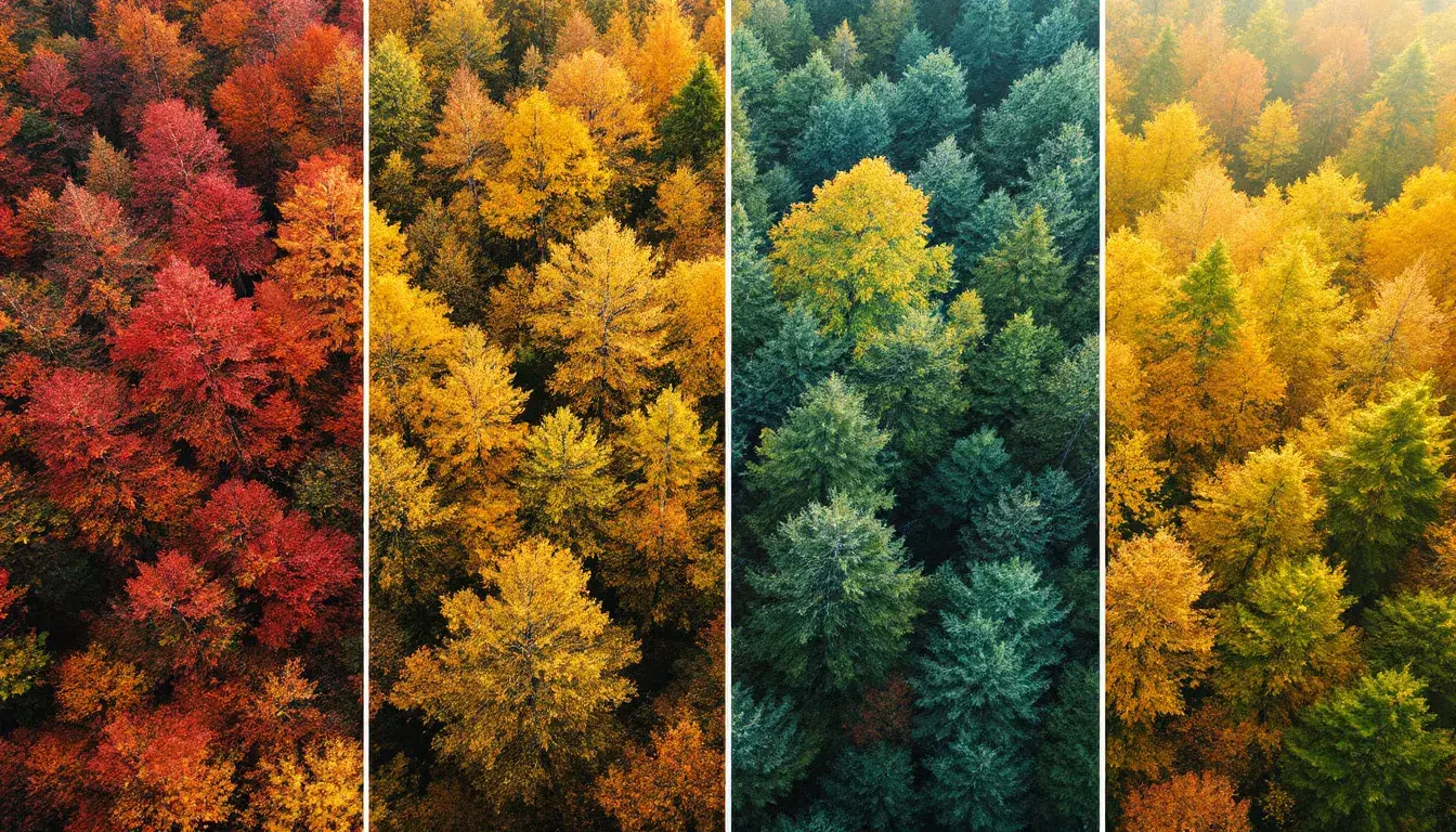
Season's Palette: Hottest Colors by Time of Year
15 Sep 2025 · 3 min readAs leaves begin their descent and sunlight softens, colors shift, mirroring nature’s own transition. It's a time of cozy nights, spiced drinks, and the desire to bring the warmth and richness of the outdoors inside. Color palettes reflecting this shift offer not just aesthetic pleasure, but an emotional connection to the turning of the seasons. These carefully curated combinations whisper of comfort, sophistication, and the quiet beauty found in the natural world as it prepares for rest. Like a warm blanket on a cool evening, these shades have the ability to transform spaces, evoke feelings, and set the tone for experiences.
The Superpower Palette is an immersion into the heart of autumn itself, a gathering of hues that seems perfectly suited to both the crisp air and the glowing interiors that seek to capture its spirit. Dusty Rose emerges softly, like a blush beneath a sky shifting from summer blues. Beside it, Cool Gray whispers of stone paths winding through forests ablaze with color. Fiery Orange announces its arrival with confidence, mirroring the spectacle of leaves turning into vibrant golds and reds. Olive Drab grounds the palette, a reminder of the earth below, the enduring strength of nature. And finally, Dark Mahogany presents a counterpoint – the color of aged wood, of deep shadows lengthening with each passing day, of the earth readying itself for a season of rest and rejuvenation. Imagine these shades composing a website: the Dusty Rose serving as background for a page detailing cozy crafts, the Fiery Orange punctuating calls to action, inviting engagement. Perhaps in branding, the Cool Gray of the text and logo anchors a sense of steadfastness, while Dark Mahogany adds depth, creating a memorable imprint. This palette is a celebration, not of any particular occasion, but of the season itself. A reminder of the beauty that surrounds us, and our continuous draw towards it.
The DMI Palette introduces a refined take on traditional autumnal colors. It moves beyond the literal translation of falling leaves, offering a complex emotional experience through strategic contrast and depth. Pale Gold brings a subdued radiance, like sunlight filtering through a misty morning. Tangelo Orange injects a playful energy, a touch akin to citrus fruits ripening late in the season. Taupe Gray interjects a note of sophisticated calm, suggesting landscapes shrouded in cool, morning fog. Dark Olive reminds of evergreen branches, a grounding presence amidst shifting colors. The final deep shade of Midnight Blue provides a grounding strength, mirroring the early nightfall of the season. Applying this arrangement in a website yields a modern aesthetic. The Pale Gold as an accent color on headlines that draws the eye without overwhelming, while the Tangelo Orange serves to signal active options. For branding, the Taupe Gray projects a sense of stability and trust, the Dark Olive provides a subtle, natural touch, and finally the Midnight Blue offers a grounding effect. This palette moves beyond an ordinary aesthetic by emphasizing emotional resonance – communicating not just what we see but how we feel.
The Red Silicon palette subtly navigates the shift into a cooler season, taking inspiration from the changing atmosphere instead of familiar natural markers. Pale Mauve presents a hushed softness, much like lingering clouds on a late afternoon. Seafoam Green provides a cool breath, like the air before the falling of the leaves. Deep Purple adds intrigue, invoking the shadows that deepen and lengthen as days wane. Vivid Raspberry gives a striking contrast, like a bold bloom defying the changing season. Finally, Charcoal Black injects essential depth, much like the stark silhouette of trees against a twilight sky. Consider how this palette could shape a website: Pale Mauve as an understated background emphasizing calmness, with thoughtfully placed Deep Purple highlighting key calls to action. In branding, Seafoam Green conveys a sense of freshness and originality. The Vivid Raspberry is an accent color making a memorable and powerful statement. Charcoal Black grounds the palette, offering a counterpoint of dependability. The Red Silicon palette presents autumn in a new perspective, mirroring the shift in feelings as we move towards a slower, more thoughtful period.
The Professional Palette reflects the structured shift from summer relaxation to autumn focus. Bold Orange-Red immediately attracts attention, like the first burst of color as the leaves begin to change. Fiery Red-Orange enhances this vibrancy, echoing the intense hues of late autumn sunsets. Steel Blue offers a strong, grounding coolness, like the crisp air that invigorates and inspires. Deep Prussian Blue mirrors the growing darkness, prompting quiet contemplation and reflection. Finally, Charcoal Gray grounds the entire composition in an image of strength and stability. This combination is perfect for websites designed for focused engagement: Bold Orange-Red used for call-to-action prompts, Fiery Red-Orange for the headings and sections that need emphasis for quick navigation. For branding, the Steel Blue offers a sense of reliability and professionalism, with Deep Prussian Blue injecting sophistication and Charcoal providing a foundation. The Professional Palette captures not just colors, but the feeling of transition – a push toward thoughtful, productive completion, framed by the colors of the season in progress.
Color palettes are more than just collections of shades: they are stories told in light, shadow, and emotion. Each palette carries impressions of environments, moods, and moments. The Superpower Palette celebrates the fullness of autumn; the DMI Palette delivers a complex range and the Red Silicon palette provides a sense of surprise. Professional Palette frames a determined return to purpose, all through the season's unique prism. Rather than mere design choices, these curated colors invite an engagement with the world, to feel and understand the impact and beauty of a season in transformation.