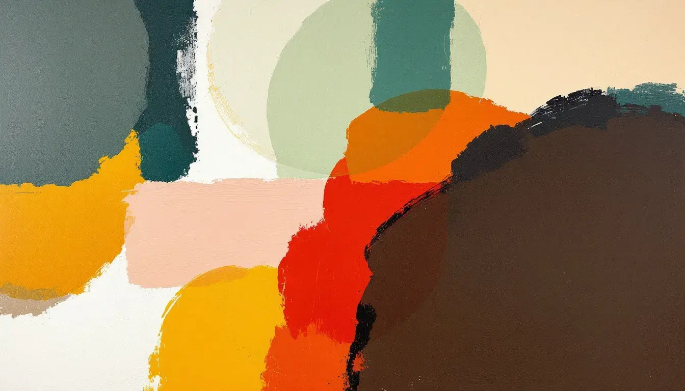
Finding the Golden Ratio in Palettes: Top 10 Dominant Colors Used with 'Mustard Yellow'
15 Sep 2025 · 3 min readColor holds stories. It whispers of dawn, screams of revolution, and hums with the quiet joy of a summer afternoon. When we speak of the Golden Ratio, that fabled proportion, we often think of geometry or art. But consider the color palette – a carefully considered arrangement of hues, each playing its part. The addition of 'Mustard Yellow,' that almost savory shade, complicates and enriches the narrative. It’s a color that hints at both faded grandeur and unexpected warmth. It’s not purely cheerful, not simply vintage; rather, it occupies a space of sophisticated comfort, capable of grounding brighter shades or adding an edge to more subdued tones. Understanding the colors that amplify 'Mustard Yellow' is to discover the emotional resonance it creates. We will look at distinct palettes, each a unique exploration into the art of color relationship, and each highlighting a pathway through 'Mustard Yellow's' complex character.
The "WhatsApp Palette", surprising in its namesake, offers a study in contrasts. Forest Green acts as a counterpoint to the Gold Tone, a clear relative of 'Mustard Yellow.' This Gold Tone brings a vintage echo, a restrained jubilance, tempering the seriousness of the Deep Gray and the boldness of the Crimson Red. Peach Beige softens the composition, giving a grounding effect that makes colors breathe. This palette avoids stark statements, instead suggesting a visual language of understated purpose. It's the color scheme for a gathering place, whether a room or a virtual space, where open discussion is encouraged, and comfort is a necessity. Here, the Golden Ratio plays out not in perfect mathematical precision, but in the careful distribution of visual weight. The unexpected vibrancy of Crimson Red against the neutral tones demands attention, creating a dynamic contrast that makes the overall experience engaging without overwhelming. The combination builds a feeling of reliability and subtle sophistication that encourages conversation and connection. It recalls the aesthetic of worn leather, aged wood, and the gentle warmth of candlelight, an atmosphere perfectly suited for environments prioritizing honest communication and comfortable interaction. The palette’s strength lies in its capacity to temper boldness with reassurance, resulting in a carefully rendered impression.
"Earthy Brightness" presents a bolder interpretation. Golden Yellow, a more assertive cousin to 'Mustard Yellow,' bursts forth, radiating a sense of untamed creativity. Dark Charcoal provides an anchor, a necessary shadow that allows the other colors to fully express themselves. The Off White offers a muted canvas, while Gray Taupe and Reddish Brown speak of earth and raw materials, giving a grounded feeling. This isn’t about soft comfort; it’s about generating excitement. Envision the walls of a studio where ideas are born – sketches pinned up, materials scattered, the air buzzing with potential. It’s a space where experimentation is welcome, and where the Golden Ratio reveals itself in surprising arrangements and innovative designs. Golden Yellow, in this instance, works as a visual jolt, a burst of energy that propels projects forward. The juxtaposition of the natural and the audacious stimulates action, a sensation of dynamic change. This palette suggests a blend of tradition and modernity, where the warmth of classic colors combines with a modern, enthusiastic edge. It summons the imagery of sun-baked adobe, vibrant textiles, and the rich, earthy tones.
"Earthy Elegance" whispers of quiet sophistication. Golden Brown, a refined relation to 'Mustard Yellow,' imbues the scene with an air of understated luxury. Paired with Light Beige, Sage Green, Slate Gray, and Dark Coffee, it avoids the boldness of the prior palette, instead suggesting a relaxed sense of balance. Imagine a country home, the walls painted in muted tones, filled with comfortable furniture and soft, natural light. Here, the Golden Ratio is less about showmanship and more about creating a haven of calm. Golden Brown acts as an inviting presence, a sign of warmth and welcome. The supporting colors weave an intricate background, recalling the beauty of the natural world. The overall effect is one of understated style and timeless grace. It suggests the slow rhythm of nature and the importance of finding beauty in simplicity. This is a palette for those who appreciate subtle details and seek to create a peaceful and harmonious environment. It evokes the sensation of worn linen, the feel of smooth stone, and the comforting scent.
These explorations reveal the chameleon-like nature of colors, each shifting and refining its identity depending on context. 'Mustard Yellow,' or shades akin, acts as a bridge, connecting seemingly disparate hues and creating visual stories that are as nuanced as they are engaging. These palettes aren't just about pretty colors; they're about capturing moods, generating feelings, and crafting experiences. They leave us with a greater appreciation for the subtle influence that color wields in configuring our surroundings and influencing our perceptions. In the grand theatre of design, these colors stand as main characters, leading us down paths that reveal more about ourselves and the world we long to create.