The 2025 Color Forecast: A Seasonal Snapshot
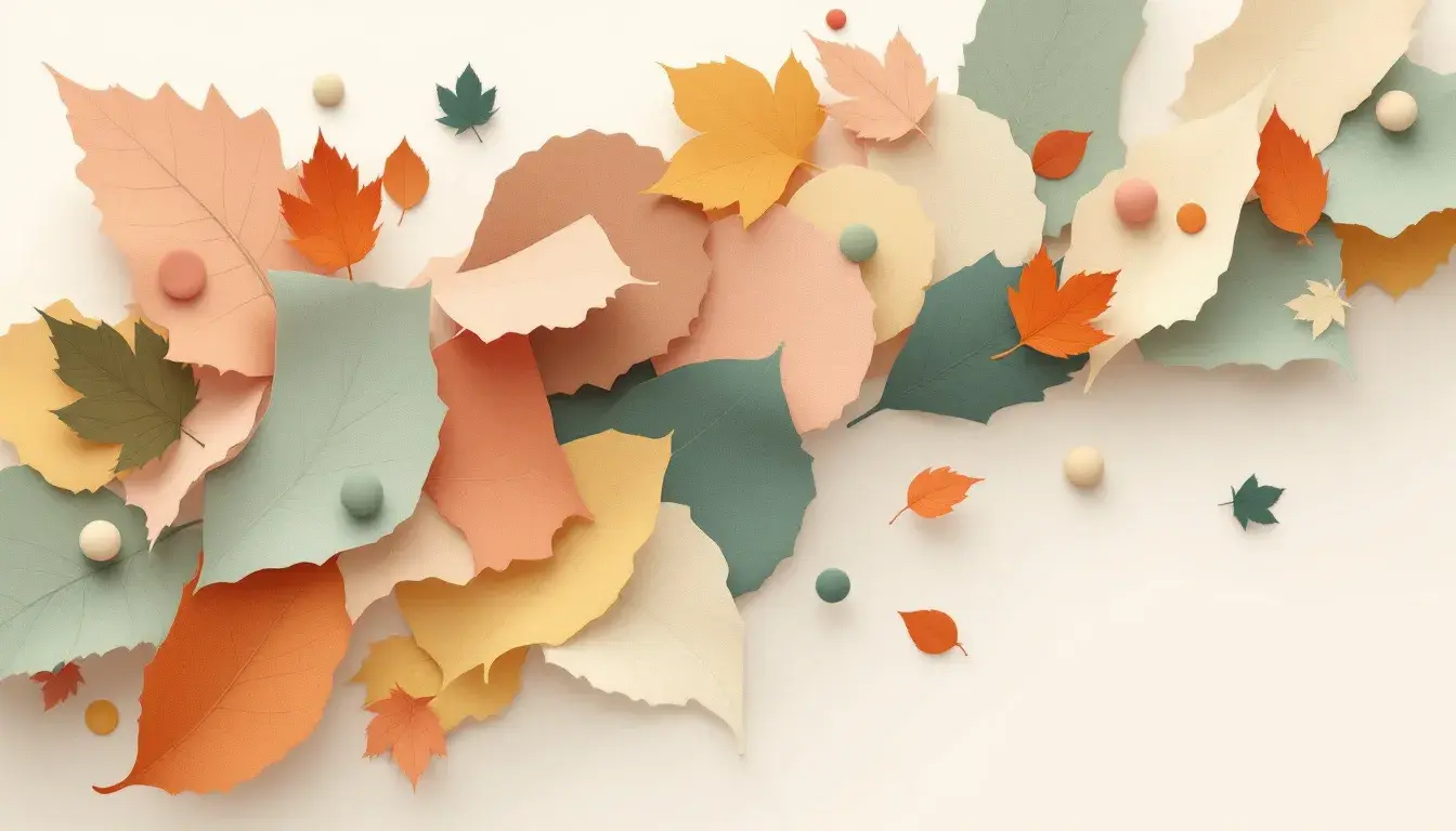
10 Sep 2025 · 3 min readThe allure of a new year often whispers through colors, not just numbers. Each shade, a fragment of feeling, anticipates shifts on the horizon. Color forecasts offer more than aesthetic suggestions; they paint a portrait of collective desires and shifting sensibilities, a visual dialogue reflecting the moods we crave. Anticipating 2025, we explore palettes tuned to the rhythm of seasons – whispers of change carried on currents of unexpected color combinations. These predictions are less about dictate, more about invitation, a starting point for expression in a world that yearns for constant reinvention through experience. They ask: what stories will we tell with color next year? How will these visual cues shape our environment, reflecting our longings for comfort, excitement, or quiet contemplation? What possibilities open when the visual landscape shifts?
"Earthy Elegance" summons the hushed transition from summer green to the bronzed landscape. One imagines a late autumn afternoon – sunlight filtering through thinning branches, casting long shadows on a woodland floor. The palette leans not towards the decay of winter, but towards a warm, comforting embrace of nature's muted tones. Creamy White offers a soft backdrop, reminiscent of morning mist, while Pale Taupe traces the color of weathered stone, or a woollen blanket draped across a chair. Amber Gold suggests the glint of hidden sunlight, a final flash of warmth before winter’s arrival. Burgundy Red cuts through the muted tones, conjuring images of ripe berries clinging to thorny vines. It’s a hue of luxurious depth. Finally, the grounding force of Jet Black – the stark outline of bare branches against a twilight sky. This combination is deeply rooted in our desire for connection, offering a sense of refuge as the year draws towards its close. It speaks to a yearning for simple luxuries as we prepare to withdraw into our homes, finding beauty and peace in the natural world.
"Warm Contrast" is an exploration of autumnal contradictions; the fleeting warmth against the imminent chill. The palette's narrative is one of controlled elegance, a step away from rustic comfort and towards a bolder, more assertive feeling. Dusty Rose lends a whisper of romance, like faded blooms clinging to the last days of the season. Paired with Cool Gray and Medium Gray, it creates a sophisticated tension, the kind one sees in fog-laden cityscapes where the pastels of sunrise meet the steely architecture of the urban environment. Then, there is the intrusion of Burgundy Red, darker and more imposing than a gentle blush – like a statement piece, it demands attention. The inclusion of Deep Charcoal adds a sense of gravity, grounding the airy tones and adding a sense of permanence. It suggests the enduring silhouettes of trees against a stormy sky. Altogether the palette channels the feeling of a season undergoing a change, that the best experience of this time lies in enjoying the shift from the old to the new. It speaks to the necessity of acknowledging shadow alongside the light.
With "Vibrant Casino," the season shifts from contemplative retreat to a playful embrace of energy. This palette feels less connected to the gentler aspects of autumn, and more attuned to the thrill of entertainment. Pale Yellow, while still holding a touch of warmth, suggests the glow of electric lights, rather than the mellowing sun. Similarly, Moss Green is darker, reminiscent of the deep carpets and shadowed corners of a late night club than the open fields. Muddy Brown offers a grounding note, like polished wood or leather furniture, a touch of earthy stability amid extravagance. Crimson Red ignites a sense of high stakes, like the flashing of a roulette wheel, and then, Deep Teal introduces an element of unanticipated drama. This combination is not about harmony, but rather about dynamic tension, echoing the sense of exhilaration and risk-taking that defines the world of entertainment. It mirrors our collective desire for diversion, for a temporary escape from the quieter realities of everyday existence as the season transitions.
"Earthy Pastel" paints the landscape with muted softness, a counterpoint to autumn's sometimes dramatic display. Instead, this palette is reminiscent of the quiet beauty found in fading blooms and wind-swept landscapes, where colors are subtly altered by the changing light. Light Pink evokes a sense of delicate beauty, like the blush of a late-blooming flower touched by frost. Sandy Beige has a natural quality to it, reminiscent of sun-bleached grasses. Steel Blue provides a cool, calming presence, much like the color of a twilight sky reflected in still waters. The bolder injection of Cranberry Red hints at hidden warmth, while Dark Taupe pulls everything back to ground with the stability of earth. This combination speaks to our need for comfort and stability as the days shorten, offering a sense of serenity through its gentle, subdued tones. It represents a shift towards softer living as the coming winter encourages us to look inwards and to embrace simple pleasures.
The recurring presence of autumnal palettes reveals a collective desire to connect the interiors of our lives with the fading beauty of the natural world. These predictions indicate a desire for grounded comfort as the year nears its end. They point away from stark minimalism and towards layered approaches to color, reflecting the multi-sensory richness of seasonal transition. “Earthy Elegance”, “Warm Contrast” and “Earthy Pastel” each carry a unique mood, showing autumn’s breadth. Each offering a lens through which to view 2025: one tempered by sophistication, another by playful expression, all united by a central theme of natural connection. These forecasted colors go beyond a static snapshot, instead, they sketch a dynamic and evolving narrative around the experience of color.