'%3e%3cpath%20fill-rule='evenodd'%20clip-rule='evenodd'%20d='M51.1303%2019.2492C50.7278%2019.913%2050.1346%2020.4426%2049.3508%2020.838C48.5669%2021.2335%2047.6172%2021.4312%2046.5014%2021.4312C44.8208%2021.4312%2043.4367%2021.0216%2042.3492%2020.2025C41.2617%2019.3833%2040.6686%2018.2394%2040.5697%2016.7706H44.4253C44.4818%2017.3355%2044.6831%2017.7804%2045.0291%2018.1052C45.3751%2018.43%2045.8164%2018.5924%2046.3531%2018.5924C46.8192%2018.5924%2047.1864%2018.4653%2047.4547%2018.2111C47.7231%2017.9569%2047.8572%2017.618%2047.8572%2017.1943C47.8572%2016.8129%2047.7337%2016.4952%2047.4865%2016.241C47.2393%2015.9867%2046.9322%2015.7784%2046.565%2015.616C46.1978%2015.4536%2045.6893%2015.2594%2045.0397%2015.0334C44.0934%2014.7086%2043.3202%2014.3944%2042.72%2014.0907C42.1197%2013.7871%2041.6042%2013.3351%2041.1735%2012.7349C40.7427%2012.1347%2040.5273%2011.3544%2040.5273%2010.394C40.5273%209.50418%2040.7533%208.73448%2041.2053%208.08481C41.6572%207.43515%2042.2821%206.93731%2043.0801%206.5913C43.8781%206.24528%2044.7925%206.07227%2045.8235%206.07227C47.49%206.07227%2048.8141%206.46771%2049.7956%207.25861C50.7772%208.04951%2051.3315%209.13698%2051.4586%2010.5211H47.5395C47.4689%2010.0268%2047.2888%209.63483%2046.9993%209.3453C46.7097%209.05578%2046.3178%208.91102%2045.8235%208.91102C45.3998%208.91102%2045.0573%209.024%2044.7961%209.24997C44.5348%209.47594%2044.4041%209.80783%2044.4041%2010.2457C44.4041%2010.5988%2044.5207%2010.8989%2044.7537%2011.146C44.9867%2011.3932%2045.2798%2011.5944%2045.6328%2011.7498C45.9859%2011.9052%2046.4944%2012.1029%2047.1581%2012.343C48.1185%2012.6678%2048.9023%2012.9891%2049.5096%2013.3069C50.1169%2013.6246%2050.6395%2014.0872%2051.0773%2014.6945C51.5151%2015.3018%2051.734%2016.0927%2051.734%2017.0672C51.734%2017.8581%2051.5328%2018.5854%2051.1303%2019.2492ZM59.0242%206.3053V21.2829H55.4016V6.3053H59.0242ZM73.9409%206.3053V9.18642H69.8734V21.2829H66.2296V9.18642H62.2046V6.3053H73.9409ZM80.7438%209.18642V12.3218H85.8069V15.0546H80.7438V18.3806H86.4425V21.2829H77.1212V6.3053H86.4425V9.18642H80.7438ZM99.667%2016.0291V21.2829H96.0444V6.3053H101.913C103.692%206.3053%20105.048%206.74665%20105.98%207.62934C106.912%208.51204%20107.378%209.7019%20107.378%2011.199C107.378%2012.1311%20107.17%2012.9609%20106.753%2013.6882C106.337%2014.4155%20105.719%2014.9875%20104.9%2015.4042C104.08%2015.8208%20103.085%2016.0291%20101.913%2016.0291H99.667ZM103.692%2011.199C103.692%209.8855%20102.965%209.22879%20101.51%209.22879H99.667V13.1268H101.51C102.965%2013.1268%20103.692%2012.4842%20103.692%2011.199ZM120.092%2018.5501H114.478L113.546%2021.2829H109.732L115.219%206.41123H119.393L124.879%2021.2829H121.024L120.092%2018.5501ZM119.16%2015.7961L117.295%2010.2881L115.41%2015.7961H119.16ZM131.555%2018.5077H136.385V21.2829H127.933V6.3053H131.555V18.5077ZM143.337%209.18642V12.3218H148.4V15.0546H143.337V18.3806H149.035V21.2829H139.714V6.3053H149.035V9.18642H143.337ZM163.507%206.3053V9.18642H159.44V21.2829H155.796V9.18642H151.771V6.3053H163.507ZM177.449%206.3053V9.18642H173.382V21.2829H169.738V9.18642H165.713V6.3053H177.449ZM184.252%209.18642V12.3218H189.315V15.0546H184.252V18.3806H189.951V21.2829H180.629V6.3053H189.951V9.18642H184.252Z'%20fill='%23EEF0ED'/%3e%3cmask%20id='mask0_3101_7327'%20style='mask-type:alpha'%20maskUnits='userSpaceOnUse'%20x='0'%20y='0'%20width='27'%20height='28'%3e%3cpath%20d='M23.8328%200.759766H2.64808C1.18559%200.759766%200%201.94535%200%203.40785V24.5925C0%2026.055%201.18559%2027.2406%202.64808%2027.2406H23.8328C25.2952%2027.2406%2026.4808%2026.055%2026.4808%2024.5925V3.40785C26.4808%201.94535%2025.2952%200.759766%2023.8328%200.759766Z'%20fill='white'/%3e%3c/mask%3e%3cg%20mask='url(%23mask0_3101_7327)'%3e%3cpath%20d='M23.8328%200.759766H2.64808C1.18559%200.759766%200%201.94535%200%203.40785V24.5925C0%2026.055%201.18559%2027.2406%202.64808%2027.2406H23.8328C25.2952%2027.2406%2026.4808%2026.055%2026.4808%2024.5925V3.40785C26.4808%201.94535%2025.2952%200.759766%2023.8328%200.759766Z'%20fill='%23D8D8D8'/%3e%3cpath%20d='M13.2404%200.759766H0V14.0001H13.2404V0.759766Z'%20fill='%238C61FF'/%3e%3cpath%20d='M13.2404%2014H0V27.2404H13.2404V14Z'%20fill='%2336C3FE'/%3e%3cpath%20d='M26.4806%2014H13.2402V27.2404H26.4806V14Z'%20fill='%236592FE'/%3e%3cpath%20d='M26.4806%200.759766H13.2402V14.0002H26.4806V0.759766Z'%20fill='%236059F7'/%3e%3c/g%3e%3c/g%3e%3cdefs%3e%3cclipPath%20id='clip0_3101_7327'%3e%3crect%20width='190'%20height='28'%20fill='white'/%3e%3c/clipPath%3e%3c/defs%3e%3c/svg%3e)
'%3e%3cpath%20d='M23.8328%200.759521H2.64808C1.18559%200.759521%200%201.94511%200%203.40761V24.5923C0%2026.0548%201.18559%2027.2404%202.64808%2027.2404H23.8328C25.2952%2027.2404%2026.4808%2026.0548%2026.4808%2024.5923V3.40761C26.4808%201.94511%2025.2952%200.759521%2023.8328%200.759521Z'%20fill='%23D8D8D8'/%3e%3cpath%20d='M13.2404%200.759521H0V13.9999H13.2404V0.759521Z'%20fill='%238C61FF'/%3e%3cpath%20d='M13.2404%2013.9998H0V27.2402H13.2404V13.9998Z'%20fill='%2336C3FE'/%3e%3cpath%20d='M26.4809%2013.9998H13.2405V27.2402H26.4809V13.9998Z'%20fill='%236592FE'/%3e%3cpath%20d='M26.4809%200.759277H13.2405V13.9997H26.4809V0.759277Z'%20fill='%236059F7'/%3e%3c/g%3e%3c/svg%3e)
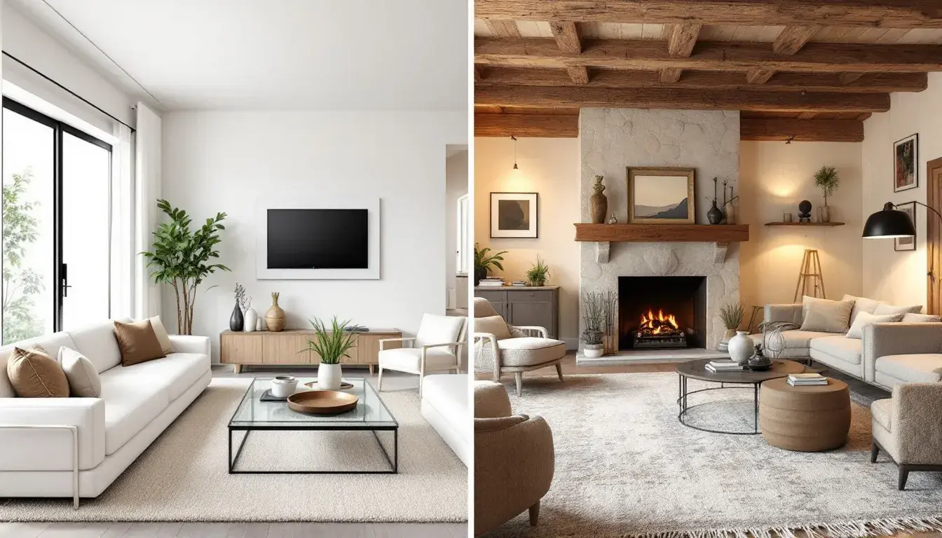
Modern vs. Rustic: A Room-by-Room Analysis of Interior Design Styles
10 Sep 2025 · 5 min readColor: it's the silent architect of our interiors, the unseen force shaping how we feel within the walls we call home. More than just decoration, a considered palette can evoke memories, spark creativity, and even influence our daily rhythms. The choices we make, whether leaning towards the sleek lines of a modern aesthetic or the comforting textures of rustic design, resonate far beyond mere aesthetics. They speak to our personalities, our aspirations, and our connection to the world around us. Consider the soft glow of dawn filtering through linen curtains versus the sharp, unfettered light reflecting off polished steel. Each tells a different story, a different way of living. It is within these contrasts that a design conversation flourishes, a dialogue between the contemporary and the timeless, the polished and the raw. The interplay between these two design languages—Modern and Rustic—reveals how color can shift the mood, redefine space, and, ultimately, transform a house into a home. Join us as we explore how carefully curated color selections bridge these seemingly disparate worlds, crafting spaces that feel both grounded and refreshingly new.
"Meesho Palette", like a vibrant marketplace, bursts forth with an energy that feels both familiar and slightly unexpected. Light Taupe lays a groundwork of serenity amidst the energetic tones of the other shades. Burnt Orange channels the warmth of terracotta, reminiscent of sun-baked afternoons and the convivial spirit of shared meals. Dusty Rose whispers of vintage charm, a nod to heirloom pieces and the patina of time, whilst Olive Green provides an anchor, rooting the palette in the natural world with the calming influence of a lush garden. Orchid Purple, a jewel tone, provides a jolt of the unconventional – an artful accent that refuses to play it safe. This assortment suggests a space where stories are both told and written, where the new brushes against the old, making it suitable for spaces striving for eclectic appeal. Imagine this color scheme in a living room, where a mid-century sofa meets a woven rug or in a bedroom where crisp, modern lines are softened by a hand-stitched quilt. It's about celebrating individual style and blending disparate elements into a harmonious whole, where a gallery wall of mixed media art is bathed in diffused light. The space should feel curated yet comfortable, inviting both contemplation and connection, the feeling of stumbling upon some treasure after some long, satisfying search. It can transform a simple space into a journey, reflecting a soul that has wandered widely and collected memories along the way, bringing the allure of distant shores to the comforts of home.
"Earthy Elegance" delivers a statement of subdued luxury, grounded in tactile textures and the quiet beauty of the natural world. Creamy White evokes the simple perfection of sun-bleached linen, a canvas for understated design. Pale Taupe mirrors the comforting solidity of aged wood, suggesting authenticity, whilst Amber Gold reflects the allure of heirloom antiques, whispering of history and enduring style. Burgundy Red brings depth and sophistication, like a well-loved leather armchair in a dimly lit study, and Jet Black provides just the right amount of grounded contrast, akin to the forged iron details found within a rustic cabin. This palette speaks to homes where quality takes precedence over fleeting trends, where the scent of beeswax mingles with the warmth of a fireplace. Imagine this in a bedroom with exposed beams and soft, wool blankets or in a living room filled with handcrafted furniture and carefully curated artwork. It's about surrounding yourself with objects that tell a story, materials that feel good to the touch, and colors that soothe the soul. The space should feel lived-in, not just decorated, an embrace that is both genuine and timeless. It is a palette that encourages one to slow down, to appreciate the simple things, and to find beauty in the imperfect, creating an interior that feels like a sanctuary from the outside world, a place where time seems to stand still.
"Earthy Harmony" captures something truly special, evoking the unique feel of a sun-dappled forest floor. Lime Green mirrors the vibrant energy of new growth, a signal of renewal and vitality. Pale Gold reflects the soft glow of sunlight filtering through the leaves, bringing a sense of warmth and quiet luxury. Soft Blue evokes the vastness of the sky reflected in a tranquil lake, offering serenity, while Deep Olive brings a sense of grounding stability, like ancient moss-covered stones. Dark Grey mirrors the shadows that dance between the trees, adding depth and complexity. This combination feels distinctly serene, suited to spaces that prioritize well-being and connection with nature. Picture a living room filled with potted plants and natural textures, or a bedroom bathed in the soft morning light. Here, the lines between indoors and outdoors blur, creating a sense of openness and tranquility. Imagine linen sofas paired with reclaimed wood coffee tables, or woven rugs layered over stone floors. This palette finds itself at home paired with natural materials that highlight the colorations, which, in a modern space, becomes a retreat, the calming effect of nature blending effortlessly with the clean, simple lines of the room, and makes it one's own personal escape from the daily grind.
"Earthy Pastel" whispers promises of tranquility and subtle sophistication, offering a gentle take on natural elegance. Light Pink calls to mind the delicate blush of a fading sunset, casting a warm and comforting glow. Sandy Beige echoes the soft texture of weathered dunes, bringing a sense of calm stability and connection to nature. Steel Blue mirrors the hazy distance of mountain ridges, offering depth and a touch of cool serenity. Cranberry Red whispers of ripe berries hidden within the brush, bringing a hint of intrigue and warmth. Dark Taupe grounds the softer tones, mirroring the solidity of fertile soil and the depths of age-old trees. Imagine this palette in a sun-drenched bedroom with flowing linen curtains or a cozy living room with a stone fireplace and plush rugs. It is a delicate balance of comfort and refinement creates spaces that feel both inviting and restorative. Picture whitewashed walls paired with antique wooden furniture, hand-woven textiles layered over smooth stone floors, or dried floral arrangements atop minimalist shelves. It transforms the space into something one wants to be surrounded by – a gentle color scheme that invites serenity and a sense of well-being. It transforms those living areas into havens of peace, places of contemplation, where the boundaries between rustic sentiment and modern design vanish.
The journey through these palettes reveals a dynamic interplay between Modern and Rustic aesthetics, showing how color acts as the ultimate interpreter. Whether the space is imbued with the marketplace energy of the Meesho Palette, the subdued luxury of Earthy Elegance, the tranquility of Earthy Harmony, or the gentle sophistication of Earthy Pastel, color creates a particular atmosphere, shaping our sensations and elevating an environment. These color stories are not merely about decoration; they speak to how we shape our lived environments, building a space that tells a story of ourselves, allowing each palette to evoke a space of sanctuary or sociability, of reflection or energy, and ultimately, of home.