'%3e%3cpath%20fill-rule='evenodd'%20clip-rule='evenodd'%20d='M51.1303%2019.2492C50.7278%2019.913%2050.1346%2020.4426%2049.3508%2020.838C48.5669%2021.2335%2047.6172%2021.4312%2046.5014%2021.4312C44.8208%2021.4312%2043.4367%2021.0216%2042.3492%2020.2025C41.2617%2019.3833%2040.6686%2018.2394%2040.5697%2016.7706H44.4253C44.4818%2017.3355%2044.6831%2017.7804%2045.0291%2018.1052C45.3751%2018.43%2045.8164%2018.5924%2046.3531%2018.5924C46.8192%2018.5924%2047.1864%2018.4653%2047.4547%2018.2111C47.7231%2017.9569%2047.8572%2017.618%2047.8572%2017.1943C47.8572%2016.8129%2047.7337%2016.4952%2047.4865%2016.241C47.2393%2015.9867%2046.9322%2015.7784%2046.565%2015.616C46.1978%2015.4536%2045.6893%2015.2594%2045.0397%2015.0334C44.0934%2014.7086%2043.3202%2014.3944%2042.72%2014.0907C42.1197%2013.7871%2041.6042%2013.3351%2041.1735%2012.7349C40.7427%2012.1347%2040.5273%2011.3544%2040.5273%2010.394C40.5273%209.50418%2040.7533%208.73448%2041.2053%208.08481C41.6572%207.43515%2042.2821%206.93731%2043.0801%206.5913C43.8781%206.24528%2044.7925%206.07227%2045.8235%206.07227C47.49%206.07227%2048.8141%206.46771%2049.7956%207.25861C50.7772%208.04951%2051.3315%209.13698%2051.4586%2010.5211H47.5395C47.4689%2010.0268%2047.2888%209.63483%2046.9993%209.3453C46.7097%209.05578%2046.3178%208.91102%2045.8235%208.91102C45.3998%208.91102%2045.0573%209.024%2044.7961%209.24997C44.5348%209.47594%2044.4041%209.80783%2044.4041%2010.2457C44.4041%2010.5988%2044.5207%2010.8989%2044.7537%2011.146C44.9867%2011.3932%2045.2798%2011.5944%2045.6328%2011.7498C45.9859%2011.9052%2046.4944%2012.1029%2047.1581%2012.343C48.1185%2012.6678%2048.9023%2012.9891%2049.5096%2013.3069C50.1169%2013.6246%2050.6395%2014.0872%2051.0773%2014.6945C51.5151%2015.3018%2051.734%2016.0927%2051.734%2017.0672C51.734%2017.8581%2051.5328%2018.5854%2051.1303%2019.2492ZM59.0242%206.3053V21.2829H55.4016V6.3053H59.0242ZM73.9409%206.3053V9.18642H69.8734V21.2829H66.2296V9.18642H62.2046V6.3053H73.9409ZM80.7438%209.18642V12.3218H85.8069V15.0546H80.7438V18.3806H86.4425V21.2829H77.1212V6.3053H86.4425V9.18642H80.7438ZM99.667%2016.0291V21.2829H96.0444V6.3053H101.913C103.692%206.3053%20105.048%206.74665%20105.98%207.62934C106.912%208.51204%20107.378%209.7019%20107.378%2011.199C107.378%2012.1311%20107.17%2012.9609%20106.753%2013.6882C106.337%2014.4155%20105.719%2014.9875%20104.9%2015.4042C104.08%2015.8208%20103.085%2016.0291%20101.913%2016.0291H99.667ZM103.692%2011.199C103.692%209.8855%20102.965%209.22879%20101.51%209.22879H99.667V13.1268H101.51C102.965%2013.1268%20103.692%2012.4842%20103.692%2011.199ZM120.092%2018.5501H114.478L113.546%2021.2829H109.732L115.219%206.41123H119.393L124.879%2021.2829H121.024L120.092%2018.5501ZM119.16%2015.7961L117.295%2010.2881L115.41%2015.7961H119.16ZM131.555%2018.5077H136.385V21.2829H127.933V6.3053H131.555V18.5077ZM143.337%209.18642V12.3218H148.4V15.0546H143.337V18.3806H149.035V21.2829H139.714V6.3053H149.035V9.18642H143.337ZM163.507%206.3053V9.18642H159.44V21.2829H155.796V9.18642H151.771V6.3053H163.507ZM177.449%206.3053V9.18642H173.382V21.2829H169.738V9.18642H165.713V6.3053H177.449ZM184.252%209.18642V12.3218H189.315V15.0546H184.252V18.3806H189.951V21.2829H180.629V6.3053H189.951V9.18642H184.252Z'%20fill='%23EEF0ED'/%3e%3cmask%20id='mask0_3101_7327'%20style='mask-type:alpha'%20maskUnits='userSpaceOnUse'%20x='0'%20y='0'%20width='27'%20height='28'%3e%3cpath%20d='M23.8328%200.759766H2.64808C1.18559%200.759766%200%201.94535%200%203.40785V24.5925C0%2026.055%201.18559%2027.2406%202.64808%2027.2406H23.8328C25.2952%2027.2406%2026.4808%2026.055%2026.4808%2024.5925V3.40785C26.4808%201.94535%2025.2952%200.759766%2023.8328%200.759766Z'%20fill='white'/%3e%3c/mask%3e%3cg%20mask='url(%23mask0_3101_7327)'%3e%3cpath%20d='M23.8328%200.759766H2.64808C1.18559%200.759766%200%201.94535%200%203.40785V24.5925C0%2026.055%201.18559%2027.2406%202.64808%2027.2406H23.8328C25.2952%2027.2406%2026.4808%2026.055%2026.4808%2024.5925V3.40785C26.4808%201.94535%2025.2952%200.759766%2023.8328%200.759766Z'%20fill='%23D8D8D8'/%3e%3cpath%20d='M13.2404%200.759766H0V14.0001H13.2404V0.759766Z'%20fill='%238C61FF'/%3e%3cpath%20d='M13.2404%2014H0V27.2404H13.2404V14Z'%20fill='%2336C3FE'/%3e%3cpath%20d='M26.4806%2014H13.2402V27.2404H26.4806V14Z'%20fill='%236592FE'/%3e%3cpath%20d='M26.4806%200.759766H13.2402V14.0002H26.4806V0.759766Z'%20fill='%236059F7'/%3e%3c/g%3e%3c/g%3e%3cdefs%3e%3cclipPath%20id='clip0_3101_7327'%3e%3crect%20width='190'%20height='28'%20fill='white'/%3e%3c/clipPath%3e%3c/defs%3e%3c/svg%3e)
'%3e%3cpath%20d='M23.8328%200.759521H2.64808C1.18559%200.759521%200%201.94511%200%203.40761V24.5923C0%2026.0548%201.18559%2027.2404%202.64808%2027.2404H23.8328C25.2952%2027.2404%2026.4808%2026.0548%2026.4808%2024.5923V3.40761C26.4808%201.94511%2025.2952%200.759521%2023.8328%200.759521Z'%20fill='%23D8D8D8'/%3e%3cpath%20d='M13.2404%200.759521H0V13.9999H13.2404V0.759521Z'%20fill='%238C61FF'/%3e%3cpath%20d='M13.2404%2013.9998H0V27.2402H13.2404V13.9998Z'%20fill='%2336C3FE'/%3e%3cpath%20d='M26.4809%2013.9998H13.2405V27.2402H26.4809V13.9998Z'%20fill='%236592FE'/%3e%3cpath%20d='M26.4809%200.759277H13.2405V13.9997H26.4809V0.759277Z'%20fill='%236059F7'/%3e%3c/g%3e%3c/svg%3e)
Balanced Hues: Cool and Warmth Equilibrium in Palette Designs
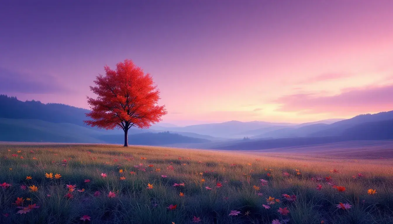
10 Sep 2025 · 3 min readColor is, above all, emotional. It speaks a language felt rather than consciously understood. The dance between warm and cool tones is a delicate balancing act, one that can evoke feelings of serenity or excitement, spaciousness or intimacy, depending on how deftly it’s choreographed. A palette too heavy on warmth can feel suffocating, a blaze without reprieve, while one skewed toward coolness might come across as austere, a landscape perpetually shrouded in twilight. The challenge lies in finding that sweet spot, that equilibrium where opposing forces not only coexist but enhance one another, creating a richer, more compelling visual experience. Consider how sunlight filters through autumn leaves, warming a cool forest floor, or how a splash of crimson enlivens a muted, overcast day. These are the instances where color achieves its full potential, turning simple arrangements into powerful expressions. The journey is, then, about discovering how to orchestrate these contrasting energies, creating palettes that resonate with a deeper sense of natural grace.
"Earthy Elegance" evokes the quiet moments of an autumn afternoon. Imagine a sun-drenched meadow, the tall grasses swaying gently in the breeze. Creamy White sets a softened stage, whispering of antique linen and dried wildflowers, a delicate opening prelude to the narrative that unfolds. Pale Taupe, like sun-bleached stone, grounds the palette with a sense of sturdy endurance. The magic happens with the introduction of Amber Gold, a concentrated glimpse of sunlight made pigment, hinting at hidden riches, of honey and ripe harvest. This gentle warmth encounters drama in Burgundy Red, the color of aged wine, of fading roses, bringing a depth and sophistication. Counterbalancing this is Jet Black, a bold punctuation mark that adds definition, preventing the combination from becoming saccharine, recalling the sharp, bare branches against a twilight sky. It is an exercise in juxtaposition, mirroring nature's own balancing act as it transitions from summer’s heat to winter’s cold breath. The resulting atmosphere whispers of tradition withstanding time, suggesting interiors where heirloom pieces comfortably coexist with natural materials, spaces designed for quiet contemplation and peaceful family gatherings, where memories are preserved and new ones are carefully nurtured.
"Vibrant Casino" is a controlled burst of energy, a celebration of risk and reward, reminiscent of a late night under glittering lights. At first glance, Pale Yellow sings a promise of optimism before the palette settles into something deeper. Moss Green speaks of felted tables, of hushed tones and calculated moves; offering a grounding foil to the bolder strokes that are introduced shortly after. Muddy Brown, a more subdued character, provides a comforting anchor, a reminder of classic leather chairs and polished wood, the comforting presence. Crimson Red arrives like a sudden win, igniting the senses, capturing the adrenaline surge, the flush of anticipation. Finally, Deep Teal anchors the palette with an enigmatic coolness, like shadows lurking just beyond the spotlights, introducing an element of mystery and intrigue. The ensemble is an exercise in playful tension, where tradition finds itself challenged by a contemporary eye. Imagine it applied to a space where vintage furniture meets avant-garde art, where the air is thick with both sophistication and an unspoken invitation to cut loose: a room where secrets are whispered, chances are taken, and the night holds endless possibilities.
"Earthy Pastel" speaks of nature rendered in watercolor, a muted hymn to soft light and gentle transitions. Light Pink serves as a wistful starting point, reminiscent of cherry blossoms kissed by morning dew. The color offers a promise of tenderness; an embrace that does not overwhelm. Here, Sandy Beige provides a grounding earthiness, the barest echo of sun-kissed shores. This unassuming base allows Steel Blue to emerge like a shadowed pool, a silent call to self reflection and peace. Bringing it all closer to earth is Cranberry Red, like a late season bloom adding a touch of unexpected delight, the hint of fire that keeps one grounded during the cool air of autumn. Finally, Dark Taupe plays the role of a grounding force, anchoring the lighter tones with its shadowy strength; think of weathered wood or smooth river stones, the bones of the land. The overall effect is one of understated sophistication: an invitation to slow down, breathe deeply, and appreciate the quiet beauty that surrounds us. The image suggests serene interiors filled with artisan textiles, organic forms, handmade ceramics, spaces tailored for mindful living, where time seems to slow down in harmony with the rhythms of nature.
Color has a language of its own, capable of communicating emotions and evoking scenes that words often fail to capture. Each of these palettes, whether expressing the quiet peace of a serene landscape, the vibrant energy of a games room, or the subtle charm of a watercolor painting, demonstrates the profound impact of well-orchestrated contrasts and careful tone. From the sun-drenched meadows of 'Earthy Elegance' to the hushed intensity of 'Vibrant Casino' and the tender tranquility of 'Earthy Pastel', these arrangements offer gateways into unique emotional territories. They showcase how the thoughtful consideration of color temperatures allows any collection of blended tones to express deeper meaning, enrich experiences and transform the familiar into the unforgettable.